Competition: Dezeen has teamed up with London’s Royal College of Art to offer five readers the chance to win a pair of tickets to the private view of the school’s 2016 graduate exhibition on 23 June 2016. (more…)
Competition: Dezeen has teamed up with London’s Royal College of Art to offer five readers the chance to win a pair of tickets to the private view of the school’s 2016 graduate exhibition on 23 June 2016. (more…)

Following the fifth edition of Romanian Design Week, Dezeen has selected the best exhibited designs, including modular children’s furniture, wooden headphones and traditionally patterned rugs (+ slideshow). (more…)

“Casa dos Caseiros” was first created to answer a private order for a social interest dwelling project to be built numerously throughout some cities in Rio de Janeiro state. Unfortunately after some time of development the project had to be canceled by the contractor.
Originally it was designed using steel frame as structural system, after cancelation we have updated the whole project to use structural concrete blocks, more usual in Brazilian construction, and still a rational modular building system. The project was set aside for a while until came the opportunity to build one unit as a prototype and still be used as home for the housekeepers of a property in a rural district from Campinas.
We then set off for an experimental construction, where the cost could not exceed R$ 50,000.00 (around US$ 14,000.00), or something around R$ 700.00/m2. The goal: to house a family with two children.
Initially, we determined that the house would have 70sqm, enough to provide users better quality of life (Brazil´s federal government has delivered homes with approximate 40sqm in social housing programs as Minha Casa Minha Vida –literal translation My House My Life- without expansion possibility).
The original design aims to rescue street interaction and conviviality stimulation between residents of the same neighborhood. A frame at the main façade creates an extensive masonry bench next to the sidewalk, creating a favorable permanence place. It’s almost an attempt to rescue smaller cities traditions where people put chairs on sidewalk and enjoy as time passes, watching children playing on streets.
The house design is very simple, yet it ensures efficient lighting and natural ventilation in social and service areas. A patio located strategically around the kitchen, office and living room, brings light and air renewal to the more permanency home environments. The courtyard is the guarantee that even with a house attached on its side the project will still have all natural resources necessary for its residents.
In addition to kitchen, living room, patio and laundry services, the project can adapt to different internal configurations:
3 bedrooms + bathroom + office or 1 suite + 2 bedrooms + bathroom
Two important decisions were taken in order to reduce building costs: Eliminate the roof slab and the exterior and interior plaster. Instead, we used roll texture applied directly on block and a PVC ceiling system together with cement roof to function on an interim basis as insulated roof and slab. A site with many treetops around contributed in preventing overheating inside the building. With good quality concrete blocks it was possible to let them apparent, reducing painting costs.
After completion we saw ourselves encouraged by the remarkable increase in the quality of life of Casa dos Caseiros residents and since it is difficult to low income population to hire an architect to design aesthetically pleasant and functional homes, we have decided release the project as an OPEN SOURCE project. We will provide (http://ift.tt/1OpmGGF) the project free of charge on our website, as a way of democratization of ideas to be improved and adapted by communities.
We believe that the idea of a network of good projects will inject into the market ways to overcome economic barriers and distances between architect and final client. We lack new typologies and best urban insertions.
It is very important to remember that adjustments are necessary since the project will be built in different bioclimatic zones, building systems, topography, rules and regulations.

After weeks of movement testing, the British Airways i360 observation pod has achieved its maximum height of 138 meters as the attraction enters final inspection phases in preparation for its opening this summer. As a part of “the world’s tallest moving observation tower,” the 18 meter diameter viewing pod will provide 360 degree views of the British seaside resort towns of Brighton and Hove, the Sussex coast and the English Channel, for to up to 200 passengers at a time.
Designed by Marks Barfield Architects, the minds behind the London Eye and the recently proposed Chicago Skyline Cablecar, the tower was recently named “World’s Most Slender Tower” by the Guinness Book of World Records for its astonishing 41:1 height to width ratio. The structure topped out at 162 meters earlier this year.
The pod’s cable-driven lift system was developed by French company Poma. Other consultants include Jacobs Engineering and Dutch company Hollandia.
As a new icon for Brighton’s historic West Pier, the project will also feature a visitor center, a 400-seat restaurant, a gift shop, a children’s play zone, an exhibition area, and conference and event spaces.
According to the architects, the tower “is a feat of cutting edge engineering combined with innovative technology and elegant design [creating] the futuristic visitor attraction on the Brighton seafront.”
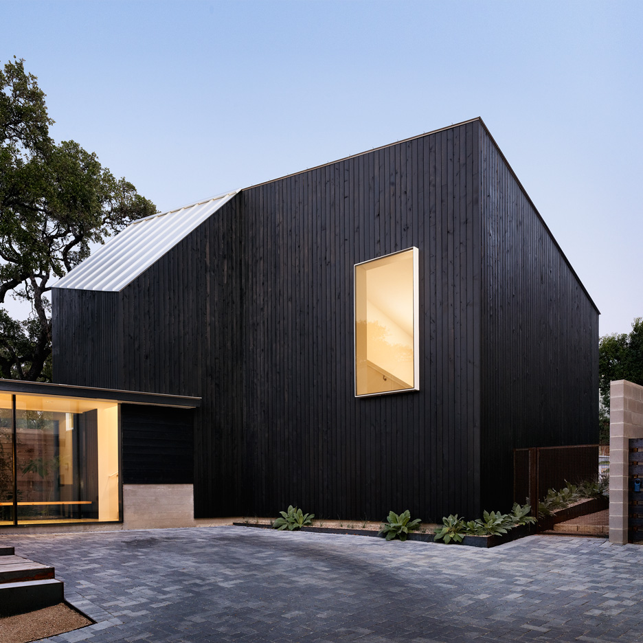
Kicking off a series that spotlights houses from different US states, we’ve searched our archive for five of the best residences in Texas. They include a black timber extension to an Austin bungalow and a lakefront dwelling with a pre-rusted steel treehouse (+ slideshow). (more…)

From the architect. Xavier Vilalta´s major project in Ethiopia, Lideta Mercato, has finally topped out in Addis Ababa and is set to open this summer.
The Lideta Mercato was intended to be a shopping mall just like many others in the city of Addis Ababa. A rigorous analysis has identified the main issues of the existing malls in the city, which are commonly built using glazing structures. As a result, the buildings suffer uncomfortable thermal conditions and over-illumination in the interiors. The observation of the Old Mercato, the largest open air market in Africa, was an inspiration to redefine the program of the building, conceiving a multistory contemporary market instead of a conventional shopping mall based on large shops.
The carved volume connects two parallel streets that define the plot of the project. This diagonal connection creates a shortcut for pedestrians and concentrates all the entrances of the building. This path extends to the inclined atrium in the middle of the building, where all floors are connected. Around this void, a different layout of small shops is placed in each floor.
The skin of the building was designed considering thelocal climate conditions and traditions. The façade acts as a protection from the sun, controlling the natural light and ventilation in the interior spaces. It was built using a lightweight concrete prefab system, and the shapes come from a traditional Ethiopian fractal pattern commonly found in the local fabrics. The passive ventilation system and controlled natural lightening created between the building´s skin and the interior atrium enables the interior space to have an open-air feeling and balanced illumination.
Constantly ceased power supply is one of the main obstacles Ethiopia is facing. This occurring problem was turned into an opportunity by placing circular shaped photovoltaic umbrellas in the rooftop that create nice shaded entertainment areas.
The roof also functions as a rainwater collection system by draining and storing the rainwater in the basement tanks, which later goes through a filtration process to be reused for building´s toilets and taps.

Herzog & de Meuron’s ten-storey extension to London’s Tate Modern, which officially opens to the public this week, is the latest in a series of ambitious building projects pursued by the internally renowned gallery of contemporary art. Sitting above The Tanks, the world’s first dedicated galleries for live art and film installations, the building’s pyramidical form provides 60% more exhibition space for the institution. Two days before its doors welcome art-lovers from around the world, photographer Laurian Ghinitoiu has captured a collection of unique views on this highly anticipated addition to London’s skyline.

ArchDaily is continuing our partnership with The Architectural Review, bringing you short introductions to the themes of the magazine’s monthly editions. In this introduction to the June 2016 issue on what the AR has provocatively named “Notopia,” Editor Christine Murray outlines the defining characteristics of this “selfish city,” the “pandemic of generic buildings have no connection to each other” – stating that their issue-long tirade against Notopia “is less a warning than a prophecy of doom.”
If what is called the development of our cities is allowed to multiply at the present rate, then by the end of the century our world will consist of isolated oases of glassy monuments surrounded by a limbo of shacks and beige constructions, and we will be unable to distinguish any one global city from another.
This pandemic of generic buildings have no connection to each other, let alone to the climate and culture of their location.
With apologies to our forebear Ian Nairn, upon this scourge The Architectural Review bestows a name in the hope that it will stick – NOTOPIA. Its symptom (which one can observe without even leaving London) is that the edge of Mumbai will look like the beginning of Shenzhen, and the center of Singapore will look like downtown Dallas.
This thing of terror, which will wake you up sweating at night when you begin to realize its true proportions, consists in the universal creation of cities that are not human settlements, but places where capital investment lives in architecture devoid of social purpose. Notopia is where empty apartments and gated communities stand under guard while the homeless are not permitted even to sleep on the street, and are prodded or hosed down with water until they move on.
How did we get here? Popular misunderstandings of one sort and another – of the consequence of capitalism and vulgarizations of the concept of democracy – have led the public to kick against the principle of land planning. Belief in trickle-down economics has likewise led us to tolerate every kind of abuse in the name of attracting financial investment. The fallacy has been that the free market will provide enough housing for those in need, and that allowing private business to build out our cities will save the public purse while providing for all.
The reality is that left to market forces, the commercialization of land has given birth to a selfish city, disfigured by the interests of bankers and stillborn in vision, and unable to cope with mass urbanization, leaving the working class to inhabit rabbit-hutch towers on the fringes. Meanwhile, the downtown cores are hollowed out by gentrification and the perversity of uninhabited luxury flats, the values of which further increase by not being lived in.
With so much energy put into the design of iconic totems, we have been confident that our cities will remain distinct. The essays enclosed at the heart of this edition prove that this is a criminally feckless illusion, and that in fact the mediocre conurbations breeding in New York, Sydney and Cape Town are obliterating the identity and culture of unique and vibrant capitals of commerce and exchange developed over thousands of years. This is not to say that capital investment has no place in development. But look where one may, in the East or the West, every city has a skyline of obelisks and trophies, the duplitecture of elsewhere with a flourish here and there to set itself apart.
The deeper issue, aside from how these towers look, is the no-places created on the ground. One building next to another does not make a place, and many buildings do not make a city. Notopia is a warning sign that the metropolis as a place of exchange, dialogue and delight between diverse groups of people is being exterminated. Buildings alone do not support life. With the erasure of identity and the desire to make cities safe and clean, comes the extinction of culture. The messiness and friction of people together makes for a creative and noisy place. There should be a cacophony of traffic, both mohawks and power-suits, and the vague notion that someone may steal your bag. It should be a place where the unexpected can happen, and not be moved on, imprisoned or fined. It must be unlike life in the suburbs, where nothing of consequence ever happens, and you are unlikely to meet anyone who is not like you.
The cure is to adopt a new approach to modern planning.
The city sells off its land to private hands who leverage the value of the property by building as much as they can, as quickly as they can, with architecture there to dress up mediocrity just as parsley dresses up a plate of rice. Everywhere we are levelling the wondrous diversity to a uniform mean. And planning machinery is being used to speed up Notopia, not check it.
The planning offensive was started in a mood of idealism which assumed two things: that rules would be used flexibly and intelligently, and that private developers would build according to the needs of the local people. Now the tail is wagging the dog, and developers are building for the needs of offshore account-holders and money launderers. Any hope of intelligent interpretation was lost when planning was made into another unrewarding office job, and chained to the lowest common denominator, not the highest common multiple, with all the planning rules perverted to make every square mile proclaim its universal style and status as a safe haven for cash buyers.
Too big a problem? Surely it’s not beyond our power to address it. The alternative is the abyss.
Subscribe to The Architectural Review.

From the architect. The James River House was designed as a place for three young boys. It is a place where they can grow and learn from their surroundings – experience mud, moths, flowing water, and the changing light of the seasons; a place that would allow for many gatherings of all the people who love them.
Three volumes hover above a bluff alongside a bend in the James River, arranged loosely and lightly on the land like a scattered group of stones around a campfire. As a visitor slips between the volumes, the house opens up to light and river views and the fully enveloping woods.
The quiet yet open interior is built around a large and flexible gathering space that can be intimate, expansive, interior, or exterior. Flanked by sleeping quarters, this central living area is at once hearth, tree house, and dining hall and is the nexus of activity for the family and the three boys who fill the house with light and motion.