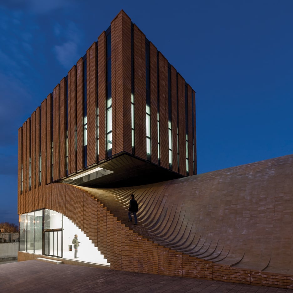
From the architect. In the highly competitive world of higher education, first impressions are critical. Building on the strength of Missouri State University’s long history and brand image, this new 13,000 square foot facility serves as the institutions “front door”, welcoming visitors to the campus at its primary entrance. In addition to providing a point of origin for campus visits, the two story lobby and 100 seat presentation room provide a multi-purpose venue for special events such as press conferences, distinguished guests and networking events. Tasked by the University with providing a “signature piece of architecture”, the design solution is both economical and monumental. Originally founded in 1905 as a teacher’s college, Missouri State University now carries the Public Affairs mission in higher education for the state.
Courtesy of Dake Wells Architecture
The building program is arranged in a two-story scheme, placing administrative functions on an upper level in order to increase the building’s visual presence as it reinforces the campus edge. The scheme considers a future expansion that will relocate existing admissions and registration services to this location, providing a one-stop-shop for new applicants.
Plan
Courtesy of Dake Wells Architecture
The building enclosure is derived from the surrounding campus context combined with an interpretive reading of the institution’s history and mission. Limestone provides a durable and contextual surface at the ground, increasing in transparency to the north toward the entrance. Two white planes are elevated above the base defining the east and west facades, almost paper thin. A two-story curtain wall angled toward the campus entrance serves as a gesture to welcome visitors and increase the building’s transparency. The west plane extends slightly beyond the pointed corner of the building signifying the main entry point to the building and folds slightly away as if dog-earring a page for future reference. Circular perforations derived from the pattern of a composition booklet provides added shade on the west facade and dappled light in the lobby interior. A wall of slate recalling the classroom chalkboard provides the backdrop to the building’s entrance and defines a generous reception desk for student greeters, with a twenty foot maroon and white bear suspended from the structure.
Courtesy of Dake Wells Architecture
Visitors can experience the University through interactive displays on their own, or participate in a guided tour that begins in the lobby, moves to the presentation, then through the linear gallery and out onto campus. Recognizing the capacity of architecture to both engage and inspire, Missouri State University is strengthening its position in the higher education market while staying true to its mission to educate citizen scholars.
As director of the 2016 Venice Biennale, Alejandro Aravena has sought to shift the very grounds of architecture. Rather than an inward-looking interrogation of the profession’s shortcomings, as Rem Koolhaas undertook in 2014, the Chilean Pritzker Prize-winner asks us to gaze in the opposite direction—to the vast swathes of the built horizon that traditionally lay beyond the profession’s purview: urban slums, denatured megacities, conflict zones, environmentally compromised ports, rural villages far off the grid.
“We believe that the advancement of architecture is not a goal in itself but a way to improve people’s quality of life,” states Aravena in his introduction to event. In other words, his biennale does not ask what architecture ought, yet often fails, to be, but rather what it could, yet often forgets, to do.
While the 2014 and 2016 editions are as different as yin and yang, they make an elegant and bracing duo when considered together. Certainly this year’s biennale owes one definite debt to a Koolhaas‘ directorship. Past biennales have often produced a hodge-podge of ideas that can make the sprawling event at once overwhelming and watered down. In 2014, Koolhaas managed to wrangle the independent national pavilions to adhere, more or less rigorously, to his theme. This year the national pavilions—and the lion’s share of official collateral events—also directly engage Aravena’s theme.
In his curatorship of the Central Pavilion, Aravena does not eschew dark realities. But rather than scolding architects for ignoring them, he presents them as rich, new fields for engagement. In that light, his selections focus not on problems but actual and potential solutions, most of which can replicated in simple, low-cost, low-impact, and often beautiful ways.
As you walk into the Biennale’s Central Pavilion, your eyes are immediately drawn to the frame of the huge masonry arch, winner of the Golden Lion award for Best Participant. Designed by Paraguayan architect Solano Benitez and his Gabinete de Arquitectura, the project instantly reminds attendees that more than a billion rural people will move to cities the next decade. In the vast majority of cases, their homes will be built without an architect in sight, not even a master builder.
In response, Benitez and team have designed an extremely simple, reusable template, enabling non-professional builders to create handsome, sturdy structures using locally-sourced brick. The Biennale’s jury the praised the project for “harnessing simple materials, structural ingenuity and unskilled labor to bring architecture to underserved communities.”
Instead of high-tech skins and attention-seeking forms, the palette of Aravena’s pavilion (indeed across much of this year’s Biennale) tend to be neutral, and the shapes simple. We get squares and triangles, bricks and rammed earth. For example:
Anna Heringer‘s “Mud Work!” reminds us that “three billion people on this planet live in buildings made of mud.” Her exhibit is set on a floor made of rammed earth, which looks remarkably like terrazzo (a technique, appropriately enough, invented in Venice).
Vietnam-based Vo Trong Nghia, renowned for his innovative use of bamboo, reveals how little green space is left in his native Ho Chi Minh city. In response, he creates a meditative maze of screens, complete with shoots of live bamboo.
Inside a blank cloth hides a welter of colorful images through which VAV Studio documents the ways Iranians have returned to traditional building processes in the face of an economic boycott.
A moving exhibit by Eyal Weizman devoted to “forensic” architecture documents the loss of both buildings and lives—and the weapons deployed—in the Gaza Strip and other zones of conflict in the Middle East.
All this is a far cry from Koolhaas’s approach. He and his team packed the Central Pavilion with a cool, almost zoological dissection of architecture’s constituent parts: a wall of doors, a gallery of connecting corridors, a dome made to recede behind the kind of false ceiling that hides the functional guts of many contemporary buildings. Not known for playing nice, Koolhaas wanted to force his profession to examine its shortcomings. In setting out his theme of “Absorbing Modernity, 1914–2014,” Koolhaas was clear that this process of absorption was not going to be as pleasant as quaffing a glass of Prosecco (the unofficial and omnipresent beverage of Venice Biennales).
“We didn’t necessarily mean ‘absorbing’ as a happy thing,” he said at the time. “It is more like the way a boxer absorbs a blow from his enemy.”
Aravena’s curatorship is not necessarily less. He decries the “banal, mediocre and dull built environments” that result from “the greed and impatience of capital or the single mindedness and conservatism of the bureaucracy.” Still, as he writes in his introduction to the event , he sticks to “stories and exemplary cases where architecture did, is and will make a difference.”
The national pavilions and official (and unofficial) collateral events have, for the most part, clung more or less closely Aravena’s theme of “Reporting from the Front.” For example:
The Spanish Pavilion was awarded the Golden Lion for a National Pavilion for its exhibition “Unfinished,” which examines the legacy of Spain’s building boom in the early 2000s, followed by the devastating bust (and abandonment of so many unfinished projects) that began in 2008. The pavilion demonstrates how select architects have “understood the lessons of the recent past and consider architecture to be something unfinished, in a constant state of evolution and truly in the service of humanity,” explain curators Iñaqui Carnicero and Carlos Quintans.
Having carved out four new doors in its pavilion (and removed 48 tons of bricks in the process), the team from Germany positively embraces the reality of immigration, especially in the wake of the mass influx of Syrian refugees since 2015. The curators from the Deutsches Architekturmuseum lined the walls with stories of cities and neighborhoods highly impacted by immigration, redefining “problem zones” into fields for opportunity.
Occupying some of the largest rooms in the sprawling Arsenale, the Italian Pavilion takes as its theme “Taking Care: Designing for the Common Good.” Curated by TAMassociati, the exhibition explores ways “architecture can and should prompt Italians to live the spaces of contemporary life with greater focus and more courage.”
Literally reporting from the frontline of the war, Ukraine’s exhibition tells a particularly poignant story. The show is curated by IZOLYATSIA, a cultural foundation exiled from its home in Donetsk. Their building in Donetsk, once a thriving center of creativity, now serves as a prison. IZOLYATSIA’s exhibit combines maps, video interviews, data visualizations, and architectural models to tell the stories of cities that lie along the volatile de facto border between the two sides in the conflict.
Venice’s own pavilion is dedicated to Marghera, its highly polluted and largely abandoned port. Proposed projects include repurposing abandoned buildings for green activities—and an ingenious plan not simply to remove toxic soil and dump it elsewhere, but to encase it safely in a series of beautiful towers rising from the site itself.
If you want to see the kind of highly funded, high-profile projects that often dominate architectural exhibitions, you can—though they have largely been pushed out to peripheral events. Near San Marco, a gallery inside the Louis Vuitton shop hosts “Building in Paris.” A series of evocative models and drawings by Frank Gehry and team document their process as they move toward the final design of the Fondation Louis Vuitton in Paris.
However, Sir Norman Foster has snuck into the main event with a project for building low-cost droneports in Africa. Drones can provide the rapid delivery of medicine and other urgently needed materials in a continent with a woefully inadequate transportation infrastructure. His droneport is designed as a “kit-of-parts.” The basic formwork and brick-press machinery is delivered to the building site, while raw materials, such as clay for bricks and boulders for the foundation, can be locally sourced. The pilot project is set to begin in Rwanda later this year.
Ranging from favelas to dehumanized middle-class neighborhoods, from poisoned ports to bombed cities, Aravena’s theme of “Reporting from the Frontline” could have been fruitlessly broad, unrealistically aspirational, or simply depressing. So far, critical reactions affirm the fact that he has managed to steer clear of all three dangers. Reviews are largely positive, if more muted than those (both positive and negative) garnered by Koolhaas. Yet in spite of focusing his lens in in an utterly new direction, Aravena, like his predecessor, manages to get under the skin. Without offering definitive prescriptions, he challenges the architectural world to go beyond business as usual, to consider brand new fields for active engagement.
Villa N is a residential project designed by Giordano Hadamik Architects in 2015. It is located in Imperia, Italy. Villa N by Giordano Hadamik Architects: “The villa plays with the cultural landscape of the Ligurian terraces becoming part of it. The natural stone facades have large openings facing the valley and the sea. The villa is composed of two half subterranean volumes arranged on a single floor, following the morphology..
Liuxiang Garden Life Experience Pavilion is like a place in the cartoon book of Miyazaki Hayao. Taking the path of “cuteness”, gad uses a building shaped as a candy to create the experience space which is filled with child interest and makes people relaxed and comfortable as well.
Located in the intersection of Fengqi Road and Tanggongju Road in Jianggan District, Hangzhou City and covering an area of 1,200 square meters, the project aims to create a young and vigorous life experience pavilion. For the whole design, designers break through traditional thinking and apply a brand-new concept of spatial layout to connect all the different functional places and define space in the meantime.
In the initial period of conceptual design, the building defines a semi-enclosed courtyard with a simple U-shaped wedged place. Through unit spatial organization and modeling of the roof, the shape creates a unique architectural “community”. Rich architectural forms enable people to wander in a mini-town seemingly and create relaxing and pleasant atmosphere of the place.
Diagram
According to features of the site, designers adopt the design technique of “subtraction”, divide large-scale architectural volume into units and make a variety of architectural forms and space, and lower architectural scale so that the building can better integrate into the site and the surrounding environment. Based on different spatial forms and scales, architects define functions of space, combine the semi-enclosed space to create to classical courtyard space, and use natural lighting and convection wind to create more comfortable spatial experience. Create spatial layout and architectural group combination in terms of user’s experience and actual demand to create home environment of literary art which adds radiance to each other with the indoor scenery.
Walking into “the candy jar”, people’ll find themselves in The Wizard of Oz. To build such a green dreamland, gad has invited IAD for interior design and Mr. Ling Zongyong, a master of floriculture for flower design. Through combination forms such as potted plants, green walls, suspension-type plants, plants as screen and swing of floriculture, plants enhance people’s visual experience in the scene like witty skits, and further pursue perfection in terms of details. Besides, the large “capsules” which serve as the sand table, the reception area, the rest area and the negotiation area etc. grow in The Wizard of Oz and add child interest of innocence and cuteness to the whole experience pavilion.
The natural transition of the indoor functional space and the outdoor courtyard space is one of the features of the project. The interface of enclosed courtyard space adopts large-area glass curtain walls to blur the boundaries and completely expand people’s indoor vision. Therefore, everyone entering the life experience pavilion can see the interior courtyard of exquisite design and elegant taste at first glance. Besides, it achieves expansion and permeation, and creates rich spatial effects in a restricted land parcel.
The modern line language goes through the whole design. In the same language, architects take different measures to allocate materials in a fine and smooth way and further give play to material properties. The general exterior facade of the building makes a contrast of white paint and glass, and strengthens pureness of the architectural volume, which is concise but not simple. The design of windows and openings combines warm-toned wooden grating and window frame while the refined details show that the building is fine, smooth and amiable.
Design of the sizes of windows and openings shows ingenuity. Sunlight casts rich shadows in the room as time goes by and makes the space full of changes. The location of windows and openings also combines the use of the indoor function. The windowsill is relatively low so that people can get close to beautiful scenery in the courtyard when they sit down.
To create the young and vigorous space, gad has taken a challenge and carried out detailed design and control of architectural proportion, shape relations and facade materials. Designers adopt various kinds of spatial combination modes to create rich experience of the place; the concise and modern architectural facade image is combined to create pureness and affinity of the building. In the design, gad breaks through the traditional design technique, redefines the sales office, and makes efforts in creating spatial characteristics of the building: elegance and innocence, pureness and delicacy.
Iran is “on the verge of a new era for architecture” according to local architects, as change sweeps through the Islamic republic following the lifting of crippling economic sanctions (+ slideshow). (more…)
Design Miami/Basel 2016: this year’s Design Miami/Basel fair opens today in the Swiss city, where a six-tonne stone meditation space, a modular armadillo and designs by Zaha Hadid are among the highlights. (more…)
Orange Barrel Media with Tom Wiscombe Architecture and MoCA – West Hollywood Belltower. Image Courtesy of City of West Hollywood
The visual identity of West Hollywood’s Sunset Strip has been synonymous with billboard advertising since the 1960s. Over time, different eras have been displayed through the advertising; from the rock bands and cigarette brands of the 60s and 70s, to the highly commercialised signage of today. As part of an initiative to probe the value of this signage as both an identifier and a valuable public asset, The City of West Hollywood (WeHo) launched The Sunset Strip Spectacular Pilot Creative Off-Site Advertising Sign Competition.
The competition sought a multi-dimensional, kinetic billboard “spectacular,” and attracted firms from advertising, marketing, design, architecture and engineering backgrounds. A pool of nine entrants has been narrowed down to four finalists: JCDecaux/Zaha Hadid Project Management Limited; Orange Barrel Media/Tom Wiscombe Architecture/MoC; Outfront Media/Gensler/MAK; and TAIT Towers Inc. Following public presentations in May, the proposals are now visible to the public before the jury make their recommendation later this month.
JCDecaux with Zaha Hadid Design – The Prism. Image Courtesy of City of West Hollywood
Once a site-specific phenomenon, the billboards that presently line the Sunset strip are predominantly mass-advertisements, replicated elsewhere throughout Los Angeles. According to WeHo, one of the key aims of the design competition was to “bring creativity and originality back to the Sunset Strip.” The new “Spectacular” had to approach all aspects of design and technology in a cutting edge fashion, superseding the double-sided billboard typology that currently reigns. Over 50,000 cars currently traverse the strip on a daily basis, and in the past the billboards have been almost exclusively oriented towards these commuters.
Tait Towers – The Vortex. Image Courtesy of City of West Hollywood
Now, West Hollywood is transforming, and pedestrian networks are beginning to influence the streetscape. Thus the new “Spectacular” was to feature a “multi-dimensional” array of signage, able to be understood at both a distance and close up, and a new public square at its base. Depending on the success of the project, the possibility exists for the winning proposal to act as a prototype for other installations along the strip, creating an entirely new visual landscape for West Hollywood.
Outfront Media with Gensler and Mak Center – Now Playing Sunset. Image Courtesy of City of West Hollywood
Despite their formal differences, the four proposals share commonalities: multi-planar surfaces; the inclusion of complex twists; the creation of a new public icon that is activated by pedestrians at ground level; an innovative use of media technology, and often a focus on social media interactivity. The partnership with local arts initiatives and artists by several teams further aligned with WeHo’s belief that this particular site is one of the few in the world where “outdoor advertising has the potential to be elevated to an art form.” Once a winning proposal is selected, the team will work with WeHo to refine their design into “an exemplary project that will inspire and delight for many years to come.”
« There’s a blackberry bush of this type upstream to Stamper house, a very dense thicket, so tangled and bushy, that even bears bypass it : around the bones left by deer and covered with moss, and the mooses that get caught up when they try to clear a pass through, stands a wall of spines that seems to be totally impenetrable.(…)
When the spring’s sun used to shine above the blackberry bush, the light would filter through the leaves, enough for Hank to clear path, and he would spend hours on all fours, exploring the feasible ways. »
Ken Kesey, Sometimes A Great Notion (Et quelquefois j’ai une grande idée), Monsieur Toussaint Louverture, p.136.
The residents have prefered to enlarge their home rather than moving elsewhere, as they are in love with their neighborhood. Raised by one floor, the Castor House (Maison Castor ) stands out from a row of brick houses, semi-detached and symetric. As if it has grown overnight, it finds itself covered by a surprising new level wearing a tangle of wooden battens strangely reminding of an animal house.
The elevation, with its simple geometry and proportions, is similar to a Monopoly house : four sides, pitched roof. Recognizable at first glance, it expresses the familiar image of the small house in the urban zones. Painted in red-orange metallic color, the covering, as a superposition of anarchic trellises, covers the added building.
Perched above the roofs and graphically separated from the whole, the volume set gives an impression of lightness. Twigs set down by the wind or brought one by one by an industrious animal, the chaotic hatchings stop short in the roofs alignment of neighboring houses. The adjoining twinning is disrupted, but respected. The harmony is restored by color reminders on the woodworks and the gate.
Evident Fantasy
Simple elevation in appearance, the house transformation is a true rehabilitation. Emptied as a shell, the original façade is used as both a base and a case which welcomes the new building within it. The interior structure offers an enhanced insulation for a better energy performance. The protective effect given by the extension’s envelope is thus affecting the entire housing.
The elevation has two openings at the front. A clear window captures maximum brightness, while the battens spread over the other window and hide it from inquisitive looks. From the inside, the residents benefit day after day from the infinite variation of the light, as filtered through the branches.
Full of contrasts, the Castor House (Maison Castor) offers a subtle mixture of vegetable and mineral, animal and urban, personal and collective. It appears in total opposition to the urban context: an environment without excess, where the housing is strictly functional. It is also against the current trend, which is to raise by putting in a minimalist parallelepiped on the existing. For both the residents and the architects, the Castor House (Maison Castor) is a gesture of poetry and fantasy, a position statement, a mark of generosity. This is a slightly absurd proposal to enlarge its nest.