Armidale House / Those Architects


© Brett Boardman

© Brett Boardman


© Brett Boardman


© Brett Boardman


© Brett Boardman


© Brett Boardman

  • Architects: Those Architects
  • Location: Armidale NSW 2350, Australia
  • Team: Ben Mitchell, Simon Addinall Built
  • Area: 250.0 sqm
  • Project Year: 2016
  • Photographs: Brett Boardman

© Brett Boardman

© Brett Boardman

Plan

Plan

Our brief for the project was to transform a late 19th century heritage-listed four bedroom cottage in a quiet, leafy country town into a larger, light filled home for a growing family. To do that, we had to connect the existing house to the garden, creating a series of flexible spaces for contemporary living & entertaining. 


© Brett Boardman

© Brett Boardman

Elevation

Elevation

A new kitchen/living/dining room and new outdoor living spaces totalling 165 sq metres were added, and an existing 25 sq metres converted into a secondary living room.
Our initial masterplan included the new pavilion and minor intervention to the existing cottage which was effectively Stage 1. A second stage is currently being designed. This will reconfigure the existing cottage internally, relocating the master bedroom and adding a walk in robe and ensuite. There are also plans to add a study and create storage in the four large bedrooms. We are also looking at ways to draw light in to the old part of the house. 


© Brett Boardman

© Brett Boardman

One of our challenges with this house was deciding how to connect the built form to the large garden to the rear. To do that we had to deal with a significant level change between the existing cottage floor level and the back yard, and also work out how to respectfully hitch a major addition on to the back of the heritage listed cottage. 


© Brett Boardman

© Brett Boardman

Section

Section

We conceived the new extension as an unashamedly contemporary ‘podium’ that would would anchor the building to the landscape, connecting the cottage to the garden, and the interiors to the sky. One of the defining characteristics of this region is the dramatic sky, which dominates your perception of the landscape, so we used the podium form to mediate the built form in between the ground plain and the vast sky, effectively using the architecture to intensify this connection. Inturn, this allowed us to respect the old house, essentially leaving it intact and creating a clear distinction between the two architectural forms. We then created spatial program between the two elements as the unification method. 


© Brett Boardman

© Brett Boardman

The entry foyer now acts as that connecting device – it works programmatically for the house to separate the private areas, which are all at the front of the house within the existing cottage, and the public spaces – we arranged the living/dining/kitchen areas around a large wraparound deck which connects the internal program to the garden. 

It was desirable to keep the levels consistent throughout the house so that it was easy to live in, and secondly, so that the addition would to sit ‘above’ the landscape, providing visual connection to the landscape and hills beyond from the living spaces and the deck. The rural town where the house is located, Armidale, sits in a valley. The sky, the treetops and the mountains you see from the rear part of the house is deliberate due to the way the building is elevated and sited. 


© Brett Boardman

© Brett Boardman

http://ift.tt/1UjPMaS

Jirisan House / Bang Keun YOU


© Kwang Sik JUNG

© Kwang Sik JUNG


© Kwang Sik JUNG


© Kwang Sik JUNG


© Kwang Sik JUNG


© Kwang Sik JUNG

  • Architects: Bang Keun YOU
  • Location: Hamyang-gun, Gyeongsangnam-do, South Korea
  • Architect In Charge: Bang Keun YOU
  • Area: 170.0 sqm
  • Project Year: 2014
  • Photographs: Kwang Sik JUNG
  • Construction Architect: GNU AYA(Atelier You Architech & Urbanism), Bang Keun YOU
  • Team: Hai Jin Anh, Seo Jeong Yang, Seong Chul Jeong, Sei Ri Lee, So Hyun Sin
  • Engineers: SNS Structure (structure), Filobe (system Window)
  • Construction: Miryung Construction

© Kwang Sik JUNG

© Kwang Sik JUNG

Site Plan

Site Plan

From the architect. The client’s first intention was to locate the house further down the valley; but in my eyes there was a much evident location.


© Kwang Sik JUNG

© Kwang Sik JUNG

Sketches

Sketches

Indeed locating the project site higher on the mountain, would provide a pleasant distant panorama of Cheonwangbong (Jirisan mountain’s summit), and at the same time a view over the valley and the small village. A poetic landscape picture, with colors changing every seasons, that could be peacefully contemplated through the house’s large window “frames”.


© Kwang Sik JUNG

© Kwang Sik JUNG

As always, if not handled with sensitivity, designing a project on a naturally virgin site can easily turn into a serious disaster. To appear legitimate among this wonderful landscape, the project had to draw from the nature’s spirit, and communicate with it.


© Kwang Sik JUNG

© Kwang Sik JUNG

Sketches

Sketches

So came the idea of an organic concept, each volumes nesting harmoniously with the surrounding environment; This harmony is by the way reinforced by the use of natural earth toned materials, inspired from Jirisan mountain’s seasonal colors. 

From the entrance door, the plan layout develops from either side of the main circulation axis going upstairs.


© Kwang Sik JUNG

© Kwang Sik JUNG

On the right the kitchen, dining room and bathroom, opposed to living room and bedroom on the left, with large windows facing the valley view. Thereby the dynamic space is distinctly divided from the resting space.

The living room wooden floor material turns over the walls reinforcing the cocoon feel.

Similar to a waggon, the different interior spaces are connected in one single homogenous entity, covered with a copper fabric.


Longitudinal Section

Longitudinal Section

Cross Section

Cross Section

http://ift.tt/1tlwsA7

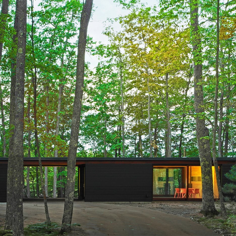
Johnsen Schmaling clads cabin in a Wisconsin forest with blackened pine


Milwaukee-based Johnsen Schmaling Architects has completed a family retreat in rural Wisconsin featuring blackened pine cladding, concrete floors and wide-span glass doors (+ slideshow). (more…)

http://ift.tt/1TYly9D

CRAFT / Sameep Padora & Associates


© Kunal Bhatia, Studio KB

© Kunal Bhatia, Studio KB
  • Architects: Sameep Padora & Associates
  • Location: Fountain @ Phoenix Mall, Lower Parel, Mumbai, Maharashtra 400013, India
  • Design Team: Shravanthi Kumar, Aparna Dhareshwar, Nitisha Raje, Sanam Bauva
  • Contractor: Sanjay Baikerikar
  • Project Year: 2016
  • Photographs: Kunal Bhatia, Studio KB

CRAFT is designed to be an antithesis to its mall location characterized by the placeless experiences that dominate mall cultures.

To subvert the typical experience of a glass horizontal edge between the corridor and ‘ interior’ space we used the arcade as a means to structure a reference to the type of a colonnaded walkway defining spaces of intimacy, pause and refuge from the cacophony of the busy corridors just outside. 


© Kunal Bhatia, Studio KB

© Kunal Bhatia, Studio KB

Details

Details

This edge is designed as a wooden arcade, assembled by stacking and rotating horizontal wooden members around a pivot point and hence through their form defining the width of a booth while rising as high as double height of the façade. The warmth and intimate scale of the booth is offset by the continuity of the service bar and open kitchen right up to the alfresco dining space beyond. 


© Kunal Bhatia, Studio KB

© Kunal Bhatia, Studio KB

http://ift.tt/1PjpSyi

Rise Design Studio adds glass extension to north London house


Rise Design Studio has added a glazed extension to the rear of a house in London, creating a light-filled kitchen and dining room that opens up to the garden (+ slideshow). (more…)

http://ift.tt/1TYcVMr

Melrose Health / Bent Architecture


© Folded Bird Photography

© Folded Bird Photography


© Folded Bird Photography


© Folded Bird Photography


© Folded Bird Photography


© Folded Bird Photography

  • Architects: Bent Architecture
  • Location: Mount Waverley VIC 3149, Australia
  • Architect In Charge: Merran Porjazoski
  • Design Team: Ian Wilson, Paul Porjazoski, Michael Germano, Lana Blazanin, Amy Clark
  • Project Year: 2015
  • Photographs: Folded Bird Photography
  • Builder: Think Commercial Projects Pty Ltd

© Folded Bird Photography

© Folded Bird Photography

Ground Floor Plan

Ground Floor Plan

From the architect. This project involves the transformation of a typically mundane and static office/warehouse building into the dynamic new headquarters for Melrose, a national health product company based in outer-eastern Melbourne. The project embraces the Melrose ideology of whole body health by creating a workplace that is responsive to the natural environment and engaged with the processes within.


© Folded Bird Photography

© Folded Bird Photography

The street façade of the existing two storey office block was eroded via the introduction of an organic tubular steel structure that literally connects the site’s landscape to the building fabric. Part sun-shade and part landscape arbor, the structure supports a combination of deciduous and evergreen vines that liberate the existing north facing windows that would otherwise cower from hot summer sun, and provides a conduit for greenery to permeate the office interior.


© Folded Bird Photography

© Folded Bird Photography

Openable windows were inserted to facilitate natural ventilation, and modular garden beds and joinery components comprising recycled materials and building off-cuts were inserted to define workstations, co-working areas, quiet spaces and collaborative ‘landscaped’ breakout zones. Existing ceiling tiles were retained and repainted and the original warehouse concrete floor was exposed; a section of floor on the upper level was removed to provide a transparency and connectivity between levels, further enlivening the workplace.


© Folded Bird Photography

© Folded Bird Photography

1st Floor Plan

1st Floor Plan

The division between office and warehouse was also eroded, with full height openings inserted to provide a more immediate connection between the various operations of the company. Warehouse palette racking permeates the interior to strengthen the link between the two zones and, in addition to storage and stationary typical of an administrative space, supports additional planter boxes and showcases the Melrose product range. The racking and merchandise extend dramatically into the company’s foyer, which is a light filled double height entrance hall that is programmatically and spatially diverse. The original warehouse floor within this forecourt was once again exposed, and timber lined terraces, a centrally located weeping fig, climbing vines and natural sunlight define a space that, on entry, embodies the ethos of the company, the products it creates and the benefits of harnessing nature to promote good health.


© Folded Bird Photography

© Folded Bird Photography

Diagram

Diagram

http://ift.tt/1YcSIHt

ArchDaily Launches Top 100 Projects


This year ArchDaily celebrates 10 years since it was first launched in Spanish as Plataforma Arquitectura. To commemorate, we sorted through the thousands of projects that have been published over the years to highlight those that represented a milestone for their time.

We also reviewed the most popular projects from each one of our sites – those that our readers highlighted through their many visits. Afterwards, we asked each one of the architects to send along additional material for their project, taking advantage of new technologies that exist and that can help our readers better understand the works.

The compilation of this material allows us to present our selection of the Top 100 Projects. These 100 projects make up a list of interesting case studies and references for millions of architects, students and specialists who are in search of the most important and inspiring projects from around the world. This section will have greater visibility on our site, exponentially increasing the global impact and opportunities that these projects can create.

The Top 100 list that we present today wouldn’t have been possible without the help of all of the architects involved, each of whom voluntarily agreed to send us additional material to enhance their former publications. Thanks to this new information, our readers can now immerse themselves in the project space through virtual models and interactive plans, in addition to viewing floorplans and images taken by some of the best photographers around the world.

As a source of inspiration for architects and students, one of our goals is to make design material available that can be used for educational purposes. The 3D models, which can be seen using the Sketchfab Virtual Reality plugin, the design files, which can be explored using the Autodesk A360 plugin, and the option to zoom in on the images to examine details, are all powerful learning tools.

In addition, as a way to help the thousands of architects that want to know what materials were used for the construction of their favorite projects, we have added a list of specifications that includes the specific products used for each project.

We thank all of the architects that have been part of this selection and we hope that this list is full of inspiration and knowledge for our readers.

View the Top 100, here:

ArchDaily’s Top 100 Projects in the US

//cdn.embedly.com/widgets/platform.js

http://ift.tt/24DDICL

Ricart House / Gradolí & Sanz


© Mariela Apollonio

© Mariela Apollonio


© Mariela Apollonio


© Mariela Apollonio


© Mariela Apollonio


© Mariela Apollonio

  • Architects: Gradolí & Sanz
  • Location: Benimaclet, València, Valencia, Spain
  • Author Architects: Arturo Sanz Martínez, Carmel Gradolí Martínez
  • Area: 250.0 m2
  • Project Year: 2012
  • Photography: Mariela Apollonio
  • Constructor: Ensecon S.L.
  • Quantity Surveyor: Julia Fernández Sorókina
  • Interior Design And Lighting: Carmen González Úbeda
  • Plot Surface Area: 140 m2
  • Built Up Surface Area: 250 m2

© Mariela Apollonio

© Mariela Apollonio

From the architect. Benimaclet used to be a farming village, an island in a sea of fields ploughed through ditches. With the growth of the city of Valencia, the island was absorbed to turn it into a residential neighbourhood, and inevitably, into an anomaly within the urban fabric. And in this condition it resists, continually more threatened by the city.


Section

Section

© Mariela Apollonio

© Mariela Apollonio

© Mariela Apollonio

© Mariela Apollonio

The Casa Ricart has been built on a plot in the Historic Centre of the neighbourhood, and its volition is to strengthen the typological features of the traditional courtyard house constructions, still on a smaller scale, so that they become the fulcrum of the residence.


Sketch

Sketch

© Mariela Apollonio

© Mariela Apollonio

This house is shaped around two courtyards: the first, located in the transition between the living room and kitchen – dining area, is bathed in sunlight and contains an olive tree; the second, of a more private nature, is a protected courtyard with vegetation providing shade.


© Mariela Apollonio

© Mariela Apollonio

© Mariela Apollonio

© Mariela Apollonio

http://ift.tt/1PjgpXK

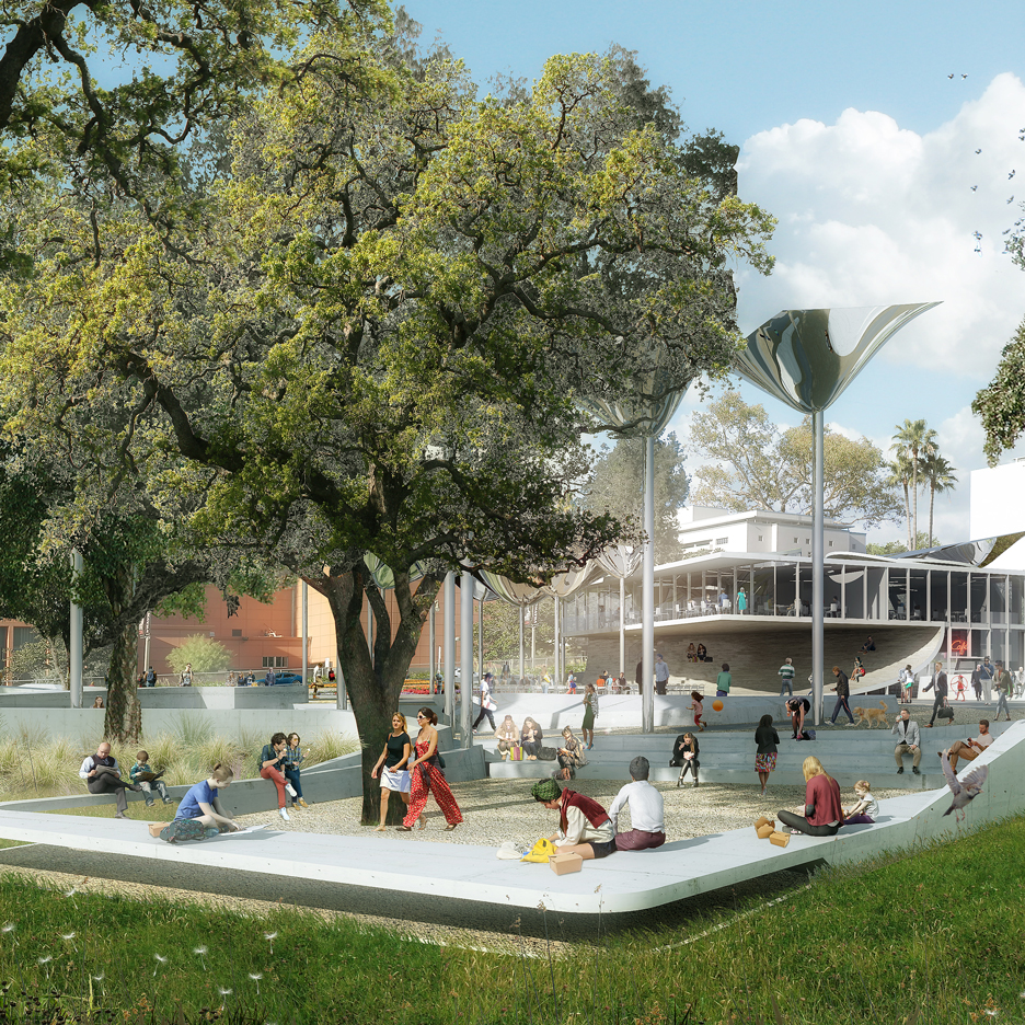
OMA’s team wins FAB Park competition for Downtown LA


The City of Los Angeles has chosen a design by OMA and landscape architects Mia Lehrer + Associates to transform a site in the Downtown area into a public park (+ slideshow). (more…)

http://ift.tt/1XIREwT

Iwan Baan Photographs Steven Holl’s Nelson-Atkins Museum for Its Ninth Birthday


© Iwan Baan

© Iwan Baan

Today marks the ninth anniversary of the opening of the Steven Holl Architect’s Bloch Building for the Nelson-Atkins Museum of Art. To commemorate the occasion, Iwan Baan has visited the project to show how it has settled into place on the museum’s campus, become an architectural icon for Kansas City, and continues to shine as one of Steven Holl’s most recognized projects.


© Iwan Baan


© Iwan Baan


© Iwan Baan


© Iwan Baan

The office’s design won the project in an international competition in 1999. The addition is composed of five interconnected structures spanning from north of the museum’s original 1933 building south across the sculpture park. In the words of the architects: “From the movement through the landscape, the five glass ‘lenses’ form new spaces and angles of vision, while bringing different qualities of light to the galleries below.”

“It is inspiring to see in Iwan’s new photos how well the Bloch Building is used,” says Chris McVoy, Senior Partner at Steven Holl Architects. “[The project brings] the museum experience for the public into the landscape, shaping space and light for engaging the art.”

To celebrate the Bloch Building’s tenth anniversary in 2017, the Nelson-Atkins Museum will host a series of public events and lectures.


© Iwan Baan

© Iwan Baan

© Iwan Baan

© Iwan Baan

© Iwan Baan

© Iwan Baan

© Iwan Baan

© Iwan Baan

© Iwan Baan

© Iwan Baan

© Iwan Baan

© Iwan Baan

http://ift.tt/22WrbLo