Miyagawa Bagel / ROOVICE


© Akira Nakamura

© Akira Nakamura


© Akira Nakamura


© Akira Nakamura


© Akira Nakamura


© Akira Nakamura

  • Architects: ROOVICE
  • Location: Miyagawacho, Miura, Kanagawa Prefecture 238-0231, Japan
  • Architect In Charge: Miyagawa Resort LLC.
  • Design Team: ROOVICE, Glove Caravan
  • Area: 214.8 sqm
  • Project Year: 2016
  • Photographs: Akira Nakamura
  • Construction: ROOVICE (member:Tomoe Naito, Motomi Kuroda )
  • Site Area: 373.2m2
  • Total Floor Area: 42.8m2

© Akira Nakamura

© Akira Nakamura

From the architect. We renovated a former fishing gear warehouse in Miyagawa-cho, Miura-city, with a population of 1300, into a bagel shop.The project began with local residents’ concern about their future due to a decrease in population and tax revenues and they were looking for the possibility of utilizing vacant houses in the city. We came to think, “we can’t stop a population decline immediately, however, might be able to attract people to visit this area” and then we decided to use a vacant house in Miyagawa-cho which was a southernmost part of Miura Peninsula.   


© Akira Nakamura

© Akira Nakamura

Section

Section

It is located in a valley overlooking a small bay, where it takes about one and a half hours away from Tokyo and an hour from Yokohama. While it is located in a place where even local residents don’t visit frequently, there is an old saltpan nearby and also a pleasant place to be felt familiar with the song of birds and the sound of wave. After thinking how we can attract people into this small town, we decided to open a shop where we sell bagels using locally grown wheat and cream cheese kneading locally grown vegetables.


© Akira Nakamura

© Akira Nakamura

Original exterior walls were replaced with the corrugated plate of clear polycarbonate. This design allows people to see inside of the shop even in less crowded road. The interior design proposed to a new feeling of nostalgia, applied to a whole counter with lauan, which was a similar material to the existing one, and with white tiles (100mm x 100mm), which has been commonly used since long time ago. Our concept was aimed at bringing surrounding green environment into the inside of the shop, opening to the outside and providing the information of local foods. We expected the inflow of people even from Tokyo, such as a little away from the area as weekend activities. In addition, we believed that we could revitalize the local community, leading them to think the possibility of starting something by themselves, if we opened a shop at an unfavorable location as seen from the local people and received any response to it.


Section

Section

© Akira Nakamura

© Akira Nakamura

http://ift.tt/1UF5ITw

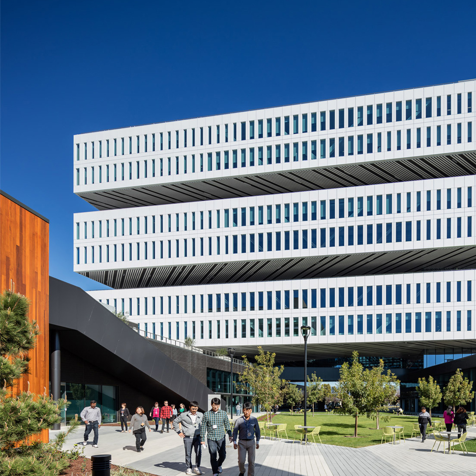
Samsung’s Silicon Valley office by NBBJ features nap pods and music listening rooms


US firm NBBJ has created the largest office in North America for tech company Samsung, incorporating features intended to show how a “legacy brand can play on par with the most-nimble tech startups” (+ slideshow). (more…)

http://ift.tt/1Yfe4Ez

Yarraville Garden House / Guild Architects


© Peter Bennetts

© Peter Bennetts


© Peter Bennetts


© Peter Bennetts


© Peter Bennetts


© Peter Bennetts

  • Architects: Guild Architects
  • Location: Melbourne VIC, Australia
  • Architect In Charge: Penny Guild
  • Area: 257.0 sqm
  • Project Year: 2015
  • Photographs: Peter Bennetts

Site Plan

Site Plan

© Peter Bennetts

© Peter Bennetts

From the architect. Yarraville Garden House celebrates the sun and seasons through a family home that opens up to the north and a garden that permeates the house and the lives of the family. 


Axonometric

Axonometric

While the original period home was in good condition, its orientation precluded effective passive solar design adaptation.  Rather than modifying the original home, it remains a bedroom wing, with the extension comprising the living areas that gain most benefit from passive solar design.  This minimised expensive and unnecessary renovations to the existing house (only one room was reconfigured) while maximising the benefits for the family of architectural input.


© Peter Bennetts

© Peter Bennetts

A new low roof links the old and new parts of the house while an adjacent courtyard separates it.  This addressed heritage requirements, which dictated a clear distinction between old and new, and provides a transition between the private bedroom wing and the public living areas.  The lounge area, sunken to compensate for the low roof and to enhance connection to the garden, was envisaged as a semi-private reflective space.  The glass doors on either end of the hallway acoustically separate the room whilst visually connecting it to the kitchen for passive observation. The roof continues to the northern boundary creating a bike shed (the space not being quite wide enough for a carport) and enclosing the rear yard.


Section

Section

The new living areas are massed to the southern boundary maximizing solar access from the north.  A dramatic roof envelopes the internal and external living spaces and tells a story of the site, sun and brief.  It reaches up to the northeast allowing a mezzanine to nestle within the volume and large northern windows then slopes back down to the northwest where glazing is less desirable.   It then reaches back up to the northwest garden and pool over the outdoor living areas. The eave tapers with the depth corresponding to the height of the clerestory windows below.  The roof also slopes southward, wrapping down the southern wall and turning its back on the dilapidated concrete carpark and flats of the southern neighbour which was a key part of the brief.  The clerestory louvers that capture southerly breezes are the only windows to puncture this wall, preventing views both to and from the neighbour.


© Peter Bennetts

© Peter Bennetts

The timber ceiling extends seamlessly from inside to the outside eave and the sky beyond.  External materials are brought inside through the recycled brick wall and the black cork flooring with subtle flecks, reminiscent of earth.  The timber deck wraps around the north and west overlapping garden beds and lawn and in parts being disrupted by them.


© Peter Bennetts

© Peter Bennetts

A house that was integrated into the garden was the cornerstone of the brief.  It’s a house that encourages you to live outdoors.  The first floor eastern balcony will one day be a tree house sanctuary nestled within the branches of the courtyard tree.  The summer meals area, surrounded by its “forest”, will be a shady oasis in the summer months, and the large covered deck area will provide the backdrop for birthday parties and family Christmases while children do bombs in the pool. 


© Peter Bennetts

© Peter Bennetts

Most importantly, it’s a house designed to enjoy the outdoors while indoors through natural light, ventilation and connections to garden and sky. As you walk through the house, the deciduous trees and vines used for summer shading also provide anticipation of the seasons as their colour and foliage change.   Reclining in the living room watching the light through the red leaves of the ornamental grape vine on the wire trellis in autumn, sitting at the dining table appreciating the colour in the native bushes in winter when the leaves on the exotic trees have long gone, washing the dishes looking out at the courtyard tree as it blooms in spring and flopping on the wrap-around couches in the sunken lounge on a hot summers day whilst enjoying the cool breeze coming from the pond and shady microclimate of the courtyard are just some of the moments that will delight the family for many years to come.


© Peter Bennetts

© Peter Bennetts

http://ift.tt/1taQFb6

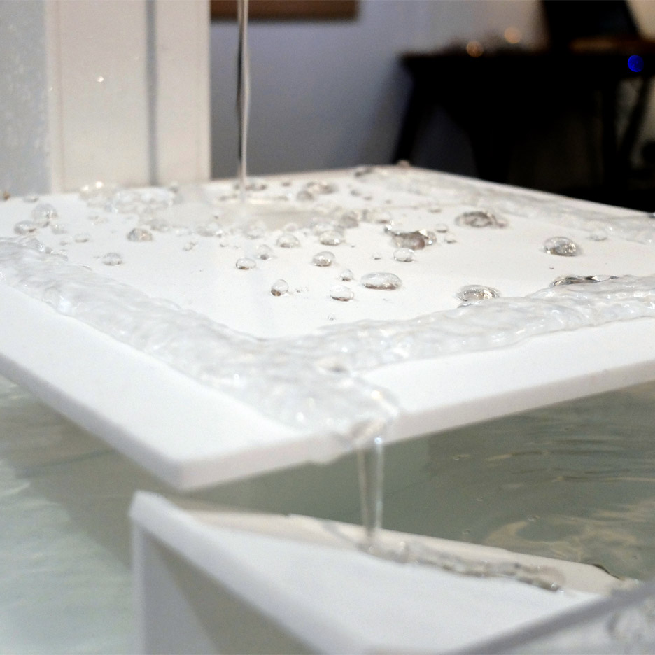
Arthur Carabott’s Superhydrophobic Fountain causes water to move in unusual ways


Water flows in seemingly impossible ways across this liquid-resistant fountain by London designer Arthur Carabott (+ movie). (more…)

http://ift.tt/25MXTRd

The Crossing / Studio2 Architects


© Simon Devitt

© Simon Devitt


© Simon Devitt


© Simon Devitt


© Simon Devitt


© Simon Devitt

  • Architects: Studio2 Architects
  • Location: Pakiri, New Zealand
  • Architect In Charge: Paul Clarke
  • Design Team: Paul Clarke, Brett Gerrard
  • Area: 130.4 sqm
  • Project Year: 2014
  • Photographs: Simon Devitt

© Simon Devitt

© Simon Devitt

The Crossing is a private home built on the original cattle tablelands overlooking Pakiri Beach.

The house fuses together a limited material palette of concrete, blue steel, and oiled cedar into a bold and incredibly dynamic space, allowing the owner (a professional writer) genuine flexibility to entertain, while acknowledging the need for the relative solitude of a working studio space.


Plans

Plans

The form of the house is immediately and boldly sculptural; at once reflecting the traditional rural steel farm buildings of the area, and the dramatic local landscape. The sophisticated position of the hilltop home is a reflection of its ability to capture sun and views.

The design consists of two primary axis; a long north-south facing corridor (extended by a 10m concrete ‘walkway’ which brings you to the entrance door) and the other, which intersects the house east to west. This is an important intersection which reinforces the name ‘The Crossing’, but also divides the house into ‘dark’ bedroom and ‘light’ living spaces. This was an important design feature brought to life even further by working with a lighting designer from concept stage.


© Simon Devitt

© Simon Devitt

Section

Section

A staircase leads to a studio space, which nests above the kitchen below – and frames a view of Pakiri Beach.

The front of the house is flexible and consists of large sliding doors, which open the space to indoor/outdoor living and a concrete terrace, designed to compliment and acknowledge the form of the roofline above.


© Simon Devitt

© Simon Devitt

North Elevation

North Elevation

South Elevation

South Elevation

The skin of the house is terne coated copper which ‘wraps’ the walls and roof of the house in a continual fold. By contrast, the interior largely consists of oiled cedar panels, which contrast warmly with the black interior and concrete floors. Steel is incorporated in the panels of the studio and the uniquely sculptural kitchen bench – both locally made.


© Simon Devitt

© Simon Devitt

http://ift.tt/1ZyW86o

MoMA Announces a Major Retrospective to Commemorate Frank Lloyd Wright’s 150th Birthday

Today, the Museum of Modern Art in New York announced a major retrospective of Frank Lloyd Wright’s work to be displayed in 2017, commemorating 150 years since the architect’s birth. Opening next June, the exhibition will feature approximately 450 works spanning Wright’s career including architectural drawings, models, building fragments, films, television broadcasts, print media, furniture, tableware, textiles, paintings, photographs, and scrapbooks, along with several works that have rarely or never been shown publicly.


Plan for Greater Baghdad. Unbuilt project. 1957-58. 34 7/8 × 52″ (88.6 × 132.1 cm). Image © The Frank Lloyd Wright Foundation Archives (The Museum of Modern Art | Avery Architectural & Fine Arts Library, Columbia University, New York)

Plan for Greater Baghdad. Unbuilt project. 1957-58. 34 7/8 × 52″ (88.6 × 132.1 cm). Image © The Frank Lloyd Wright Foundation Archives (The Museum of Modern Art | Avery Architectural & Fine Arts Library, Columbia University, New York)

The exhibition will be structured as an “anthology” of Wright’s work, separated into 12 sections dedicated to a key project or set of pieces from the Frank Lloyd Wright Archive, which was acquired in 2012 by MoMA in conjunction with the Avery Architectural & Fine Arts Library at Columbia University. Models and drawings from works such as Unity Temple (1905–08), the Robie House (1908–10), Fallingwater (1934–37), the Johnson Wax Administration Building (1936–39), and Beth Sholom Synagogue (1953–59) will be on display, alongside investigations into lesser-known projects such as his proposed design for the Rosenwald School for African American children and Wright’s design for a model farm.


Press conference unveiling The Mile-High Illinois (Chicago, Illinois). Unbuilt Project. 1956. Image © The Frank Lloyd Wright Foundation Archives (The Museum of Modern Art | Avery Architectural & Fine Arts Library, Columbia University, New York)

Press conference unveiling The Mile-High Illinois (Chicago, Illinois). Unbuilt Project. 1956. Image © The Frank Lloyd Wright Foundation Archives (The Museum of Modern Art | Avery Architectural & Fine Arts Library, Columbia University, New York)

The exhibition will also cover Wright’s use of ornament, circular geometries and his Native American-inspired designs. Other considerations of the retrospective will be the intersection of nature, landscape, and architecture, and the contrast between the architect’s call for the democratization of the profession and his celebrity and media prowess.


Rosenwald Foundation School (La Jolla, California). Unbuilt Project. 1928. Pencil and color pencil on tracing paper. 12 3/4 x 25 7/8” (32.4 x 65.7 cm). Image © The Frank Lloyd Wright Foundation Archives (The Museum of Modern Art | Avery Architectural & Fine Arts Library, Columbia University, New York)

Rosenwald Foundation School (La Jolla, California). Unbuilt Project. 1928. Pencil and color pencil on tracing paper. 12 3/4 x 25 7/8” (32.4 x 65.7 cm). Image © The Frank Lloyd Wright Foundation Archives (The Museum of Modern Art | Avery Architectural & Fine Arts Library, Columbia University, New York)

Raul Bailleres House (Acapulco, Mexico). Unbuilt Project. 1952. Brown ink, pencil and color pencil on tracing paper. 31 3/4 x 52 7/8″ (80.6 x 134.3 cm). Image © The Frank Lloyd Wright Foundation Archives (The Museum of Modern Art | Avery Architectural & Fine Arts Library, Columbia University, New York)

Raul Bailleres House (Acapulco, Mexico). Unbuilt Project. 1952. Brown ink, pencil and color pencil on tracing paper. 31 3/4 x 52 7/8″ (80.6 x 134.3 cm). Image © The Frank Lloyd Wright Foundation Archives (The Museum of Modern Art | Avery Architectural & Fine Arts Library, Columbia University, New York)

A recently restored model of one of Wright’s proposed towers designed to cluster around St. Mark’s Church-in-the-Bowery, deemed too radical for the tastes of the time, will conclude the exhibition. The final section will also include the model of the Solomon R. Guggenheim Museum, a historical analysis of drawings, and a data-visualization project illustrating the architect’s global network of clients, professional relationships, and buildings.

The exhibition is scheduled to run from June 12 – October 1, 2017.


Liberty Magazine Cover. 1926. Color pencil on paper. 24 1/2 x 28 1/4″ (62.2 x 71.8 cm). The Frank Lloyd Wright Foundation Archives. Image © The Frank Lloyd Wright Foundation Archives (The Museum of Modern Art | Avery Architectural & Fine Arts Library, Columbia University, New York)

Liberty Magazine Cover. 1926. Color pencil on paper. 24 1/2 x 28 1/4″ (62.2 x 71.8 cm). The Frank Lloyd Wright Foundation Archives. Image © The Frank Lloyd Wright Foundation Archives (The Museum of Modern Art | Avery Architectural & Fine Arts Library, Columbia University, New York)

Model of St. Mark’s-in-the-Bouwerie. Unbuilt project. New York, New York. 1927-31. Painted wood. 53 x 16 x 16″ (134.6 x 40.6 x 40.6 cm). Image © The Frank Lloyd Wright Foundation Archives (The Museum of Modern Art | Avery Architectural & Fine Arts Library, Columbia University, New York)

Model of St. Mark’s-in-the-Bouwerie. Unbuilt project. New York, New York. 1927-31. Painted wood. 53 x 16 x 16″ (134.6 x 40.6 x 40.6 cm). Image © The Frank Lloyd Wright Foundation Archives (The Museum of Modern Art | Avery Architectural & Fine Arts Library, Columbia University, New York)

http://ift.tt/1VMYRtG

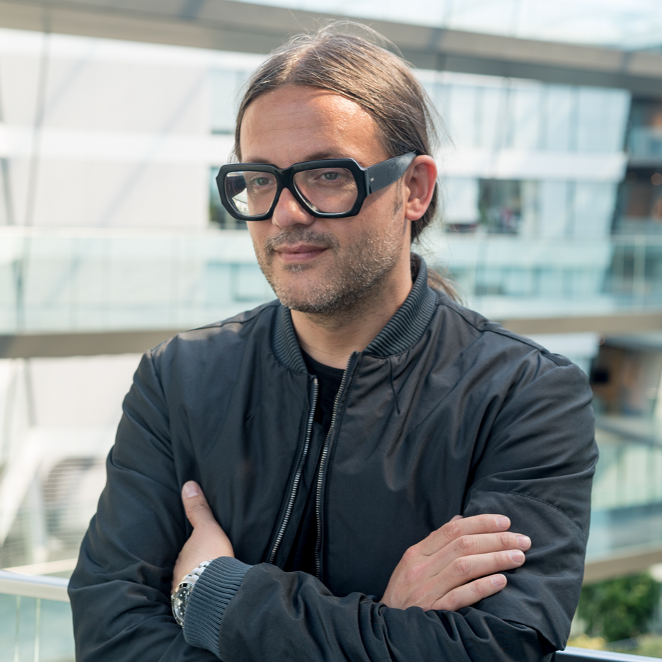
“Plastic is a design failure” says Parley for the Oceans founder


Designers and brands need to wean themselves off the plastic “drug”, according to Parley for the Oceans founder Cyrill Gutsch, who is releasing his organisation’s shoes made from recycled ocean plastic with Adidas today (+ interview). (more…)

http://ift.tt/1TWeiuQ

Surrey City Centre Library / Bing Thom Architects


© Ema Peter

© Ema Peter


© Ema Peter


© Ema Peter


© Ema Peter


© Ema Peter

  • Budget: $26.5 million

© Ema Peter

© Ema Peter

Ground Floor Plan

Ground Floor Plan

From the architect. The LEED® Gold Certified Surrey City Centre Library marks the next phase of a major civic investment in the transformation of downtown Surrey. With advances in easily available electronic information, the role of libraries is changing and the book collection is no longer the central focus.


© Ema Peter

© Ema Peter

Sections

Sections

The building design evolved out of the need to provide a space for reading, studying, and above all, gathering as a community. The library features large windows, a welcoming entrance with clear sight lines that allow visitors to quickly orient themselves in the space, and an upward winding central atrium and two skylights that allow natural light into the building. Utilizing state of the art computer modeling software, BTA was able to ensure that the concrete formwork was highly efficient and easy to construct. The exterior concrete structure was carefully detailed as the final surface, thereby eliminating the need for expensive building cladding.


© Ema Peter

© Ema Peter

The outward sloped walls also provide solar shading. Together with the Surrey librarians, BTA developed a social media strategy using blogs, Facebook, Twitter and Flickr to engage the community in the design of the building, encouraging the public to post comments and photos, thereby making the City Centre Library arguably the first public building in the world to be designed with the aid of social media.

http://ift.tt/1UfQfe4

ArchDaily Interviews the Curators of the Golden Lion Awarded Spanish Pavilion at the 2016 Venice Biennale

In an exclusive interview with ArchDaily, the curators of this year’s Spanish Pavilion at the 2016 Venice Biennale, Iñaqui Carnicero and Carlos Quintáns, discuss their reasoning and intentions for the Golden Lion awarded national pavilion’s design. Titled “Unfinished,” Quintáns describes the project’s influence as “the detection of reality that we show only through photography, of what happened (in Spain) after the housing bubble, first the real estate boom and then the crisis, and how we can offer solutions thanks to the many talented architects of the many projects which have been realized in Spain and have been partially obscured.” The pavilion answers Director Alejandro Aravena’s call for national pavilions that identify domestic responses to architectural dilemmas that could be the solutions for other places facing similar issues.

To see the video with subtitles, make sure that the “CC” button is selected.

The 55 selected projects on view in Venice demonstrate what the curators refer to as “a chain initiated by other architects in the past and by existing constructions. And they are able, with only a series of minimal resources, to reactivate, to reuse building that up until now had been abandoned.” The exhibition itself employs some of the same elements of minimal intervention and resourcefulness characterized by the projects being featured, with simple construction elements being used in highly versatile ways.

This video is part of an exclusive partnership between ArchDaily and the Spanish photographer Jesús Granada. Granada’s stock images of the Biennale can be obtained on his website, here. ArchDaily’s complete coverage of the 2016 Biennale can be found, here; with coverage focused on the Spanish Pavilion, here.

Spain’s “Unfinished” – Winner of the Golden Lion at the 2016 Venice Biennale
//cdn.embedly.com/widgets/platform.js

http://ift.tt/25Mr7mC

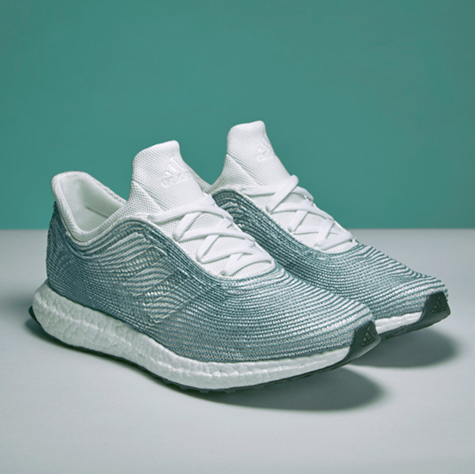
Adidas launches trainers made from ocean plastic with Parley for the Oceans


Sports brand Adidas and environmental initiative Parley for the Oceans have released the first batch of running shoes with uppers made using recycled plastic recovered from the sea (+ movie). (more…)

http://ift.tt/25MEcsx