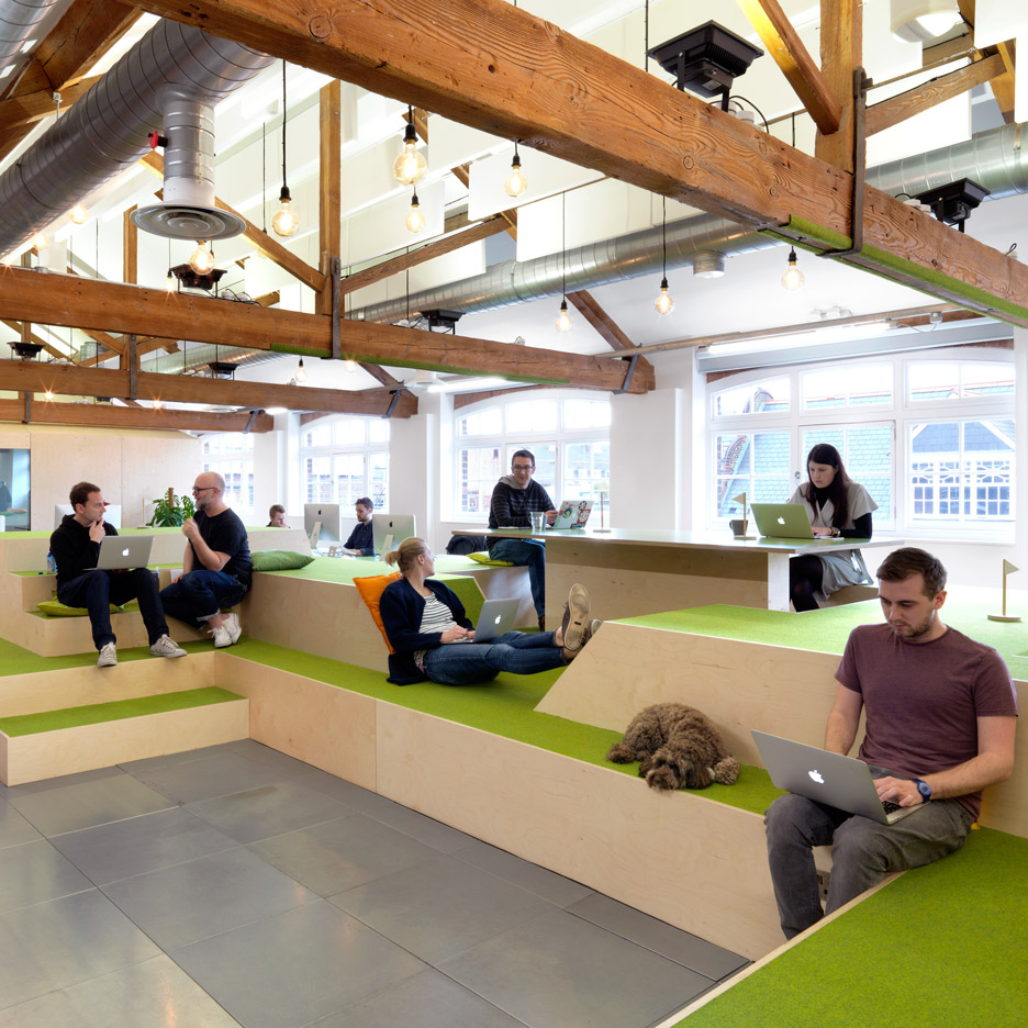
Clerkenwell Design Week 2016: new research is driving a major rethink of office design, and interesting workplace interiors and furniture dominated this year’s Clerkenwell Design Week. (more…)
Clerkenwell Design Week 2016: new research is driving a major rethink of office design, and interesting workplace interiors and furniture dominated this year’s Clerkenwell Design Week. (more…)

From the architect. The Marshall Family Performing Arts Center is the focus of the performing arts at the Greenhill School. The design establishes a dialogue between building and campus: the building’s configuration creates a sequence of spaces that shape an outdoor courtyard and frame views out to the existing campus. The courtyard is animated by a double-height lobby. Designed to be an ascending gallery of collaborative spaces, the lobby connects all the performance venues and creates a destination for informal performances and spontaneous interactions.
The performance spaces occupy two levels of the building and include a 600-seat proscenium theater, a state-of-the-art studio theater, a dance rehearsal and choral space, a film/video lab, and extensive theater support space. The multi-purpose proscenium theater includes a fly loft, the studio theater seats 150, the dance and choral rehearsal studio seats 80, and the film and video production lab extends the performing arts into new digital territories. Learning environments include theater spaces as well as in classrooms, dressing rooms, a costume shop, and a scene shop.
The dramatic profile of the building emerges from the topography of the site and continuously ascends to reach the fly tower for the theater. The exterior brick collaborates chromatically with the materials of the campus. Illuminated soffits and overhangs provide shade and support outdoor teaching. Together these elements shape and give measure to the Performing Arts Center’s commitment to advance teaching, performance, and production across the boundaries of individual performing arts disciplines.

This week’s issue of The New York Times Magazine, the second annual New York issue with a theme of “New York Above 800 Feet,” takes a rather irreverent approach to the magazine’s design. Instead of being viewed in the traditional horizontal orientation, the periodical has been rotated 90 degrees and is meant to be viewed by turning the pages up. The long dimension, which is only 10.875 inches horizontally, becomes 17.875 inches vertically, and according to the magazine’s editor, Jake Silverstein, “‘[It] remains absurdly short for our subject, but it is in keeping with the striving spirit that has given New York City its distinctive skyline: This is as tall as it is possible for our magazine to be.”
One of this week’s highlights is the magazine’s cover story, Man on Spire by Taffy Brodesser-Akner, which documents a climb to the upper reaches of One World Trade Center’s spire, conducted by adventure photographer Jimmy Chin and safety liaison Jamison Walsh. On the expedition, the two not only worked out the magazine’s cover image, but were also the featured subjects of aerial photographs by George Steinmetz, and a video that documents the climb in 360 degrees. The latter is available to watch in the NYT VR app (a free download in the Google Play and iOS App Stores). In all, Chin and Walsh spent over six hours on the tower’s spire, one waxing lyrical about the importance of safety, the other contemplating the perfect shot, and how 1,776 feet really doesn’t feel so tall when you’ve also climbed Everest. As the two marveled at their surroundings, and the charged context of World Trade Center site, there was consensus about their rarified vantage, with Brodesser-Akner comparing the two to “harnessed King Kongs” and the two high-fiving over “what giants they were.”
For the full story, visit The New York Times Magazine, here. And to see the video for NYT VR, the app is available for download on the Google Play and iOS App Stores.

North Carolina Modernist Homes (NCMH) and Hanley Wood (parent company of ARCHITECT) have partnered to create Colossus: a new digital archive of 20th century architectural publications, reports Architect Magazine. When complete, it will be the largest digital archive of modern architecture magazines, with over 1.3 million pages.
For NCMH, a non-profit organization dedicated to the preservation and documentation of mid-century modernist residential architecture, Colossus is a natural next step. The sizable collections of NCMH have already been uploaded, while Hanley Wood’s collection will be available July 1, 2016.
Finds in the archive can range from informative to humorous to nostalgic. Earlier issues evoke the distinctive aesthetic of the 70s, 80s, and 90s, while ads remind present day readers of the progress in building technology in recent decades. Read more about the project at Architect Magazine here, and see images from the archive below.
Architecture, August 2006 Page 6
Progressive Architecture, June 1987 Page 58-59
Architecture, August 2006 Page 14
AIA North Carolina, May-June 1970 Page 43
AIA North Carolina, May-June 1970 Page 4
View the full collection on Colossus: http://ift.tt/1r3DhEm
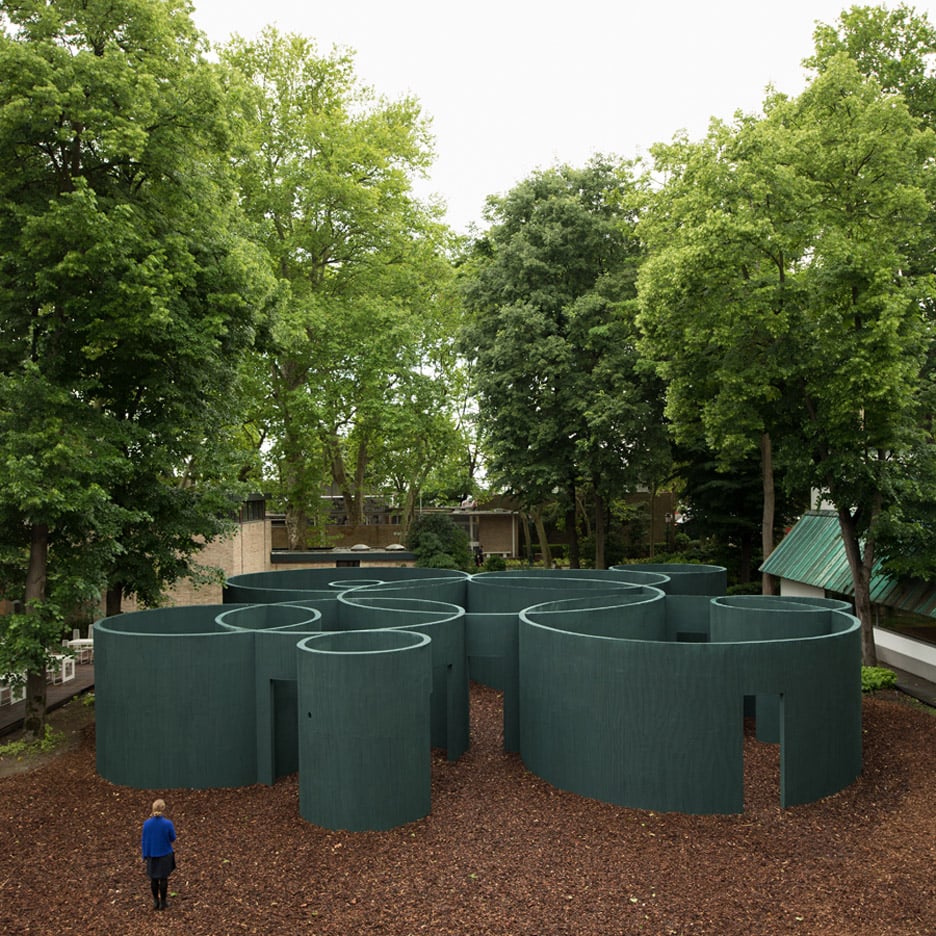
Venice Architecture Biennale 2016: Chilean architects Mauricio Pezo and Sofia von Ellrichshausen have built a maze-like pavilion in the Venice Giardini, made up of 10 overlapping cylinders (+ slideshow). (more…)

Penthouse on the Park is a private residence renovated by KNOF design. It is located in Sofia, Bulgaria, and was completed in 2016. Penthouse on the Park by KNOF design: “KNOF design (based in London and founded by New York designer Susan Knof) has completed its first major commission: the remodelling of a spectacular 360° penthouse in the Bulgarian capital of Sofia, uniting two separate apartments into a single 3,600..
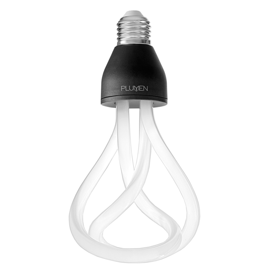
Business news: low-energy designer lighting brand Plumen has launched a crowdfunding drive to fund new product launches and “kick the business up to the next level”. (more…)

It should be designed a total of five houses in two close sites, being those of a different morphology, with topographic inclines up to four metres, adjacent to other buildings’ dividing walls and orders to several streets. The houses, because of being subisidized housing, should have a limited area of 80 m² usable area and if it is possible, some of them will be developed in just one floor, and they will have sloped roofs as building regulations state taking into account other regulations.
The strong differences in heights would produce important steps between the house, this is the reason why it was had the clear intention of joining and softening those steps with a common surrounding of the building project, considering this as the only one and not as the addition of repetitive elements so common in the detached houses. It was intended as the sloped roofs as the front of the houses, acted as a unique enveloping, using the same colours for their textures (If I had to say with a colour my memory about the houses of Badajoz area, is the white.)
The houses, like in no other way in this environment, have a courtyard, that is conceived as a living and privative element towards most of the rooms of the groundfloor are pointed. It could almost be said that the vision to outdoors does not mind and that their openings are conceived in many cases, only to guarantee the crossed air circulation with the yards.
With the intention of obtaining, on the one hand, they privacy of the froundfloor rooms, and on the other one, to give more importance and clearnees to the with texture, it is conceived a series of covering louvers part of the enclosure behind which different openings are hidden.
The peculiarity of having different perspectives of the edifications and integrated them in the different urban scene of which they are part, preserving in all the proyect a common language.

The Hambly House is a project completed jointly by DPAI Architecture & Toms + McNally Design. The home is located in Hamilton, Ontario, Canada. The Hambly House by DPAI Architecture: “The Hambly House is a rare example of 1930s Streamline Moderne architecture in Hamilton. Since the purchase of the house by its new owners in 2012, the house has undergone a full restoration with an additional second storey wrapped in..
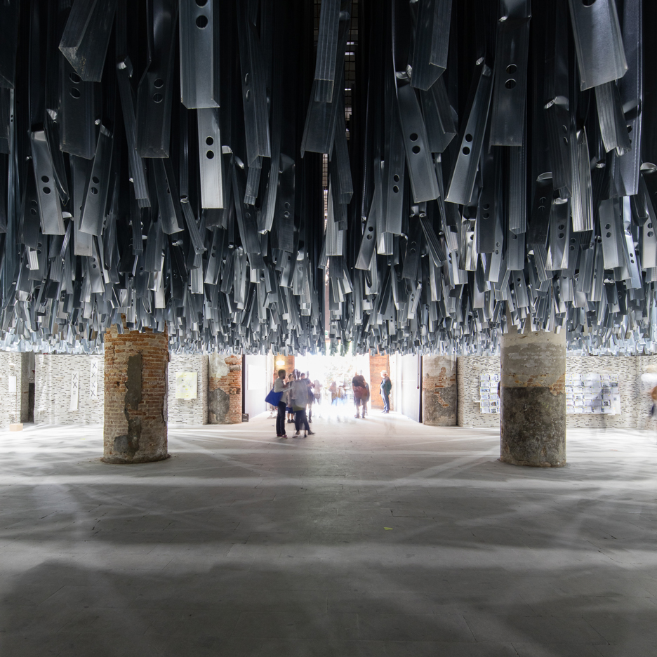
Venice Architecture Biennale 2016: Chilean architect Alejandro Aravena has used over 90 tonnes of waste generated by the Venice Art Biennale 2015 to create two introductory rooms for this year’s architecture event (+ slideshow). (more…)

