Tel Aviv House / Pitsou Kedem Architects


© Amit Geron

© Amit Geron


© Amit Geron


© Amit Geron


© Amit Geron


© Amit Geron

  • Architects: Pitsou Kedem Architects
  • Location: Tel Aviv-Yafo, Israel
  • Architect In Charge: Noa Groman
  • Design Team: Pitsou Kedem, Noa Groman
  • Project Year: 2016
  • Photographs: Amit Geron
  • Lighting Design: Orly Avron Alkabes
  • Styling For Photography: Eti Buskila

© Amit Geron

© Amit Geron

From the architect. Visitors to the Old North of Tel Aviv would be surprised should they stumble upon a small neighborhood of low-lying family homes possessing just one or two storeys each. These are the remaining relics of Israel’s early urbanism when the English garden city motif populated many of her towns.


Ground Floor

Ground Floor

© Amit Geron

© Amit Geron

It incorporated a rural aesthetic of red-tiled roofs, low construction and spacious, generous gardens – some buildings were constructed by the Ministry of Housing and others were enthusiastically encouraged by it. Their first inhabitants were often new immigrants and many were soon purchased by elites who saw in them the promise of comfortable lives and peaceful surroundings within an ever-growing city.


© Amit Geron

© Amit Geron

In the march of time, some were abandoned, neglected, and then rediscovered and renewed. Dense cities developed rapidly and intensively around them causing a sharp desire for these oases of comfortable family homes. Some remained unaltered – modest homes through which waft the romantic scents of their history. Others have been adapted to reflect the modern tastes and desired proportions of their current owners.


© Amit Geron

© Amit Geron

Unique is the advent of contiguously built homes – built from the start as linked units with a continuous appearance. Siamese twins bound together by visual and constructive obligations. Their development requires consideration and adjustment. Their environment seeks to preserve their values – their culture and history.


© Amit Geron

© Amit Geron

At first glance the clean, bright facade of the house seems alien against the background of the neighborhood. Emphasizing its difference is the additional height of the home and its long, horizontal windows, hidden behind white iron lattice-work. These are in conversation, as it were, with the early international-style homes built in Tel Aviv, some of which displayed similar lattice-work that emulated freedom of form – rendered by indecipherable spatial division.


© Amit Geron

© Amit Geron

Viewing the home from the side reveals the preservation of the original slanted roof with its distinct romantic character. Now, however, the roof appears to be resting on the surrounding walls rendering its appearance so subtle it may even be missed. The end result of the side facade is an homage to the image of the “village home”.


Section

Section

Section

Section

A passage runs from the street straight through the entrance into the inner areas – exterior and interior – past and future – a home of modern proportions. The rear facade reveals a large, vitrine window unifying the home to the yard and pool. The passage through the storeys of inner rooms is formed by a floating bridge crossed by a staircase leading up to the roof.  There the bleached wood eaves stand out against the wall thinly coated with black cement, as if acquainting the architectural motifs of new and old, identity and exactitude that permeate the structure. Hence – inside and outside – two worlds – two cultural tales are intertwined within the existence of the structure, permitting its existence, breathing into it completely new life.


© Amit Geron

© Amit Geron

http://ift.tt/1XRzMOp

A Modern House with a Stunning Landscaping Program in Kharkov, Ukraine

Gym Enoseis / ENO Architectes


© Pascal Leopold

© Pascal Leopold


© Pascal Leopold


© Pascal Leopold


© Pascal Leopold


© Pascal Leopold

  • Architects: ENO Architectes
  • Location: Saint Thonan, France
  • Client: Citu of Saint Thonan
  • Area: 2173.0 sqm
  • Project Year: 2016
  • Photographs: Pascal Leopold
  • Be Fluids: ATIS
  • Be Structure: SBC
  • Acoustics: Alhyange
  • Cost: € 1,620,000 / HT

© Pascal Leopold

© Pascal Leopold

Get to the point, minimal gym : simple program and tight budget.
The problem is clear from the beginning of the story : build an ambitious fitness gym with few ways.
Here, no stylistic device, no free graphic effect and, all in all, nothing exceptional.
The common sense, and only the common sense, as the line of conduct of conception.


Plan

Plan

* Pragmatics, the plan limits circulations, places the various needs carefully and allows the mixing of the program (fitness gym, gym, changing rooms soccer, concession stand, clubhouse).

* Pragmatics, the volume answers directly the request while keeping a strong identity in the respect for the environmental standards (level RT 2012 but with a performance of remarkable airtightness of 0,25 m3 / h.m2 for an objective of 1,7 m3 / h.m2).


© Pascal Leopold

© Pascal Leopold

* Pragmatics, the choice of the used materials is simple and radical. 

The use of bardage isolated 2-in-1 (internal and outside finishes + isolating) coupled with bands of translucent polycarbonate allows quite at the same time a pleasant and dynamic facade, an insured thermal comfort and an important visual comfort (no dazzle, almost opaque south facade and very open north facade) for a mastered cost. 


© Pascal Leopold

© Pascal Leopold

© Pascal Leopold

© Pascal Leopold

The gym is clearly identified by its canopy wood handled to the black of Falun (very resistant natural treatment often used by the sea) who goes on to in front of the concession stand situated in front of soccer field.


© Pascal Leopold

© Pascal Leopold

Except the sports ground, the ground of spaces is a simple tiled floor with hardener quartz. No forgery-ceiling, networks are visible and circulate under the roof. Cinder block painted in changing rooms, acoustics treaty with perforated steel ceiling and a just almost monochrome bright atmosphere disrupted by colors “Elmer” of the earthenware of the showers which come to pick the visitors in changing rooms.


Section

Section

http://ift.tt/1PmbiLC

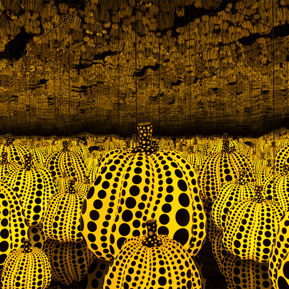
Yayoi Kusama exhibition in London includes three new mirror rooms


Japanese artist Yayoi Kusama is exhibiting a year’s worth of new sculptures, paintings and installations at London’s Victoria Miro galleries, including three mirrored rooms and plenty of pumpkins. (more…)

http://ift.tt/1TZ2go7

Guanghua Road SOHO2 3Q / AIM Architecture


© Jerry Yin

© Jerry Yin


© Jerry Yin


© Jerry Yin


© Jerry Yin


© Jerry Yin

  • Architects: AIM Architecture
  • Location: Xi Li, Xicheng Qu, Beijing Shi, China, 100055
  • Area: 33874.0 sqm
  • Project Year: 2015
  • Photographs: Jerry Yin
  • Design Team: Wendy Saunders, Vincent de Graaf, Ivan Yu, German Roig, Byungmin Jeon, Liat Goldman, Lily Zhu, Bertil Dongker, Alex Fripp and Zhikun Zhang
  • Client: SOHO China
  • Client Industry: Real estate

© Jerry Yin

© Jerry Yin

From the architect. SOHO approached AIM with a challenge: imagine a shopping centre as a new type of office. 25,000 square metres of blank space, already built for retail. Transform it into a co-working space, part of SOHO’s new 3Q brand that Forbes has called “Uber for offices”. SOHO is known for pure white. AIM is vibrant. Offices are divisive. Shopping centres are built on a massive scale. Bridge the gap.


Diagram

Diagram

The first consideration was approach. AIM decided it had to be bold. Strong colours and strong patterns would add life to the often-drab mall (and do double-duty as way finding).

The space would be used by ambitious entrepreneurs, start-ups and companies not tied to old models. Bosses looking for more than a corner window in a glass tower.


© Jerry Yin

© Jerry Yin

In one way, the project reflected us: it was not conventional. Re-programming a retail space brought up questions of the use of space in our cities, how interaction works and how to foster communities. This generation of workers was not content with a cubicle. A moot point, really, as filling the massive space would have required all of the cubicles in Beijing. AIM would have to turn that thinking on its side.


Diagram

Diagram

From this perspective, the constraints of the existing retail design became opportunities: where a shopping centre would say hallway, AIM could say island, a natural place to meet while using the home-style kitchens or sitting at the communal table.

This was a greater challenge with two massive atriums, which carried in daylight but presented their own problems: how to maintain the peace of the open space but make it useful to 3Q’s community of companies?


© Jerry Yin

© Jerry Yin

The answer was in an oversized oak staircase, spilling down from the entrance into the basement floor. The slope of the stairs frames the space as a venue for lectures or events, transforming an area meant for personal consumption into one meant for community development.

A second atrium allowed AIM to re-imagine the built world as a natural community, quite literally. In The Park, the great expanse comes back down to the human scale, with stands of live bamboo and glass meeting rooms that evoke backyard conservatories.


Diagram

Diagram

Natural, witty, peaceful and considered. Not often the words one associates with an office or shopping mall.

Neither is ‘efficient’. But with more 3,600 desks, 3Q is a small town. And towns have addresses. This idea of neighbourhoods brings community back into a commercial space. Like Shanghai’s lanes or Beijing’s hutongs, the addresses relate to a neighbourhood, where private and public spaces co-exist and networks of people develop naturally.


© Jerry Yin

© Jerry Yin

And this is 3Q at its purest: interaction. The design draws people into shared areas, where the real potential of co-working lays – crossover. When you put ambitious people in the same room (or atrium or kitchen or lounge), new ideas and collective experience can be exchanged, created, rejected, discussed. Ultimately, taken back to the desk for consideration about how to include it in one’s work and how we each shape our own communities.


Diagram

Diagram

© Jerry Yin

© Jerry Yin

http://ift.tt/24jFitl

PK79 / Ayutt and Associates Design


© Soopakorn Srisakul , Ayutt Mahasom

© Soopakorn Srisakul , Ayutt Mahasom


© Soopakorn Srisakul , Ayutt Mahasom


© Soopakorn Srisakul , Ayutt Mahasom


© Soopakorn Srisakul , Ayutt Mahasom


© Soopakorn Srisakul , Ayutt Mahasom

  • Landscape Designer: Ayutt and Associates design (AAd)
  • Lighting Designer: Ayutt and Associates design (AAd)
  • Construction Area: 450 m2

Diagram

Diagram

From the architect. PK79 is located on Petchkasem 79 road, Bangkok, Thailand where is known as the suburban residential area. The site location is in the middle of wasteland zone, remotely from the city and low density of population effected directly to the safety issue. The neighborhoods of this area live quite far apart from each other. The security issue becomes the main problem for this area and Thai architecture. Most of households solve this problem by adding the “wrought iron screens” as a protection screen to all doors and windows preventing thieves or other invaders.

Which somehow make the owners feel uncomfortable and ends up being confined in their own residence and also causes negative effects like terrible shape, view blocking, and extra maintenance. Although today world can solve this problem with various technologies, most Thai people still feel insecure to live in a house without these secondary screens. We live in these skins for years and years becoming unconcerned about it. This gives an architect a design question to develop the façade which works as a protector, but at the same time improves living quality by creating space hierarchy and special characteristic. Ayutt and Associates design (AAd)’s result turns out that the house has the special protection screen, which works multi-function as a house feature facade, space divider, a wall, a sun- heat protector, air buffer zone and air ventilation. 


© Soopakorn Srisakul , Ayutt Mahasom

© Soopakorn Srisakul , Ayutt Mahasom

© Soopakorn Srisakul , Ayutt Mahasom

© Soopakorn Srisakul , Ayutt Mahasom

AAd also creates the program of this house by dividing the function between daytime area and nighttime area. The daytime area is on the lower floor, Living zones,  with full connection to the outside and the garden. This area is designed as “THE WHITE box”  with the solid white wall and the white vertical protection screen. These white aluminum extrusion strips are developed and applied from the normal obsolete security curve steel, to disappear and blend with the landscape outside. Most of living areas are directly connected to the garden with sliding partitions allow the air flow through into the double height space to reduce the heat for tropical climate. The location in the middle of two courtyards give rises to the people feel connected between inside and outside. The service function is divided by a kitchen which located in a place where it can serve people in living area and all zones. The guest bedroom behind has been defined by pocket courtyard to increase more privacy, and provide dramatic spatial quality for corridor in the middle.


© Soopakorn Srisakul , Ayutt Mahasom

© Soopakorn Srisakul , Ayutt Mahasom

© Soopakorn Srisakul , Ayutt Mahasom

© Soopakorn Srisakul , Ayutt Mahasom

The nighttime area is on the higher floor, to provide privacy and safety. The main nighttime area or the masterbedroom, is designed as “THE BLACK safe box” by cladding the customized screen panels, of which some can open to make way for the windows behind them. The black protection screen is made from Metalic-dark perforated aluminum panel with the gradation of varying size holes and patterns, from small to bigger, vary to the function inside and level of privacy. These perforated aluminum panels are not only serve as architectural elements, but also help to block the ambient noise, and allow light and air to enter without sacrificing privacy. These folding panels are 100% ventilation and allow the user to take the panorama view of scenery when fully opened, or they can completely closed for privacy, sun-shade control and obtaining security. This Black box is an excellent concept for adding a visually stunning element to interiors and exteriors alike. The result is a constantly changing building facade, almost the feature sculpture.


© Soopakorn Srisakul , Ayutt Mahasom

© Soopakorn Srisakul , Ayutt Mahasom

Diagram

Diagram

Apart from the security issue, The layout is designed in response to the tropical orientation. The significant function like master bedroom and working room, has the high ceiling for ventilation and slightly shifted a mass forward to create the cantilever balcony, this also functions as eaves for rain and sun protection to the mass below. These climate protection concepts are applied from the traditional trace of Thai architecture which is the most suitable for rain and tropical condition in Thailand and South East Asia. The house layout is also designed by taking advantage of big opposite green space behind the house.  The big trees are placed along the boundary to block the unwanted view from the next door area. Landscape is designed minimally with a privacy concern as well as provide aesthetic aspect.


© Soopakorn Srisakul , Ayutt Mahasom

© Soopakorn Srisakul , Ayutt Mahasom

Diagram

Diagram

http://ift.tt/24jwNyt

Spanda / Christian de Vietri


© Robert Frith

© Robert Frith


© Christian de Vietri


© Apertunity Productions


© Robert Frith


© Christian de Vietri

  • Lighting: Electrolight, Melbourne
  • Commissioner: Metropolitan Redevelopment Authority Commission
  • Dimensions: 30 x 16 x 1m
  • Value: $1,380,000

© Metropolitan Redevelopment Authority

© Metropolitan Redevelopment Authority

From the architect. Spanda is a 9 story high sculpture by Australian born artist and sculptor Christian de Vietri. It is located at Elizabeth Quay in Perth, Western Australia. Unveiled in January 2016, it is now the world’s largest freestanding structure made of carbon fiber. It was designed by de Vietri using 3D modeling software and fabricated with CNC milling and vacuum resin infused carbon fibre. The artwork, inspired by the artist’s experience of the teachings and practices of Śaiva Tantra, celebrates union of the individual with the universal.

Formally, the artwork could be described as a series of six white nested arches that are exactly the same shape but vary incrementally in their size. The thickness of each arch tapers as it rises from the ground, reaching its thinnest point at the apex. The smallest arch frames the human body, and the largest arch reaches 9 stories high. When the artwork is completed by the viewer’s presence, the shape and its repetitions suggest the contours of a moving energetic field surrounding the human body, creating the impression of an infinite vibration inwards and outwards.


 Fornt Elevation

Fornt Elevation

BACKGROUND

In September 2015, The Metropolitan Redevelopment Authority released an open call for proposals for an artist to create a signature artwork for the Elizabeth Quay development on the Swan River in Perth Australia. In March 2016, Christian de Vietri was awarded the commission to create Spanda.


© Christian de Vietri

© Christian de Vietri

CONCEPT

The title of the work, Spanda, is a Sanskrit word meaning “divine vibration”. This term is used to describe how consciousness moves in waves of contraction and expansion. Spanda is the subtle creative pulse of the universe as it manifests into the dynamism of living form. Spanda can be translated as throb or pulse, or to mean vibration, movement, or motion, referring to waves of activity issuing forth from an unseen source. It might be described as an impulse or desire to create and enjoy, likened to an eternal spring, joyfully over-flowing and always full.

Mark Dyczkowski, in his book “The Doctrine of Vibration”, describes spanda as follows:


© Jarrad Seng

© Jarrad Seng

“The mainstay of the Doctrine of Vibration is the contemplative experience the awakened yogi has of his true nature as the universal perceiving and acting consciousness. Every activity in the universe, as well as every perception, notion, sensation or emotion in the microcosm ebbs and flows as part of the universal rhythm of the one reality, which is Siva, the one God Who is the pure conscious agent and perceiver. According to the Doctrine of Vibration, man can realise his true nature to be Siva by experiencing spanda, the dynamic, recurrent and creative activity of the absolute.”

The sculpture is intended to be both a formal representation of this ‘spanda’ principle, and a tool, or means, to experience it.


Side Elevation

Side Elevation

Site Plan

Site Plan

DESIGN

The artist’s intention was to create an icon that would transform the cityscape and the identity of Perth, in effect opening its “heart”.

It was also specifically designed and situated by the artist to function optimally with the color, shape, use and aspirations of the Elizabeth Quay development project, which had already been designed by ARM Architecture and was being created in tandem with the sculpture production.


Diagram

Diagram

The sculpture is large, but not heavy, the gaps between each arch still allowing people to walk through and see the sculpture and the city from any angle. The sculpture has a strong sense of presence, yet no building nor vantage point is obscured, and every person, from every position on the Quay is able to appreciate the harmony between sculpture and site. The curvature of the sculpture contrasts with gridded square buildings behind it.


Model

Model

The arch-like quality of the form is mysteriously functionless as it is neither an entrance nor an exit, but rather stands alone, declaring its own liminal space for the viewer to merge with. The location, smooth lines, and durability of the form is conducive and complimentary to the many events that occur in and around the Quay, and has activated the site in many unpredictable ways already. Yoga and fitness groups regularly practice under the arches and recently a pop-up “Dîner-en-Blanc” was organized around the sculpture There seems to be a constant stream of people taking photos with the sculpture and interacting with it.

“Open, radiant, inclusive. These are the qualities I wished the sculpture to embody. Spanda is a kind of womb space for the city, where exalted experience and expanded states of being are born. The dimensions of the human body were used as a starting point for designing the form. In fact the whole sculpture was designed with human interactivity and bodily presence in mind”


© Christian de Vietri

© Christian de Vietri

“Gazing along the outer contours of Spanda leads the eye inevitably to the sky and beyond. When people visit the site I see the sculpture enables them move beyond themselves, into a state of awe and wonder, if they attune to the aesthetic and spatial vibration of the form. When we get lost in our minds, worried, anxious, we get contracted, we feel small, we reduce our capacity to see and experience the world fully and we cannot host others in our presence. Art has the capacity to move us out of this state, to expand us, to return us to our basic state of contentedness and connectedness, which, in modern society, with all our stress and distraction, can be unusually hard to maintain. Spanda can be a refuge that allows people to recognize the simple and ever-present beauty of who they at their core. The implied infinite ripples of Spanda invite each individual to encompass more and more of what they perceive themselves to be. Spanda represents and facilitates this journey of recognition, from limitation to ultimate freedom.”


© Robert Frith

© Robert Frith

CONSTRUCTION

The sculpture was fabricated by the Brisbane based company ShapeShift Technologies over a period of 9 months. The arches were made in sections that were then joined on site. Moulds for each element were CNC milled and then formed in carbon fiber. The sculpture is coated in a highly durable gloss white finish.

The complete installation of the work took 10 ten days, the arches finally being crane-lifted into place.


© Robert Frith

© Robert Frith

© Robert Frith

© Robert Frith

UNVEILING

The official opening of Elizabeth Quay occurred on January 29th 2016, attended by over 30,000 people.

http://ift.tt/1O6n6Sa

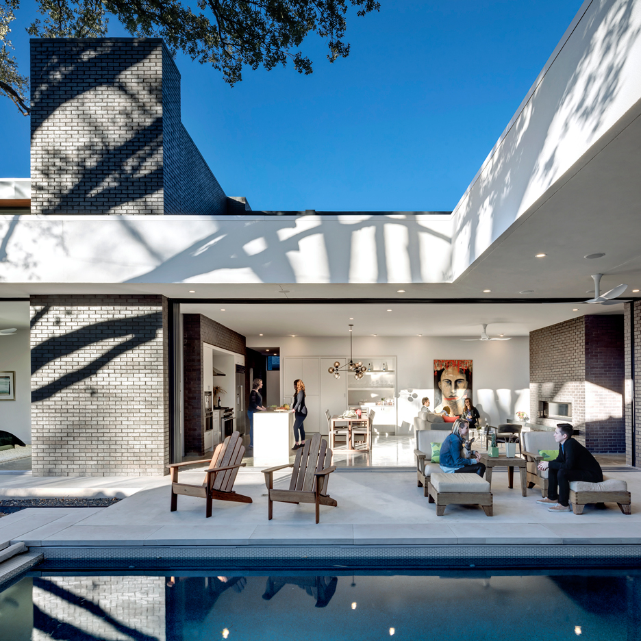
Matt Fajkus completes urban Austin home with retractable glass walls


Texas firm Matt Fajkus Architecture has completed a family home in Austin that features rooms with sliding glass walls, enabling the spaces to be fully opened to the outdoors (+ slideshow). (more…)

http://ift.tt/1P70Thz

Glasshouse Community and Function Centre / Croxon Ramsay


© Dianna Snape

© Dianna Snape


© Dianna Snape


© Dianna Snape


© Dianna Snape


© Dianna Snape

  • Architects: Croxon Ramsay
  • Location: Melbourne VIC, Australia
  • Project Directors : Andrew Croxon, Catherine Ramsay
  • Project Architect : Nick Gamble
  • Area: 4190.0 sqm
  • Project Year: 2015
  • Photographs: Dianna Snape
  • Team: Jeff Gabriel , Richard Cox, David Young
  • Interiors: Hecker Guthrie
  • Project Manager: Coffey Projects
  • Structural / Civil: Kersulting
  • Services & Esd: Simpson Kotzman
  • Building Surveyor: BSGM
  • Quantity Surveyor: DDH
  • Catering Consultant: FCA
  • Landscape: Tract
  • Access: Architecture & Access
  • Audio Visual: Lumicon
  • Heritage: Lovell Chen
  • Signage: Hunt & Co
  • Acoustics: Marshall Day
  • Traffic: Cardno
  • Builder: ADCO Constructions
  • Client: Collingwood Football Club
  • Floor Area: 4190m2
  • Footprint: 2150m2
  • Budget: $22 Million

© Dianna Snape

© Dianna Snape

Site Plan

Site Plan

From the architect. Designed by Croxon Ramsay, the new Glasshouse community and function centre for Collingwood Football Club was to provide elite player facilities, event spaces for the public and the Club and encourage community participation within the sports precinct in Melbourne, Australia. Requirements included a café, bars, multiple hospitality spaces, a lecture theatre, a gymnasium, players’ rooms, storage facilities, meeting rooms and a boardroom. Many areas required individual access – for example, the gym would be open to the public when the theatrette was closed, the café would be open when the function centre was not and players would require access to their rooms without meeting patrons of the café.


© Dianna Snape

© Dianna Snape

So a complex plan was designed of particular areas that could be ‘locked down’ and isolated from each other. The catering needs were immense – a commercial kitchen that would supply food and beverages for intimate gatherings, sit down dinners for 500 or cocktail events for 1000 people. 


© Dianna Snape

© Dianna Snape

© Dianna Snape

© Dianna Snape

The building is wedged between an Olympic Swimming Pool and a full-size community oval on an elongated triangular site. At one end of the site, in the tail-end of the building to the north, is the bar and café with an outside seating area and access to the Glasshouse can be approached through the café; however, the official entrance is from the midway point of the building that is accessed from a pedestrian pathway that curves around the oval. The entrance opens to a substantial staircase that becomes the stepping-off point to all areas. The ground level provides the lecture theatre, gymnasium, and change and storage rooms; the first floor has the hospitality areas and above this, on the second floor, there is a boardroom and small meeting/coaches’ room. 


Plan 0

Plan 0

© Dianna Snape

© Dianna Snape

The footprint of the site is the protagonist for the design, the geometric shape a constant within the exterior and interior of the zinc brick building. The materiality of the façade is substantial with masonry used at low levels and glass and metal cladding, black zinc and natural anodised aluminium above. These disparate elements combine in linear and geometric shapes to form patterns that highlight and delineate features such as the rake of the roof and a triangular soffit that is also reflected internally. Strip lighting highlights the soffits and again reinforces the ubiquitous triangular shapes within the design. High-tech glazing systems were developed and installed, and the function areas support the latest audiovisual equipment.
The interior, designed by Hecker Guthrie, is a reflection of the architecture and features fine contemporary furniture and a bespoke carpet designed for the function spaces, all set against the backdrop of raw cement walls. Throughout the interior and exterior subtle references to the Collingwood Football Club abound. The palette of black, white, beige and grey reinforces Club colours (black and white) and the shape of the building echoes the span of a bird’s wing, in this case, the Australian magpie (the Club’s nickname is the Magpies). 


© Dianna Snape

© Dianna Snape

Section

Section

http://ift.tt/1Y39aud

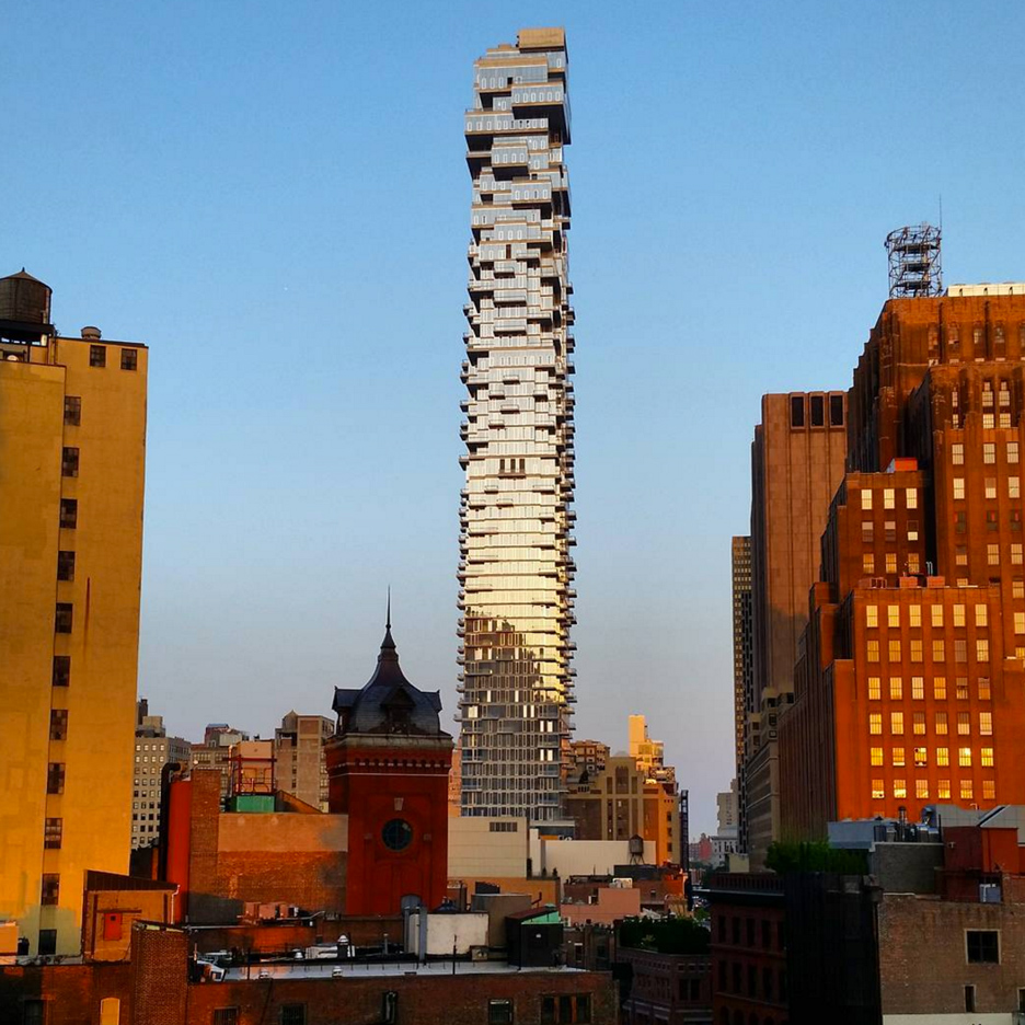
Herzog & de Meuron’s 56 Leonard “Jenga tower” nears completion in New York


The Jenga-like form of Swiss firm Herzog & de Meuron’s residential skyscraper in Tribeca, New York, has been captured by Instagram users ahead of its imminent completion. (more…)

http://ift.tt/1P6Gfy2