
A survey of the UK’s Creative Industries Federation members has shown that 96 per cent are in favour of remaining in the European Union. (more…)
A survey of the UK’s Creative Industries Federation members has shown that 96 per cent are in favour of remaining in the European Union. (more…)

Bricks are an iconic element of Solano Benítez’s studio. An ancestral material, forged by man using an ancient technique of modeling and baking. Bricks are very versatile, cheap and easy to manufacture – even marginalized areas of the world can afford to build houses with brick. Benítez feels the poetry of brick and has experimented with its versatility, relying solely on bricks as the main construction material. [1]
Gabinete de Arquitectura‘s exhibition, designed by Solano Benítez, Gloria Cabral and Solanito Benítez, was awarded the Golden Lion for Best Participant in the International Exhibition, Reporting From the Front, for “harnessing simple materials, structural ingenuity and unskilled labour to bring architecture to underserved communities.”
BREAKING THE SIEGE
Gabinete de Arquitectura‘s contribution to the International Exhibition, Reporting From The Front
Venice Biennale 2016
By Gabinete de Arquitectura / Solano Benítez, Gloria Cabral, Solanito Benítez
Asunción, Paraguay
[1] Official Catalog of the 2016 Venice Biennale

In a corner space, surrounded by the most important hotels of Mexico City, facing Reforma, the ceremonial boulevard created in the 19th century by Maximilian Habsburg as Emperor of Mexico and across the street from Chapultepec, one of the largest urban parks in the world, stands Barberia Royal, a barbershop that offers services as privileged as its location.
Through our design we wanted to incorporate the bits and pieces of a previous proposal that was under construction on the site for a different barbershop that was never finished, recycling mismatching moldings and other wooden elements almost randomly, fitting them in a contemporary form that still references the traditional symbols of European royalty.
The lower half of the space relates in colors and materials to the long standing heritage of traditional barbershops including a black and white hexagonal tiles floor with a flower pattern and the Royal name greeting all the patrons at the entrance.
In contrast the ceiling is shaped with an intricate faceted surface that adapts to the changing heights of the space and the structural elements of the building finished with a laser-cut golden anodized aluminum reflective surface that mirrors the plan view of the shop and sharpens the edges of the volume creating a point of interest for the clients as they lay back on the service chairs.
The store plan is distributed into two equally important zones: the waiting area with a fully stocked courtesy bar, very comfortable leathered stools and sofas, shelves with exhibition of the best grooming products for sale that share the space with a real life buffalo head and a fully restored vintage Triumph motorcycle as decorative highlights; the service area is furnished with original chairs from the 1950s upholstered in mustard yellow each facing a large scale beveled mirror with a rounded gilded frame with golden heads of a lion, a wolf, a stag, a zebra, an elephant and a moose fixed onto its surfaces.
The interior is sheltered from the outside with a double wooden façade reminiscent of old English storefronts reduced to its minimum expression.
The branding and image design was realized by Andy Butler who devised a flexible communication system that incorporates symbols associated to royal houses and heraldry along with the barbers’ basic tools to create graphic elements that work from the scale of a card or a product to large scale signage and digital applications.
Along the store several pieces of artwork and decoration stylized by Ivan Esqueda detail every corner of the space.

Are tree covered buildings really in tune with ecological and sustainable principles, or are they just a form of greenwashing? This is the question posed by Kurt Kohlstedt in his essay, Renderings vs. Reality: The Improbable Rise of Tree-Covered Skyscrapers, for 99% Invisible. The author notes that vegetated designs come about for myriad reasons – the appearance of sustainability, better air and views, investment intrigue – but that most of these concepts will never leave the realm of paper or virtual architecture. For as many reasons that these buildings have become popular, there are detractors for why they simply cannot be built, including daunting construction hurdles (extra concrete and steel), vast irrigation systems, added wind load complexities, and the trees themselves having difficulty adapting to their vertiginous conditions.
Kohlstedt cites Bosco Verticale by Boeri Studio as a “vertical forest” project that has actually been built and subsequently praised. The project received numerous awards and accolades including being named the 2015 Best Tall Building Worldwide by the Council on Tall Buildings and Urban Habitat (CTBUH) and LEED Gold certification, but critics have noted that the amount of resources required to place and maintain the trees far outweigh their ecological merit.
Of the article’s several conclusions, those that stick out are Kohlstedt’s note that extensive green coverage (mosses, succulents, herbs, and grasses) are easier to implement than intensive green coverage (roofs or balconies with shrubs and trees), and that vertical gardens can seem to have egalitarian merit, but they are park conditions that benefit the few not the many. ArchDaily has taken on this issue previously, with authors who defend and others who denounce the trees on buildings phenomenon.
For Kohlstedt’s complete evaluation, read the full article on 99% Invisible, here.
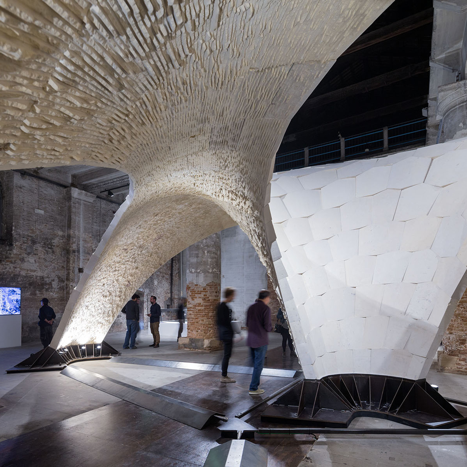
Venice Architecture Biennale 2016: a team led by ETH Zurich researchers has constructed an expansive canopy using 399 slabs of limestone and no glue, showcasing a “milestone for stone engineering” (+ slideshow). (more…)

Kamadhenu is a private institution, conceived around the basic principles of yoga practices, demanding the architects to generate an architectural program focused on creating a Yoga studio to fulfill the needs of yoga practitioners from Bogota, and its neighboring towns. All profits derived from the operation of the studio are destined to finance educational programs that benefit the children from the Subachoque community.
The architectural program was developed around the idea of creating a school that would provide yoga courses and courses in related disciplines to its users, as well as art and cooking workshops. These functionalities are able to turn the studio into a full-fledged community center.
Being a place for the practice of yoga and meditation, space is neutral and relaxed. Nature and environment act as the main protagonists, integrating interior spaces and landscape. Changes in natural light transform spaces further, achieving an atmosphere that is propitious for meditation practices and the individual achievement of mindfulness.
The project consists of a central courtyard and three core modules articulated by a large corridor along which the yoga room, dining room, kitchen and bathrooms and changing areas are organized. The outdoor patio is the central space where different natural elements such as trees, mountains, sky, water and fire, as well as a Buddha who acts as guardian of the place, integrate.
Access is located at the upper level, visitors and users descend ceremonially by a stone staircase to the outdoor patio. The two main areas, the yoga and dining room, have wood sloping roofs that integrate the interior spaces to the landscape, allowing light to reflect inward.
The materials used are concrete, wood, stone and glass; providing a serene, beautiful and austere environment, where light plays a fundamental role. The materials are balanced with each other, since wood gives warmth, concrete solidity, stone connection with the earth and glass reflection of light.
Since its completion, the project has successfully achieved every objective that was initially conceived as a premise. The building has not only become a meeting point for yoga practitioners, but it also serves the purpose of working as a community center for the local community.
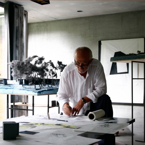
Comments update: Swiss architect Peter Zumthor divided opinion this week with his claims that handmade architecture is experiencing a resurgence, and that computers are simply slaves. Read on for more about this and explore our comments page to keep up with the latest discussions. (more…)
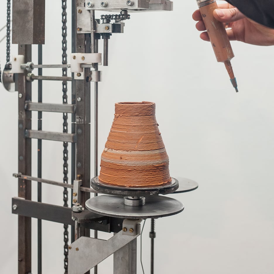
Dezeen promotion: a rug patterned like mould and calligraphy created from heartbeats were among projects by Dutch designers showcased for the launch of Ventura Projects at New York’s design week (+ slideshow). (more…)

LIAG Architects has unveiled their design for a new art storage building. Commissioned by the Rijksmuseum in Amsterdam, the aim of the project was to create a large open space, while simultaneously meeting other needs such as protecting art that can’t be exposed to daylight, controlling the temperature in certain zones, and using minimum amounts of energy to operate the building.
The 29,000 square-meter storage building is a simple volume designed not to reveal the organization of the interior. The entrance is a gold cladded arch shape, which opens the building towards an adjacent train station. The compact volume allows for the form to be expanded upon to create a larger facility if needed in the future.
The layout of the facility allows for art to be transported through the shortest routes possible. Each of the three floors contains one main corridor from which all spaces are accessible.
The design addresses the need to protect the artwork through both passive and active systems. The façade system utilizes a material that reflects daylight, but avoids glare. This material not only changes the building’s appearance throughout the seasons, but also allows controlled amounts of light to enter into the storage spaces.
The temperature of the facility is moderated by an insulated skin and energy stored in the ground. Different programs within the building are situated in ways that meet their specific needs. Studios and offices, which can tolerate warmer temperatures, are located at the top of the building, while cooler storage spaces are located on the lower levels.
DESIGN TEAM: Thomas Bögl, Maja Frackowiak, Jordy Aarts, Erik Schotte, Arie Aalbers, Jeroen Moerman, Anna Gunnink, Clemens Rothleitner, and Jose Reviriego Machío.

From the architect. The house is located in a residential area of Brasilia that despite being in the city center, provides great interaction with nature. Given the urban planning requirements of the district, the project focuses within the minimum limits of recess from the access road so the entire background could be occupied by the green area, as requested by the customers.
The project starting point was the couple’s desire to have a house that integrates with the landscape, combined with the functionality and aesthetics.
Our goal was to bring the landscape into using the architecture. The project designed from the outside in shows full integration between the interior and exterior, and through large openings and skylights, it values the natural lighting and ventilation.
The impenetrable surfaces of the main façade guarding the findings surprise reserved for those who enters. Daylighting happens many ways, but its main impact comes from above and it is present in almost all the house’s rooms. The sky can be seen from various parts of the house.
This natural light brings light and breaks the straight lines’s coldness, valuing the materials used and providing a better use of daylight that also feeds the heating system through solar panels.
For the ventilation, large openings were proposed, slat panels and skylights that along with high ceilings provide an internal temperature always pleasant. With a simple and rationalist proposal, the project was designed as a whole, from the party that favors straight lines and pure forms, through the structure and coming to detail, where natural materials were valued.
The overlap of the two boxes is a unique architectural structure, but with use and different internal compositions. The assembly is interconnected by metal and wood ladder structure that functions as a central axis defining a movement flows by internal spaces.
With the shift between the two boxes, the architecture gains a stylish and contemporary volumes, combining the aesthetics and completely open to the garden and closed to the access road, the lower box received the main access, garage and social areas integrated into the green and the gourmet areas through large panels with aluminum frames and clear glass; while the upper box, with virtually blind side gables, houses the intimate area. The rear facade opens completely to the sky and the garden and have their privacy preserved through large slatted sliding panels that can be opened in various ways. These panels exert light filter function at the same time maintaining the natural ventilation.
The materials choice retrieves the Brazilian house features in a simple palette of concrete, glass and wood. It focuses on the use of relatively few elements, the appreciation of space and natural light, creating a neutral base, which enables the house evolve and become together with its members.

