De Schuyter / Joshua Florquin Architect


© Matteo Rossi

© Matteo Rossi


© Matteo Rossi


© Matteo Rossi


© Matteo Rossi


© Matteo Rossi


© Matteo Rossi

© Matteo Rossi

From the architect. This medical practice is founded by Dr. Hans de Schuyter and is based in Maldegem, Belgium. Hans commissioned Joshua Florquin Architects to design the planning and interior-design of the practice. The program consists of inserting into an oblong shaped one floor building public and private amenities such as waiting area, reception with archive, a kitchen and two offices.


© Matteo Rossi

© Matteo Rossi

The concept and design of the practice has a strong functional and psychological approach that overlap each other. Functional because of accessibility and technical regulations, that are inherent to the working environment of a medical practice, where circulation interconnects the public and private spaces. Psychological because of the mental and physical state patients can find themselves in when visiting. Particular attention is given to light and materials that influence the state of mind in a positive way.


Plan

Plan

In the floor plan we distinguish a central placed rectangular threshold-volume. It holds mainly the reception but also archive, kitchen, lavatory and a technical area. It separates the private working spaces from the public waiting area. This gives waiting patients and the doctors direct access to reception and lavatory without crossing each other.


© Matteo Rossi

© Matteo Rossi

The central rectangular volume has a tulip identifiable wood coating and gives a soothing bright atmosphere. Together with the function of the area it changes in shape throughout the practice. In the waiting area a serpent like form emerges from the wooden wall and becomes a bench where patients can sit. The different benches are separated by armrest-libraries creating small waiting islands. When a patient visits the practice, according to his mental and physical state, he can choose to sit with other patients or search privacy and sit alone in one of the islands. The facing benches are not parallel but have a skewed zigzagged form in order to naturally avoid a direct eye-contact, if wished.


Diagram

Diagram

From the waiting area you can walk towards the reception where the wooden wall transforms itself into a front desk made out of three emerging intersecting volumes. Each volume has a height and a function. The highest volume is the desk where documents can be laid or and handed over. The middle height volume can be used to rest handbags on and finally a third lower volume in form of a niche, where children can take a small toy when leaving the doctor’s office. The concept and aesthetic language continues in the offices where custom furniture, also coated in tulip wood, divides the consultation area from the more private examination area.


© Matteo Rossi

© Matteo Rossi

http://ift.tt/1ShJ6aY

Kram/Weisshaar’s SmartSlab dining table has hidden tech to cook food and chill drinks


Milan 2016: designers Kram/Weisshaar have created a table embedded with hidden circuitry so you can cook dinner and keep plates warm and drinks cold while you dine. (more…)

http://ift.tt/1YzlBMf

Monocle 24 Explores Women in Architecture


Heydar Aliyev Center / Zaha Hadid Architects. Image © Hufton + Crow

Heydar Aliyev Center / Zaha Hadid Architects. Image © Hufton + Crow

Following the death of Zaha Hadid on March 31st of this year Section D, Monocle 24’s weekly review of design, architecture and craft, hones in on the role of women in architecture and design. They discuss why, despite an almost 50:50 gender split in undergraduate architecture courses, women are still grossly underrepresented at senior levels within the profession by featuring conversations with two leading female architects, Angela Brady OBE and Amanda Levete. The episode also looks back over the lives of some of architecture’s overlooked heroines.


http://ift.tt/1S0EmYk

Monocle 24 Explores Women in Urbanism
//cdn.embedly.com/widgets/platform.js

Why Equal Representation for Women in Architecture is Better for Everyone
//cdn.embedly.com/widgets/platform.js

Find out more about Monocle 24’s Section D here.

http://ift.tt/1QdLlaH

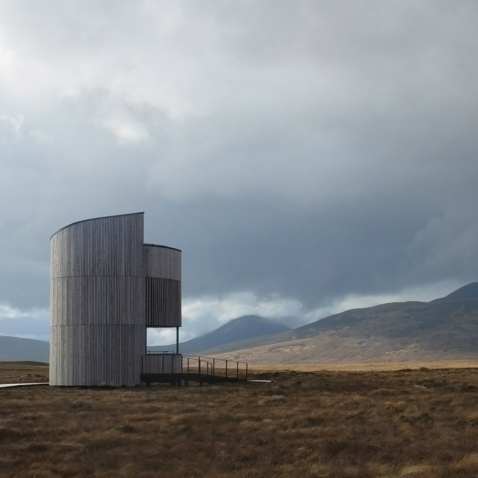
Icosis Architects create stargazing lookout tower in the Scottish highlands


This cylindrical, larch-clad observation tower was designed by Icosis Architects to provide an elevated vantage point over picturesque bogland and night skies in Scotland (+ slideshow). (more…)

http://ift.tt/1SlcUqr

A Clean, Elegant Home Done in White in Rome

Casa Pietrina by Filippo Bombace (5)

Casa Pietrina is a residential project designed by Filippo Bombace Architect in 2015. It is located in Rome, Italy. Casa Pietrina by Filippo Bombace: “After touring around the world for pleasure, study and work, a Roman crooner defines near St. Peter the new home to be shared with the partner. The windows of the apartment look out the belfry of Santa Maria delle Grazie alle Fornaci, typical example of that..

More…

P.L. House / Atelier d’Arquitectura J. A. Lopes da Costa


© Manuel Aguiar

© Manuel Aguiar


© Manuel Aguiar


© Manuel Aguiar


© Manuel Aguiar


© Manuel Aguiar

  • Engineering: GF Building – Eng. Ricardo Melo, D-Solution
  • Project Date: 2009-2010
  • Building Date: 2011-2014

© Manuel Aguiar

© Manuel Aguiar

From the architect. The house consists of two structures. One comprises only one floor parallel to Av. Das Laranjeiras, and the other consists of 3 floors (basement, ground floor and first floor), which has a slight twist to the first, and lies parallel to the slope of the land, taking advantage of the land platform.


© Manuel Aguiar

© Manuel Aguiar

The entrance to the house is made to the north, through a hall that links the two structures and that opens south on a courtyard defined by the 2 volumes of the house.


© Manuel Aguiar

© Manuel Aguiar

In the lower structure, to the West, lies the leisure area, enjoying greater independence and functional autonomy.


Plan 1

Plan 1

It is a very transparent building, enjoying the afternoon sun from the West and, to the East, the visual relationship with the courtyard and the living rooms of the house placed in the other structure.


© Manuel Aguiar

© Manuel Aguiar

In the East-facing structure it is located the house itself, distributed over 3 floors. In the basement there are the technical areas of storage and service, on the ground floor the social areas and on the first floor the private areas.


Section

Section

This structure opens to the east, to the morning sun, and to the unending green, which extends far beyond the boundaries of the property. The living areas also open up to the West, to the privacy of the courtyard contained between the two structures.


© Manuel Aguiar

© Manuel Aguiar

The volume of the first floor rests on that of the ground floor almost like a box, and is open almost exclusively to the east, with the openings of the bedrooms and bathrooms marking the façade as protruding volumes, forming balconies between them.

There is also an outside staircase connecting the basement to the terrace of the living rooms. 

http://ift.tt/1W6bm2S

This week, the design world flocked to Milan

COS x Sou Fujimoto Forest of Light installation

This week on Dezeen: the Dezeen team were in Milan this week to cover product launches, events and installations from the world’s biggest and most important design fair. (more…)

http://ift.tt/1NesTnK

Elding Oscarson Designs a Luminous Contemporary Home in Tokyo

Nerima House by Elding Oscarson (21)

Nerima House is a private residence designed by the Swedish firm Elding Oscarson in 2015. It is located in Tokyo, Japan and covers an area of 1,065 square feet. Nerima House by Elding Oscarson: “On a plot in Tokyo, a small garden has been thriving next to an old house for a long time. As the tiny existing building was replaced, our client really wanted to preserve the garden and..

More…

AIUEnO Restaurant / MIEL Arquitectos


© Asier Rua

© Asier Rua


© Asier Rua


© Asier Rua


© Asier Rua


© Asier Rua


© Asier Rua

© Asier Rua

This project is the result of some unconsciousness mixed with a lot of admiration. The unconsciousness came from the side of the clients, Neus and Kenji of Can Kenji team, commissioning his new Japanese restaurant “izakaya” to a team that had never designed a restaurant and not even been in Japan. The admiration is ours to a culture as unknown as admired. 


Diagram

Diagram

Which one is our Japan? The one of the videogames and the lights of Tokio, the Japan of Frank Lloyd Wright, in the mood for love, their admired tradition of periodically rebuilt some temples to preserve the touch and smell for its sensorial perception, the House of Sugimoto and of course In Praise with Shadows of Tanizaki. 


© Asier Rua

© Asier Rua

All of that, without any order or ambition, joint to a healthy obsession for the Atmospheres of Peter Zumthor had end to be AIUEnO. 


© Asier Rua

© Asier Rua

Later came the 85cm jump from the street to the inside, that’s when the toilets started to play making a virtue of disadvantage moving from almost the bottom space to the front assuming the allegorical and light prominence of the restaurant and at the same time providing the essential accessibility. 


Plan

Plan

The materials? Oak, the Shōji, carpet at the expense of tatami, the ceramic and the lighting, of shines more than lights… insinuations dancing so quite all over the space, at different highs, with golden reflections and a dark blue body, almost black. 


© Asier Rua

© Asier Rua

To seat down 2 bars, the first one panoramic in descending diagonal towards the other one, connecting visually what the preexistence separated; and 2 tables, one protected (almost hidden) and the other shared, with 13 legs just in case. 


© Asier Rua

© Asier Rua

But it wasn’t til 1 month before the opening, when Kenji and his team castled inside the kitchen behind a plastic membrane, that we returned to our place. The art of AIUEnO happens between fires and we have just built the air around the delightful quality of his dishes. Bon Appétit… Itadakimasu! 

http://ift.tt/1WwJoOk

Nendo’s Tangle side tables entwine together “as if holding hands”


Milan 2016: this trio of side tables by Japanese studio Nendo for Italian brand Capellini features corkscrew legs that allow them to interlock (+ slideshow). (more…)

http://ift.tt/20JUyj0