From the architect. The Chapel of the Blessed Sacrament, just 100m2 and with room for up to 40 people, is built as an extension of the existing church and connected to it through its northern facade. It has been conceived as a space to promote meditation, prayer and thus peace inside those gathered there.
The square plan receives light “from above” bathing three of its four sides and with minimal openings to the outside to avoid distraction. This space, including its roof made of wooden slats, opens onto the fourth side where the sanctuary is located and to the bottom of the tabernacle as the central point of the chapel, topped off by a free volume formed by a quarter vault with double height.
The new building, designed in concrete, is integrated into the existing building by contrast, but following the relationship in height, color and texture of some of the characteristic elements, such as the great stone plinth, windows and lattices. Thus, the smooth concrete alternates with the cane texture finish dyed in a beige color present in the stone plynth.
Plan
The horizontal sequence of the parish complex is topped with the double height vault of the new chapel, which in turn is related by analogy and naturally with the curved shape of the end of the public sidewalk.
Photographer’s Loft is a private residence designed by Desai Chia Architecture. It is located in New York City, USA. Photographer’s Loft by Desai Chia Architecture: “We designed this Tribeca loft as a home, work space, and gallery for a photographer. A library/reception area immediately off of the entry vestibule allows her to meet with gallerists and research new themes for her work. That space serves as a hinge for two..
From the architect. The House is situated in one of Pretoria’s oldest Golf Estates, which has already been extensively developed. Our client was particularly open-minded in buying one of the last open plots in the estate, an extremely rocky piece of ground not many would see opportunity in.
Courtesy of Earthworld Architects & Interiors
The site is defined by two rocky outcrops, generously dotted with indigenous flora, posing serious challenges in situating the building without damaging the environment or incurring serious costs in erecting a conventional structure.
Courtesy of Earthworld Architects & Interiors
From the onset the client’s brief was clear, we were to provide for 4 bedrooms (en-suite), a study, an open plan living area, dining room, kitchen as well as the given ancillary functions. The twist was the structure was to be predominantly concrete.
Courtesy of Earthworld Architects & Interiors
From inception it was clear that the natural environment found on the site should be disturbed as little as possible, only using the two rocky outcrops as the footings for the structure. A palette of Steel, Glass & Concrete was chosen, attempting to keep the materials as true to their rawest forms as possible. The building spans between the outcrops, positioned carefully between a collection of prominent Appelblaar & Karee Trees. The importance of this natural context is amplified through its close proximity as one moves through the house.
Plan 0
Maintaining the concept of touching the earth lightly, there are only two access points into the house, 2 sets of stairs that seemingly float above the natural ground level.
Courtesy of Earthworld Architects & Interiors
The Residence is also equipped with a Solar Hot Water System, as well as integrated Intelligent Controls, circulating Solar Heated Water through the structure, reducing the house’s need for Municipal electricity. Similarly, Double glazing was employed throughout, reducing the need for active cooling & heating.
Section
In conclusion, the design marries the romance of South Africa’s Highveld Landscape with the contemporary concrete & glass designed house, creating an interesting contrast & relationship between the amenities of contemporary living while reducing the impact thereof.
From the architect. Major transformation project gives Lucent industrial site a new lease of life.
Studioninedots’ design transforms an existing 1970s office building on the Lucent site in Hilversum into the new headquarters of de Alliantie, a Dutch housing corporation. The most eye-catching intervention involves the removal of large areas of infill floors and walls from the sturdy concrete structure. This creates a spectacular four-storey-high void, the light and lively new heart of the building that connects the different departments.
In this way the concept of connection was integral to the design. The new headquarters functions to consolidate de Alliantie’s regional offices, and facilitate new interactions between both colleagues and visitors through collective functions, which are centred around the atrium. These functions include the lobby, restaurant, library and kitchenettes on each floor.
Spatially, the dynamic character of the atrium is accentuated by crisscrossing steel staircases, cantilevered balconies, walkways and vistas, but most of all through the void that zigzags within the concrete frame. This dynamism is also expressed on the facade: large glazed surfaces within the structural concrete framework cut out a Tetris-like form from the anthracite-coloured facade, which lends the building its prominent new identity.
Floor Plan
Internally it’s immediately clear that the removal of floors and walls has literally resulted in more space and daylight, which now floods the 22-metre-deep floor plates of the once dark building.
The structural framework in the atrium is infilled with perforated wooden panels and steel frames. Besides their acoustic function, the walls also incorporate various functions such as the kitchenettes, library, storage and displays.
Diagram
The former Lucent industrial site in Hilversum is currently being transformed into a mixed-use residential/commercial district. The last companies vacated the site in the 1980s, and two of the five office buildings were retained. Being in good condition, these two buildings could be renovated to easily gain a new life. In addition to designing de Alliantie’s headquarters, Studioninedots is also repurposing the second building into an apartment complex, due for completion at the end of 2016.
The owners are all Buddhists looking forward to having a place of peace, tranquility and completely free from the hustle city.This is not simply a house, it is a monastery…
A place where there os no limit in work, where you can either travel or stand in one place and other remaining angles are transparently as a continuous open space designed. Where everyone will see each other gleamingly, listen to each other, call each other, and think of other, etc.
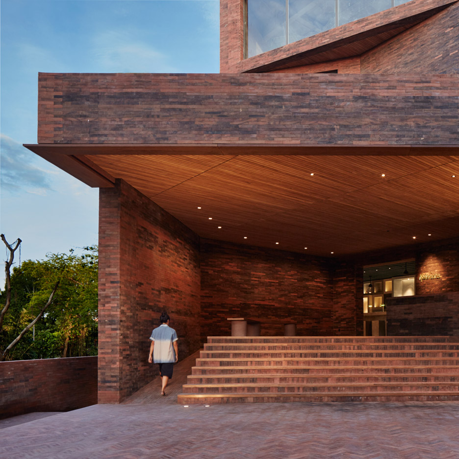
A natural and rustic material palette of unrefined brick, bare wood, unpainted cemboard, and ferrous iron, etc. Everything is definitely in the way it is, staying with its nature.
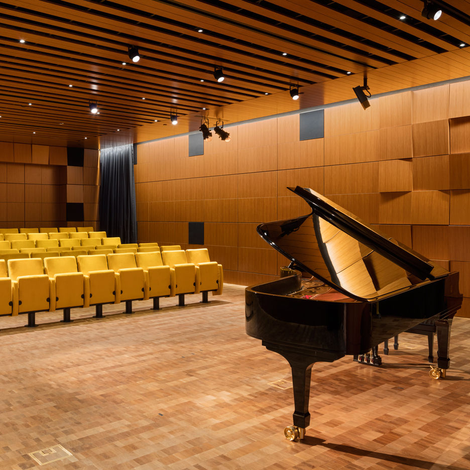
Indonesian architect Andra Matin chose multi-hued bricks, handmade tiles and bespoke terrazzo for this hotel in Bali, which is intended as a showcase for local design and craftsmanship (+ slideshow). (more…)
From the architect. A Boundless Space of Joy and Delectable Delights
For young married couples with kids, the downtown cafes and bistros they used to frequent often become no-go zones. But for this pair, who were just beginning to experience the travails of parenthood, the desire for a habitat where their children’s laughter and their beloved yuppie lifestyle may coexist was still strong. Lucas and Kelly’s house in Kaohsiung exemplifies the perfect balance between child-rearing and romantic intimacy.
Lucas and Kelly are both passionate about cooking; the couple met while travelling overseas. Now, married with two adorable daughters, they decided to settle down in Kaohsiung. The kids are still pre-school age, which was why at the initial stages of design conception, the couple requested an open kitchen so they could have a full view of the kids’ living room activities while making meals in the kitchen. The living room, which serves as their children’s designated play space, is furnished with lazybones style sofas and furniture items with reduced heights such as low, round coffee tables to give the overall vision more of permeability. Wooden grid paneling on the ceiling serve as simple, harmoniously detailed spatial partition. When the children grow older, the space below the partition will provide them with a library- like reading space. The windows that frame and reflect the everyday lifestyle of this happy family are also a main feature of this extended spatial design. Each time a family member steps into the home, their line of sight will automatically rest upon the pleasing landscape afforded by the large, expansive window. The comfortable built-in window seat means that Lucas can lounge a little while enjoying a view of the city, rain or shine, while Kelly may also tuck into the cozy space with her computer and enjoy a leisurely afternoon of writing and home-brewed coffee.
Building a Blissful Home Through Cooking and Dining
The kitchen and dining rooms are undoubtedly the heart and soul of the entire household. Both being passionate cooks, the couple often prepares family meals side by side. Based on their personalities, we employed a subtle, modern contemporary style in our design of the kitchen island and back wall, paving them with black mosaic tiles to color-coordinate with the grey ceilings of fair-faced concrete coating, all of which exude a sense of wintry coolness. Tall sky-blue wood grain cabinets were inserted to match the concrete surface Scandinavian chandelier and imbue the space with a little warmth. The extended wooden table is reminiscent of a stretch of canvas that quietly complements the vibrant colors of each delectable dish. Both kitchen and dining are structured with a variety of materials in gradations of blue that create a strong sense of spatial dynamic. For instance, the kitchen door that leads to the balcony is made out of a perforated board from which S-shaped hooks can be hung to accommodate kitchenware display. The perforation serves as both ventilation and storage, a design that is at the same time practical and aesthetically pleasing.
To help the children cultivate their creativity, we create secret hide-outs across the home so the kids could engage in creative projects in freedom. These include the Lego painting in the foyer, which encourages the children to try their hand at collage and enhances their sensitivity toward color. In the living room we also set up a wall of blackboard, on which we drew cute cartoon characters that attract their attention and inspire them to draw and doodle. The children’s room, instead of the usual pink chosen by most parents to satisfy their young daughters, features doors and cabinets painted in vibrant, neutral colors of blue, green and yellow, shades that work perfectly with the muted grey of the concrete walls. The space is fun, colorful and at the same time calming and serene. Inside the wardrobe are specially-shaped drawers and shelves that give the space interesting visual effects. These designs not only satisfy all the storage needs at different phases of the children’s lives, but also give them the opportunity to express themselves via the arrangements of their personal belongings. As they grow older, this tiny castle will also transform into a space that fully reflects the styles and personalities of its inhabitants. Meanwhile, Lucas and Kelly, as we can fully imagine, will still be in the kitchen late at night, busy putting together a feast of wine and favorite snacks, one of the most beautiful sights of a perfect family home.
From the architect. Mundo Verde is a bilingual, sustainability-focused public charter school located in the District of Columbia. The school’s curriculum is based in expeditionary learning, where students learn through the active exploration of the world around them. Awarded a shuttered 1920s-era school building and site by the District in 2013, Mundo Verde had a direct question for the design team: “How can this redevelopment and addition project teach our students to be global stewards?”
Mundo Verde is two buildings: the renewed and refined historic school and a new Pre-K annex. The surrounding landscape is integral to the buildings, blending the natural systems of the city with learning space.
Section
Pre-K Annex: The massing of the annex is derived from the existing building and modulated in response to solar exposure and the pattern of the surrounding city fabric. It sits at the northeast corner of the site, reinforcing the site’s urban edge while protecting a courtyard for Pre-K student play. The exterior facade is designed to be deferential to the historic school, yet textured at a scale accessible to the Mundo Verde students. A third floor learning terrace, large window openings, and building orientation provide for light-filled classrooms which frame the natural landscape of the interior play court. Bold colors inspired by Latin American culture add additional vibrancy to the interior.
Site: The new Mundo Verde campus is a framework for learning expeditions about environmental sustainability. The paths of these expeditions are quilted together to form the campus design. Students grow and harvest food for their lunches in gardens onsite, learning healthy and seasonable eating habits. Indigenous plantings support migratory insect and bird populations. An underground cistern and constructed streambed illustrate the importance of water conservation.
Plan
Historic School Renovation: The institutional plan of the existing building is reimagined as an innovative blend of flexible student and administration spaces. Breakout nooks and cubbies are carved from the generous corridors, abandoned ventilation chases, and existing wall thicknesses. New windows provide natural light to the building core. As in the Annex, high ceilings and grand window expanses are supported by highly coordinated building system integration.
The expeditionary learning curriculum empowers MV students to be leaders in their own learning expeditions. The new Mundo Verde buildings and landscapes are designed to be dynamic partners in the growth of children into life-long learners and stewards of the environment.