Villa Jisp / SeARCH


Courtesy of  SeARCH

Courtesy of SeARCH


Courtesy of  SeARCH


Courtesy of  SeARCH


Courtesy of  SeARCH


Courtesy of  SeARCH


Courtesy of  SeARCH

Courtesy of SeARCH

From the architect. How do you enlarge a farmhouse that has low eaves on three sides and one high side with barn doors? Typical North-Holland farmhouses, the ‘Stolp’, have a clear, strong shape. A modern extension easily demystifies this characteristic.


Courtesy of  SeARCH

Courtesy of SeARCH

The traditional Stolp has a core, the ‘square’ comprising a hayloft over the full height. Around it are the living quarters of the farmer and the barn which is in open communication with the square. Hay and house enjoy the warmth of the cows.


Floor Plan

Floor Plan

The new extension ‘skews’ the slanted roof up from the square and protrudes over the old brick facades. On two sides this creates a zone of 5 to 7 meters wide where the new living room, kitchen and two bedrooms are located.


Courtesy of  SeARCH

Courtesy of SeARCH

The old Stolp contains the other bedrooms, study and all service areas.The living room, with a sloping concrete floor down to polder level, has 32 meters length of panoramic views over the beautiful Wormer and Jisperveld while the rooms in the existing dome have a more introversive, oak interior.


Section

Section

The old and mostly rotten, boards on the east facade were replaced by a single ‘patchwork’ of different kinds of treated wood according to Japanese Shou Sugi Ban technique, created by ‘Zwarthout’.


Courtesy of  SeARCH

Courtesy of SeARCH

http://ift.tt/1Vlc5y6

Gufram brings together old and new furniture for 50th anniversary exhibition


Milan 2016: Italian furniture brand Gufram‘s 50 Years of Design Against the Tide exhibition shows classic products alongside more recent pieces by designers including Ross Lovegrove and Alessandro Mendini (+ slideshow). (more…)

http://ift.tt/1S5A1j5

In the Loop / Takuma Sugi + Nanako Hirai + Ben Nitta


Courtesy of Ben Nitta

Courtesy of Ben Nitta


Courtesy of Ben Nitta


Courtesy of Ben Nitta


Courtesy of Ben Nitta


Courtesy of Ben Nitta

  • Project Participants: 2nd grade students, Art and Architecture School of Waseda University
  • Dimensions: 5.46m x 5.46m x 2.73m

Courtesy of Ben Nitta

Courtesy of Ben Nitta

From the architect. This plywood pavilion was designed and built for the 2015 Science and Engineering Festival at Waseda University. As it was to be built in the campus’ central courtyard and displayed to the public, it was imperative that the design not impede the flow of pedestrians. Tight limits to the available budget and manpower necessitated that the design make efficient use of materials and allow for quick assembly. Furthermore, the design was to embody the festival’s annual theme: “Spread Out! The Ring of Science and Engineering”. The design we arrived upon managed to meet these requirements, in the form of a grid of plywood panels in the shape of a cubic volume with the four sides spherically hollowed out.


Courtesy of Ben Nitta

Courtesy of Ben Nitta

The design process made full use of 3D CAD. This enabled us to work out the design down to the fine details, simulate the process of assembly, and quickly reflect any design improvements to be shared with the rest of the team. On the other hand, the actual fabrication was done the old-fashioned way: by hand using paper stencils and jigsaws.


Courtesy of Ben Nitta

Courtesy of Ben Nitta

Diagram

Diagram

Courtesy of Ben Nitta

Courtesy of Ben Nitta

While the completed pavilion was on display to the public for a mere two days, it received an overwhelmingly possitive response. Visitors would gleefully wander in and about the structure, snapping photos from various angles. They also made good use of the similarly designed tables and stools strewn about. The dappled shadows cast as sunlight fell through the grid brings to mind light filtering through tree leaves, while the rhythmic pattern of consecutive rings gave visitors a peculiar uplifting feeling. All in all, the project was a tremendous success, and became a great experience for everybody involved.


Courtesy of Ben Nitta

Courtesy of Ben Nitta

http://ift.tt/1VkWVJ5

22.House / Chon.a


© Hieu Tam & Huynh Dung

© Hieu Tam & Huynh Dung


© Hieu Tam & Huynh Dung


© Hieu Tam & Huynh Dung


© Hieu Tam & Huynh Dung


© Hieu Tam & Huynh Dung

  • Architect In Charge: Nguyen Cong Toan
  • Associates Architects: Vu Bao Ngoc, Le Minh Duc
  • Structural Engineer: Dang Son, Nguyen Dung

© Hieu Tam & Huynh Dung

© Hieu Tam & Huynh Dung

From the architect. Starting a new day with a cup of coffee in  small house, it is  a habit that never give up every morning of young couple.


© Hieu Tam & Huynh Dung

© Hieu Tam & Huynh Dung

The first morning coffee, they talk about their life, work, children, the hard time for beginning their career in a narrow house, their hobbies and love nature of every member in their family.


© Hieu Tam & Huynh Dung

© Hieu Tam & Huynh Dung

The second morning coffee, they talk about the land that they will be built for their new house. The land is located in the center market in the city, it operates  from early morning till late at night.


© Hieu Tam & Huynh Dung

© Hieu Tam & Huynh Dung

The third  morning coffee, they talk about their house in the future, they like taking care of  birds and fishes, their kids like keeping some lovely dogs, the wife likes cooking and making flowers vase, they love gardens, vegetables and plants. They hope to have a quite place near by the noise market. They don’t need any special things, they just hope every material for building is the most popular, the simplest for building up and the cost is  as cheap as possible.


Section

Section

Some later morning coffees , we still keep our habits . And then we talk again about space, material, detail…


© Hieu Tam & Huynh Dung

© Hieu Tam & Huynh Dung

Six months later, we drink morning coffee together again at the house which they talked. We don’t try to make anything special in this space, we just try to give all  family members live closely with nature as much as possible between noise city. To the nature speak out by Koi carp lake, garden, plants, birds singing, naughty pets, natural light and shadow, windy, the sea breathe…


© Hieu Tam & Huynh Dung

© Hieu Tam & Huynh Dung

This album has been performed after the project was used for about over 18 months.

http://ift.tt/1S8JKYc

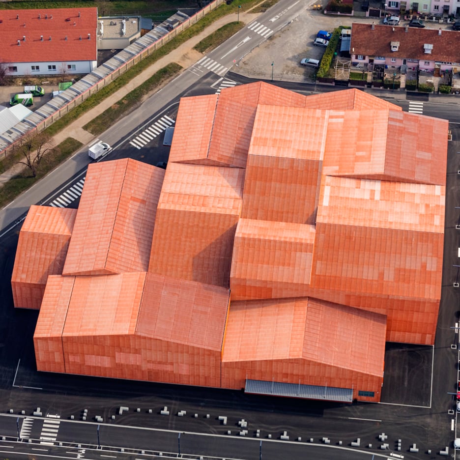
Manuelle Gautrand divides exhibition centre into 13 orange-hued blocks


Thirteen gabled blocks come together to form this orange-toned events building in Saint-Louis, a French town on the outskirts of Basel (+ slideshow). (more…)

http://ift.tt/1YstnY6

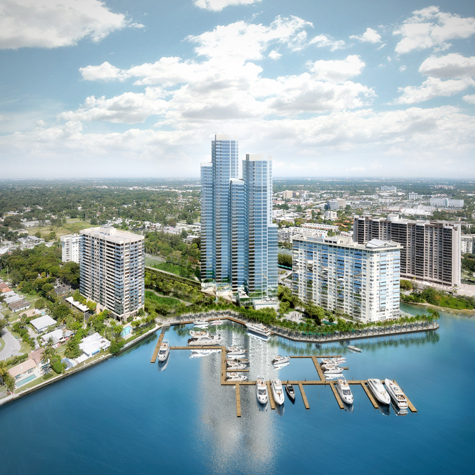
Rafael Moneo designs luxury condo towers for the Miami waterfront


Rafael Moneo, the 1996 Pritzker Prize winner, has been tapped to design his first Miami project: a pair of upscale residential towers intended to revitalise the once-famous Jockey Club. (more…)

http://ift.tt/20zHpJ5

IRO / Reiichi Ikeda Design


© Yoshiro Masuda

© Yoshiro Masuda
  • Interiors Designers: Reiichi Ikeda Design
  • Location: 2-7-17-105, Minami-Horie, Nishi-ku, Osaka-city, Osaka, Japan 550-0015
  • Interior Designer : Reiichi Ikeda, Yuma Harada
  • Area: 59.4 sqm
  • Project Year: 2012
  • Photographs: Yoshiro Masuda


© Yoshiro Masuda


© Yoshiro Masuda


© Yoshiro Masuda


© Yoshiro Masuda


© Yoshiro Masuda

© Yoshiro Masuda

This is an interior design for a hair salon in Osaka, Japan. The interior design was by Reiichi Ikeda of reiichi ikeda design, and the graphic design including the logo design was by Yuma Harada of UMA/design farm.


© Yoshiro Masuda

© Yoshiro Masuda

The two companies shared the concept with each other, and comprehensively directed the hair salon together. Generally, a hair salon has a conventional traffic line of waiting, shampooing, cutting, and so on.


Plan

Plan

To specially add the uniqueness as a spice, I dotted with some visually standardized box-shaped objects such as furniture and a spot that have roles. The angle of the diagonal lines which constitute the facade and the interior visual effects follows the concept of the logo “IRO”.


© Yoshiro Masuda

© Yoshiro Masuda

“O” in the logo “IRO” is rotated 23.43 degrees to be parallel to the axis of the earth. Even though the Japanese word “IRO” means colors in English by ordinary, we considered it as what gives us the seasonal indications with the Sun instead of as being colorful. The light streaming through the diagonal lines and its shadows are shifted from season to season.


© Yoshiro Masuda

© Yoshiro Masuda

Additionally, the moire effect caused by the overlapping lines helps to bring out the visual movement in the design. 


© Yoshiro Masuda

© Yoshiro Masuda

http://ift.tt/1S8DG1N

Loft Szczecin Designs a Bright Private Residence in Poland

House in Gumieńce by Loft Szczecin (2)

House in Gumieńce is a private residence located in Szczecin, Poland. The home was designed by Loft Szczecin in 2015. House in Gumieńce by Loft Szczecin: “The project included interior design of a 100 year old house after its expansion and modernization. In addition, it required designing a fireplace and a staircase connecting the three levels. Most of the furniture (dining table, bureau, coffee table, sideboard, kitchen cabinets, bathroom cabinets)..

More…

ÉCAL students anticipate the future of familiar objects for Milan exhibition


Milan 2016: interaction design students at Swiss university ÉCAL have used connected technologies and virtual reality to imagine possible future versions of everyday objects such as a toaster, a broom and a book (+ movie). (more…)

http://ift.tt/1WqrpJ6

Rhyll House / Jarchitecture


© Shannon McGrath

© Shannon McGrath
  • Architects: Jarchitecture
  • Location: Rhyll VIC 3923, Australia
  • Architect In Charge: Jarchitecture
  • Design Team: Jason Gec, Jorja Gec
  • Area: 360.0 sqm
  • Project Year: 2015
  • Photographs: Shannon McGrath


© Shannon McGrath


© Shannon McGrath


© Shannon McGrath


© Shannon McGrath

  • Builder: Brent Casbolt Builders
  • Engineer: Meyer Consulting
  • Pool Contractor : PJ Pools
  • Site Area : 805m2

© Shannon McGrath

© Shannon McGrath

From the architect. The site is engrossed by nature and aspect, therefore the design competes by being bold, sharp and textural. This boldness and form is also an expression of the clients and their family expanding out of their current holiday house, a caravan.


© Shannon McGrath

© Shannon McGrath

A solid black box expands out of the ground from nothing into a duality of aspect and function, picking up more materials as it expands toward French Island and Western Port Bay. The top storey acts as a self-sufficient lookout for when it is in use by a single couple, while downstairs acts as a family extension, with focus placed on play around the pool, spa, barbeque deck and cinema. Upstairs is decadent in its finishes and complex plan while downstairs is laid out and finished more simplistically; there is a play off between warm rustic materials and contemporary decadence.


Ground Floor Plan

Ground Floor Plan

1F Plan

1F Plan

The design aims to be bunkered down and of the site, then grow, expand and lift from it. The views, planning setbacks, site orientation, prevailing winds and land fall all promoted an Easterly aspect; so we acted accordingly. We then went about making the most of the less than ideal solar orientation of the house by exposing the slab to the North, blocking the Westerly winds and sun, limiting openings to the South/street and controlling the morning sun.


© Shannon McGrath

© Shannon McGrath

The site specifics and clients brief presented a challenge for environmental design but we prevailed by including the following initiatives in the design.

  • Exposed slab to collect solar energy with 15-20% recycled fly ash
  • Highly durable decking material of recycled plastic and timber
  • Highly insulated and durable double-glazed UPVC windows
  • High grade timber cladding that will grey gracefully
  • Solar heated pool
  • Highly-insulated walls, floor and ceiling
  • Minimal southern and western glazing
  • Optimized cross ventilation

The design has a highly efficient layout and a more complex aesthetic than the inhabitants might have expected. In both ways the design breaks from their current conventions and provides a new way of being. The clients constantly say they can’t wait to get back to the house; what more could a designer want?


© Shannon McGrath

© Shannon McGrath

http://ift.tt/25Y7XHX