Architecture
Tokyo Pop Lab Honorable Mention Layers Boxes in a 3D Visualization of Pop Culture

Courtesy of Tomas Vlasak
The team of Peter Bus, Tomas Vlasak, Vaclav Petrus, and Petr Bouril has received an honorable mention for their proposal for the Tokyo Pop Lab Competition, which recently announced its winners. The proposal, entitled “At The Crossroads of Ideas,” is designed as a “three-dimensional representation of history and development of pop culture.”
Separated into three parts, one below ground, one above ground, and one in-between, the design is interconnected via cylindrical concrete towers, which act as the main structural support of the building.
Courtesy of Tomas Vlasak
In the aboveground section, clusters of boxes are fixed in space by superstructure lattices of steel beams, each representing an individual category of pop culture.
Courtesy of Tomas Vlasak
The intermediate space—the parterre—is a natural extension of the public space around the building, with a single large space connected by two atriums that connect to the underground. This level furthermore hosts a lobby, cafeteria, and library with a reading room.
Courtesy of Tomas Vlasak
Courtesy of Tomas Vlasak
“The underground contains regularly spaced two-story boxes with educational and technical spaces of various heights,” with a main connection axis sharing the passage between the two atriums. Along this axis are main lounges, conference rooms, and an open design studio, with service rooms, offices and storage space to the sides.
Courtesy of Tomas Vlasak
Vertically, the building is more porous and more transparent than a traditional house: for example, floors aboveground are replaced by a system of walkways and perforated surfaces.
Learn more about the project here.
News via Tomas Vlasak.
Grimshaw and MDT-tex Unveil New Tessellating Canopy System in Frankfurt

© Becker Lacour
Grimshaw and MDT-tex have launched a tessellating canopy system at the Frankfurt Light + Building design festival and trade fair. The Tensilation Type EV canopy system is the result of a partnership that aimed to develop a product that not only offers the flexibility of modular canopy systems, but also has the engineering advantages of a unified structure.
© Becker Lacour
Each canopy unit is structurally connected to its neighboring pieces via a watertight capping, with drainage taking place at a series of central supporting columns. A single unit stands at nearly four meters tall, and weighs under 30 kilograms, making Tensilation one of the lightest structures in its class. Through the utilization of tensile design and lightweight fabrics and cables, the product requires no special lifting equipment and can be erected by only three people.
© Becker Lacour
“Tensilation’s overall form is comprised of tessellating diamond and square-shaped canopies that fit together in a variety of configurations, while creating an elegant overall impression,” states a press release. “The flexibility in its shape means the canopy system can be used independently, or annexed to buildings or marquees to deal quickly with changes in crowd size, seamlessly connecting fixed and temporary spaces. Its vaulted form provides an expressive structure designed for events and pop-up spaces, as demonstrated at Light + Building.”
© Becker Lacour
© Becker Lacour
Learn more about the project, or purchase here.
News via Grimshaw Architects.
Build Inc Architects adds brass “veins” to Munich bar interior

A path of narrow brass lines leads visitors around the different areas of this restaurant in Munich, which is set inside an important Modernist building. (more…)
Santa Croce Goes To Japan / Boselli Arredamenti

© Alessandra Bello
- Architects: Boselli Arredamenti
- Location: Santa Croce TS, Italy
- Architect In Charge: Archt. Maximum Orio Boselli
- Area: 120.0 sqm
- Project Year: 2015
- Photographs: Alessandra Bello
- Project Of Structure, Installations And Supervision Of Works: Eng. Stefano Debiasi, Surveyor Roberto Daneu
- Electrical Equipment: Skerk Boris
- Company: Sandri Marco & Mitia, Duino Aurisina (TS)
- Customer: private customer
© Alessandra Bello
From the architect. In the small house, located in a village of the Karst region close to Trieste, practical sliding elements made in Dacron, appear in their lightness (at the same time items of furniture and lighting), concealing endless possibilities.
This project takes place in a small town in the Karst plateau, not far from Trieste, characterized by its narrow alleys stretching around the old dwellings, overlooking the Gulf of Trieste.
© Alessandra Bello
The will was that of avoiding the addition of an indoor staircase that of course it would have taken up too much room, so we have finally opted for connecting the different storeys, thanks to a tiny elevator and the staircase has been moved outside.
Thus, space has become wider by giving the possibility to create new dimensions.
Section
The space is empty, just few dynamic elements with a light design represent those anchorage points to “make the conquest” and reinvent continually the space of experience.
The total absence of furniture, substituted by lightweight sliding elements made in Dacron conceals endless possibilities, including the elevator.
© Alessandra Bello
The same area on the ground floor can become a place for cooking, listening to music, meeting; on the first floor, a bedroom and a reading or listening room, while the second floor is a study that can be converted into a guest room.
1st Floor Plan
The wall in Dacron becomes an item of furniture, lighting and steady change of the space and ideally it extends to the first floor creating a continuity clearly visible from outside.
© Alessandra Bello
This continuity is pointed out by a clear glass cutting, conceived to be walked, it is repeated on every loft corresponding to the main façade and it allows to have a visual image on all floors, by highlighting the height of the building and the continuity of the light cutting and sliding elements.
The fluid space winds the way, set completely free also thanks to the choice not to use any kind of close or door: this implies even more emphasis in the fluidity of every function.
© Alessandra Bello
The dialogue with outside is strong and any hour of the day or night priorities areas move outside and vice versa, depending on how you want to live the space; it happens through a wide glass window and glazing placed on a slight metal stand.
© Alessandra Bello
Thanks to some devices (complete closure of the front door on the ground floor and black sliding wall in Dacron on the first floor), the space can be lived in intimacy, but also it can be transformed by opening outwards, so becoming a place for meeting many people.
Prison Puzzle Winners Announced

1st Prize – (Proto) Prison by Alex Warr and Zach Walters. Image Courtesy of Combo Competitions
The winners of the latest Combo Competitions challenge, Prison Puzzle, have been announced. Based on the idea of utilizing architecture to reduce recidivism–the large number of criminals that relapse into crime and back behind bars–Prison Puzzle sought out proposals for the design of a medium-security prison with a capacity of 500 inmates. The design was to be sited in Arizona, in the United States, where the number of inmates per resident is high above the national average.
Each design had to include elemental components like cells, exercise yards, and visiting rooms, and participants were encouraged to explore “how architecture can help in shaping environments that influence behaviors.”
The jury included an ArchDaily staff member, James Taylor Foster.
The winners of the Prison Puzzle challenge are:
First Prize: (Proto) Prison / Alex Warr and Zachary Walters
Courtesy of Combo Competitions
Second Prize: To the Moon and Back Again / Lina Aakeroy, Wenzel Mielke, Elias Solberg, and Charlotte Hoaas
Courtesy of Combo Competitions
Third Prize: Borderless Prison / Emmanuelle Agustoni, Konstantinos Katsas, and Sergio Antonio Torres Escobar
Courtesy of Combo Competitions
Honorable Mention: Catharsis / Alzbeta Barancikova
Courtesy of Combo Competitions
Honorable Mention: Plug-in Prison / Michael MacFarlane and Adam Telfer
Courtesy of Combo Competitions
Learn more about each of the winning proposals here.
News via Combo Competitions.
RAAAF plans to hide Venice’s Giardini pavilions beneath a layer of fabric
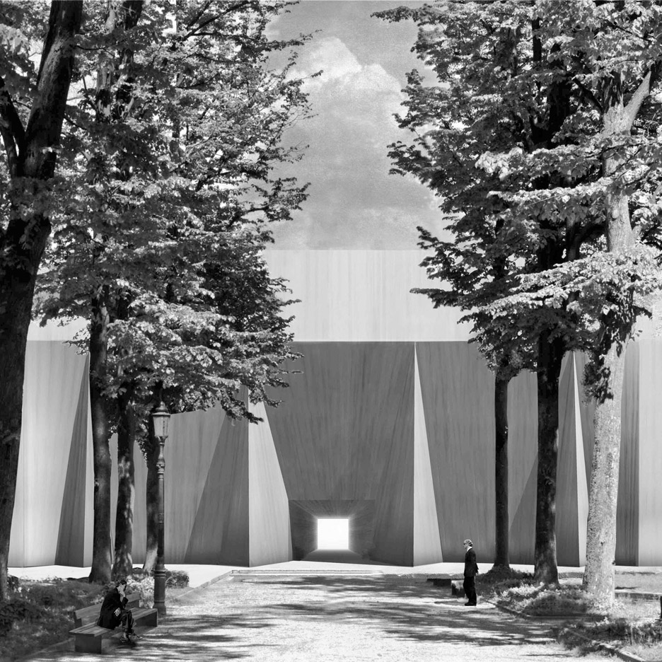
Pavilions that host exhibitions for the Venice Biennale are boarded up for six months every year, and Dutch studio RAAAF thinks a better solution would be to cover each one with a veil of fabric. (more…)
Lee Broom to showcase Optical lighting collection with “surreal roadshow” in Milan

Milan 2016: British designer Lee Broom will recreate part of an Italian palazzo inside a delivery van for a travelling installation to showcase his latest 90s-inspired lighting collection. (more…)
Triplex in Paris / Studio Pan

© Mariela Apollonio
- Architects: Studio Pan
- Location: Paris, France
- Principle Designer: Lilan Pan
- Area: 65.0 sqm
- Project Year: 2015
- Photographs: Mariela Apollonio
From the architect. Located on a side street the hip 11th district of Paris, the job site was a boutique of an abandoned beauty salon that occupied part of the lower levels of a late 19th century working-class apartment building. The original space consisted a 19m2 ground floor that has been connected with a 32m2 flat upstairs and a18m2 basement right below. We have further sacrificed the precious square meters for thermal and acoustical insulation. Especially for the basement, we’ve literally built a box in the box and installed mechanical ventilation to make it suitable for daily use. The demolition and insulation had left us 3 boxes on each level.
© Mariela Apollonio
The goal was to create a live-work pied-à-terre for a couple while they currently split their time between Paris and their home in the province besides their frequent travels to other places. Ideally, the place can also pay for itself by renting out a part to travelers. The fact of having three levels was quite ideal for a division. We naturally decided to create two independent units: the flat on the first floor to be the rental unit and the rest to be the office & pied-à-terre for the owners. However, we have kept the connection between the two so that they can be reunited seamlessly and without effort into a generous (Parisian standard) triplex whenever needed.
© Mariela Apollonio
Lower Unit
The program is quite intense for a 34 m2 in total. 2 permanent workstations for the couple and ideally a temporary one for a third person, a full service kitchen, a living-dinning area, a bathroom, a bedroom and ideally an extra bed for a friend, and also the staircase that allows to access the upper unit whenever needed.
A staircase in such a small space can be very dominant. We opted for the floating treads for an extremely light form and minimal visual impact. Usually not used, it becomes almost a sculpture in the background for the boutique. At the bottom, it is integrated into a banquette or daybed.
© Mariela Apollonio
A kitchen in a small office can be distracting. So we hid it in a closet to get it out of way when it’s not in use. A central island that built around the fridge, more kitchen cabinets and the A3 format printer can be used as a bar, part of the kitchen countertop or the third workstation by pulling out a hidden tabletop.
The working station facing the window has a screen goes up to the eyelevel of its user to provide the right amount of privacy but still allow the view towards outside. The station is also retreated 30cm from the window, which has not only created a buffer zone from the exterior, but also let the natural daylight reach the basement via the glass panel right under the station.
© Mariela Apollonio
The workstation is made up of 2 parts, a narrow fixed shelf that holds the computer and the objects in place while the table on wheel can be removed for other purpose, i.e. as the dining table.
In the evening, when the kitchen closet is open and the table moved in front of the banquette, the office becomes the dining room for 6-8 people.
© Mariela Apollonio
Upper Units
Without any charming architecture elements from the epoch, the only advantage of the space was the three French windows along its south façade, although they were separated by a partition. The demolition re-established the continuity of three windows. It had a beautiful rhythm so that we decided to duplicate the effect with a full height mirror on one end and made it a series of six windows. On the same elevation we’ve added another full height mirror by the entrance. The two mirrors has created a visual extension along each side of the flat, thus doubled its length and created a seemingly continuing space. In addition, we’ve chosen a mirror as the backsplash of the kitchen on the opposite wall to the windows, in a very subtle way doubled the depth to the space and created an illusion of openings on both side of the flat.
© Mariela Apollonio
Being rectangular space, the flat can be a project quite straight forward, yet when taking into consideration its connection with the lower unit, there are more variables in the equation.
Plan
When separated from downstairs for rental purpose, the projected occupants of the flat will be a couple or a family of three. The ideal program is to create a real bedroom for the couple, a reasonable sized living area with a comfortable full service kitchen, closet and storage for guests and the housekeeper, a bathroom with a large shower, and in the end, a sleeping alcove for the third person to ensure privacy for everyone. However, when the flat is reunited with the lower unit, it is also desired to have an open space that is big enough for parties or events. A movable partition made it possible to achieve the two contradictory programs. Its different position allows configuration of so many possibilities. The users can choose to have either a larger room or a larger dining area, or to have the bedroom disappear completely into a cube.
© Mariela Apollonio
Comic Break: “Annoying Revit Commands”

© Architexts
There is an ongoing battle between architects and our tools of the trade. Whether you use a 2D drafting program like AutoCAD, or a BIM program like Revit, you have experienced a full spectrum of frustration. Like many architectural firms, the office of Franklin + Newbury Architects, depicted in our webcomic Architexts, has been trying to transition to BIM for years, and that transition has translated into blood, sweat, tears, and expletives. Software woes and transitioning from 2D to BIM are just a couple of the many topics found in our body of comics.
Recently, we decided we wanted to collect stories and insights and write a book about the realities of architectural practice, titled Architects, LOL. Check out Architexts for information on submitting your stories and insights for this book.

