Architecture
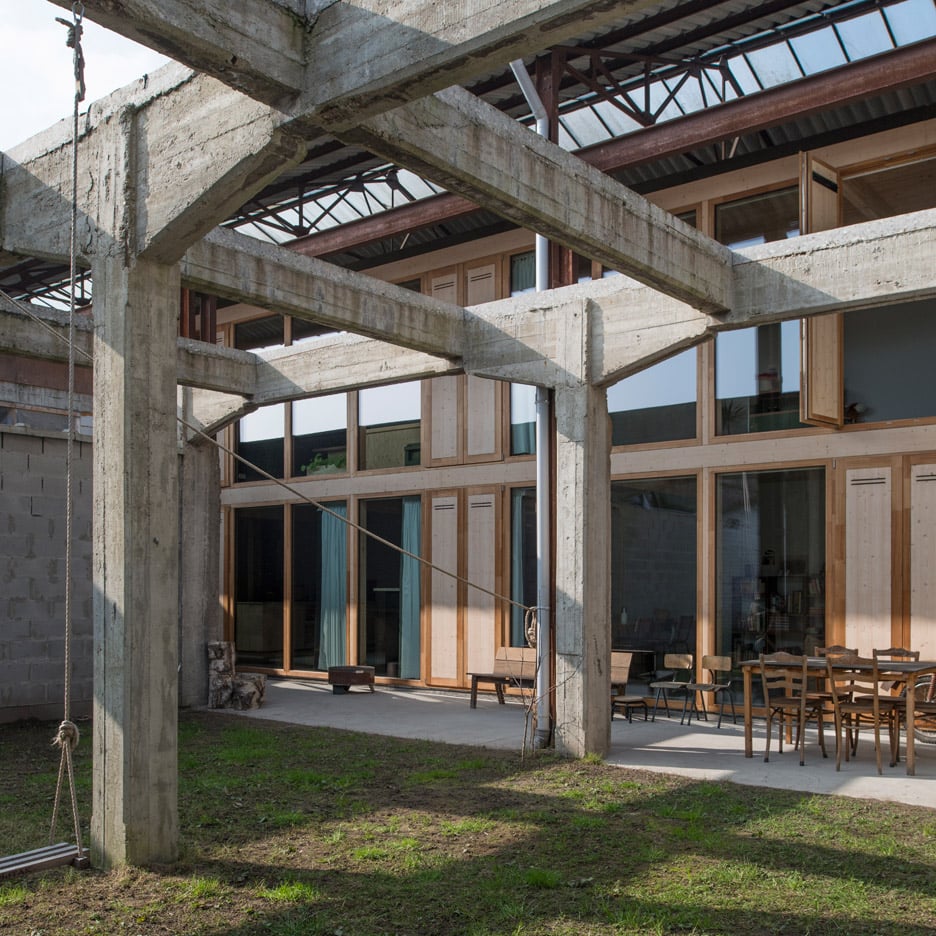
Art Gallery Aldama-Fabré / BABELstudio

© José Luís Revuelta
- Architects: BABELstudio
- Location: Bilbao, Biscay, Spain
- Architect In Charge: BABELstudio
- Area: 57.0 sqm
- Project Year: 2016
- Photographs: José Luís Revuelta
- Collaborators: Andrea Emmanuel Laredo
- Client: Private
© José Luís Revuelta
From the architect. Located in Bilbao’s upcoming neighbourhood La Vieja, the project for an art gallery focusing on works of local and international photography artists is situated in a former workshop, derelict for years.
Axonometric
The design was to great extend influenced by the clients request to preserve the ambience of the space’s architecture and it’s enclosing brick and stone walls, while obtaining a contemporary, flexible exhibition space. This set-up was accompanied by our intention as designers to avoid the conventional concept of the white cube.
© José Luís Revuelta
The project thus focuses on a respectful and in-detail restoration of the existing perimeters, providing the needed wall surface for the art pieces by a minimal architectural intervention: A series of wall-mounted wooden panels inserted between the structural elements create a second, neutral layer for the art to be shown.
© José Luís Revuelta
An additional movable wall panel increases the exhibition surface available and gives possibility to various layouts according to the particular requirements of each exhibition. The abstract appearance of the panels as a partially overlaid second skin contrast with it’s build environment, emphasizing the physical qualities of the restored brick walls.
© José Luís Revuelta
This week the world mourned the loss of Zaha Hadid

This week on Dezeen: architects including Rem Koolhaas, Norman Foster, Odile Decq, Daniel Libeskind and many more paid tribute to Zaha Hadid this week after the Pritzker Prize-winning architect died unexpectedly. (more…)
A Tiny Contemporary Apartment in Paris, France

Vicky is a project completed by Batiik Studio in 2015. The home is located in Paris, France. Photos by: Roberta Donatini
A Home For An Austrian Couple in Budapest

Strict Elegance is a private residence designed by Batlab Architects. The home is located in Budapest, Hungary, and covers an area of 549 square feet. Strict Elegance by Batlab Architects: “We were entrusted with the task to come up with a design for an Austrian couple’s apartment in Budapest. The plan and functionality were left almost completely untouched. The box-like sanitary zone is wedged in the social space forming an..
Gallery Fumi shows new work by Study O Portable and Glithero in Paris

London’s Gallery Fumi is showing a collection of pieces at the PAD Paris fair encompassing new work by designers and artists including Study O Portable, Glithero and Johannes Nagel (+ slideshow). (more…)
Nest / APOLLO Architects

© Masao Nishikawa
- Architects: APOLLO Architects
- Location: Nagoya, Aichi Prefecture, Japan
- Architect In Charge: Satoshi Kurosaki / APOLLO Architects & Associates
- Area: 43.45 sqm
- Project Year: 2015
- Photographs: Masao Nishikawa
- Structural Engineer : Nomura Structure (Nomura Motoi)
- Mechanical Engineer : Naoki Matsumoto
- Lighting Design: SIRIUS LIGHTING OFFICE
- Total Floor Area : 90.58m2
- Exterior Finish : autoclaved lightweight aerated concrete
- Floor : Oak Flooring
- Wall: Emulsion Paint
- Ceiling: Lauan
- Lighting : LED
- Principal Use : Private housing
© Masao Nishikawa
From the architect. This small house located within a commercial area near Nagoya station is built on a lot with 43 sqm in steel frame structure of three levels, while building area is less than just 33 sqm. The chic building exterior, covered with brown-colored louver and exterior wall with gray-colored spray paint, looks as if like a nest of a bird.
Section AA / BB
The 1st floor level consists of a garage space in a piloti style for a small car, the entrance to the house at the end of the approach, and a main bedroom, while the 2nd floor level is compactly provided with a children’s room and water section. The entire space of the main bedroom is treated as furniture to be conscious about the tightness of the space, thus a bed with storable mattress was provided along with a headboard equipped with indirect lighting system, creating a cozy and intimate atmosphere only available within such “tight” space.
© Masao Nishikawa
The children’s room on the 2nd floor level is intentionally kept as an open layout continuous to the staircase area, allowing to be used as a multi-purpose space for adding spatial flexibility to the entire house. Because of this house in such small configuration, it is necessary to provide a niche space beyond pure functionality. A cockpit-style kitchen is provided on the 3rd floor level for mother and daughters to enjoy cooking together in the future, while this kitchen is connected to a compact dining table to make the space as a central focus of the house. The finish of the built-in kitchen and the interior is consistent by the use of lauan plywood, creating a sense of unity within the small space and pleasant feeling from its fine details.
© Masao Nishikawa
Floor Plans
© Masao Nishikawa
The top light above the double-height living space provides ample daylight, creating an open atmosphere with the view to the sky. Louver of the balcony allows visibility from inside, while the sight from the outside is blocked to control the privacy level. This is the prototype of an urban residence, realizing the originality of the client by making the best use of the site conditions.
© Masao Nishikawa
Be Kids for One Moment / RIGIdesign

© Yue Ping
- Architects: RIGIdesign
- Location: Wuhan, Hubei, China
- Architect In Charge: Kai Liu
- Writer: Kai Liu
- Area: 450.0 sqm
- Project Year: 2015
- Photographs: Yue Ping
© Yue Ping
From the architect. It is necessary for designer to observe the lifestyle and needs of people and to sense the change of the trends. At the very beginning of kidsmoment project, RIGI did a number of researches of children fashion. Different from adult fashion, the fact is that the behavior of children clothes shopping is controlled by parents. From this point of view, it could say the children fashion business is built on a kind of social relationship. Designer thus developed a key word of this project, which is trust. The idea is delivering a clean, pure and joyful space, a trust atmosphere. By increasing the display efficiency and controlling the materials and color, create an attractive retail space with home feeling.
© Yue Ping
RIGI designed a member zone and kids experience zone strategically to increase the customers’ loyalty. The member could found children side-line products such as stationery in reasonable price. And lots of interesting details are added to several corners, a height mark on the wall, and a blackboard paint wall for children doodling. All of these design details are results of designers’ thinking, which is how to build the connection between the brand and the customers.
Diagram
The scale of fixture is tailored to fit both adults and children. Following the products’ category logic, several different spectacular space groups are formed by serial of modularized fixture. The fixtures themselves are becoming a part of the space. At the same time, all of the hard edges are chamfered to protect children.
© Yue Ping
Designer tried to understand the world from children’s perspective. A pure simple house shape is widely used on POP, fixtures and feature walls to suggest the concept of “home”. Because children are highly sensitive to number, the different single numbers are printed on several obvious places to enhance the spatial order of zoning. Material-wise, designer chose common stuffs such as felt, tile. The warm and gentle touch of timbers combining with naïve color, designer composed a fairytale space for children.
Diagram
In RIGI’s understanding, the visual elements are infectious. Illustrations are widely used in the space. A serial of simple signs are easy for children understand. Vision, fixtures and behaviors are well integrated with the space. RIGI delivered an innovative experience to both the brand and the public.
We all are kids at least for some time .
© Yue Ping
Cabañeros National Park Visitors Center and Interactive Museum / Álvaro Planchuelo

© Ricardo Santonja, Alberto Cubas
- Architect: Álvaro Planchuelo
- Location: 13110 Horcajo de los Montes, Cdad. Real, Spain
- Architect (Architecture, Museography And Equipment): Álvaro Planchuelo
- Collaborating Architect: Susana Sánchez-Izquierdo, Laura de Aurora, Luis de la Infanta
- Area: 4637.0 sqm
- Project Year: 2015
- Photography: Ricardo Santonja, Alberto Cubas
- Promoters: Organismo Autónomo Parques Nacionales (OAPN). Ministerio de Medio Ambiente y Medio Rural y Marino.
- Engineerings: Prosec S.L. (Estructuras), Reolid Consulting (Instalaciones)
- Collaboration Museography Project: Lunatus / Expociencia
- Constructor: DRAGADOS
© Ricardo Santonja, Alberto Cubas
From the architect. The Cabañeros National Park Visitors Center and Interactive Museum is a public architectonic intervention whose main objective is to promote ecotourism in the populations that forms the environment of the park, through information, exhibition, research and care of the main values of this natural space.
© Ricardo Santonja, Alberto Cubas
One of the main features of this Center is that architecture and museum exhibition are designed at a time from the beginning and by the same team, so that complement and content express the same idea. Both try to show the unique biodiversity that exists in Cabañeros. It is told in a rigorously scientific manner and in a divulgative way at the same time. It is a complement of the National Park, a gateway to knowledge and enjoyment for visitors.
Diagrama
Architecture
The main idea of implementation of the different volumes is resolved by a gradient of the process of humanization of landscape, from the access road to the Sierra del Gavilán on the horizon.
© Ricardo Santonja, Alberto Cubas
The design of structural and construction elements used are inspired by the forms of nature.
© Ricardo Santonja, Alberto Cubas
Volumes in the foreground represents the most humanized environment so that has been used load-bearing walls with white reinforced concrete, interpreting the typology of the traditional built environment, with a serie of white volumes linked by courtyards (patio–corral) forming a succession of full and empty spaces.
Elevation
The hall, the library and the cafeteria, form the entrance courtyard facade of the main building. Here the concrete walls are crowned with perimeter windows that make the slab of the sloping roof to “float” suggesting the shape of a bird of prey that is supported by isolated groups of inclined columns, inspired by the small woods of evergreen oaks that are scattered in grasslands (rañas) of the Park.
© Ricardo Santonja, Alberto Cubas
In the third level, the walls protruding from the half buried space containing the exposition, are covered with local stone. They look like a crag over the mountains. Its roof is flat and landscaped with native plants. During construction, special attention was taken not to damage the nearby vegetation, so the evergreen oaks close to the cover contribute to hide the architectural intervention blending it into the landscape
Diagrama
The last plane its conformed by olive groves, scrub bush and the imposing Sierra del Gavilan in the background, now in the National Park, frequently overflown by pairs of black vultures and other birds of prey.
Energy efficiency
The design gives priority to the protection of the building from solar radiation to avoid spending on air conditioning during the hot months, which is the element of increased consumption. The architectural measures of passive design, such as volumetric fractionation uses, orientation of buildings, subterranean land use as thermal insulation and the incorporation of natural light graduated in the exhibition, along with the use of electric heat pumps, are the measures which contribute to achieve high energy efficiency of the building without emitting polluting gases into the atmosphere.
© Ricardo Santonja, Alberto Cubas
Park biodiversity is shown in a direct way, without author interpretations, using scientific knowledge, ethology (animal behavior) and biogeographic (species distribution in the territory) of a deep and rigorous manner. It has been used technology of digital photo reproduction, representing all the wildlife park in photomontages scale 1:1, forming scenes of specific moments of nature in Cabañeros (seasons, equinoxes and solstices), illuminated with natural light overhead. These scenes inform the visitor “when”, “where” and “why” the major events of nature occur in the park, so that later is more likely to observe in the natural environment.
© Ricardo Santonja, Alberto Cubas
Permanent exhibition is resolved in the main building and shows the most significant values of the Park:
– Biogeographic values: distribution of species of wildlife and vegetation in relation to time and space, developed in the “Hall of Seasons”.
I
It includes:
Main Hall: Geology and fossils
Room Introduction: The formation of the seasons
Spring Equinox: Migration of birds
Spring in the grasslands
Summer Solstice: Storks
Summer in the Raña
Autumn Equinox: The rutting deer
Autumn in the mountain, the forest and the river
Winter Solstice: owls and bats
Winter in the water and mountains.
Summer Solstice: Storks
Summer in the Raña
Autumn Equinox: The rutting deer
Otoño en el monte, el bosque y el río
Autumn in the mountain, the forest and the river
Winter Solstice: owls and bats
Winter in the water and mountains.
– Landscape values: interpretation of landscape evolution, developed in the “Biorama Room” by an audiovisual multiscreen that explains the formation of the landscape seen from a large window inside the room.
© Ricardo Santonja, Alberto Cubas
– Ethnographical values: traditional production systems of the evergreen oak and the cork oak, developed in the “Quintería” by audiovisual and interactive ways.
Casa Veintiuno / Hernández Silva Arquitectos

© Carlos Díaz Corona
- Architects: Hernández Silva Arquitectos
- Location: Guadalajara, JAL, Mexico
- Architect In Charge: Jorge Luis Hernández Silva
- Team: Alejandro Aponte Gómez, Roberto Peña Rodríguez
- Area: 531.0 sqm
- Project Year: 2012
- Photography: Carlos Díaz Corona
The house is located in a conventional land inside a gated community, west of Guadalajara’s metropolitan area. Is has a north orientation towards the street and south on the back, leaving a free area on the side facing west.
© Carlos Díaz Corona
The project begins at the idea of making a house with the minimum of walls to feel it completely transparent and open from the entry. We decided to make a big hole inside that takes back the old spanish patio, being the protagonist of the residence.
© Carlos Díaz Corona
The formal concept is based on a blind volume, the private part, and an open volume, which are interrelated through this large central void. The house appears as a white solid body in second level and an obscurer lower body. A Piacentina stone covered wall confines the house all the way through the north-south axis; it doesn’t touch the slab, thus the second level seems to float above the ground floor. A concrete body is secured to the front and borders, along with a wooden wall, the entrance vestibule. This wooden wall was rotated to vent the entry, make a garden in the vestibule and reduce circulation area inside while giving some chaos when coming into the house.
© Carlos Díaz Corona
The entry area is a generous foyer, the visitor is greeted by the great void that connects the three levels, a glass roof with a metal lattice was placed and opens mechanically to enjoy natural light inside. In this manner, we bring in a garden into the home.
© Carlos Díaz Corona
Vegetation is extremely protagonist, in this central area a punctual tree is located upon a pound and an indoor green wall runs along the boundary wall from the vestibule and finishes with a piece of glass and vinyl made by the artist Jorge Méndez Blake to give continuity to the vegetation in a more conceptual way.
© Carlos Díaz Corona
Plan
The house was developed contained only by the side walls and in the center lies a concrete volume to separate the kitchen and the family room from other spaces but at the same time it gives service to the dining-living and terrace area. The kitchen doors can be opened to create a small deck that ends in a Thunbergias wall. With the same idea of transparency, the residence is designed as an open space, the terrace integrates with the living. The glass doors slide and hide behind a concrete wall that fold and shapes the fireplace.
© Carlos Díaz Corona
The inner patio also contains the only vertical circulation, a ladder that is conceived in a very subtle way, it seems to float in the center of the vacuum with a central beam and glass railing. The metal planter forms the pound and merges with the piece of art and basement walls; the idea is that the few elements, weaves and ties up horizontally and vertically along the house.
Section
The garage entry is through the basement. The circulation area in this level was painted gray to manifest the duality between light and dark; when going up the ladder the dichotomy is emphasized discovering light and directs the view to the green areas. In the basement level, there is a large game room, containing a bar, pool table and a TV area for entertaining. It is a space designed for big gatherings without interfering with the home privacy. Also on this level, the service area and laundry are located unfolding towards a void.
© Carlos Díaz Corona
The bedrooms are placed on the second level; a single corridor links all the rooms to optimize the circulation areas, in the center there is a wooden wall that hides the linen closet. At the front there are two bedrooms with a common bathroom area but each has its own closet area. To the north, there is a bedroom with its own bathroom and wardrobe and the master bedroom, a generous space overlooking the garden. The dressing and closet areas surrounds the shower, tub, toilet and sink. The roof of this zone is higher to give the feeling of spaciousness and receive natural light from above.
© Carlos Díaz Corona
The house is made with few materials, concrete walls in some volumes, plastered walls, Piacentina stone and Cumarú wood in some coverings. The carpentry was made in parota with horizontal wood grains to produce a dramatic use of this extraordinary wood. The house wouldn’t have much furniture; therefore some elements were incorporated to the architecture, one of them being the sideboard, a high gloss white wooden body, whose modulation is related to the stone covering.
Plan
The ground floor windows are frameless to make the inside out communication much more transparent. The terrace deck unfolds and forms a bar in a very subtle way. The cover is a steel structure and lattice with glass on top, which allows having the doors open in rainy season while protecting the large terrace. At the back some trees were placed to finish the view while giving privacy to the house.
© Carlos Díaz Corona

