Duplex Penthouse is a private home located in Tel Aviv, Israel. The 1,722-square-foot home was designed by Toledano +Architects in 2015. Duplex Penthouse by Toledano +Architects: “This Duplex Penthouse apartment and its surrounding Roof terrace were completely renovated. The main challenge was to combine privacy between quiet parents and children areas and big spacious and modular living spaces that would encourage get togethers and would play with the powerful middle..
Frutt Family Lodge / Philip Loskant Architekt

© Ulrich Stockhaus
- Architects: Philip Loskant Architekt
- Location: 6068 Kerns, Switzerland
- Project Year: 2015
- Photographs: Ulrich Stockhaus
- Interior: Matthias Buser, Innenarchitekt, Zurich
- Execution: Architekturwerk AG, Sarnen
- Client: Frutt Resort AG, Melchsee-Frutt
© Ulrich Stockhaus
From the architect. The compound is situated just beside a lake, high up in the swiss mountains at an altitude of about 1900 meters above the sea. The small village of Melchsee-Frutt is the top station of a skiing area, in winter only accessible by a small cable car . The crystalline building cubes mark the edge between village and lake. Hotel and apartments face the rough landscape scenery and seem to become a part of it: four monumental rocks floating on a crystalline basement, just like mountains up on a mirroring lake. Recalling Bruno Taut’s expressionistic „Alpine Architektur“ from the 1920s, the buildings are a optimistic statement of how architecture and nature can become a „fantastic“ whole.
© Ulrich Stockhaus
The guest approaches the building from north, entering a welcoming courtyard. From this perspective, the four building volumes and their basement rim become sort of a crown, embracing the guest. From here on, the building does, what architecture is doing since millennia: protecting man against a wild and unexpectable nature –and from that save harbour, opening up ever new perspectives on that wild „outside“.
© Ulrich Stockhaus
In this sense, the glassy basement’s entry area, restaurant, bar and lounge are a „lodge“ at its best: offering all the commodities of a wooden, chalet like interior, they open up fantastic views on lake and mountains at the same time. Wherever interior and exterior meets, natural light is flooding the rooms. While reception, bar and lounge recall the free flowing shape and space of the exterior, the restaurant is boxing the space for the sake of commodity. In the evening hours, the lounge’s great fireplace is becoming the warm hart of the hotel – and the building basement itself becomes a warm glowing torch in the dark lonesome mountain wilderness.
Section
When the sun is gone, or on foggy and windy days, the SPA offers a different experience. Situated in the lower basement, it seems to be a strange and yet familiar world on its own. While the other public spaces have a more typical wooden chalet like interior, the wellness area recalls a natural experience: just like the outside shape of the building, the SPA’s interior seems to be a geometric interpretation of mountain caves. In fact, Melchsee-Frutt’s underworld embodies a gigantic cave system. Comparably, the SPA is a system of polygonal chambers, connected by short and narrow corridors. Starting with the intimate changing rooms, and varying on scale and light in the wooden sauna chambers, the space system finds it’s culminating in the cold bath: after a series of small, more dark rooms, the bath surprises with its large artificial top light, flooding the spacious „cave“ with a day bright light. Appendix of this experience is the hot bath and relaxing room, both opening panoramic views on the outer natural landscape.
© Ulrich Stockhaus
The up-floor hotel rooms are adept on family needs. The two-room family suites combine the commodity of a suite with a variety of sleeping possibilities for up to five people. Bay windows extend the rooms towards the outside and again open views on the landscape. Here, in the intimacy of the private rooms, the dualism of architecture and nature finds its peak: standing at the window, just wearing your pyjama, watching the sunrise over the snowy mountains. Civilization and wilderness, just divided by three thin layers of glass.
© Ulrich Stockhaus
Karim Rashid’s Bump smartphone charger “eliminates the knotty tangle of power cords”

New York designer Karim Rashid has unveiled a smartphone charging device that neatly stores a metre-long cable in a loop around its outside (+ slideshow). (more…)
A Home Surrounded by Dunes and Facing the Afternoon Sun in Amagansett

Amagansett Dunes is a residential project completed by Bates Masi Architects. It is located in Amagansett, New York, USA. Amagansett Dunes by Bates Masi Architects: “In a town famous for sprawling estates, the clients requested a house just large enough to accommodate their family, in a unique 1950’s development of modest cottages set among rolling dunes, a few hundred feet from the ocean. Local lore says that the dramatic landscape..
Centre For Contemporary Drawing / Nord Architecture And Exhibition

© Christoph Rokitta
- Architects: Nord Architecture And Exhibition
- Location: Berlin, Germany
- Area: 312.0 sqm
- Project Year: 2015
- Photographs: Christoph Rokitta
- Design Team: Fabian Wichers, Jan Liebe, Rebeca Juárez, Jutta Kliesch
- Units: 2 Galeries, 1 Drawing Archive, 1 Studio
- Building Costs: 450.000,- Euro Gross
© Christoph Rokitta
Founded by the art historian Jan Philipp Fruehsorge and two belgian art collectors the gallery ensemble explores the medium of drawing. It is the only institution in Germany which exclusively focuses on the presentation and promotion of this particular field. The new location sits on the ground floor of a prominent street corner in Berlin mitte.
Model 1
The strategy for the conversion of the derelict space has been bold and subtle at the same time in order to provide generous spaces with maximum exposure to the streetlife. By that the gallery functions as a significant platform for the presentation of contemporary drawing.
© Christoph Rokitta
Scale
Even though this project was initially meant to be only an interior refurbishment it evolved to a more complex layering from urban to public and an almost domestic intimate scale. The sequence consists of exhibition spaces, the project space, an artist studio and the drawing archive. You enter them independently from the street but as a whole they are percieved as a series of showcases towards the city.
© Christoph Rokitta
© Christoph Rokitta
The juxtaposition of the large openings and the deep and low thresholds between the exhibition rooms create a fine balance of exposure and intimacy. Once you are inside the exhibition space large timber panels open up towards the more private areas as living, sleeping, archive, office and other services. They act as a filter according to use and the level of privacy needed for the rooms behind. From there domestic openings provide light and allow access to a common patio.
Plan 1
Aperture
The large windows are the key element in the intervention. Their dimension stands out in the sequence along brunnenstrasse. The glazing sits flush with the facade. Some of the windows are stepped creating an entrance niche towards the street and a deep threshold towards the inside – either used for display or sitting.
© Christoph Rokitta
The amount of sky present in the gallery spaces is unique. Built in textile screens filter the direct sunlight if needed in order to create appropriate light conditions for drawings. Small panels open up sidewards to ensure natural ventilation and at the same time not disrupting the glass plane.
Model 2
Surface
The gallery has a clear perceptible physical character. Three materials are used for all the internal surfaces. The floor consists of a special concrete mix based on gravel from berlin which is carefully sanded to expose the fine aggregate. The floorheating and all electrical outlets are embedded in the terrazzo like surface. Several wooden elements as panels, built in shelves and furniture are made of european maple treated with a white pigmented oil since the client uses the same timber for his picture frames. A colorless off-white paint for walls and ceiling create a soft brightness to the exhibition spaces. For the external facade a light grey cement based rendering is applied similar to the color of the painted windows frames.
© Christoph Rokitta
Sustainability
According to the particular request of the client only eco friendly materials have been used. All exposed and unexposed wooden elements are eco certified and have a low grade of V.O.C. (volatile organic components). The insulating subfloor is made of foamed clay, all window frames and doors are treated with several layers of ecological stains and the paint applied throughout the interior walls is on a mineral base. The windows are triple glazed.
© Christoph Rokitta
Light
Linear T5 neon tubes are embedded in the ceiling and their alignment is always perpendicular to the street providing a homogeneous light when needed. The private spaces in contrast are lit punctually creating pools of light in a more atmospheric manner.
© Christoph Rokitta
Soyoo Joyful Growth Center / Crossboundaries

© Yang Chao Ying
- Architects: Crossboundaries
- Location: Zhengzhou, Henan, China
- Partners In Charge: Binke Lenhardt, DONG Hao
- Area: 28200.0 sqm
- Project Year: 2015
- Photographs: Yang Chao Ying
- Team: Tracey Loontjens, LI Zhenyu – Earlier Stage: Cristina Portoles, Brecht Van Acker, Filip Galuszka, Diego Caro
- Client: Soyoo Castle Enterprise Management Co., Ltd
From the architect. Since 2002, the overpopulated city of Zhengzhou has been developing its new financial center, Zhengdong New Area, within China’s Central Plains Economic Region. The area, once dubbed by international media as one of China’s largest “ghost districts”, is where Crossboundaries’ latest completed project – Soyoo Joyful Growth Center, is situated. The building is part of a triumvirate of desolate round buildings, never used since it was built as a business center 10 years ago.
© Yang Chao Ying
More Than a Building to Design, but a Vision to Lead
Practicing architecture in China is never just about the building. The practitioners can, if they are willing, be the architect’s second definition in the Oxford Dictionary: A person who is responsible for inventing or realizing a particular idea or project. At the beginning of Soyoo’s commission, a vision was put forward to “make a difference in Chinese education”. The conversation between Soyoo and Crossboundaries became a living brief defining what difference to make, starting from its pedagogic philosophy.
© Yang Chao Ying
Through extensive research on education conducted by Crossboundaries, Soyoo embraced a holistic approach to education. It does not limit intellectual development through academic instruction. Instead, it actively cultivates each child’s distinct character and interest, as well as develops its healthy relationship with the people and knowledge of the world.
© Yang Chao Ying
The response Crossboundaries provided is a program based on role-playing. Children are free to explore what they should learn in order to become whoever they want to be on a particular day. Amidst the rising trend of learning through play, this novel and holistic program positions Soyoo as the leader in the booming market for children’s recreational facilities. While regulations for conventional educational facilities were well in place both internationally and in China, placing this program in a large existing structure required a new spatial typology.
© Yang Chao Ying
Translating Holistic Education to a Spatial Textbook
From several entrances, children enter Soyoo into an open lobby on the ground floor with play frames and children’s retail stores. At the center of it, light shines through the sky light, eyes could be led through the fan-shaped swimming pool area.
The main program on the second floor, consists of spaces for reading, art, music, dance, geography, etc. They flow from one space to the next without barriers, suggesting knowledge is, rather than segmented, interconnected. This open plan layout encourages interaction between children and allows them to experience different subjects in a broader context. This program of the building extends to the third and fourth floor’s outside space. On the third floor are more learning areas, a planetarium and a green house, as well as a Soyoo operated Kindergarten. While the fourth floor, the roof, provides a running track and playgrounds.
© Yang Chao Ying
In addition to the existing vertical circulation within the building, Crossboundaries provides children with additional pathways. Five tubes of different colors cut through the building in different angles, deliberately breaking the rigidness of the floor plates. Similar to a subway system, these tubes intersect and lead children to different parts of the building.
A child begins in a color tube, allowing its interest to guide it through various fields of knowledge and explore their interconnections. The experience is never the same for any one child, depending on each visit, opening up a multitude of journeys in Soyoo, as well as in a universe of knowledge and social interactions. The spatial solution for Soyoo resonates international advisor Sir Ken Robinson’s philosophy on education. That it should be personalized and children should be exposed to an environment where they appreciate learning and discover passions.
© Yang Chao Ying
A Vital Contribution to the Residential Neighborhood
Required by the municipality, a percentage of the building’s original facade had to remain visible, to preserve its affinity to the other two buildings in the development. However, the original cladding of stone and aluminum did not reflect the building’s new function as a children facility. Its horizontality and large facade area added as much heaviness from outside as dullness inside.
Master Plan
These challenges resulted in Crossboundaries’ innovative yet effective solution – lightweight ropes spanning from the existing roof to the ground. Installed diagonally and of double layering, they diminish the original building’s rigidness and add richness without blocking any light. To provide ease for orientation, the ropes’ color follows the same color palette as indoor – a color wheel. People weave around between the old facade and new ropes facade, touching them as they vibrate with the wind.
© Yang Chao Ying
A large public space opens up to the road intersection, easily accessible from all sides of the site. Benches and planting are offered to provide a pleasant environment beyond the building. This plaza isn’t just given to children to play but also to the city dwellers, as a place to relax and gather.
Section 2
Soyoo invigorates the numerous peripheral residential compounds built over the years. Its intriguing educational program and public space attracts a flow of people and businesses, neighboring retail spaces opening soon after construction began. The building as a whole creates coherence and connections within the community, adding vitality to a long disengaged residential neighborhood.
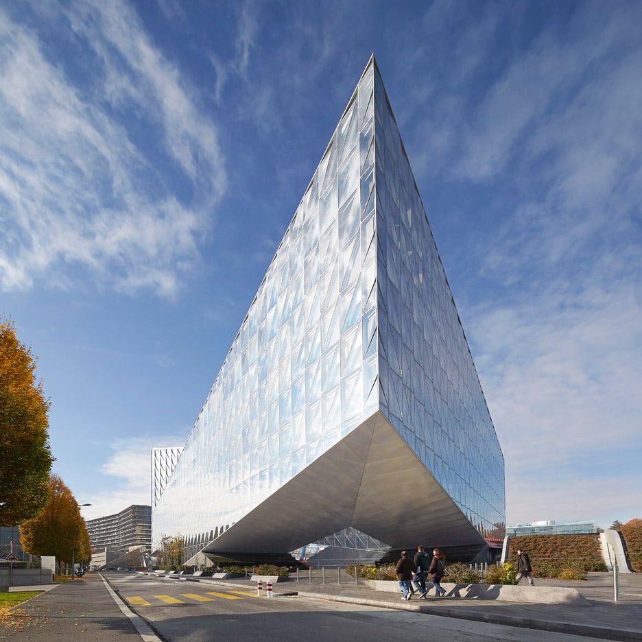
SOM builds new Geneva headquarters for Japan Tobacco International
The Ground Wall / FHHH friends +

© Kim Yong Kwan
- Architects: FHHH friends
- Location: Gimhae-si, Gyeongsangnam-do, South Korea
- Architect In Charge: Yoon Hanjin + Han Seung Jae + Han Yang Kyu, Kim Kook Hwa
- Area: 741.56 sqm
- Project Year: 2014
- Photographs: Kim Yong Kwan
- Construction: Yedam (jeong Woong Park+Byung Kwon Choi)
- Structure: RC
- Area: 741.56 sqm.
© Kim Yong Kwan
“We feel awe at strong power. Sometimes fear. Imagine a scene with a huge rock that is pressing down hard on the earth. In this scene, the rock is actually not you are seeing. Strictly speaking, what you are looking at is the “gravity” fighting hard against the earth.
The site is surrounded by the nature – the heavy nature. The scenery of the steep hills and basins overawe the site. Furthermore, one side of the site meets a straight expressway. Hundreds of trucks pass by the site all the time beating down the road noisily.
© Kim Yong Kwan
Some structures show off its power by standing heavily. And some structures adopt themselves by following circumferential power. As such, the structure makes the topography of the power by standing still. The ‘ground wall’ chose to show off its power rather than to adopt itself to its surroundings. We chose not to be daunted by the gaze of its surrounding nature; we intended the structure to be seen as rough and heavy as possible.
© Kim Yong Kwan
Every material has its own character by the name. For instance, the name ‘concrete’ contains characters that represent ‘hardness’, ‘roughness’ and ‘heaviness’. And the name of ‘steel’ contains characters that represent ‘coldness’ and ‘straightness’. The name of material contains countless days of human progress in construction. In other words, it can be said that the name of each material contains one’s power in it – its historical power.
© Kim Yong Kwan
The ‘power’ we intended to show in this structure is not only the shape of the building, but also the original way of construction using each material’s properties. Even in the case of a trifle part of structure, we tried not to betray the historic power of the name. We tried to find right ways to construct that respect each material’s property.
The power of architecture must not be shown through the shapes only. It must be felt through the reality of the materials and the efforts that were devoted to realization.”
© Kim Yong Kwan
The ground wall is consisted of four difference uses. – Café, Restaurant, residence, fermentation cellar. Passing by the fermentation cellar on ground floor and restaurant at 2nd floor we can meet café and residence at 3rd floor. Following private problems by complex uses could be solved by one massive core on behind of the building. Dividing and combining, the core conducts the building from public to private.
Section a-a
The characterful concrete blocks on the wall used to be mentioned as the most impressing point in this building. Not only for shape, that block was born by the special need of client- “wants to keep seeing in private room.” The blocks were designed possible for control quantity of lights by arrangement, and all blocks are made by everyday manual labor.
© Kim Yong Kwan
LA architects create imaginative cat houses for charity auction
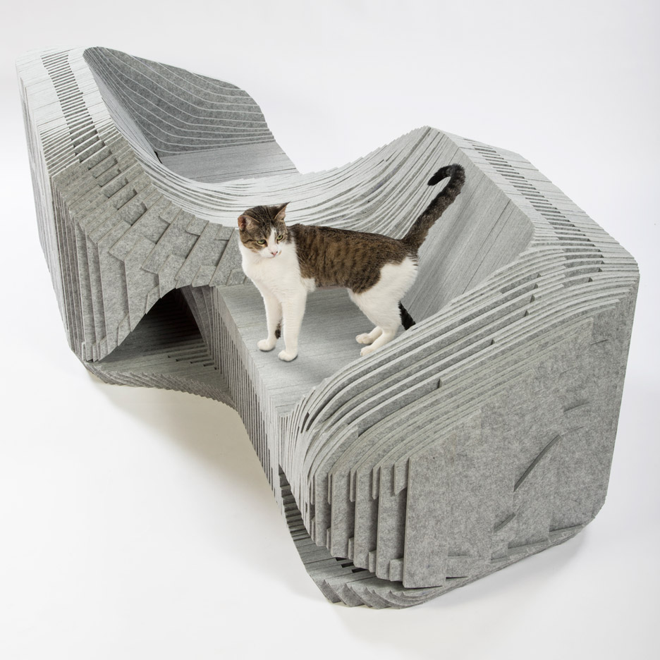
A sinuous enclosure that doubles as seating and a shelter inspired by the yin-yang symbol are among the cat houses by Los Angeles architects that were created to benefit an animal welfare organisation (+ slideshow). (more…)