
Apple Watch wearers can know take photos with a flick of the wrist, using the CMRA watch band. Read more
Apple Watch wearers can know take photos with a flick of the wrist, using the CMRA watch band. Read more
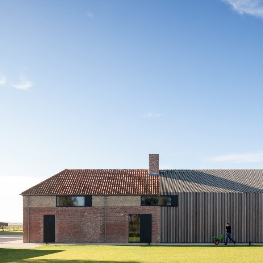
Govaert & Vanhoutte Architects has renovated and extended a former fort in West Flanders to create a home for an estate agent and his family. Read more
British automotive company Charge has unveiled its vision for the “future of electric trucks“, with an autonomous vehicle that can be assembled in four hours. Read more
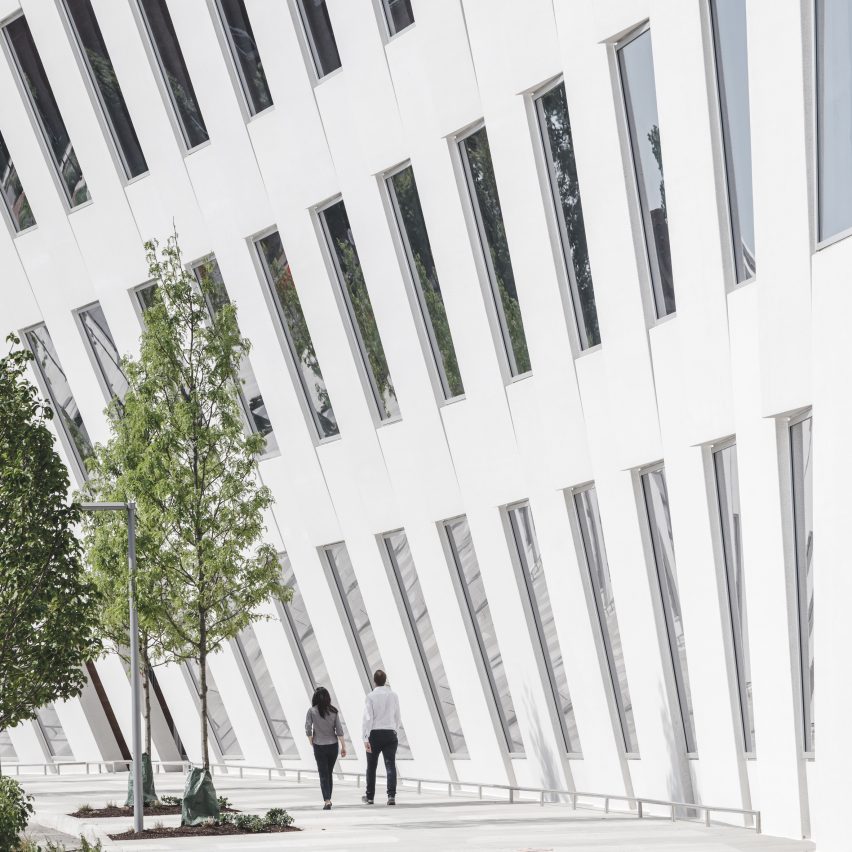
Bjarke Ingels Group has completed an office facility in the Philadelphia Navy Yard with a facade that curves like the bow of a ship. Read more
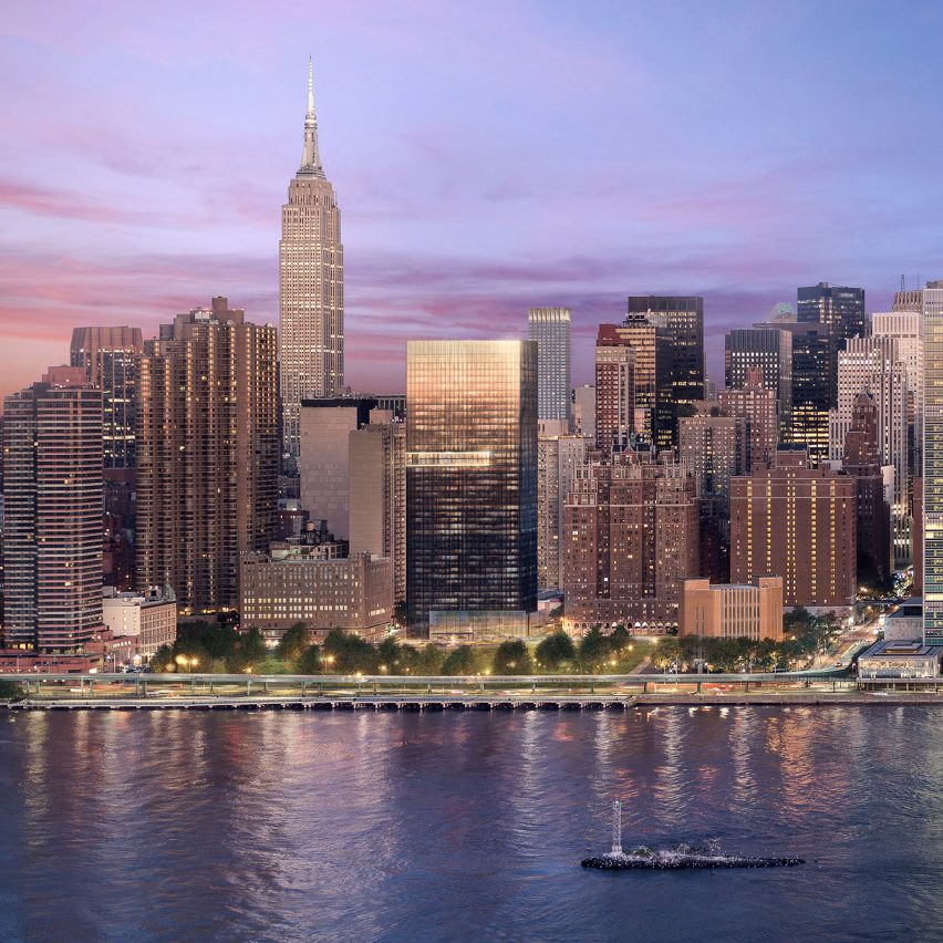
American architect Richard Meier has followed up teasers of a black tower planned for New York‘s East River with a wider set of images showing the firm’s interiors for the building. Read more

From the architect. One storey high private house is located in Koidu village, Estonia in a private housing area. The geometry of the building is inspired by the plot and the movement of the sunlight. The building is a shape-shifter offering different views from every angle and changing its form to catch as much warm southern and western sunlight as possible.
The main building was erected on the western side of the plot while the grill house stands on the east side inside a small hill and acts as an echo of the main building. Between these two volumes an inner rectangular courtyard is created with golden ratio proportions. The landscape protects the yard from the traffic noise and offers privacy.
Spacious living room, with a height up to 6 meters, is located on the western side of the building and opens into both south and west. The living room is tightly connected with the terrace outside. The shape of the patio is also created to follow the sun and open to the south and west. The main part of the terrace is covered with the edge of the roof protecting it from the rain. The wide overhang protects the living room from the sharp and hot summer sun. In the winter when the sun is lower, the light passes under the eave to warm the building. There is a chance that a neighbouring house will block the western sunlight in the future. To maintain the access of the valuable evening light into the living room, a special sun window was created higher from the eyelevel.
Main parts of the constructions are made out of stone and laminated wood. The facades are covered with painted larch wood. The natural tree sap in the wood protects the material and holds is appearance for decades without any artificial additives.
Product Description. The most important material in this project is wood, which is used in both structural design as well as on the façade. Wood is a renewable material and the production has a relatively small ecological footprint. Laminated wood used for the roof construction in this project is made out of local Estonian wood and produced by an Estonian company Arcwood.
The facades are covered with painted larch wood. The natural tree sap keeps the material weather proof and it can last for decades.
This project is also nominated for the best wooden structure award in Estonia this year.

Due to its ability to mold and create different shapes, concrete is one of architecture’s most popular materials. While one of its most common uses is as a humble foundation, its plasticity means that it is also used in almost all types of construction, from housing to museums, presenting a variety of details of work that deserves special attention.
Check out this collection of 40 projects that highlight the use of concrete. Impressive!

This article was originally published by Metropolis Magazine as “Q&A: Steven Holl.”
For twenty years, Maggie’s Centres have been providing cancer treatment to patients within thoughtful, beautiful spaces designed by renowned architects like Rem Koolhaas, Frank Gehry, and Zaha Hadid. Steven Holl‘s Maggie’s Center Barts, located adjacent to St. Bartholomew’s Hospital in central London, is slated to open at the end of this year. While the design has been somewhat controversial in the UK due to its contemporary nature, the cancer care facility incorporates innovative lighting, sustainable materials, and a compact structure in a way that is—according to the architect—entirely complementary to its historical neighbors. We spoke with the renowned architect to learn more about the project and what it has meant to him over the past four years.
Vanessa Quirk: What is your relationship to the city of London?
Steven Holl: I went to the Architecture Association in London, and lived there in 1976. Those were great days, when Zenghelis and Rem were running Unit 9. I was a critic there, in the graduate school. We discovered Zaha Hadid as a student. It was a wonderful year. There was amazing energy happening at the AA.
VQ: And that particular site, where the hospital is?
SH: I recall being there, and, of course, when we were given the commission, we did a lot of studies about that site. That square and the history of that place goes back hundreds and hundreds of years. It’s a very important area, in the heart of London.
VQ: Can you discuss the challenge of designing a vertical building that still maintains all the goals and aspirations of a successful healthcare building?
SH: Well, it had to be vertical, because of the constricted nature of the site, but that was an exciting challenge. It’s like a house, you know, and it has a sense of vertical space, a sense of movement up.
Looking at my first concept drawing from 12th of March, 2012, you see this idea of a thing within a thing within a thing: a glass case surrounding a concrete frame, inside of that, a kind of basket-like bamboo structure, which gives a kind of warmth, a kind of structure on the inside. The development of it really has a lot to do with that site. I was inspired by this ancient Gregorian chant notation, because right there is St. Bart’s, the church where that notation was used. That cathedral is that old.
We developed something for this project that’s never been done before, with a company in Germany, because I wanted these colored notations floating on the staff lines of the façade. We developed something really exciting, a UV safe film that’s layered between two layers of a material called Okalux, that carries the color. It’s like a micro-optical painting. It gets blurry at the edges. This is a super-economic, 21st-century stained glass experiment.
It’s not just a glass wall. If you look at Okalux, it’s like polar bear hair. It’s hollow, it’s in tubes. It’s wedged between two panes of glass; it creates an insulating boundary, and it allows light through.
VQ: There’s been a lot of research lately about lighting and health. Do you think there will be some impact with this kind of lighting on wellness?
SH: Absolutely. The whole building is carefully orchestrated in natural light; all of my buildings focus on this condition of natural light. I believe that is a very important, helpful aspect of making architecture in the 21st century.
As the day changes, and the light changes, there’s a real interest in the way this color wash can be thrown onto the interior in small ways, and always changing. I’ve always loved the feeling of the light that comes in the cathedral, where splashes of color come down on the floor, projected down.
There’s a train station in the middle of Helsinki that Eliel Saarinen made, with these subtle pieces of stained glass in the façade wall, and it throws these wonderful pools of color into the interior. Really something that gives a kind of special energy to the place. It changes the way we feel in space. It gives us an uplifting feeling. I’ve been in Rem Koolhaas’ Maggie’s Centre, and Zaha’s, and I think there’s a quality to the architecture that improves our psychological well-being, to be in these spaces.
What’s really interesting about this project is that it’s promoted by Charles Jencks. Now, if you remember, Charles Jencks wrote a book called “The Language of Postmodern Architecture” in 1977. In that book, he argues that modernism was all wrong. It can’t change the way we live, et cetera, et cetera. Look, they’re blowing up the Pruitt-Igoe housing. Architects should give up trying to change the way people live, et cetera, et cetera. Right? It’s a very cynical statement.
Now, with these Maggie’s Centres, he’s come 360 degrees. He and I both discussed this—architecture does change the way we live. It can be something that transforms our feelings, our emotions, our sensations, and our feelings of well-being, and that’s what these Maggie Centres are all about.
It’s 6,500 square feet. It’s not a big project, but it’s a very important project, because it says something, in the history of architecture. We went through this terrible period called postmodernism, which really, I think, was a waste of a lot of people’s focus. What’s really exciting is the dimension of architecture which is uplifting—that’s what’s exciting about working on these Maggie Centres.
VQ: When you’re designing a healthcare facility, do you think carefully about the healthiness of the materials?
SH: Absolutely. It doesn’t have to be a healthcare facility. Every piece of architecture that we make, we think carefully about. We just finished a house called Ex of IN House. Everything that’s in that house is considered carefully. There are no formaldehydes, there are no off-gassing materials. It’s all natural woods, without anything on them.
I think all buildings should be done with this care, not just in cancer care. They all should be done with extreme care. Certainly we should never use carcinogenic materials in our constructions, and I never do. I’m always working to be as green as possible. Like in the Ex of IN House, it’s all geothermally heated, with special thin film solar panels on the roof.
VQ: And the inner layer of perforated bamboo? Why that material?
SH: Because it’s ecologically sustainable. Bamboo grows overnight, and it’s more ecological than cutting trees down. I’ve been using bamboo in China a lot, and there we use it in our projects for the same purpose, to maximize sustainability.
VQ: To what extent do you think a contemporary design needs to be referential to its context?
SH: The Gibbs building is a very important historic building, and I think the real way to give it its due is not to ape it in any way. I think the last thing you would do is to make a stone extension, trying to imitate that beautiful stone—you can’t.
I think it’s a similar thing that we did at the Pratt Institute, where you have these two buildings, 1850 and 1864, flanking this new section. The idea is that the new section is unabashedly 21st century, but it pulls lines from the other two, as the floor plates are pulled through.
We developed the same complementary contrast with our addition at the Nelson Atkins Museum of Art, which opened in 2007. We saved the 1933 neoclassical stone museum façades all the way around, and added a connection below ground to our glass architecture in the landscape. That’s a super modern expression, but it’s the best way to save and complement that existing building. We won that competition because the other architects were going to build up against the building on the north wall. They all followed the competition brief, and we said, “Wait a minute, that’s not what you should do here. You should keep all the façades free.”
There’s a kind of plasticity of modern architecture that allows it to reveal and geometrically respect the historic architecture, while being something quite different.
Each project takes on a different series of challenges, but this one, I’m very excited about it. I think we achieve a lot in the little urban fragment of a postage stamp size that we’re allowed—a glowing lantern, if you will, in that constrained site.
It’s been a long process. It’s four years so far, but architecture takes time. And it’s there for a long time afterwards. I feel very fortunate to be able to make something in the great city of London. Even if it’s very small. I’d say that architecture doesn’t have to be large to be meaningful.

House PY is a private home located in Cuenca, Ecuador. It was designed by ModulARQ Arquitectura in 2016. Photos by: Juan Alberto Andrade

Aedas has unveiled plans for Gemdale Changshou Road, a new mixed-use project located within Shanghai’s urban city ring that will add 45,000 square meters (484,000 square feet) of terraced office and retail space within close proximity of a planned residential development.
Led by Aedas Hong Kong Director Andrew Bromberg, the design is nicknamed “Cloud on Terrace,” as it uses a series of green terraces as a visual and occupiable “bridge between the low-rise, residential developments to the south and Changshou Road to the north.”
At its base, the retail podium creates a streetwall along the property edge, gradually stepping away with vegetated terraces to meet the tower setback. Entrances to the retail areas are located at both ends of the building, facing the most highly-trafficked pedestrian junctions and linking to two nearby metro station entrances. According to Aedas, these design decisions will make the development highly accessible, providing a “missing ‘humanism’” to the neighborhood.
As the building rises, the terraces dissolve into the tower’s deliberately ambiguous form, articulated with soft corners and a rippling curtain wall façade to gently reflect its surroundings. The architects describe the visual impact as one that will “allow the tower to float above the green terraces of the retail below as a ‘cloud’ may sit on hill.”
Further contributing to its interaction with the street, the tower has been oriented to optimize views along Changshou Road, while below, a recessed ‘cave’ breaks down the mass to a human scale.
The building has also been designed for ideal light conditions: horizontal ribs around the tower act as sunshades and high-performance, low-e, low-iron glass has been specified for the curtain wall to reduce solar gain on the office floors. Natural landscaping on the podium balconies will also provide cooling and shading benefits to the naturally-ventilated environment.
Gemdale Changshou Road is expected to be completed in 2019.
News via Aedas.
