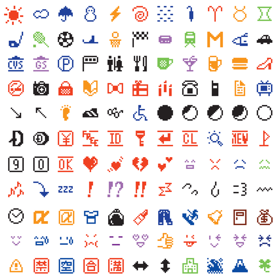
New York’s Museum of Modern Art has announced the addition of the original 176 emoji set to its collection of “humble masterpieces”. Read more
New York’s Museum of Modern Art has announced the addition of the original 176 emoji set to its collection of “humble masterpieces”. Read more

La Bruyère high school is composed of four buildings erected at different times. The school canteen was achieved in 1980 as an extension of the historical building constructed at the end of the nineteenth century. As the high school is built on a steep slope site, the canteen is half buried and enlightened only by zenithal openings.
The purpose of the operation is the kitchen’s upgrading, the creation of a second line of distribution to respond to an increase of requests and the refurbishment of the teachers and students’ refectory. The school restaurant takes place in a 70m long, 14m wide and 6m high volume divided into three parts : the kitchen East, the refectory West and in the center the distribution line, the laundry and access to garden by the roof terrace.
The main asset of the project is the realization of a mezzanine at the center of the volume: first it allows spreading the flows coming from the roof of the refectory on both lines of distribution and avoiding crossing flows out of the restaurant, while ensuring continuity between the kitchen and the canteen for the staff. Afterwards, the mezzanine provides an additional relaxing and meeting space, offering a stunning view on the refectory throughout large windows.
The project stands out for the implementation of two wooden parts, in birch precisely, defining the atmosphere and different spaces: on one hand, the balloon frame false ceiling that connects the refectory with the mezzanine and on another hand, the alcove which forms the teachers’ dining hall.
These two elements aim to qualify each space in a different way while providing a reading of the existing volume the widest and most generous way possible. This is why, the teachers’ dining room was designed as a cocoon within the students’ refectory, a cocoon formed by a two meter high furniture both visual barrier and seat. Meanwhile, the false ceiling is lowered as if it was drawn above the alcove, providing more privacy to this space and improving the acoustic features.
The game between the two components, ceiling and alcove, offers an alternative to the traditional partitioning by proposing a richer and more subtle relationship between the two refectories, redefining thereby the concepts of intimacy and communication.
The expression of raw materials – colorless varnished wood, polished concrete floor et galvanized railings, the care giver to their implementation as well as the visibility of the structure and of the technical bodies express the particular attention to the raw material, the one that was already there, the one used to build and which is too often hidden from public view. The ceiling is like a veil that shows what is going on behind the scenes.
Product Description. The principal material of this project is the birch plywood, used for the false ceiling and the alcove of the teacher’s refectory. The digital die-cutting of the birch plywood panels made it possible to achieve in an economic way the complex geometry of these two elements.

Apple has unveiled a new version of their professional-level portable computer, the MacBook Pro, making steps towards defining the laptop as a tool for those in the creative industries. With a full 500 days since these devices were last refreshed by the company, the standout feature of this latest incarnation is a new, application-specific Touch Bar – a touch-sensitive display band at the top of the keyboard which becomes an “intuitive” part of the user interface, which also includes a Touch ID fingerprint sensor. Oh – and there’s still a headphone jack!
The laptop’s display is now 67% brighter than its predecessor, with a 67% higher contrast ratio and 25% more visible colors. The computer is also 130% faster in rendering 3D graphics, and is able to be connected to multiple 5K displays making the device ideal for CAD, modeling, and high-quality video editing. But perhaps the most useful update for architects is the touchbar’s integration with many designer’s favorite tool: Adobe Photoshop.
The display and interactivity of the new Touch Bar adjusts to display only the controls needed for a particular task, such as using the Brush or Mask tools – and even provides a unique way to pick colors. You can also use it for simple tasks, such as resizing photos; “it’s a two-hand way of working. Hands and eyes work in concert,” a representative from Adobe said. According to Adobe, this new version of Photoshop will be in the hands of customers before the end of the year.

Kodak has rebranded for the first time in 10 years, ditching its typographic logo for a red and yellow version of the marque it used during the 1970s and 80s. Read more
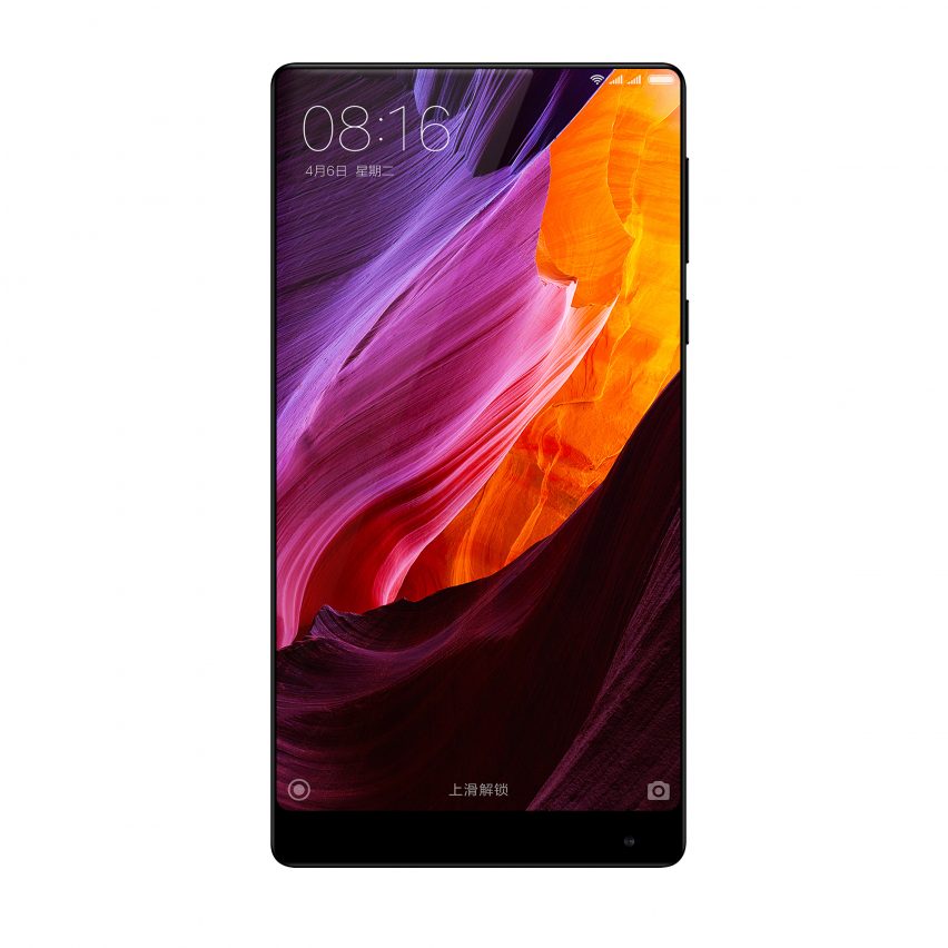
French designer Philippe Starck has designed his first smartphone: the Mi Mix for Chinese electronics company Xiaomi. Read more

An elderly mother decides to build two compact houses along with her daughter, upon her own recent state of widowhood, giving up the large-sized house in which the family used to live.
This project reflects on compactness. (This can be defined as the ratio between the usable space of buildings and the space occupied by the surface).
Typically the amount of square meters guarantees social position, the more square meters we built, the more socially accepted we were, she commented.
The passing of time is fast. Children migrate building new places and that home becomes a museum, dark and silent.
Fearing abandonment and especially oblivion, this proposal restates coexistence based on practicality but especially constituting a new concept of compact use of space.
Based on functional requirements and especially the qualification of space rather than quantifying square meters.
We define a load bearing structure in reinforced concrete (efficiency and low maintenance cost, as requested by the future user) that optimizes the occupation giving emphasis to the void.
An upper beam 25 meters long. 2 columns located in a 1 to 5 relation. A side wall.
This basic and combined structure builds 3 habitable blocks and 2 intermediate courtyards. Two overlapping houses 4 meters wide and 25 meters deep in a 12×30 meter plot.
The front block is suspended 7 meters, generating the garages on the ground floor. The central block (fully suspended) houses living room and kitchen. The rear block houses the suite of the mother, also catilevered. Upstairs the daughter’s dwelling, with 3 bedrooms en suite and private living room.
All the blocks have intermediate light and ventilation courtyards. A house that occupies a minimum area of land, giving the possibility to enjoy the garden. The exterior image results from the interior spatial search. Structural abstraction and dignity, rich spatiality, controlled lighting and human scale.

In the latest episode of what has become a dramatic narrative worthy of its own space opera, The Lucas Museum of Narrative Art has revealed plans for their two newest hopes: prospective museum designs, one in Los Angeles and one in San Francisco, that could serve as the new home of filmmaker George Lucas’ eclectic personal collection of artworks, costumes and artifacts.
After their failed proposal for a mountain-shaped museum along the Chicago Waterfront, the museum has again tapped architect Ma Yansong and his firm, MAD Architects, to design both proposals for the California sites, the first along the water on Treasure Island in San Francisco Bay, and the second for a site in Exposition Park in Los Angeles, adjacent to the city’s Natural History Museum and the Coliseum.
The two proposals feature similar specs (between 265,000 and 275,000 net square feet and 90,000 – 100,000 square feet of gallery space), and a similar fluid architectural language. As opposed to the soaring tent-like museum envisioned for Chicago, both designs are relatively low-lying and compact. Yet each reacts to its context in appropriately unique ways.
On the Treasure Island site, the museum has been placed along the water within a larger master plan for the island designed by Skidmore, Owings and Merrill. To combat the site’s blustery seawinds, MAD has chosen to move the majority of the public space inside, instead providing large, glazed surfaces that look out over the water and toward to San Francisco skyline.
Meanwhile, in Los Angeles, the bulk of the museum would be lifted above ground level, preserving a large percentage of the ground area for a brand-new park. The vegetated outdoor areas would continue onto the building roof, adding 6 to 7 acres of green space to a site currently occupied by a surface parking lot. To accommodate for the lost parking, an 1800-vehicle garage would be constructed under the museum.
Both proposals have already gained the support of their respective city’s mayors, but their support doesn’t make the museum a shoe-in for public acceptance; in Chicago, despite vocal endorsement from Mayor Rahm Emanuel, museum plans were still undone by the efforts of local activist groups.
The Lucas Museum is expected to decide upon a site by early 2018, after which they will continue to refine the design for realization.
News via Los Angeles Times, SFGate, Lucas Museum of Narrative Art.

Kodak’s new smartphone aimed at photographers features in this week’s issue of Dezeen Mail, along with BIG’s plans for a high-speed transportation system and a dinosaur egg museum in China. Subscribe to Dezeen Mail ›

From the architect. The Hochschule Ruhr West – University of Applied Sciences in Mülheim an der Ruhr, Germany, in short the HRW, is part of a nationwide development of new universities. With a total of eight buildings and about 62,000 m² of GFA, the university has the dimensions of an autonomous district: four institute buildings, a canteen, a lecture hall and a library as well as a multi-storey car park have been built on the former railway site in the Broich district. The HRW functions not only as a new educational institution, but also as an important component of the urban development concept for the entire university surroundings. For this reason, the various campus buildings reflect the heights and volumes of the surrounding development and the campus itself deliberately opens up towards the quarter and to the adjacent buildings.
The residential area and the infrastructure along Duisburger Strasse will be enlivened and enriched by events and uses of the new university. At the same time a number of different public spaces have been created on the campus that invite one to stop and sit for a while and that are also available to residents for recreational activities.
HPP / ASTOC’s design for the new college campus on Duisburger Strasse was the winner of a Europe-wide, 2-stage competition with a total of 15 participants.
Due to the technical orientation of the courses at the Mülheim location (Computer Science, Engineering, Mathematics, Science and Economics) special attention was paid to services and supply planning and the technology used thereby as well as the climatic impact of the overall development. The project was realised on the basis of a general planning contract; a total of 15 specialist engineering offices were involved.
The grand campus was opened with a speech from Hannelore Kraft, State Prime Minister of NRW and the Ruhr West University presented the work of its institutes and range of courses on offer.