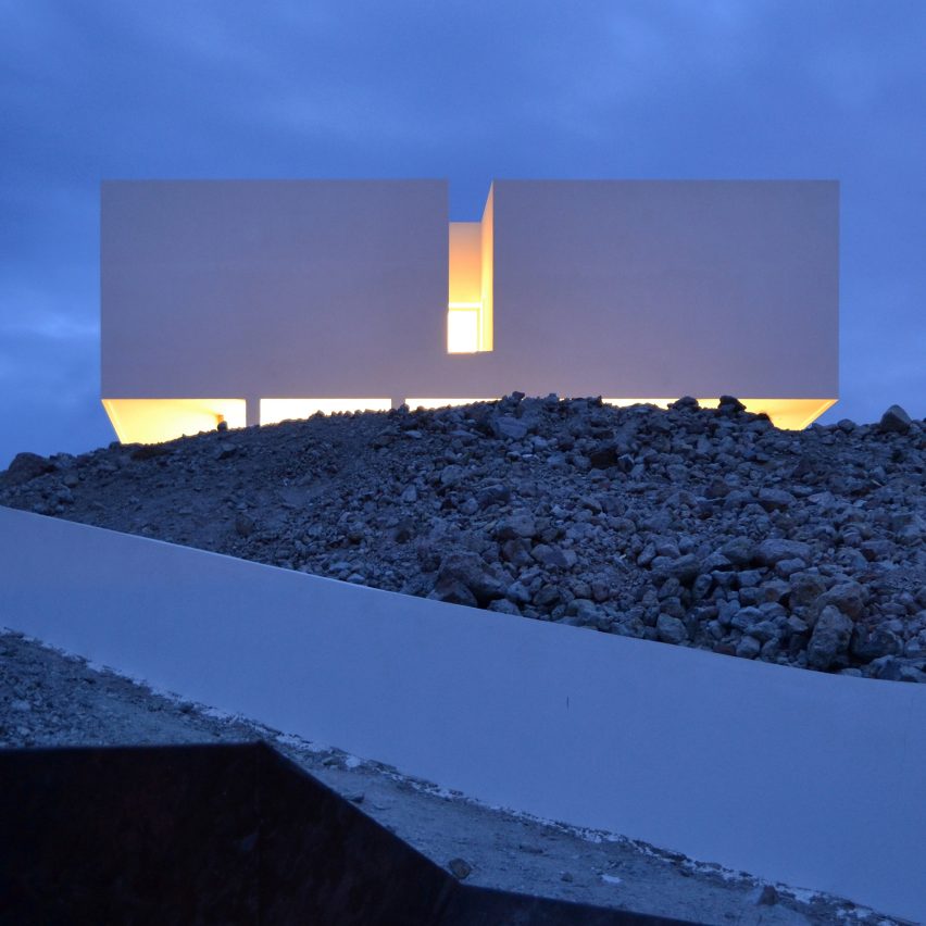
A bright white box containing the private areas of this house in Spain‘s Almería region rests on top of a glass-walled living space that provides uninterrupted views of the nearby Mediterranean Sea. Read more
A bright white box containing the private areas of this house in Spain‘s Almería region rests on top of a glass-walled living space that provides uninterrupted views of the nearby Mediterranean Sea. Read more

EID Architecture looks to the traditional side of Shanghai when designing CITIC Pacific‘s high-rise residential neighborhood. The Shanghai downtown area will see six new residential towers and amenities through the development.
Designs for the building encourage social interactions through its amenities, which include leisure facilities, a spa, meeting and conference spaces, and roof gardens overhead. Undulating terraces on the top of each building promote a sense of community in addition to responding to the site’s preservation of sunlight.
In vast contrast to neo-classical residential towers often seen in China, CITIC Pacific Residence aims to create a residential design sensible to the site and its context. It is unique and memorable, reflecting the ethos of evolving city of Shanghai, said EID design principal Ping Jiang, AIA.
In a beautiful combination of natural and artificial, the landscape design incorporates the “duality of Chinese architecture tradition.” The fluidity of the garden space mixes with the geometric structure of the residential buildings, resulting in a contemporary yet culturally inspired project.
Pacific Residence Phase II also comprises small retail buildings and a kindergarten along the main street. Renovated Shikumen – common land houses in Shanghai — served for the new retail buildings, while the design of the kindergarten borrowed from that vernacular.
EID is an architecture, urban planning, and interior design firm noted for its commitment to sustainability.
News Via: EID Architecture

Viger Square, Montreal‘s first large square, is getting a makeover. The redevelopment project is being led by landscape architects NIPPAYSAGE, which will begin the first phase of redesign in 2017.
Historically, the 30,000 square foot center has always contributed to the liveliness of the city, and it was the largest square in Canada in the 19th century. Now coinciding with the adjacent redevelopment of retail and office spaces at the Viger Hotel, the city hopes for a major revitalization of the area.
https://www.youtube.com/watch?v=SyYGtIWpRZQ
The square’s previous design and development reflected the planning ideologies of the time, including highway-like roadways surrounding the square, the separation of the blocks with concrete walls, a large number of compartmentalized spaces, a lack of openness, light and natural sightlines, and a shortage of programming and other efforts to encourage people to use the space. All of these factors inevitably contributed to the abandonment and eventual occupation of the square by a marginalized population, said Michel Langevin, a partner at NIPPAYSAGE, in the press release.
NIPPAYSAGE’s goals for the project include user-friendliness, inclusiveness, anchorage of the surrounding area, and a “commemorative element.” The eastern end of the square will feature basketball courts, a skateboard park, and numerous playground structures. Another section will feature a more traditional look with sprawling parks and large trees.
The landscape architects intended to showcase public art and lots of green. On Daudelin Block (nearby the square) a new cafe, currently under construction by Provencher_Roy architects, will also bring some energy to the area. Moreover, the square will also serve as a venue for concerts, festivals, and other types of performances.
In addition, the firm has managed to preserve 18 pergolas (minus their roofs) along with the Mastodon sculpture, which were all originally designed by Charles Daudelin. NIPPAYSAGE hopes for these to add to the composition of the overall park, integrating them into its new sustainable landscape.
Lighting for the square was designed by Lightemotion, who intended for the light to showcase certain works of art without overwhelming the vegetation.
NIPPAYSAGE was first recognized when it won a Canadian competition for the design of the Promenade Smith in Montreal.
News via: v2com
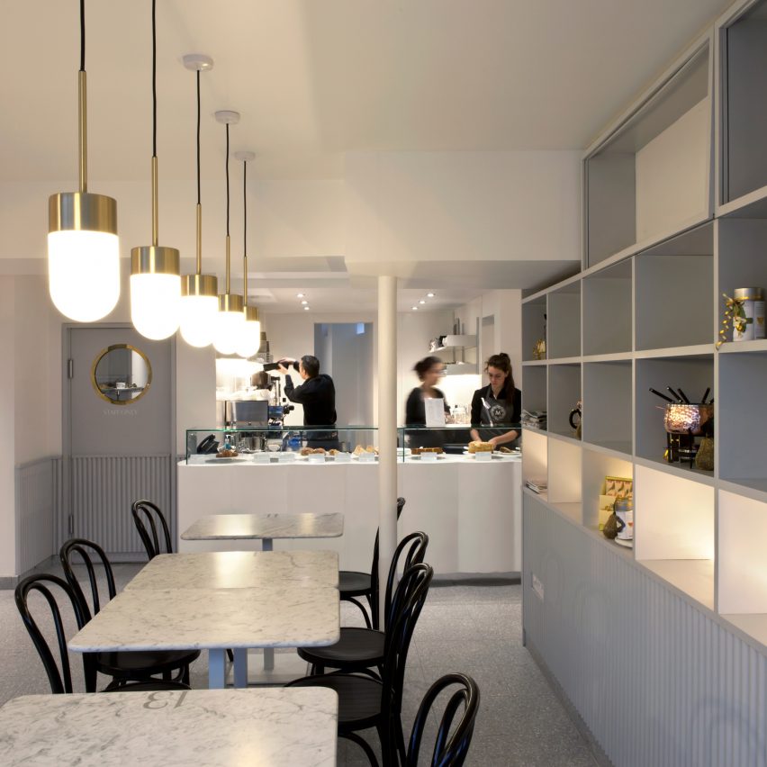
Architecture studio vPPR has borrowed architectural details from a historic department store in Surrey to design the interiors for Café M, which features a scalloped counter and pendant lighting. Read more

From the architect. The project equates itself around four fundamental conditions: the program for a banking institution – corporate and generic offices but with a socio-cultural area – with an inevitable intensive occupation of the available plot; the prime location in Largo Lumeji, with its strong public profile, one of the joints in the city’s urban expansion from the downtown; the near context, rapidly changing and unpredictable, with general verticalization and space closure; and the will to safeguard or even increase, a priori, the public space of the city.
In response, the project summarizes four key steps.
Within the plot size, one organizes a prismatic volume of 27 floors with a width of around 30 meters and a height of 110 meters above the ground, with five underground floors for parking. However, the office tower is lifted off the ground, resting on stilts, which three floors void, transparent and more articulated, organizes the socio-cultural areas (bank branch, auditorium and art gallery, supported by a cafeteria), expanding and qualifying the public space of Largo Lumeji. The tower rationalizes 18 floors of equipped open-space offices interrupted by 4 technical floors and topped by two floors for administration. Finally, the expression of the tower results from the programmatic contingency, striated floor to floor, with recessed glazed fronts and opaque cornices, protruding and undulating. Very elegant.
Day or night, even with the surrounding verticalization, the 1st Congress Tower gets strong aesthetic and urban autonomy, without disregarding the ethics of the public space. At distance, by its strong visual identity. By near, with its inherent constructive quality and, above all, the openness of inner and outer spaces of the ground floors, delivering space for the public use of citizens.

White Arkitekter A/S has revealed its plans for Arven fra Havet, or Legacy of the Sea, a World War II memorial to be built at the Mindelunden site in Ryvangen, Denmark. Arven fa Havet will honor the 2,000 Danish sailors and more than 800 Danes who died in merchant ships serving the Allies, and in Operation Overlord, respectively.
Currently, the Mindelunden site is a graveyard bound on one side with dense bushes and trees. With the new memorial, the site will be better framed by creating a symmetrical boundary, mimicking the proportions of the low tombs, but at a larger scale to represent the common grave of all sailors, the sea.
The walls of this silent monolith hover still above a pool of water. The profile and texture of the concrete exterior will patina, helping to embed the monument as a timeless addition to Mindelunden. Two axes cut through the enclosed space, one oriented North-South, an important direction for maritime navigation; the other directly connecting Copenhagen and Normandy, where many sailors lost their lives during ‘Operation Overlord’.
Inside the memorial, a narrow path restricts visitors. Beneath the surface of the pool lie other pathways, broken and shattered, which at times become accessible with the rise and fall of the water, like that of the tides. Engraved on each path are fragments of oral history: the voices of the sailors lost at sea.
Generally, the memorial will be a space of solitude, with the exception of one day of remembrance, when the water changes from a barrier element into an interface of connection. On this day, visitors are able to place flowers and candles on the surface of the water as a signal of respect, turning the space into a symbol of hope and confidence for the future.
News via White Arkitekter A/S.

When looking at a building, how good its internet is, is probably not one’s first thought. But for the tenants and companies inside it, it’s a key building service that they rely on daily.
As Arie Barendrecht explains, “it’s vital to tenants of buildings and critical to attracting and maintain new tenants – it’s a non-negotiable design component.”
Barendrecht is the co-founder and CEO of WiredScore, a company that ranks commercial buildings on their connectivity. Beginning in New York, the company has provided wired certification to over 300 buildings in the city, with further operations across several other US cities as well as London and Manchester in the UK. The company’s work is instrumental in showing architects how their designs need to prepare for the 21st century and acknowledging those that already do.
An interesting lesson from analysing connectivity across international cities is that the biggest variations aren’t found from city to city, but between buildings on the same street. While neighbouring buildings may appear physically similar on the outside, “under the hood,” they can be completely different. It’s this difficulty in gauging connective performance by the average tenant or broker that wired certification hopes to combat, by making internet infrastructure more transparent.
This transparency is perhaps a good reminder for architects that they also need to be paying attention. Even just looking at a floor plan reveals “a tonne” about the connectivity of a building. Large points of entry, considered space allocation and secure, air-conditioned telecom rooms are good to see.
Space allocation, in particular, is a critical factor. It’s not unusual for tenants wanting to upgrade their connectivity to discover they can’t, simply because there is no room for it. A common example of this seen by WiredScore is not having the floor space for wireless equipment like DAS or small cells. The space for wireless is simply not included in a lot of current building designs, but increasingly needed by tenants given the rise of the mobile workforce.
It’s also important for spaces to be flexible, not just for the potential to free up more floor area, but also to support the installation of new technologies regardless of what sort of wired or wireless infrastructure is required. This is especially relevant for new buildings where technological requirements can easily change between the time of planning and its completion.
When evaluating existing buildings, “about 25% of our evaluation is focused on the design and infrastructure of the building,” says Barendrecht. But for buildings that are still in development, design and infrastructure is the sole basis of evaluation. There are two umbrella concepts that rule good connectivity in building design – redundancy and resiliency.
Redundancy moves away from putting all your eggs in one basket, i.e. systems based on one central riser, which depend entirely on nothing going wrong. Nowadays, many companies depend on having connectivity 100% of the time, making this sole dependency especially risky. Instead, diverse conduit pathways provide an alternative backup if one side were to come under fire, flood, or other physical damage. This involves having at least two different internet providers running their cables vertically through, and horizontally out of different sides of the building.
Resiliency focuses on the protection of the equipment itself, such as placement above grade – a lesson many New Yorkers learnt following the flooding caused by Hurricane Sandy. It also covers allocating telecom in a way to prevent day to day damage, and the best-designed buildings for connectivity separate equipment from areas of the building where users could accidentally damage equipment.
Materiality also comes into play, especially their effect on wireless coverage. Energy-efficient glass, in particular, blocks external cellular networks from entering buildings. So for developers aiming for LEED certification, Arie suggests having wireless strategies in place to compensate for the typically worse cellular coverage caused by low-e glass. These strategies are likely to involve further infrastructure considerations, so it’s important these considerations come in early in the planning of a building.
In the years to come, he sees connectivity playing a larger role earlier on in the design process, something that is usually left as an afterthought. Part of the reason for this afterthought could be the physical size of connectivity equipment, which still remains less clunky and smaller than that of HVAC and plumbing.
By raising awareness, however, around the importance of connectivity through wired certification, he hopes that more will understand that “telecom isn’t something we should cut corners on”. Since the arguments for redundancy and resiliency also apply to other building services, increased thought into the integration of connectivity with other building service systems and the building itself, could perhaps come to shape a more holistic approach to everything that’s “under the hood” of a building.
WiredScore rankings range from ‘Certified’ through to ‘Platinum’, which are more widely digestible than riser dimensions and cable paths. This reflects the heart of wired certification, says Barendrecht, which is to translate “the smart technical design planning that an architect has done into a really easy language to understand”.

From the architect. An Office for Three Companies
How to use color and material to unify an increasing amount of junk in the contemporary office landscape? An office interior for three companies is structured by a neutral background of white walls, white exposed ceilings, and a poured black floor. Everything connected to the floor is black. Everything connected to the ceiling is white. The three companies, while different and to a certain degree independent, are unified through this common material framework.
Islands of colors and materials (stone, felt, wood, mirror, glass) punctuate the otherwise monochromatic workspace, creating activation and interest. The islands consist of tonal and visually related combinations of surface and furniture like couches, chairs, rugs, and custom furniture.
The organization of the plan provides a variety of different qualities and settings for both collaborative and focused work. The project combines the advantages of the open plan (flexibility, informality, interaction) with the advantages of enclosed and semi-enclosed spaces (definition, structure, and concentration). Rejecting the signifiers of the so-called contemporary creative office environment (ping-pong tables, sharing pods, juice bars, etc.), the project supports creativity through a balanced proportion of interaction and focus.
The showroom is populated with four rolling modules. The modules partition the space and accommodate product display and storage on the inside. An “X” configuration of the modules divides the showroom into four intimate meeting and presentation spaces. At the same time, the mirror finish maintains a feeling of expansiveness. Other plan positions of the modules allow larger and more contiguous configurations.