The Guild / RAW Architecture


© Eric Dinardi

© Eric Dinardi


© Eric Dinardi


© Eric Dinardi


© Eric Dinardi


© Eric Dinardi

  • Architects: RAW Architecture
  • Location: West Jakarta, West Jakarta City, Special Capital Region of Jakarta, Indonesia
  • Architect In Charge: Realrich Sjarief
  • Area: 250.0 sqm
  • Project Year: 2016
  • Photographs: Eric Dinardi
  • Project Team: Septrio Effendi, Miftahuddin Nurdayat, Rio Triwardana, Tatyana Kusumo, Jovita Lisyani Halim, Tirta Budiman, Rifandi S. Nugroho, Hendrick Tanuwidjaja, Bambang Priyono, Hawandi Wijaya
  • General Contractor: Singgih Suryanto
  • Supervisor In Charge : Sudjatmiko and Singgih Suryanto
  • Construction Manager: Eddy Bachtiar
  • Structure Engineer: Edy Sinergi
  • Master Carpenter : Syarifuddin Pudin
  • Mechanical And Electrical Engineer : Bambang Priyono, Andi, Karim and Hamim
  • Team Leader Plan And Illustration: Miftahuddin Nurdayat ,Tatyana Kusumo
  • Project Team Of Plan And Illustration : Fadiah Nurannisa, Teddie Gunawan Wijaya, Eunike Nathania, Sherika Permana, Laurencia Nathalia, RR Annisa Raras

© Eric Dinardi

© Eric Dinardi

Located at the corner of the Street at Villa Meruya residential precinct, The guild shows its introvert side with the solid and high border wall, the solid fence without a gap to peek. As if to withdraw from the noisy Jakarta city and build its own sanctuary, the guild is solid from the outside but open on the inside. 


© Eric Dinardi

© Eric Dinardi

© Eric Dinardi

© Eric Dinardi

The Building consists of one master bedroom, living room, studio a place to work , a library, one open courtyard and a kitchen. The entrance is introduced by concrete, steel, glass and polycarbonate sheet. The access from public and private is separated by open air corridor. The access to the House and the Studio are separated by 2 x 2 m foyer. 


Ground Floor Plan

Ground Floor Plan

The bedroom is located on the 1st floor while the other program is located on the ground floor. The circulation is interlocked to give ease access for the owner to access the studio below.  Living room and also the dining room with total area of 35 sqm located on ground floor, while the more private family rooms are located on the first floor and limited by the void of stairs to separate family area and the studio. 


© Eric Dinardi

© Eric Dinardi

Hot west – east tropical sunlight is blocked by placing solid wall and bathroom while the facade is open to the north-south orientation. Several pyramids shaped form is also introduced to allow sunlight coming to the middle of the building and allowing fresh air circulation through the small gaps in between glass and concrete.


© Eric Dinardi

© Eric Dinardi

The building system uses an automatic watering system that applies zero greywater runoff and zero storm water runoff. It means the whole water is collected to the retention basin with 8 m3 capacity and 2.75 x 3 m of catchment basin with 1,5 m of depth that also contribute the catchment to the neighbor.


Section

Section

The studio is consist of 6 x 6 m square shape, a small void. The small void has a tapered skylight made of concrete with several small gaps to provide light and air circulation. The library named Omah which is open at the weekend has  the size of 3,4 x 12,3 m. It is sunken at perimeter area, half below the height of 0:00 meters considering public access and the needs that require a condition to keep books from the sun and constant temperature with  the minimum possible to use the air conditioner. At the heart of the house  is a courtyard with a fish pond with a background of the 3.5 m radius circle window with 3.50 m looking through the family room. The Guild is one example of project which exercise the modification of form and program with interlocked circulation  in the tropical climate of Jakarta, Indonesia.


© Eric Dinardi

© Eric Dinardi

http://ift.tt/2dWyfUO

SAPOON SAPOON Café / Betwin Space Design


© Yong-joon Choi

© Yong-joon Choi


© Yong-joon Choi


© Yong-joon Choi


© Yong-joon Choi


© Yong-joon Choi

  • Architects: Betwin Space Design
  • Location: South Korea
  • Design Directors: Jung-gon Kim, Hwan-woo Oh
  • Design Team: Sun Kim, Hye-jin Yang, Su-in Lee, Dae-hyun Lee
  • Client : KGC
  • Area: 220.9 sqm
  • Project Year: 2016
  • Photographs: Yong-joon Choi

© Yong-joon Choi

© Yong-joon Choi

“Two years for gathering energy of the earth with the sounds of water, wind and human footstep, and six years for looking after ginseng. Six-year-old Red Ginseng nourished by the devotion of KGC (Korea Ginseng Corporation) for eight years. ”Opened on the first floor of KT&G (Korea Tobacco & Ginseng Corporation) Tower last August, Café Sapoon Sapoon expresses the advertising copy of Cheong-Kwan-Jang implicatively. Sapoon Sapoon is a compound word of Saponin, main ingredient of red ginseng, and Spoon, a tool to deliver taste and nutriment of food. As Sapoon also means ‘a figure of light and careful step’ and ‘light and refreshing state of body and mind’ in pure Korean word, people can feel refreshing scenery with light beverage. 


© Yong-joon Choi

© Yong-joon Choi

Sapoon Sapoon is a casual space created by KGC in order to be free from the perception, ‘Red ginseng is nothing but health functional food’, while keeping credibility of company and its quality-first spirit. Betwin Space Design grafted traditional ideology of Cheong-Kwan-Jang on this café modernly. They applied two elements, ‘Nature’ and ‘Lab’ to the space for delivering the products produced obstinately for a long time to young customers intimately. They obtained the motif from the scenery of ginseng field. All the natural elements composing the field such as wooden structure for screening sunlight, shading curtain, wind, and hilly spot become design elements of Sapoon Sapoon. Sculpture on the ceiling which overwhelms the space secretly symbolizes the wooden structure to control the quantity of sunlight. Fabric which surrounds the repetitive sculptures is a metaphor of shading curtain, which penetrates the light while fluttering naturally in the wind. And they created various shapes of seats, reflecting customers’ extensive needs for seat. 


© Yong-joon Choi

© Yong-joon Choi

Floor Plan

Floor Plan

© Yong-joon Choi

© Yong-joon Choi

It also applied the element of ‘earth’ through the design method to put wood on concrete or to compose diverse levels. Outdoor terrace has chairs and backs formed only by level difference, which is extended to inside organically. Along table in the middle expresses the feeling of earth only with the matter property of concrete, and plants are placed on it here and there. Lower part of front bar patternizes the figure of spreading ginseng roots in three dimensions, a sculpture behind the bar displays professionalism and credibility with piping equipment for Cold Brew and materials reminding of laboratory.


© Yong-joon Choi

© Yong-joon Choi

http://ift.tt/2ef6qKn

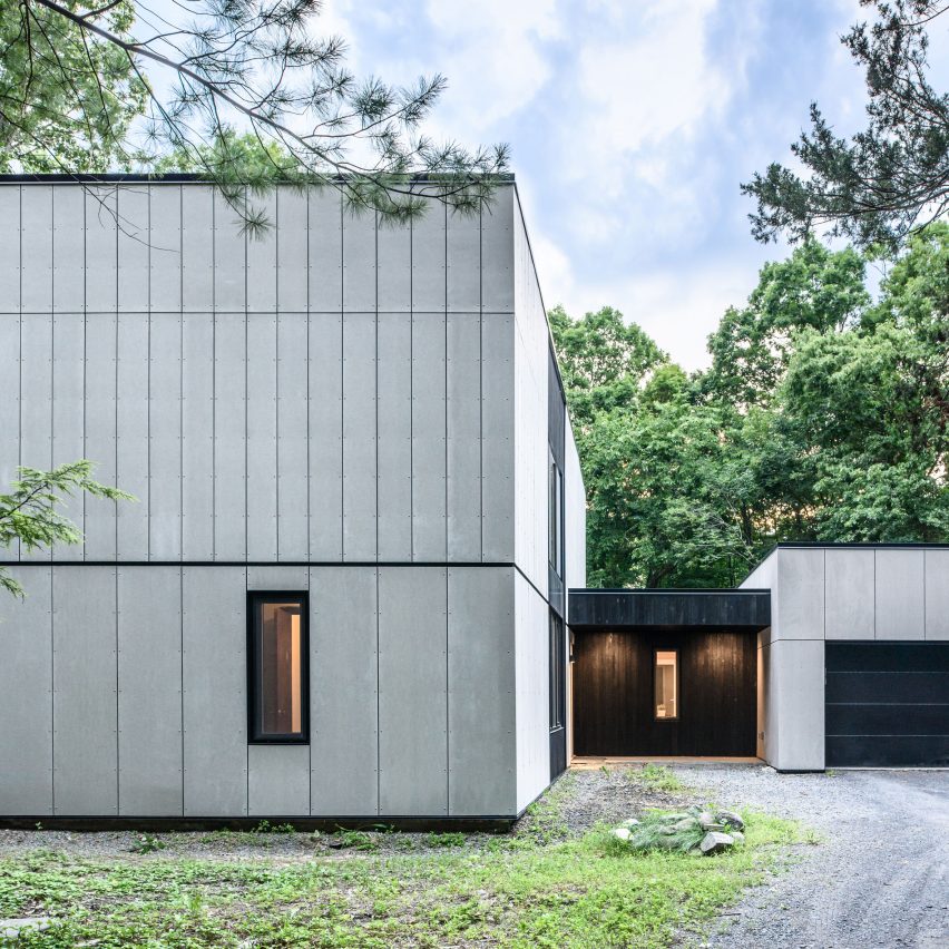
New York home swaps dated plywood siding for charred timber and cement panels

New Paltz Renovation by AlexAllen

Brooklyn studio AlexAllen has entirely revamped a family home in New York State, trading its outdated plywood siding for a modern finish composed of cement panels and blackened timber. Read more

http://ift.tt/2epkP7j

Monolith House / Rara Architecture


© Christopher Alexander

© Christopher Alexander


© Christopher Alexander


© Christopher Alexander


© Alison McWhirter Photography


© Alison McWhirter Photography

  • Structural Engineer : John Kyrgios Building Surveyor – AABP
  • Land Survey : Brian Watson Energy Rating – BEAC
  • Soil Report : Indepth Geotech Builder –Precision Building Solutions Styling – Mila Jarvis

© Christopher Alexander

© Christopher Alexander

From the architect. Our mission was to reinstate the old home’s glory through highlighting it’s simplistic characteristics and its overall form. We stripped it right back to a neutral state. The height of the rear addition had the potential to dwarf the original heritage home, so, sympathetically, we mimicked the roof angle, but didn’t hide it. Nothing about the addition is ‘trying to hide’ anything. The old building transitions smoothly to the new, visually and emotionally, both internally and externally – the old floorboards transition to a new polished concrete slab, the old weatherboards transition to a perforated brick wall (outlining the central Zen garden) and then again to a solid brick wall. The addition, which can


© Christopher Alexander

© Christopher Alexander

be enjoyed from the rear lanes and from within the property stands proud, like the existing Edwardian; it stands high, and strong without any exaggeration or excess, it is brutal, minimal and statuesque: a monolith.


© Christopher Alexander

© Christopher Alexander

Our client hired us knowing the value an architect can add to the quality of their space. Bianca pushed us really hard to getting an exceptional work of architecture and not something easy they could ‘pull off’ as owner builders. This licensed us to explore some challenging design ideas that were pushed around in council for a while and was quite challenging structurally.


Ground Floor Plan

Ground Floor Plan

The result is outstanding. It’s a humble house, with a simple and modest extension that meets the highest standards – everything is considered. With a variety of different spaces to enjoy and storage for everything. No one would guess there were two toddlers living in the space.


© Alison McWhirter Photography

© Alison McWhirter Photography

The front half is a fully refurbished double fronted weatherboard Edwardian with a calm grey palette that really celebrates the old. The new mimics the striking form of the Edwardian, while employing the use of modern materials built to last. The design intent is to make the space feel endless and not confined; to be able to see right through the house, regardless of where you are. The new open plan living and dining areas boast ample space for entertaining by eliminating the island bench. The client wanted to pack away the amenities behind a wall; so we gave her exactly that.


1st Floor Plan

1st Floor Plan

Upstairs, we managed to avoid frosted windows by dropping fixed windows to the floor (more interactive for the children), while having the openable windows above 1.7m. The raked cathedral ceilings make the space feel larger than it is in the playroom/study area.

The site is less than 300sqm, making it difficult to design a functional 3 bedroom family home with enough subsidiary space for each family member that meets today’s market expectations. So we decided to forget about the market’s expectations and make a truly beautiful space that did all of those things simply and perfectly and suited for a family.


© Alison McWhirter Photography

© Alison McWhirter Photography

The result is a space that feels like it’s floating. Externally, the facade dons only a slim line window ribboning the bottom leaving a brilliantly blank monolithic wall looming over the back yard. 


© Alison McWhirter Photography

© Alison McWhirter Photography

Product Description. We choose to use Cemintel Barestone for the 1st floor extension cladding as we wanted something substantial while also low maintenance and cost effective. We love that it’s lightweight, comes in large sheets and is easy to install. The finish of the compressed fiber cement panels has an impressive concrete feel to it and is crisp and elegant making the overhanging extension look proud and monolithic, which the project was named after.

http://ift.tt/2eux1Bw

AIRBUS Spain Central Offices / Pablo Notari Oviedo + SUMAR + CONURMA


© Eduardo Sánchez

© Eduardo Sánchez


© Eduardo Sánchez


© Eduardo Sánchez


© Eduardo Sánchez


© Eduardo Sánchez

  • Chief Architect: Steffen Ringler
  • Project Team: Begoña Vives Vinent, Judith Krassnig, Amelia Mateos Yagüe, Augusto Signorio MacroDraftsman: José Luis Paredes Conde Bill of Quantities: Manuel Sevilla Seoane, Yolanda García Portillo Systems engineer: David Torremocha Mesto Structure engineer: Infotaller de Estructuras S.L.
  • Draftsman: José Luis Paredes Conde
  • Bill Of Quantities: Manuel Sevilla Seoane, Yolanda García Portillo
  • Systems Engineer: David Torremocha Mesto
  • Structure Engineer: Infotaller de Estructuras S.L
  • Works Supervision Team: Pablo Notari Oviedo (Architect), Steffen Ringler, David Torremocha Mesto (Collaborators), Manuel Sevilla Seoane (Assistant)

© Eduardo Sánchez

© Eduardo Sánchez

From the architect. This project was born as result of the restricted competition launched in April, 2002 by AIRBUS Spain S.L. The works began in February 2003, ending in July of 2004.


© Eduardo Sánchez

© Eduardo Sánchez

The building is located at the entrance of the Airbus factory in Getafe´s municipality, forming its access door.


Ground Floor

Ground Floor

The spatial solution of three blocks supported on a stone podium linked to the topography, is the fundamental element of its expression, creating a central courtyard where the main entrance is located.


© Eduardo Sánchez

© Eduardo Sánchez

This access space is designed as a large Atrium surrounded by the glazed wings of the offices, and covered by a large canopy. The wings are connected with the rear longitudinal block by two vertical circulation cores, where also the spaces of relationship and service of each plant are located. In the rear block the closed offices are located, and the open offices are on the glazed wings.


© Eduardo Sánchez

© Eduardo Sánchez

Type Floor

Type Floor

© Eduardo Sánchez

© Eduardo Sánchez

In the access floor two patios as guiding spaces of the building are arranged, dynamic spaces both by the horizontal circulations created around them, as by the different intensities and reflections of natural light that they produce.


© Eduardo Sánchez

© Eduardo Sánchez

This Project, highly energy efficient and sustainable, expresses the commitment of AIRBUS with the environment.


© Eduardo Sánchez

© Eduardo Sánchez

The North longitudinal block has a metal panels façade, similar to the industrial buildings of the factory. But to the South it has a double façade composed by a skin of glass, and a second façade of horizontal metal louvers for light sun control.


Detail

Detail

Detail

Detail

The lateral wings also have double façades, in this case double glass façades with an intermediate space. These double façades are intended to prevent the greenhouse effect, which is difficult to control using louvers in the East and West orientations. This double façade forces up the hot air circulation in the inside, eliminating it quickly in summer, and allowing its reuse in winter by injecting the hot air in the air conditioning system.


© Eduardo Sánchez

© Eduardo Sánchez

The energy-efficient system is completed with a ventilated double cover formed by metal louvers that meet three functions: the protection of the air conditioning machinery, the solar light passive control optimizing the circulation of air, and the support of the photovoltaic panels.


© Eduardo Sánchez

© Eduardo Sánchez

http://ift.tt/2dHkrQc

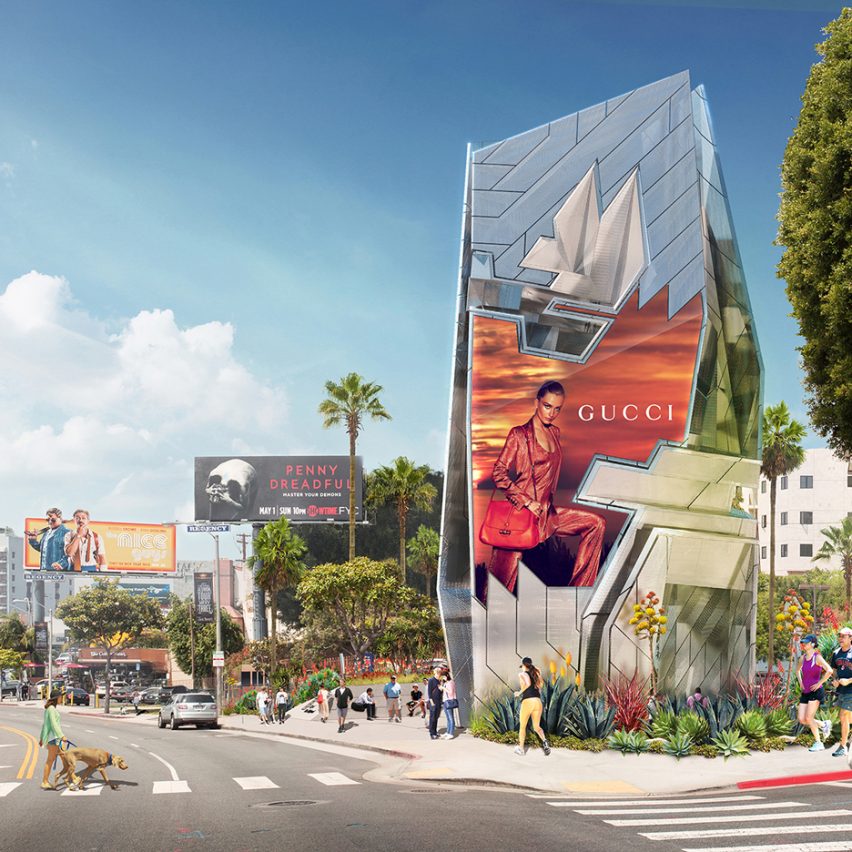
Futuristic digital billboard to be erected in Hollywood

Belltower digital billboard by Tom Wiscombe

A design for “the most Instagrammable billboard in the world” by a Los Angeles team has beaten schemes by Zaha Hadid Architects and Gensler in a competition to create an advertising structure for Sunset Boulevard. Read more

http://ift.tt/2eeBxG8

Adjaye Associates Selected for San Francisco Shipyard Redesign


San Francisco Shipyard. Image Courtesy of Adjaye Associates

San Francisco Shipyard. Image Courtesy of Adjaye Associates

Adjaye Associates has been announced as the firm that will serve as masterplan architect and creative director for the second phase of revitalization of the San Francisco Shipyard, the waterfront neighborhood located at Hunter’s Point along the San Francisco Bay.

The project, developed by FivePoint Holdings, is envisioned as a state-of-the-art commercial district containing offices, labs, research facilities and housing, and will feature a mix of reclaimed heritage buildings and new constructions. The plan will center around acres of public spaces and sports grounds.

“I’m thrilled to be partnering with FivePoint to explore ways to reinvigorate this site’s unique infrastructure for the 21st Century,” said David Adjaye, firm principal. “This is a project with incredible transformative potential; to be given the opportunity to contribute to San Francisco’s urban fabric in such a significant way is a true honor.”

“David Adjaye is one of the world’s most prolific architects. We are delighted that he is bringing his unique, creative talents and culture to help shape the physical spaces and urban form of the second phase of The San Francisco Shipyard,” said Kofi Bonner, Northern California regional president for FivePoint.

The masterplan will be developed over the next five years with a multibillion dollar investment from FivePoint. The design will draw inspiration from the Shipyard’s rural and naval origins to celebrate the layered 150-year history of the neighborhood while maximizing access to the waterfront.

The Shipyard site will serve as the anchor of a larger 760-acre urban plan that aims to add over 12,000 apartments, townhomes and condominiums to the competitive San Francisco housing market, and over 350 acres of waterfront parks, trails and restored shoreline.

You can read more about the project, here.

News via Adjaye Associates.

http://ift.tt/2erQlP2

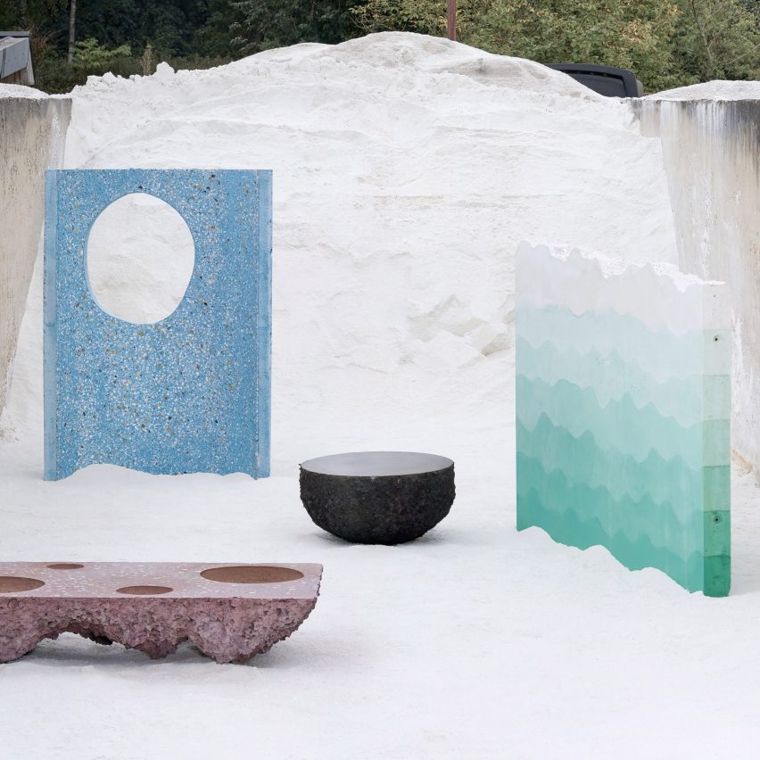
Studio Ossidiana creates “petrified” versions of Persian carpets

Petrified Carpets by Studio Ossidiana

Architecture practice Studio Ossidiana has reinterpreted traditional Persian carpets as a series of concrete pieces installed at this year’s Dutch Design Week. Read more

http://ift.tt/2ePAzln

Freight Residences / Dynia Architects


© JC Buck

© JC Buck


© JC Buck


© JC Buck


© JC Buck


© JC Buck

  • Architects: Dynia Architects
  • Location: Denver, CO, United States
  • Architects In Charge: Stephen Dynia, FAIA and Doug Staker, AIA
  • Area: 55.386 ft2
  • Project Year: 2016
  • Photographs: JC Buck, Stephen Dynia
  • Architect Of Record: Barker Rinker Seacat Architecture
  • Owner: Zeppelin Development
  • Structural Engineer: KL&A
  • Landscape Architect: Plot
  • Mechanical Engineers: MEC
  • Electrical Engineers: Technicus

© JC Buck

© JC Buck

From the architect. Housing development in Denver is booming, especially in the newly revitalized River North (RiNo) neighborhood of Denver.  Unlike the majority of apartment buildings in the area, Dynia Architects’ Freight Residences rejects the typical models of development.  The building has a sense of intimacy and privacy, reduces the homogony of multifamily development, and targets the underserved urban family market. 


© JC Buck

© JC Buck

Freight Residences is the newest addition to the mixed-use TAXI development, situated between the train tracks and the Platte River in RiNo.  The building is Dynia’s fourth completed project on the site, with two more to be scheduled for completion by 2018.  This 48-unit, four-story urban housing development was designed for professionals and young families with urban sensibilities.  The one-, three-, and four-bedroom units are configured as a stacked, repeating module of 18-foot sections.  All but the one-bedroom units offer two floors of living space with through-unit ventilation and light infiltration.  Each unit has an operable glass garage door that opens the living spaces to the gardens on the first floor, generous private balconies on the fourth floor, and to incredible mountain views to the west from the third floor one-bedroom units.  


© JC Buck

© JC Buck

Floor Plans

Floor Plans

© JC Buck

© JC Buck

This urban residential block is unconventional, having a single corridor located on the third floor providing access to the one-bedroom and three-bedroom top floor units.  Generous windows at each end of the hallway offer a street-like experience.  The four-bedroom units are accessed through private entrances on the first floor of the building, either from the car-port parking area in the back or through the garden terraces on the front of the building.  This configuration of the first and second floors offers privacy and creates a row house sensibility rather than the feel of a double loaded apartment block. These two-story units allow light and air to flow from east to west on each floor. 


© JC Buck

© JC Buck

The utilization of day lighting and natural ventilation has positive health benefits while reducing energy costs. The building’s HVAC systems use efficient domestic hot water heaters and energy efficient fan coils. On site storm water detention basins are built into the landscaped terraces off of the east side of the building providing natural irrigation and filtering excess water.  


© JC Buck

© JC Buck

Freight Residences taps into the amenities serving the entire TAXI campus.  The site features a unique shipping container pool, fitness center, multiple community gathering areas, green spaces, a restaurant, coffee shop, and an early childhood education facility.  The creative recreation room on the ground floor of Freight Residences is an additional amenity space for the building and the surrounding TAXI community. Separated from the elevator vestibule by a hanging plastic strip curtain door, the creative recreation room was designed as a learning and play space.  The vibrant orange room features a large garage door, connecting the space to the outdoors.


Section Diagram

Section Diagram

Freight Residences is clearly a unique and innovative building.  It’s location, design features, and sense of community appeal to its tenants. The building has become fully occupied in less than six months from its doors opening to residents.


© JC Buck

© JC Buck

Products Information. Light and height are central to the Dynia planning strategy; operable walls of windows or garage doors are incorporated into most projects.  At the recently completed Freight Residences, located on the TAXI campus in RiNo, the garage doors on all levels connect interior spaces with the outdoors in a city with a passion for outdoor activity.  Generous private balcony spaces provide an additional outdoor room with iconic mountain or urban views.  These elements also allow for through-unit ventilation and ample light infiltration. Garage Doors by Clopay.

Located along the Rocky Mountain Range, Freight Residences is heavily exposed to the elements.  As an exterior material, whether corrugated or flat, steel siding is impervious to weather and offers maintenance free durability. Corrugated Steel Siding by Corrugated Industries. 

Amerimax vinyl windows include tilt-turn and fixed unit types, with excellent U-values.

http://ift.tt/2eoGk8p

27 of the Best Google Doodles Celebrating Architects and Architecture

Since 1998, Google has been manipulating their iconic logo to celebrate holidays, anniversaries and the lives of famous artists, pioneers and scientists, creating what they call Google Doodles. Since the very first doodle (used to indicate founders Larry Page and Sergey Brin’s attendance at Burning Man that year), Google has produced over 2000 fun, colorful drawings to inform their users about the important milestones that fell on that date.

Of these doodles, numerous have featured the works or lives of some of history’s most prominent architects. Check out a sampling of some of our favorites, after the break!

March 27, 2012 – Mies van der Rohe’s 126th Birthday


via Google Doodles

via Google Doodles

August 4, 2011 – Roberto Burle Marx’s 102nd Birthday


via Google Doodles

via Google Doodles

December 15, 2011 – Friedensreich Hundertwasser’s 83rd Birthday


via Google Doodles

via Google Doodles

March 9, 2013 – Luis Barragan’s 111th Birthday


via Google Doodles

via Google Doodles

January 27, 2014 – Eugène Viollet-le-Duc’s 200th Birthday


via Google Doodles

via Google Doodles

April 3, 2013 – Henry van de Velde’s 150th Birthday


via Google Doodles

via Google Doodles

October 20, 2014 – Christopher Wren’s 382nd Birthday

April 18, 2012 – Jan Kaplický’s 75th Birthday


via Google Doodles

via Google Doodles

April 21, 2012 – Brasilia’s Anniversary


via Google Doodles

via Google Doodles

July 12, 2011 – 450th Anniversary of St. Basil’s Cathedral


via Google Doodles

via Google Doodles

September 4, 2010 – 25th Anniversary of Buckyball

October 20, 2008 – 35th Anniversary of the opening of the Sydney Opera House


via Google Doodles

via Google Doodles

May 17, 2008 – 125th Birthday of Walter Gropius


via Google Doodles

via Google Doodles

June 8, 2005 – Frank Lloyd Wright’s 138th Birthday


via Google Doodles

via Google Doodles

June 25, 2013 – Antoni Gaudí’s 161st Birthday


via Google Doodles

via Google Doodles

August 6, 2014 – Anna Castelli Ferrieri’s 94th Birthday


via Google Doodles

via Google Doodles

January 19, 2016 – Sophie Taeuber-Arp’s 127th Birthday


via Google Doodles

via Google Doodles

March 4, 2016 – 42nd Anniversary of Rio-Niteroi Bridge Opening


via Google Doodles

via Google Doodles

May 4, 2016 – Jane Jacobs’ 100th birthday


via Google Doodles

via Google Doodles

May 20, 2013 – Exposición Universal de Barcelona’s 125th anniversary


via Google Doodles

via Google Doodles

May 27, 2012 – 75th Anniversary of the Golden Gate Bridge


via Google Doodles

via Google Doodles

January 9, 2013 – 150th Anniversary of the Tube


via Google Doodles

via Google Doodles

November 17, 2009 – Isamu Noguchi’s Birthday


via Google Doodles

via Google Doodles

January 15, 2014 – The 255th anniversary of the British Museum


via Google Doodles

via Google Doodles

September 4, 2013 – Kenzo Tange’s 100th Birthday


via Google Doodles

via Google Doodles

April 3, 2013 – Henry van de Velde’s 150th Birthday

March 31, 2015 – 126th Anniversary of the public opening of the Eiffel Tower


via Google Doodles

via Google Doodles

You can find even more architecture-related doodles, here.

News and images via Google Doodles.

http://ift.tt/2dGUr7L