
La Maison Haute is a private home located in Lac-Clair, Quebec, Canada. Completed in 2016, it was designed by Atelier Pierre Thibault. La Maison Haute by Atelier Pierre Thibault: “La Maison Haute was designed to reinforce the relationship between the residents, their immediate surroundings and the view on Lac Clair. Located on a plateau, in the middle of a steep hill, circled by mature trees and a narrow river, the..
Office KGDVS Create “Silver Lining” Scenography for Kortrijk’s 25th Biennale Interieur

© Office KGDVS
Located close to the French border, one Belgian city has become a biannual fixture on the calendar for those who work with interior space. Since its foundation in 1968, Kortrijk’s (Courtrai in French) Biennale Interieur has been at the beating heart of interior-innovation, curated by leading figures such as Philippe Starck, Gio Ponti, and Verner Panton.
This year, for the Biennale’s 25th anniversary, Kersten Geers and David Van Severen (Office KGDVS)—a practice with strong roots in the city itself—have been invited to make their mark on the exhibition’s architectural and artistic programme. Their take on the show, entitled Silver Linings, marks a shift from the presentation of objects to the creation of full scale, complete interiors.
© Office KGDVS
© Office KGDVS
We look at INTERIORS in the broader sense: from our everyday living rooms to high-tech environments, to art installations and complete interiors. We want to offer a catalogue of the hypothetical world. The silver edition of the Biennale Interieur seems like the perfect place to realise that ambition. With INTERIORS we want to investigate and explore ‘inhabited’ space – in the form of a rich collection of interpretations that not only focuses on objects, but strives for a complete spatial experience.
© Office KGDVS
© Office KGDVS
In 2009 Office KGDVS master planned the Biennale’s home – the Kortrijk Xpo exhibition halls. Based on a grid of 5.7 meters, they added a grand loggia encircling the existing site and constructed new office space. The structural grid has become the modular framework for this year’s Biennale; their ambition is to develop the whole of the show’s setting into a “city” within the city – an urban indoor and outdoor space in which design, art, and architecture meet.
Plan. Image © Office KGDVS
© Frederik Vercruysse
© Frederik Vercruysse
© Frederik Vercruysse
© Frederik Vercruysse
© Frederik Vercruysse
© Frederik Vercruysse
© Frederik Vercruysse
© Frederik Vercruysse
© Frederik Vercruysse
© Frederik Vercruysse
© Frederik Vercruysse
© Frederik Vercruysse
Nook Architects uses mirrors to exaggerate space in Barcelona apartment
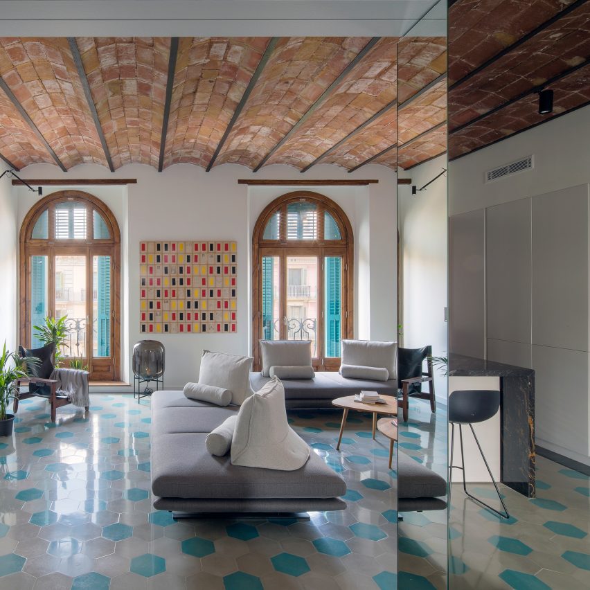
Strategically placed mirrors are used to reflect natural light and create the illusion of greater space in this compact Barcelona flat, which has been renovated by local studio Nook Architects. Read more
MM Hose / OHLAB

© José Hevia
- Architects: OHLAB
- Location: Palma, Balearic Islands, Spain
- Architect In Charge: OHLAB
- Team: Paloma Hernaiz, Jaime Oliver, Rebeca Lavín, Walter Brandt, Sergio Rivero de Cáceres
- Area: 196.0 sqm
- Project Year: 2015
- Photographs: José Hevia
- Quantity Surveyor: Jorge Ramón
- Structure: Jesús Alonso
- Energy Efficiency Advisor: Anne Vogt
- Project Management: Paloma Hernaiz, Jaime Oliver (architects), Jorge Ramón (quantity surveyor)
- Site Area: 1620m2
- Usable Area: 130m2
© José Hevia
From the architect. This house looks for the maximum energy efficiency adapting itself to the program, the solar orientation, the views and the slope of the terrain.
© José Hevia
The project optimizes the program grouping it in four boxes –kitchen, living-dinning, main bedroom and guest bedrooms- which can be used together or independently. Each box is placed carefully on the ground and rotates on its axis with precision to find the best views and orientation for their use. The bedrooms face the East, the garden and the Bellver Castle; the living and dinning room face South-east, the sea and the garden; the kitchen faces South and the vegetable garden; and in the attic over the living room, the terrace looks towards the view of the sea and its big window over the living room faces South allowing the winter sun to warm the main space of the house while the eaves of the roof protects from the summer sun.
Plans
Each box has large openings towards the best orientations and sights, and smaller openings on the opposite façade allowing cross ventilation and taking advantage of the East-West breezes of the place. The South openings are recessed to let the sun enter in winter and block it in summer, while the East and West openings have exterior shutters.
© José Hevia
The house has been designed according to PASSIVHAUS standards to achieve the maximum energy efficiency.
A rigorous infographic and thermal study has been made to ensure an optimal heat input, maximizing it in winter and minimizing it in summer.
© José Hevia
The façade has an exterior insulation system that increases the insulation thickness up to 15cm and strictly guarding all joints to completely avoid any thermal bridge. The infiltrations through the façade have been reduced to the minimum, and the hermeticism of the enclosure has been maximized to overcome pressurization tests in every space. The heat exchanger ensures air renovation wasting no energy and it is optimized to use the heat generated with showers’ steam and cooking to transform it into heating.
© José Hevia
Thanks to this design cooling is not necessary, which is typically an issue in the hot days of Mallorca’s summer, and the heating demand is only 11kWh/m2a (a typical house of this characteristics in Mallorca would have a heating demand of 85 to 100 kWh/m2a) which is solved with a small perimeter underfloor heating circuit. The energy to heat the hot water is obtained almost entirely from the solar thermal installation.
Scheme
The pitched roofs have a system for collecting rainwater, three of them get water for irrigation and general use while the fourth roof is “the clean one” and collects water for consumption. For this purpose two separate tanks, one of 40 m3 and another 8 m3, are arranged taking advantage of the gaps created between the housing and the slope of the terrain. With this measures the house is completely autonomous in terms of water. The garden includes a vegetable patch, low maintenance native vegetation and deciduous trees along the south of the house to protect from the summer sun.
© José Hevia
The project has been made with a low construction budget and a very low cost of energy maintenance. It is a home that promotes environmental and sustainability values, reporting savings and comfort without incurring additional economic effort.
© José Hevia
The house was finished last September and monitoring its performance has been key to value the results beyond the happiness and satisfaction of the clients. As of April the clients have not turn on the heat at all reporting an interior temperature (measured daily –day and night) for the winter between 21ºC to 24ºC, with exterior temperatures between 5º to 15º.
First winter living in the house and it had ZERO heating consumption (100% passive) and ZERO water expense (100% rainwater).
© José Hevia
Manon Bélanger Designs a Minimalist Contemporary Home in Montreal

Christophe-Colomb is a private home located in Montreal, Quebec, Canada. It was designed by Manon Bélanger in 2015. Photos by: Adrien Williams
Széll Kálmán Square / Építész Stúdió + Lépték-Terv

© Gergely Kenéz
- Architects: Építész Stúdió, Lépték-Terv
- Location: Budapest, Hungary
- Area: 22000.0 sqm
- Project Year: 2016
- Photographs: Gergely Kenéz
- Építész Stúdió Team: Tamás Fialovszky, Richárd Hőnich, Benedek Sólyom, Gergely Kenéz, Gergő Jedlicska
- Lépték Terv Team: Barnabás Szakács, Sándor Liziczai
- Construction: 2015 – 2016
- Open Competition 1st Prize: 2012
© Gergely Kenéz
The project was the refurbishment of one of Budapest’s busiest downtown transport hubs, and the most visited public square on the Buda side. Due to the strict order of tramlines and roads, the main architectural and landscaping goal was to clean up and rationalize the inner parts, making the square a pedestrian priority public space with as many green areas as possible, in a way that does not interfere with the transferring crowd. The placement of the resting areas, filled with shrubs, trees, fountains and benches is based on an analysis of the crowd movement, providing the shortest route for each transfer and utilizing the least loaded patches, while leaving the heavy connections empty.
© Gergely Kenéz
Site Plan
© Gergely Kenéz
A total reconstruction meant the demolition of old soviet-era bus stops, commercial pavilions and the old tramlines crossing and dividing the square. The only exception was the fan shaped metro station, which was engineered in the 70’s, but got crowded during the decades with small shops blocking transparency from all sides. This iconic building opened up, and became a transparent meeting point. The new constructions – the service buildings and tram stops – follow the raw materiality of the metro station, in a square where the color is provided by the crowd rather than the architecture.
© Gergely Kenéz
Plan 1
© Gergely Kenéz
Product Description. Concrete reliefs were created via various techniques by the industrial design collective S’39 HYBRID MANUFACTURE, to give artistic variance and appeal to the concrete surfaces of the new construction. Materials including textiles, minerals and rubbers cast into the concrete created a mix of micro-surfaces that composed different collages – the centuries old map of Buda and Pest for example.
© Gergely Kenéz
Elevation
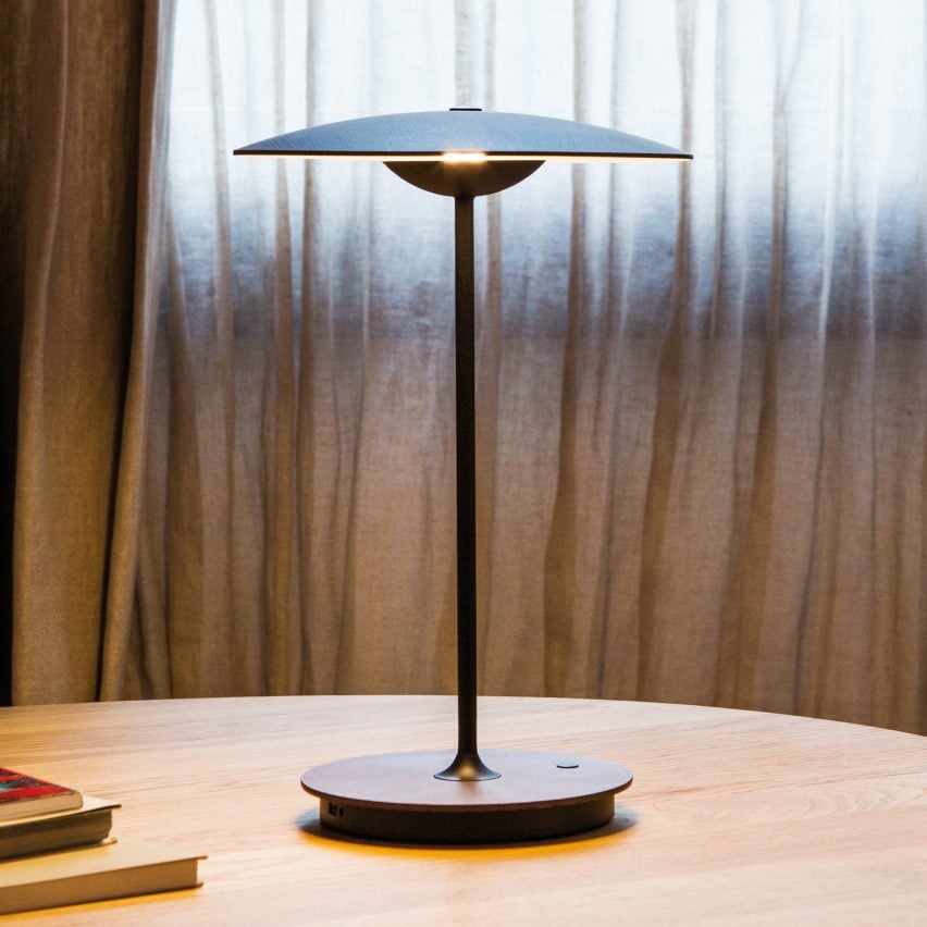
Marset’s cordless Ginger lamp is designed to be carried from room to room
Kurundu House / Zowa Architects

Courtesy of Zowa Architects
- Architects: Zowa Architects
- Location: Digana, Sri Lanka
- Area: 4300.0 ft2
- Project Year: 2015
- Photographs: Courtesy of Zowa Architects
- Structural Engineer: Signet consultants
- Quantity Surveyor: Chula Jeewakaratna
- Contractor: M.Kalyanaratna
Courtesy of Zowa Architects
Tucked away in a remote mountain side off the Digana golf club road is Kurundu house ,a small 4 bedroom retreat for a busy financial consultant and his family. The site is a 132 perch bare plot except for a lonely Kohomba tree.
Courtesy of Zowa Architects
There is no visible habitation in its immediate environs and one is immediately aware of the openness and loneliness. To add further drama it overlooks a branch of the Victoria reservoir which fills up during the rainy season, and in the far distance is the Hunnsagiriya mountains.
Courtesy of Zowa Architects
The approach from the main road is a rough track winding through small village huts, vegetable gardens and large Mara trees and finally up a steep rocky lane that lands at the site.
Floor Plans
This is when one is confronted for the first time with the breathtaking view.
With a stage like this, at the outset we thought we should have a grand central verandah space that can somehow capture the explosive openness of this place while focusing on the distance views beyond, this would be the focal element from where one could access the rest of the spaces such as bed rooms and utility spaces.
Courtesy of Zowa Architects
The design was conceived as two staggered 2 storey rectangles with the verandah in the center. Further taking advantage of the slope this space was made split level, the top tier gives access to bed rooms on either side while the bottom tier accesses the a living room, kitchen and staff areas.
Courtesy of Zowa Architects
Apart from acting as the central circulatory space it is also informal sitting areas, the bottom tier is more open and next to a lawn and swimming pool with 180 degree views, this is where one would hang out most days, the top tier is different in mood and feel, the filtered light through the cinnamon sticks adding to its ambiance.
Courtesy of Zowa Architects
By using the level difference to bury half the structure, we managed to presents a nonchalant single story façade to the road. The façade is clad in cinnamon sticks which conceals a passage that leads to bed rooms as well as the entrance verandah.
Courtesy of Zowa Architects
A narrow wedge shaped cutout in the cinnamon stick façade gives access to the double height verandah. There is no front door.
Courtesy of Zowa Architects
The lower verandah gives to a third living space which is a closable glazed living room which can be air conditioned. This is a place of refuge when the lower verandah is not usable during thunderstorms or during the hot days of the year. The two solid blocks are treated simply, with lean to roofs draining to a common concrete slab that gathers rain water.The walls are unplastered ,painted brick work,and floors are cut cement in the rooms and rubble paved in the verandah’s. The spaces immediately in front and back of the building is grassed, to give foreground to the building but the rest of the land will be left to go wild.
Shanghai Hongqiao Performing Arts Center / BAU

Courtesy of BAU
- Architects: BAU
- Location: No.888 Tianshan Road, Changning District, Shanghai, China
- Design Team: James Brearley, Steve Whitford, Jiang Han, Luo Huaili, Liu Shuai, Song Hui, Yang Qing’an, Xia Wen, Rong Yu, Li Fuming
- Area: 14300.0 sqm
- Project Year: 2016
- Photographs: Courtesy of BAU
- Landscape Team: Huang Fang, Robin Armstrong, Luo Li, Liang Yongqing, Chen Qi
- Interior Architect: BAU + Shanghai Jianke Architectural Design Institute Co., Ltd
- 3 D Rendering: BAU
- Contractor: Jiangsu Guangyu Construction Group
- Documenting Architect And Engineer: Qingdao Times Architectural Design Co., Ltd
- Client: Shanghai Changning Cultural Bureau
Courtesy of BAU
Highly visible
The project is located in Tianshan Road, the new commercial boulevard in Hongqiao, one of Shanghai’s high activity districts. It is surrounded by brightly lit shopping malls built this century. This development replaces and expands on the existing state run cinema center on the site. The project was the subject of three rounds of invited competition over 5 years before BAU was contracted to design the project.
Courtesy of BAU
Exposure to difference
This project includes both traditional and modern programs of mass entertainment: theater (1000 seats) and cinema (seven of various capacities). Usually seen as separate programs and increasingly supported by distinctly different user groups, this project presents the opportunity for the two different programs and variable patrons to engage. Articulating the programs as separate objects and linking them via an enclosed plaza creates an in-between-space in which the differences between the programs are enhanced, the potential for cross-patronage is maximized, and cross-fertilization between the performing arts is encouraged.
Courtesy of BAU
A-A Section
Courtesy of BAU
An assemblage of difference
The theater is developed as a stone monolith (a traditional material for a traditional program) with rounded articulation and a theatrical staircase. The cinemas are an ensemble of stacked metal boxes (a 20th Century material for a 20th Century program), the largest of which is suspended above the street corner. The enclosed plaza or mixing-lobby has ticket offices, café, flexible exhibition and event space, and open views to the external plaza and streetscape, also designed by BAU.
Courtesy of BAU
Diagram
Courtesy of BAU
Katzden Architec Factory / NISHIZAWAARCHITECTS

© Hiroyuki Oki
- Architects: NISHIZAWAARCHITECTS
- Location: Căn hộ City Tower, Bình Dương, Hưng Định, tx. Thuận An, Bình Dương, Vietnam
- Architects In Charge: Shunri Nishizawa, Vu Ngoc Tam Nhi
- Area: 5753.87 sqm
- Project Year: 2016
- Photographs: Hiroyuki Oki
- Landscape: Shunri Nishizawa, Vu Ngoc Tam Nhi
- Client: Katzden Architec Vietnam co., ltd
- Building Construction: Daiwa House Vietnam co., ltd
- Landscape Construction: I Fit Home Co., Ltd
© Hiroyuki Oki
Located in the heart of a new industrial park in Binh Duong, the factory was considered to be an iconic construction which is “simple but must-be-impressive” enough to be the face of this park.
© Hiroyuki Oki
Plan
© Hiroyuki Oki
The client is a steel manufacturing company with the architectural products including staircases, handrails, bicycle stands,… Although factories are usually figured by purely pragmatic boxes for its efficiency and flexibility, we were strongly asked to design this factory to be an aesthetic object while functionality means everything with a limited budget but on the other hand, could offer a fresh working environment for human activities in a tropical climate.
© Hiroyuki Oki
Initially, to meet the demand of the standard budget for normal built-in factories, cubic simple form with 8m-span grid system was chosen as the dominant mass so as to match the neighborhood while reducing the expenditures. Using bricks for the exterior of the building would provide the opportunities to let the building itself work as a landmark with natural clay color contrast to the unobstructed neighborhood. Old bricks were collected from abandoned colonial buildings in the Mekong Delta area and recycled for the exterior layer. In order to decrease the weightiness of the massive brick cube as well as provide the air ventilation for the whole building, an enormous roof made by galvanized corrugated metal is lifted up with 3-meter-cantilivered-canopy in order to protect the indoor working areas from harsh sunlight, gusts and squalls.
© Hiroyuki Oki
Right at the centerof this man-made construction, 16m x 16m open-air garden celebrates a serene fragment of the tropical garden and refreshes the working spaces with the natural elements. When all the rotating doors are opened, the air flows could go through and refresh the environment inside the building. The courtyard itself, along with the water feature could functionally build up its own tropical diverse ecology with sensual connection to changing light and seasonal qualitative.
© Hiroyuki Oki
The landscape concept that we mostly desire for approach should provide as much as possible the tropical scenario for the factory. By that meaning, many kinds of tropical plants and fruit plants were installed such as Papayas, Bananas, Tamarinds, Malpighi glabras, Coconut trees, and especially dragon fruit ones which could be considered as one of our first-time attempt. We were inspired by the image of a field with countless rows of poles covered by dragon fruits triangular stems, which would be considered as common sceneries in the middle Vietnam. The in-order pole system made by old bricks intentionally becomes the important landscape element, and tightly connects with the architecture itself.
Diagram
via nishizawaarchitects
The design, which could preserve a large amount of greenery in order to serves as a “working environment closed to nature” for the employees as well as interacts the landscape and the building itself, could obtain the new tropical approach of designing factory.
© Hiroyuki Oki

