From the architect. Jointly organized by Singapore Institute of Architects (SIA) and Singapore Institute of Landscape Architects (SILA), Archifest 2016 returns from 23 September to 9 October 2016 with a Pavilion, designed with the theme ‘Exhale’. The annual architecture festival not only celebrates Singapore’s urban environment but also sets the stage for a wider discussion about our city, spaces and life. From exhibitions, conversations, workshops, markets to architecture tours, the Archifest Pavilion @ Raffles Place Park will host an exciting program that is diverse, informative, thought-provoking and fun.
Sketch
Celebrating its 10th edition, Archifest’s theme for this year ‘Exhale’ seeks to challenge the rapidity and density of activities that define our pace of life, weigh in on the state of Singapore’s built environment and breathe new life into it.
The festival will be bringing back the popular Archifest Pavilion, after a hiatus last year. The winning pavilion design by a team from DP Architects is composed entirely of construction site materials – safety netting suspended on a frame of steel scaffolding. The gigantic Technicolor urban sculpture plays on the interaction of multiple primary colour layers that overlap to create a playful pavilion, offering a respite from the hectic city life right in the centre of the Central Business District. Professor Richard Ho, Chair of Archifest 2016 Organizing Committee said, “One of the primary aims of Archifest is to make architecture more accessible and engaging to everyone. Offering a unique and multi- sensorial experience of the city in the spirit of ‘Exhale’ this year, the psychedelic Archifest Pavilion is set to inspire more people to recognize the profound impact that design and the built environment have on the vitality of the city and our lives.”
With a line-up of more than 30 events, Archifest 2016 will feature activities for everybody. Highlights include exhibitions featuring winners of SIA Architectural Design Awards and SILA Student Design Awards; lunchtime architecture studio sessions City-Studio; specially curated Architours to explore Singapore’s hidden architectural gems; weekend Barter Market to trade good vibes; SG Farm for a dose of urban farming in the city; a Pop-up Library to borrow and exchange your favorite reads; interactive event #FlipTable to release your work stress; parent-children design workshop by ArKIDecture; as well as several Conversations with creatives sharing their inspirations and projects.
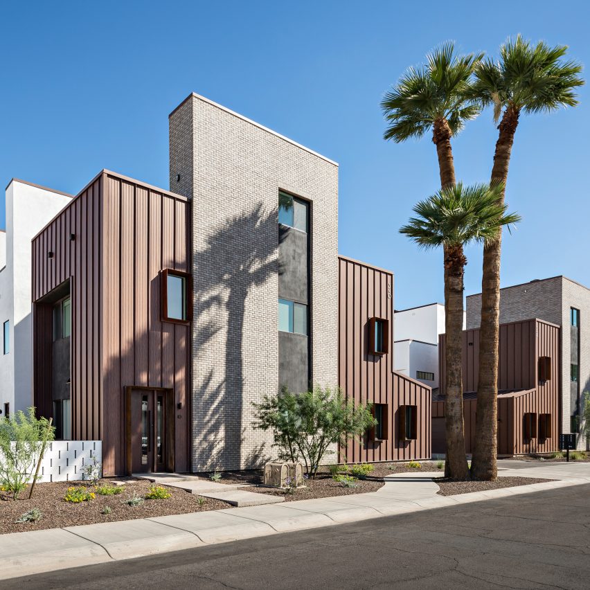
US studio The Ranch Mine has completed a residential development in central Phoenix that consists of a pair of matching buildings, each containing five spacious townhouses. Read more
From the architect. The architectural concept design is based on the hotel itself … a “low cost” hotel where the length of stay for a weekender, a tourist, or a business traveler is only 9 to 12 hours approximately, where the stay should preferably be simple and based on the fact that hotels provide services that the client does not need, does not seek or is not willing to pay, the program was done; reduce those services to a minimum and save those cost, designing the space of the room taking a 20 foot shipping container measures as reference, optimizing the space, uses, and the election of materials and furniture with a minimalist design… the results were 20 compact rooms of 15 sqm., with the elements and accessories of the highest quality.
The building was designed and constructed taking advantage of the square meters allowed by the city and being a corner the building was implanted in such a way that all rooms had a view to the city, income of ventilation and natural lighting; the short side of the street but with major pedestrian movement was reserved for the entry of the building.
The hotel is distributed in 5 floors, at street-level are entrance, lobby, reception, administrative office and services, also the snack bar that has two environments separated with a large stained glass window, but with the same use, inside as an air-conditioned place and the outdoor terrace having the feeling of spaciousness.
The four upper floors have a repetitive distribution, modulated by its structure, optimizing the space and connected by ducts of vertical circulation, the elevator and a staircase of emergency that communicates with the room aisle, differentiated only by a space in common in the façade, a double height for the lobby, a meeting room and an upper balcony which gives access to the terrace where are located the ventilation equipment, air conditioning and domestic hot water equipment.
The location of the hotel in the downtown area of las Peñas of Guayaquil City is a privilege, being only 200 meters from the greatest tourist attractions reference of the city, Malecón 2000 and Cerro Santa Ana an also near Jose Joaquin de Olmedo Airport, Bus station and the rest of the city in minutes by expressways.
Construction methodology was done in order to use efficient and sustainable construction materials, modulation, minimum heights between slabs, etc… reducing waste of work and the structure is a mix of reinforced concrete, slabs with the TECNILOSA system and masonry with HORMI2 (reinforced polystyrene) system to reduce the weight of the building, as also the structure and piles, managing to decrease the cost of construction by square meter as well as the time of execution.
The materials in grey tones, white walls using the color black and silver to accentuate the details, as well as large windows and basic design achieve a pure, simple architecture with lots of natural lighting, giving the feeling of spaciousness in a small site of only 174 sqm.
The Council on Tall Buildings and Urban Habitat (CTBUH) has released some of the facts and figures behind the projects appearing in their recent book, 100 of the World’s Tallest Buildings. The construction of tall buildings requires collaboration between many different companies and firms and the efforts of hundreds of people, but a few select firms have been responsible for more of the design and engineering achievements than any other.
Continue reading to see the 18 design architects that have contributed multiple buildings to the top 100 list.
Visit the CTBUH “Skyscraper Center” for a full list of the top 100 tallest buildings, as well as more rankings and analytics, including Top Owners/Developers, Top Consultants, Buildings by City/Region/Country and Structural Material Analysis.
The Open House programme, which gives the public a chance to see buildings and sites that are usually off limits, comes to New York this weekend. Here’s 10 places we recommend to explore over the next two days. Read more
From the architect. After the successful completion of the first and second design for the Cold Pressed Juicery at the Willemsparkweg and the Herengracht, Standard Studio got asked to create their third store. Located opposite the Anne Frank Museum, right in the corner where the busy Prinsengracht meets the calm and peaceful Bloemengracht. Every morning the street is full of cyclists rushing to work and during the day the tourists will appear, trying to find their way around or simply enjoying the beautiful city. Either way, this store is located right in the center where everyone can enjoy a healthy tasty juice.
The layout has made it possible to create two different worlds. As the front we have the entrance to the Prinsengracht, a canal with so much happening that life never stops. As you enter you will notice how Standard Studio has kept the monumental characteristic of the marble floors, where the fridges are located, containing the “take away” products. The fridges are set up in a way that has been inspired by the intersection of both canals following two different directions. Commuters in the morning pop in for a few minutes, go straight to the fridges, grab their juices, and off they go to work.
Floor Plan
The calmer world is at the back of the store. This area is elevated by a few steps and is designed as a concrete box. The contrast in material and in height creates the division between both worlds. A very calming and relaxing atmosphere has been created thanks to the possibility of having the space for cosy living room setting, the addition of some plants and the pretty view onto the Bloemengracht.
Both worlds are connected with a huge tree trunk that was cut to create the counter that houses a smoothie station and the cash desk. This counter was made entirely out of a solid wooden beam weighting over 4 tons. The wood that came out of the beam was used to create a screen that refers to the graphic identity of the brand which was made by Build Amsterdam. The wood was also used to create windowsills and benches outside. For a strong spatial effect a mirror is used in the back to make the space look bigger.
If you find yourself in the center of Amsterdam, stop by and grab a juice at The Cold Pressed Juicery, and if you need to take a break just pop into the back of the store where you will find enough space to relax and enjoy the beautiful sight both of the inside and outside world.
On October 30, 2014, as Burkina Faso President Blaise Compaoré was preparing to make an amendment to the country’s constitution that would eliminate presidential term limits and allow him to extend his 27 year rule, tens of thousands of Burkinabé citizens in the capital city of Ouagadougoubroke through police lines to set fire to several government buildings, including city hall, the ruling party headquarters, and the National Assembly Building. The following day, Compaoré stepped down, ushering in a new era of democratic rule and resulting in the country’s first ever pluralistic and competitive Presidential election in 2015.
But the revolution left the former government complex in tatters and in need of a clear direction forward both culturally and architecturally. A former French colony, Burkina Faso is home to 19 million people, 50 different ethnicities and more than 60 languages. The country would require a new Parliament that could serve as a common ground for these diverse groups, while providing the technology and education necessary to create opportunities and a better quality of life for all Burkinabés.
To find this solution, last year, the new head of Parliament approached architect and Burkina Faso native Francis Kéré to develop a building and masterplan for the Assembly Building. The new building, in the architect’s words, would need to be one that could “not only address the core democratic values of transparency, openness and equality, but could also become a catalyst for growth and development for the capital city of Ouagadougou as a whole.”
At the 2016 Venice Biennale, as part of the exhibition “In search of a new Ouagadougou” at the 15th International Architecture Exhibition, Francis Kéré and his firm Kéré Architecture, unveiled the plans for their design for the first time.
Kéré’s design takes the form of a grand, stepped ziggurat that invites people to climb, enter or occupy the entire building surface. At 6 stories tall, the building would stand out from the low profile and radically flat topography of Ouagadougou, giving residents a new elevated perspective on the entirety of their city. These design decisions combine to create a new sense of democracy that is both literal and symbolic.
“In a village setting, the process of decision-making is not a private matter occurring behind closed doors; community-members are free to sit near the gathering and observe the proceedings. In this true spirit of transparency and openness, the outer facade of the parliamentary structure is designed to be inhabited by the public,” explain the architects.
The design also draws inspiration from Burkina Faso’s agricultural economy, where nearly 90% of the labor force is employed in farming. For this reason, Kéré has integrated several green terraces along the occupiable facade to create a communal laboratory for pioneering new urban agricultural techniques. The vegetation would be supported by solar shading elements, which would also provide cooling and air circulation to the building’s interior.
Inside the building, the new 127-seat Parliament Assembly hall has been designed not to replicate western models for government chambers, but to respond to local needs, resources and climate. To achieve this, Kéré looked to traditional Burkinabés government settings.
“In rural areas, the elders of a village gather to discuss important matters under the shade of a great tree. Kéré reinstated this Arbre à palabres, or tree of discussion, in a private garden directly adjacent to the formal assembly hall where members of parliament can convene more directly.”
Photo from "In search of a new Ouagadougou" at the 15th International Architecture Exhibition at the Venice Biennale. Image Courtesy of Kéré Architecture
Photo from "In search of a new Ouagadougou" at the 15th International Architecture Exhibition at the Venice Biennale. Image Courtesy of Kéré Architecture
The new parliament building will sit within a larger masterplan that will also pay homage to the site’s history – in place of the ruin of the old assembly building, Kéré has designed a memorial in the form of a shaded depression and pool in the earth where rainwater can be collected for on-site irrigation and to serve as a passive cooling system for the interior. The space is intended to create a serene atmosphere where “visitors can relax in the shade and reflect upon those who lost their lives in the revolts.”
Surrounding the memorial, a grove of native trees will provide shaded areas for seating and gathering. Nearby, new commercial storefronts and exhibitions spaces will activate the space.
Building Diagram. Image Courtesy of Kéré Architecture
In a transformative time for Burkina Faso, Kéré Architecture’s design tackles the question of “How do we move forward?” by creating a building and masterplan that are truly for its people. Says Kéré:
“We want the entire building to be a platform for people to take ownership of.”
This project is currently on display at the 15th International Architecture Exhibition Reporting from the Front for the Venice Biennale. The exhibition is on view until November 27th 2016.
From the architect. An undeveloped sixty-foot wide parcel of land, extending three blocks is a result of two residential developments merging in the 1930’s. In time, houses were built on each end of the three blocks. Moretti’s house began with the purchase of one of these 60’ x 300’ lots, the only lot without an existing house.
The street elevation gives an appearance of solid. Once past the green entry gate, the courtyards open to the sky and the living areas open to a private garden filled with sunlight.
Site Plan
The main volume of the house is clad in CMU. The two courtyards and porch are clad in paint-grip metal. The studio in the garden is clad with Douglas fir. A glass bridge connects the main house to the studio.
Two cubic courtyards are inserted within the main house composition. The courtyards serve as “light wells” filling the interiors with ambient light. The north walls of the courtyards are composed of a steel frame with white translucent panels. The sunlight is cast on the white fiberglass panels and the sunlight is constantly in motion within these courtyards. The movement of sunlight is cast onto the white translucent panels through the roof portal, reflecting the passage of the day.
The deep overhang above the south-facing porch prevents direct sunlight from reaching the window wall; even in winter when the sun’s arc of movement is lowest. The porch runs the length of the garden and serves as a threshold between the interiors and the landscape.