Sotheby’s / Correia/Ragazzi Arquitectos


© Fernando Guerra | FG+SG

© Fernando Guerra | FG+SG


© Fernando Guerra | FG+SG


© Fernando Guerra | FG+SG


© Fernando Guerra | FG+SG


© Fernando Guerra | FG+SG

  • Collaborators: Francisco Tavares Ascensão, Juliano Ribas Silva, Rita Breda
  • Structure And Foundation Engineering: : Alcepi Engenharia
  • Hidraulic Engineering: Alcepi Engenharia
  • Technical Facilities Engineering: Lusoclima
  • Electrical Installations: Acácio Cerqueira Gabinete de Projectos

© Fernando Guerra | FG+SG

© Fernando Guerra | FG+SG

The new Sotheby’s real estate headquarters at Carvoeiro, Algarve, is on an existent building characterized by both local and traditional construction technics as well as materials. In order to save and recuperate the building having in mind the new program, we have decided to conduct some internal demolitions as the building was not well preserved. said demolitions, at a spatial configuration level, will allow to recover the building and make the necessary adjustments to the contemporary needs, mainly in terms of energy efficiency.


© Fernando Guerra | FG+SG

© Fernando Guerra | FG+SG

The main façade had been transformed over the years therefore we have redesigned it according to what was believed to have been in the past. We have also introduced a cornice as it is tradition in most buildings of the region, similar to those existent in the area.


© Fernando Guerra | FG+SG

© Fernando Guerra | FG+SG

Sections

Sections

© Fernando Guerra | FG+SG

© Fernando Guerra | FG+SG

On the ground level one finds the public access into a double height hall with a connecting stair as the main element, of sculpture character; it intends to give the space more fluidity in order to achieve greater sense of flow and space. On the upper floor, over the stair, we have proposed a skylight remembering the local constructions, as a way to achieve a higher height, sense of space and particular interest.


© Fernando Guerra | FG+SG

© Fernando Guerra | FG+SG

Plans

Plans

© Fernando Guerra | FG+SG

© Fernando Guerra | FG+SG

On the terrace we have proposed a new volume finished with the same materials as the existent building and with the same height; here one can find a small kitchen with a particular spatial configuration given by its skylight. Both volumes, the existent and the new building, are openly different and take as architectonic options for its completion a sense of rehabilitation, maintenance and consolidation of existent walls and structure, being chosen, whenever possible, local and traditional technics and materials. we believe that this way one can establish a coherent relation between the existent and the new construction.


© Fernando Guerra | FG+SG

© Fernando Guerra | FG+SG

http://ift.tt/2e4N38O

Matteo Nunziati Designs a High-Rise in Bosco Verticale in Milan, Italy

Penthouse at Bosco Verticale by Matteo Nunziati (2)

Penthouse at Bosco Verticale is a private home located in Milan, Italy. Completed in 2016, it was designed by Matteo Nunziati. Penthouse at Bosco Verticale by Matteo Nunziati: “One of the 27 apartments on the 22nd floor in one of the buildings of Bosco Verticale, Milan’s ‘multi-storey intensive living façade’ – winner of the 2015 Best Tall Building award, was conceived by interior designer and architect Matteo Nunziati. The high-rise..

More…

Mehrshahr Villa / Hooba Design


© Babak Toosipour

© Babak Toosipour


© Deed Studi


© Pooyeh Nouryan


© Babak Toosipour


© Pooyeh Nouryan

  • Client: Aptus Iran Company
  • Project Manager: Mohsen Kazemianfard
  • Phase 2: Dariush Ghorbani
  • 3 D Illustration: Mona Razavi
  • Presentation: Parima Jahangard, Atousa Shiran, Pooyeh Nouryan
  • Structure: Steel Framing
  • Mechanical & Electrical: Mr Etemadi
  • Supervisor: Aptus Iran Company
  • Furniture: Harmony Company

© Pooyeh Nouryan

© Pooyeh Nouryan

From the architect. The Initial idea of this project was to design a 330 m2 villa in a 3 hectares private yard facing a lake. One of the main criteria was to create spaces that are closely engaged with the surrounding landscape, an uninterrupted connection between the interior and the exterior to form a structure which becomes a part of the site itself:


Diagram 1

Diagram 1

Diagram 3

Diagram 3

A. A systematic organization of open and semi-open spaces was used to enhance the presence of nature in the interior spaces. The main semi-open space is a void on the first floor of the main cubical form. The strategic position of this void provides both physical connection to the private lounge and the master bedroom as well as visual connection to the lake. The semi-open space is also connected to the terrace on the lake side by the means of a bridge. This terrace is a perfect view point of the lake.


© Babak Toosipour

© Babak Toosipour

© Deed Studi

© Deed Studi

B. The stones used on the façade are in harmony with the existing stones in the garden. These stones are used in their natural form but in a controlled horizontal pattern. The voids in the stone pattern provide a controlled overlook and a limited sunlight penetration to spaces such as washrooms and corridors which require less exterior exposure.  Integration of the voids and solids not only creates a consistent exterior façade, but also provides the interior spaces with a view to the greenery. At nights these voids provide a lighter feeling of the solid exterior façade. These voids are also used to naturally ventilate the building as well as to implement the mechanical equipment.


© Babak Toosipour

© Babak Toosipour

C. The existing trees between the open and semi open spaces were kept so that both spaces are surrounded by vegetation. The variation of sunlight penetration through the leafs during the day significantly enhances the quality of the atmosphere.


© Parham Taghioff

© Parham Taghioff

One of the main criteria in the design process was to maximize the amount of sunlight exposure. Two sets of skylights were implemented, one over the main staircase and the other at the vertical gap between the two roofs. Moreover, transparent dividers implemented parallel to the vertical skylight increase sunlight penetration to spaces not directly connected to the skylight. The main function of the horizontal skylight over the main staircase was to provide natural winter heating. This skylight could be shaded in summer to prevent excess sunlight exposure. In section, these systems enable sunlight penetration in three directions: vertical, horizontal, as well as diagonal.


© Babak Toosipour

© Babak Toosipour

http://ift.tt/2e0iUTx

Ding doorbell brings minimal approach to smarthome design

Ding smart doorbell

Barber and Osgerby’s creative consultancy Map has collaborated with a London startup to create a minimal new smart doorbell called Ding. Read more

http://ift.tt/2dv4IBp

Vision Tower at Business Bay / tvsdesign


© Paul Dingman

© Paul Dingman


© Paul Dingman


© Paul Dingman


© Paul Dingman


© Paul Dingman

  • Architects: tvsdesign
  • Location: Dubai – United Arab Emirates
  • Architect In Charge: Brooke Taylor, Jay Thomson
  • Area: 650000.0 ft2
  • Project Year: 2014
  • Photographs: Paul Dingman
  • Client: Dubai Properties Group

© Paul Dingman

© Paul Dingman

From the architect. The elegant Vision Tower is located at the entrance to Dubai’s newest business district, Business Bay, and serves as a beacon for the development. Within the new Dubai Creek extension and Sheik Zayed Road, Business Bay is the new standard for professional property development in the region.


© Paul Dingman

© Paul Dingman

The tower delivers over 650,000 sf of prestige-class leasable office space. The 67-story building offers commanding views to Sheik Zayed Road and the Business Bay Creek along with parking for 1,220 cars and related amenities.


Section

Section

The graceful glass forms of the tower reflect the elegance of Dubai and salute its success as one of the top developing regions in the world. The bent glass facade is the signature element of the project and is internally lit to create a lasting image for the project.


© Paul Dingman

© Paul Dingman

http://ift.tt/2dHYwcq

Ping Shan Tin Shui Wai Leisure and Cultural Building / ArchSD


Courtesy of ArchSD

Courtesy of ArchSD


Courtesy of ArchSD


Courtesy of ArchSD


Courtesy of ArchSD


Courtesy of ArchSD

  • Architects: ArchSD
  • Location: 1 Tsui Sing Rd, Ping Shan, Hong Kong
  • Architect In Charge: Thomas Wan, Edward Wong
  • Area: 17011.0 sqm
  • Project Year: 2012
  • Photographs: Courtesy of ArchSD

Courtesy of ArchSD

Courtesy of ArchSD

From the architect. How can we build a tall modern building that reflects the past? We want to get away with the idea of a glass tower. With the use of brick walls, timber and metal screens, the design signifies the idea of civic building with a piazza as a place for gathering, establishing a connection with its roots yet modern at the same time. The spatial concept is inspired by the Chinese traditional cabinet, a kind of multipurpose storage space for books, as well as open shelves to display porcelain and bonsai. By incorporating terraces that mediate the outdoor and indoor environments, the design re-interprets the traditional elements in a contemporary way.


Courtesy of ArchSD

Courtesy of ArchSD

By reflecting upon the watch tower of the nearby village that combines natural earthly materials that harmonize with the lower structures, we establish our design idea through the DNA of the nearby Chinese vernacular tradition of Ping Shan Heritage Trail. The building accommodates two main functions: a public library and an indoor recreation centre (IRC).


Courtesy of ArchSD

Courtesy of ArchSD

Section Diagram

Section Diagram

Courtesy of ArchSD

Courtesy of ArchSD

Metal frames, timber screens and steel lattices offer varying degrees of transparency and permeability, while Chinese bricks and fair-faced concrete present the feeling of sturdiness and stability in contrast. In collaboration with the terraces interconnected by stairs at the periphery, they unite the internal functions three-dimensionally and maximize the multiple connections between these outdoor rooms.


Courtesy of ArchSD

Courtesy of ArchSD

http://ift.tt/2dJoACs

Keaton Tailor / PHTAA Living Design


© Flashdiamond

© Flashdiamond


© Flashdiamond


© Flashdiamond


© Flashdiamond


© Flashdiamond

  • Architects: PHTAA Living Design
  • Location: Bangkok, Thailand
  • Architect In Charge: Ponwit Rattanatanatevilai
  • Area: 10.0 sqm
  • Project Year: 2016
  • Photographs: Flashdiamond

© Flashdiamond

© Flashdiamond

© Flashdiamond

© Flashdiamond

Keaton by PHTAA Living design is the modern vintage tailor shop which located in downtown of Bangkok. With the commercial context, independent retail, bar and cafe. Keaton well-blends with surrounding. The look of vintage fashionable guy reflect on the shop’s atmosphere. 


© Flashdiamond

© Flashdiamond

From the study of fabric weaving, ‘A Handbook of Weaves by G.H. Oelsner.’ As we can see, Front and back side of the fabric has it own pattern. The linkage between two side is the covert space in pattern. This interesting issue is the starting point of architecture design. We create huge pattern in architectural scale with gentle mood.


© Flashdiamond

© Flashdiamond

Strongly concept of fabric weaving show at the facade. The pattern has defined by two parts which  are lines and square holes. Lines create general pattern for the simple and gentle look. Square holes play a role as the connection between exterior and interior space. At the same time, they reflect the basic theory of fabric weave. Micro square holes connect outdoor and indoor atmosphere by allow beams of sunlight get into the shop. 


© Flashdiamond

© Flashdiamond

Floor Plan

Floor Plan

© Flashdiamond

© Flashdiamond

Architect mainly select pure concrete mixed with navy blue painted metal to create Keaton characteristic in the same way as its brand identity. Below the feature wall, clear glass has used to show ambiguous feeling of interior space. People from the outside will see only below of the knee. This situation make the sense of cuiousity to create new welcoming sense to the clients. 


Facade Diagram

Facade Diagram

Interior space designed with simple and gentle atmosphere. In this micro architecture, approximately 25 square metres, natural light create charming atmosphere. The feature wall creates lighting effect, by reflection pattern from the outside. Simple local has used as main interior materials. Plywood counter with the same pattern as feature wall create strong identity of retail design. Brick wall divides public and private space of the tailor shop. Back of the wall is the space for tailor discussion and fitting room.


© Flashdiamond

© Flashdiamond

http://ift.tt/2d5RTBw

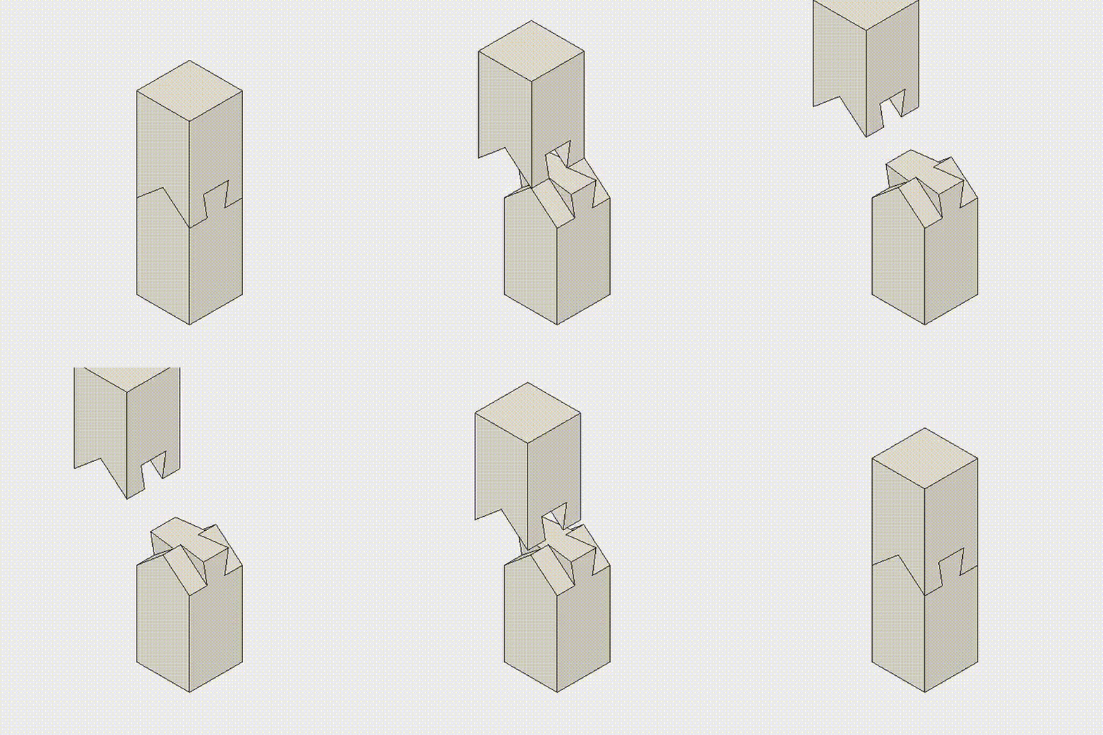
Hypnotic gifs animate traditional Japanese joinery techniques

japanese-joinery-gif-a

Timber joints slot together in these Tetris-like gifs – the work of a young Japanese man so obsessed by joinery techniques he set up a Twitter account dedicated to the cause. Read more

http://ift.tt/2dVGyDC

10 of the best TED Talks about architecture

bjarke-ingels-ted-talk-photo-james-d-davidson_dezeen_sq

The TED conference series has enabled leading thinkers, including architects, to share their ideas with the world for over 30 years. Dezeen contributing editor Jenna M McKnight has chosen some of the best presentations about the built environment from the past three decades. Read more

http://ift.tt/2e3SlBF

Crossroads School for Arts and Sciences / Frederick Fisher and Partners


© Jeremy Bittermann

© Jeremy Bittermann


© Jeremy Bittermann


© Jeremy Bittermann


© Jeremy Bittermann


© Jeremy Bittermann

  • Landscape Architect: Pamela Burton
  • Environmental Artist: Ned Kahn
  • Construction Management: Morley Builders

© Jeremy Bittermann

© Jeremy Bittermann

Frederick Fisher and Partners was selected to design the new Science Education & Research Facility for the Crossroads School for Arts & Sciences in Santa Monica. As the first new building to be constructed at the school’s main campus in nearly 20 years, the Science Education & Research Facility is 25,000 sf and serves the school’s Upper and Middle School students as their primary science facility. Its location and relationship to the urban campus and freeway create opportunities as both a promotional beacon and destination.  


© Jeremy Bittermann

© Jeremy Bittermann

© Jeremy Bittermann

© Jeremy Bittermann

© Jeremy Bittermann

© Jeremy Bittermann

FFP led the design effort, which was a community effort that involved Crossroads alumni, students, faculty, staff and administrators every step of the way. FFP also worked closely with Morley Builders to manage this project so that construction schedule coincided with the school’s summer break to minimize disturbance of the regular school functions.  The facility includes seven Upper School science classrooms, five Middle School science classrooms, three faculty prep rooms, one student study area, a fume hood room and a Projects Pavilion that features two project classrooms and one outdoor living laboratory. Exterior hallways and public terraces featuring slate blackboards extend the learning environment outside the classrooms. To the north of the building, a new plaza serves as an all-school gathering place for events and recreation. The plaza features a solar clock and a butterfly garden by Landscape Architect Pamela Burton. Atop the Pavilion rests a hyperbolic paraboloid sculpture by esteemed environmental artist Ned Kahn, who created the piece as a visual reminder of the hidden interplay between wind and gravity.  In addition to meeting Crossroads’ strict sustainability guidelines, the facility also features energy-generating photovoltaic panels embedded into the glass curtain wall, recycled denim insulation throughout, LED light fixtures and ample natural light, a storm-water filtration system and energy-efficient plumbing and a roof garden.


© Jeremy Bittermann

© Jeremy Bittermann

http://ift.tt/2daJPu8