AD Classics: Museo de Arte de Ponce / Edward Durell Stone


© Mary Ann Sullivan

© Mary Ann Sullivan

Among the dignitaries in attendance at the dedication ceremony of the Museo de Arte de Ponce (MAP) in Puerto Rico was Roberto Sánchez Vilella. In his capacity as Governor of the island, he gave a tongue-in-cheek speech[1] directed at his political opponent and founder of the museum, Luis A. Ferré:

I feel that I have contributed, in my small way, to the building of this museum. Had I not defeated Luis Ferré in the election, he would not have had sufficient leisure time to devote to this cultural project.


© Mary Ann Sullivan


© Mary Ann Sullivan


© Mary Ann Sullivan


© Mary Ann Sullivan


© Mary Ann Sullivan

© Mary Ann Sullivan

It is certainly true that this new building, designed by Edward Durell Stone and inaugurated in 1965, would not have existed without Ferré’s singular vision and extraordinary generosity. Stone’s design for the museum earned him an American Institute of Architects (AIA) Honor Award and, together with Ferré’s unwavering commitment to the success of the institution, produced what is now one of the most recognized and respected cultural landmarks in the Caribbean.


© Mary Ann Sullivan

© Mary Ann Sullivan

Prior to pursuing a political career, Ferré had amassed a small fortune through industrial enterprises. He spent much of his wealth on philanthropic ventures, of which the MAP was the most significant; as well as founding the museum, Ferré was initially its sole patron. The museum’s original collection comprised seventy-one artworks, all of which had been purchased by Ferré himself. At the time of the museum’s founding, his native city of Ponce was poorly connected to the capital city of San Juan, and thus did not benefit from international tourism. Ferré’s decision to open a major public art museum in his hometown was partly driven by a desire to provide a boost to tourism outside the capital and, ultimately, create a more even distribution of wealth across Puerto Rico.[2]


© Mary Ann Sullivan

© Mary Ann Sullivan

The museum was initially located in an old colonial house but the compact size of these premises was quickly outstripped by the scale of Ferré’s ambitious plans. His expansion of the collection, which included artworks donated by other charitable organizations, demanded a larger exhibition space. The American Modernist architect Edward Durell Stone, whose previous work included the original Museum of Modern Art (MoMA) building in New York City, was commissioned to design a dedicated building for the collection. Ferré’s vision for the museum extended to its architecture, and he laid out certain basic requirements for the design – namely that it should “express, with simple and sedate lines, the noble spirit of Ponce and, while being modern, should also be serenely classical.”[3]


© Mary Ann Sullivan

© Mary Ann Sullivan

By this stage of his career, Stone’s architectural style had evolved through several incarnations. His early designs of the 1930s were in the International Style, which he had studied while spending two years travelling in Europe. Subsequently, having found the style to be overly austere, his work began to display the influence of Frank Lloyd Wright, whom Stone visited at Taliesin East in the 1940s.[4] By the late 1950s, Stone had developed a more independent architectural style, carving a distinctive architectural niche with his design for the U.S. Embassy Building in New Delhi.[5] Nevertheless, certain references to his earlier stylistic influences remain in his later work, as evidenced by his design for the MAP.


© Mary Ann Sullivan

© Mary Ann Sullivan

Stone designed a rectangular building of two stories to house the museum. The first floor contains a lobby and seven rectilinear galleries, while the second floor houses seven hexagonal galleries encircled by a terrace. The two floors are linked by an elegant double staircase located in the lobby, which acts as an architectural centerpiece for the building. Additionally, two gardens to the north and east of the building were designed by Stone’s son, Edward Durell Stone Jr. (a third garden was added in 1991). The heavy roof, which forms deep eaves over the balcony, and the low horizontal composition of the building appear to reference Frank Lloyd Wright’s Prairie houses. The choice of materials, however, is closer to the International Style; the marble aggregate with which the building is clad recalls the formal purity of European Modernism.


© Mary Ann Sullivan

© Mary Ann Sullivan

The use of natural lighting is characteristic of Stone’s work, and he became adept at using textured surfaces to fragment sunlight as it fell on and into his buildings. At the MAP, a geometric pattern of recessed triangles makes up the hung ceiling, which is punctured by skylights in the center of each upper-story gallery. The double staircase aside, these skylights are perhaps the building’s most visually arresting architectural features. Hexagonal in shape, the skylights diffuse the harsh Caribbean sun to softly light the interior spaces and artworks. The sunlight even reaches the lower floor, as it streams down the double staircase and the circular light-wells installed in two of the upper galleries. Further natural lighting is provided by narrow windows at each corner of the upper galleries, ensuring the rooms are evenly lit.


© Mary Ann Sullivan

© Mary Ann Sullivan

The various components of the museum are unified by Stone’s harmonious design. The hexagonal skylights, for instance, echo the hexagonal plan of the galleries themselves. The tessellated pattern of the ceiling is mirrored on the floor of the upper galleries, where the triangles are delineated in bronze. Elsewhere, the molding pattern found on the cornice of the roof is repeated on the openings of the stairwell and lightwells. Both the floor and ceiling patterns continue from the galleries to the outdoor terrace, creating a sense of spatial continuity which blurs the boundary between interior and exterior. The corner windows of the galleries were originally operable, allowing a tropical breeze to flow around the galleries and drawing the surrounding environment further into the building.


© Mary Ann Sullivan

© Mary Ann Sullivan

Not only did Stone’s design respond to the local climate, it also paid homage to local vernacular architecture, differentiating this project from the architect’s work in America. While San Juan was dominated by Spanish Revival architecture as a result of its colonial history, in Ponce a unique style of architecture had developed, known as Ponce Creole. Borrowing and blending design elements from multiple sources, Ponce Creole is characterized by the use of Neoclassical columns, Art Deco detailing, and the long balconies of French Creole – the style’s namesake. These features can all be found at the MAP, where the monumental balcony stretches the length of the building and a row of slender columns support the overhanging roof. Symmetrical Art Deco patterns, meanwhile, are formed by the exterior grills of the upper gallery windows and by the cornice moldings.


© Mary Ann Sullivan

© Mary Ann Sullivan

With regard to Ferré’s goal of attracting international tourists to Ponce, the MAP has been a resounding success; in 2011 the museum welcomed over seventy thousand visitors, of which almost nine thousand were tourists from overseas.[6] Due to the growing popularity of the museum, in 2010 a large-scale extension was added and Stone’s original building, which had weathered over the years, was carefully restored. The ever-expanding collection of the museum now comprises 4,500 works, with Pre-Raphaelite, Renaissance and Spanish Golden Age paintings presented alongside the work of Puerto Rican artists.

The diversity of the museum’s collection is reflected in the character of its architecture; though Stone’s design shows international influences, it remains rooted in the visual culture and heritage of its locality. By referencing traditional Ponceñan architecture and incorporating the Caribbean climate into the building, Stone created a design specific to its context and unique within his body of work.

Photography of this project has been shared by Mary Ann Sullivan’s Digital Imaging Project (Bluffton University), which contains a growing archive of more than 24,000 images of sculpture and architecture.

References
[1] Ash, Agnes. “New Art Museum Attracts Tourists to Ponce”. New York Times, Jan 23, 1966, p. 358
[2] Ibid.
[3] “Edificio Edward Durell Stone”. Museo de Arte de Ponce. Translation author’s own. Accessed 12 July, 2016. [access]
[4] James, Elizabeth A. “Arkansas Listings in the National Register of Historic Places: Edward Durrell Stone Buildings”. The Arkansas Historical Quarterly, 66:1, 2007. p.61
[5] Ibid. James. p.63
[6] “Informe Annual 2011-2012”. Museo de Arte de Ponce. Accessed 12 July, 2016. [access]

http://ift.tt/2d8GJL8

Max Kasymov Designs a Private Residence in Moscow, Russia

A Posteriori by Max Kasymov (1)

A Posteriori is a private residence designed by Max Kasymov. The 1,400 square-foot home is located in Moscow,Russia. A Posteriori by Max Kasymov: “Simple shapes — square, circular, rectangular, and their combination creates an asymmetrical, but at the same time balanced composition in the interior. Color emphasizes the architecture of the space and each individual item of furniture. White, black, beige and shades constitute the base color palette: orange, yellow,..

More…

Door Shopping! : Top questions to consider when buying new doors

apartment-m-12

Summer is an ideal time to consider transforming your home with brand new doors. Whether you think your home needs updating, or even if you’re taking on a huge renovation project, fitting new stylish doors can give your home a completely different look. Often our internal doors fail to match the period or style of our homes, so restoring them accordingly to suit our individual styles, can give our homes..

More…

10 inflatable buildings designed to blow you away


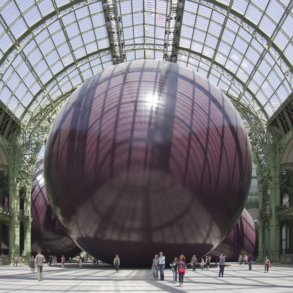
There was a time when inflatable pavilions were all the rage, but now architects are creating blow-up buildings for all kinds of uses. Here are 10 of the most inventive examples, including a mobile concert hall, a black PVC nightclub and a field of giant mushrooms. (more…)

http://ift.tt/2drGP28

La Pinada House / Fran Silvestre Arquitectos


© Fernando Guerra | FG+SG

© Fernando Guerra | FG+SG


© Fernando Guerra | FG+SG


© Fernando Guerra | FG+SG


© Fernando Guerra | FG+SG


© Fernando Guerra | FG+SG

  • Interior Design: Alfaro Hofmann
  • Collaborators: María Masià, Estefanía Soriano, Fran Ayala, Ángel Fito, Pablo Camarasa, Sandra Insa, Santi Dueña, Ricardo Candela, David Sastre, Sevak Asatrián, Álvaro Olivares, Paloma Márquez, Eduardo Sancho, Esther Sanchís, Vicente Picó, Erika Angulo, Alba Monfort, Ruben March
  • Structure: Josep Ramón Solé (Windmill)
  • Project Manager: Studio 2
  • Technical Architect: Carlos García

© Fernando Guerra | FG+SG

© Fernando Guerra | FG+SG

From the architect. Twenty-one plateaus and seven volumes tell the story of this house.

The aim of the project is to give a new and even identity to a house belonging to the same family for several generations. The original house formed by the aggregation of different interventions at different times, with different construction systems. Each of the rooms in the house describes a moment in life of this family story. Thus it was essential to maintain the structure, spaces, uses, garden and memories, presenting them in a new way.


© Fernando Guerra | FG+SG

© Fernando Guerra | FG+SG

Plan

Plan

© Fernando Guerra | FG+SG

© Fernando Guerra | FG+SG

The further layer built in the history of this place employs new volumes used for new parts of the program. In this way leisure areas are projected, containing always the scale of the building and are presented as a sort of aggregation of small parts, which draws courtyards and narrows areas, as the traditional Mediterranean architecture does.


© Fernando Guerra | FG+SG

© Fernando Guerra | FG+SG

Section

Section

© Fernando Guerra | FG+SG

© Fernando Guerra | FG+SG

The interior respects the intermediate levels system producing a large spatial heterogeneity in rooms with a wide variety of sizes and heights. The supporting structure of the original house is housed inside the furniture that has the same gray shade as the trunks of some of the species that inhabit the garden.


© Fernando Guerra | FG+SG

© Fernando Guerra | FG+SG

© Fernando Guerra | FG+SG

© Fernando Guerra | FG+SG

The house is woven both among the trees and among the good memories that live in this pine forest.


© Fernando Guerra | FG+SG

© Fernando Guerra | FG+SG

http://ift.tt/2dqqCKO

Hans Verstuyft Renovates a Historical Residence in Ghent, Belgium

Footbridge, Shelter and Bench on Straník Hill / 2021+LABAK


© Jana Makroczy

© Jana Makroczy


© Jana Makroczy


© Jana Makroczy


© Jana Makroczy


© Jana Makroczy

  • Architects: 2021, LABAK
  • Location: Stranik, 010 03 Žilina, Slovakia
  • Area: 1227.0 sqm
  • Project Year: 2016
  • Photographs: Jana Makroczy
  • Labak: Michal Marcinov, Andrej Badin, Zuzana Demovičová
  • Construction Company: SOAR
  • Client: Tourist Board Small Fatra – an organization founded by the city of Žilina, 8 other municipalities and 16 private companies

© Jana Makroczy

© Jana Makroczy

From the architect. Originally, the local government aimed to construct an observation tower at Straník, as the hill offers an exceptional view of Žilina – an 80 thousand industrial city in the Northwest Slovakia. Since the 1930’s the hill of Straník has been used for flying gliders. In a favorable weather, one can enjoy the view as well observe rogallos, paragliders and gliders taking off. Local authorities therefore initiated a workshop at the site, which brought together architects (2021 and LABAK), students of architecture and all stakeholders. The outcome of this gathering generated a consensus, that the idea of constructing a lookout tower at Straník should be reconsidered.


Axonometric

Axonometric

Obstacles
Firstly, Straník itself makes a great viewpoint, because much of the hill’s crest is not forested. Moreover, eventually it came to light that the crest of the hill was a protected national heritage site – around 10th – 12th century B.C. a hill-fort had existed here. Although no complex archeological excavations and research have taken place here just yet, it is only a matter of time. And that further complicates any kind of intervention into the environment. So in the end the ambitions to develop Straník narrowed down to: how to make this place attractive for tourists, while taking into consideration claims made by heritage conservationists, paragliders as well as forestry, because the area is also used for logging timber.


© Jana Makroczy

© Jana Makroczy

Solution
Instead of introducing new elements, 2021 and LABAK mapped the existing infrastructure – the pathway, provisional shelter and the bench and translated it into contemporary architectonic language.


© Jana Makroczy

© Jana Makroczy

The subtle footbridge aims to controllably manage movement of tourists, away from the flying, and at the same time provide an easy access to the top of the hill for visitors with limited mobility. The footbridge levitates above the terrain and the only physical contact is through ground screws. “Since we are located in an area of potential archeological excavations and an eventual need to present them to the public, the construction is reversible. So in case a need emerges, we can adjust the footbridge or move it,” says Peter Lényi, who is one of the authors of this project.


© Jana Makroczy

© Jana Makroczy

Shelter Detail

Shelter Detail

© Jana Makroczy

© Jana Makroczy

In the last stretch to the crest of the hill, the footbridge is discontinued in order to allow passage for the timber-logging logistics. Then it further continues to a shelter roof, from where visitors can observe the picturesque images of rogallos, paragliders and gliding planes taking off and flying above the landscape, while munching on a sausage from a near-by food stall. The pathway leads visitors to its end with a bench, where they can sit and enjoy the  panoramic view of Small Fatra mountain range and national park, as well  Žilina’s car factory.


© Jana Makroczy

© Jana Makroczy

This project used local black locust wood, which is maintenance-free, resilient to vermins as well as to changing weather conditions. 


© Jana Makroczy

© Jana Makroczy

http://ift.tt/2d5Apqf

Barber and Osgerby base minimal wooden table on Japanese joinery


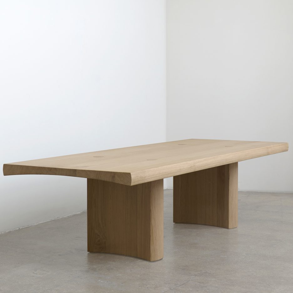
London Design Festival 2016: design duo Barber and Osgerby have created a limited-edition table constructed from just three curved pieces of oak (+ slideshow). (more…)

http://ift.tt/2d8GKx2

Central Canteen of Tsinghua University / SUP Atelier + School of Architecture Tsinghua University


© Xia Zhi

© Xia Zhi


© Xia Zhi


© Xia Zhi


© Xia Zhi


© Xia Zhi

  • Architects: SUP Atelier, School of Architecture Tsinghua University
  • Location: Qing Hua Da Xue, Haidian Qu, Beijing Shi, China, 100084
  • Architect In Charge: Yehao Song
  • Project Architects: Yehao Song, Jingfen Sun, Dan Xie , Xiaojuan Chen, Lina Wang, Xiaolong Zhang
  • Area: 21000.0 sqm
  • Project Year: 2015
  • Photographs: Xia Zhi

© Xia Zhi

© Xia Zhi

From the architect. To improve the living quality of the campus, a new building is built with multi-functions as canteens for students and professors, lecture hall and exhibition hall for the campus, office and service hall for the Tsinghua Career Center and food storage for all the canteens at the center of the campus of Tsinghua University.


© Xia Zhi

© Xia Zhi

The project paid close attention to those points in design:

1. The former chaotic site with blind corner should be transformed and integrated as a convenient and complete public place for the campus. 


© Xia Zhi

© Xia Zhi

2. The terrain of the site should be in good use for easy accessibilities in all directions. The trees and vegetation should be preserved to keep the continuity and sustainability of the environment.  


© Xia Zhi

© Xia Zhi

3. As a public building in campus, it should be a sustainable, low cost and low energy consumption building, which means that passive strategies, local materials and appropriate construction methods are essential.  


© Xia Zhi

© Xia Zhi

4. Architecture represents the spirits of campus and will be passed down in future. The brickwork could be designed as artwork, just like painting or sculpture, which mixes art and wall together. 


© Xia Zhi

© Xia Zhi

The site of project used to be a blind corner in the center of campus, with dead end road, chaotic traffic, mixed logistic and service route, unattended courtyard. All of these were mismatched with the location. The core idea of design is to repair the urban texture in the campus context, to improve the fluency of the site, to make it easy to get in for the public from all directions. 


System 1-Sustainability

System 1-Sustainability

System 2-3D Street

System 2-3D Street

System 3-Brick Wall & Activity

System 3-Brick Wall & Activity

The section design takes the full advantage of the terrain of the site, creates a three-dimensional indoor street for the public, through ground floor on east and B1 floor on west. The north and south are also available as entrance. The entrance floor of the building on the one hand is functional and solid and on the other hand is a kind of cluster of open public space, which makes students possible to access and go across the building in all directions. Moreover, the entrance floor serves as shortcut and meeting places for students in the campus.   


© Xia Zhi

© Xia Zhi

West-East Section

West-East Section

© Xia Zhi

© Xia Zhi

The old trees and landscape terrain in the site are preserved as much as possible. The project is built on the site of former canteen and former chaotic backyard, without occupation of the former open green space and vegetation in north and west of the site. To keep the sycamores on southeast corner alive and create more nature friendly outdoor space, the outline of the building was designed to keep at least 5 meters distance away from the trunks, and provide double-deck balcony, bay window and wooden cafe terrace for people. 


© Xia Zhi

© Xia Zhi

Sustainable strategies, especially passive design strategies are adopted in the project to make the space more comfortable and reduce the cost and energy consumption in operation. 


Natural Lighting & Ventilation

Natural Lighting & Ventilation

The building above ground is divided into two main functions: canteen and career center, which are operated independently. They are connected with a public atrium, which connects public spaces on different stories, like a traditional inner Chinese courtyard. On the top of the atrium there are seven egg-shaped skylights, which bring natural daylight to the atrium. Each of the skylights has a small window on the side frame wall above the roof, which could be opened as outlet vent for natural ventilation. The 3-story high atrium works like a stack and with all inlets and outlets open, there is a stack effect to accelerate the natural ventilation and prevent the whole space from being overheated and make the atrium more comfortable in summer. Obviously, it significantly reduces the maintain cost and energy consumption for artificial lighting and air-conditioning in operation phase. 


© Xia Zhi

© Xia Zhi

The depth of the building is more than 40 meters, to improve the daylight and natural ventilation for the public space and offices, a roof garden with side windows is inserted to the 3rd floor. The glass curtain wall with grating, facing south, draw more sunlight to the atrium courtyard. The flat roof windows on the timber floor of the roof garden will bring natural light down to the lecture hall. Among which two raised boxes with side windows are used for low cost chimney to accelerate the natural ventilation for the hall. The roof garden can be used as open cafe or party for the campus. 


© Xia Zhi

© Xia Zhi

The exterior brick wall is also designed with the idea of sustainability. In this project, the brick masonry walls are built not only as enclosure wall, they are also as sun-shading system and ventilation openings. The width of the gaps between bricks could gradually change from 30 mm to 100mm, to satisfy the required aperture ratio. 


© Xia Zhi

© Xia Zhi

Bricks are constructed in more than 5 ways: in conventional way, in zigzag way, brick indented, brick overhung and brick sun-shading system. They bring various textures for exterior walls and meet different functional demands.


Tiled Wall Structure of Northwest Stair

Tiled Wall Structure of Northwest Stair

Tiled Wall Structure

Tiled Wall Structure

The brick for the sun-shading façade is using a kind of specially customized brick with two rectangular holes, every piece of which should be integrated with reinforced bar through the holes in vertical, and every 8 layers bricks will be integrated with stainless flat steel in horizontal. All the bars will be welded on the flat steel, and they will be integrated with the main structure to keep the brick sun-shading facade safe and stable. The rectangular holes are set to suit the gap between bricks, which could be changed according to the design, to meet the needs of sun- shading or ventilation, and to keep the wholeness of the brick façade. 


© Xia Zhi

© Xia Zhi


© Xia Zhi

© Xia Zhi

The masonry wall, as handmade constructed wall, could be more than a mere functional element. Some brick walls are designed as pieces of art work, to emphasize the specificity of the space. Taking the wall under the east steel porch, next to the east entrance as an example, the overhung bricks are settled like a painting, the brick wall is embodied with the capitalized characters of GHUA as part of “TSINGHUA”, the name of the university.   


© Xia Zhi

© Xia Zhi

The advantage of handicraft is adopted in the project. Since the brick walls are designed like artwork, the traditional craftsmanship is prevailing.       

http://ift.tt/2diHe5N

Siam Discovery / Nendo


© Takumi Ota

© Takumi Ota


© Takumi Ota


© Takumi Ota


© Takumi Ota


© Takumi Ota

  • Architects: Nendo
  • Location: Thailand
  • Area: 40000.0 sqm
  • Project Year: 2016
  • Photographs: Takumi Ota
  • Owner And Developer: Siam Piwat Co., Ltd.
  • Concept: The Biggest Arena of Lifestyle Experiments
  • Budget: Bht 4,000 Million

© Takumi Ota

© Takumi Ota

From the architect. Siam Discovery is The Biggest Arena of Lifestyle Experiments packed with exhilarating experiences that say ‘come play with us’ to visitors. People can come in to experiment and discover what they like and what expresses their own identity best.


© Takumi Ota

© Takumi Ota

© Takumi Ota

© Takumi Ota

Without the constraints of a particular brand or school of design, products are brought together under a single universal concept that puts customers at the centre; everything at Siam Discovery is presented by visitor’s interest. From among a choice of more than 5,000 international and local brands of every price range, customers can conveniently choose, mix, match, try, and then try again so that their purchases are in line with their taste and needs.


© Takumi Ota

© Takumi Ota

© Takumi Ota

© Takumi Ota

Among the exciting debuts at Siam Discovery is a new Loft store with a design concept that is being utilised for the first time in the world and which is conceived by world-renowned designer Nendo and Loft Japan’s designers. Nike is opening its only concept store in Southeast Asia. Issey Miyake will open its first concept store outside of Japan. It is called the World of Issey Miyake and offers a full line of products including, for the first time in Thailand, Issey Miyake’s products for men.


© Takumi Ota

© Takumi Ota

© Takumi Ota

© Takumi Ota

Home decoration brands like Hay, Tom Dixon and Kartell will open their first and only concept stores in Thailand. Artist’s Design Products from world-class artists like Yayoi Kusama and Lisa Larson will have their first and only stores in Thailand. And, Adidas will open its largest concept store in Thailand and with an interactive store concept.


© Takumi Ota

© Takumi Ota

http://ift.tt/2d4WnJP