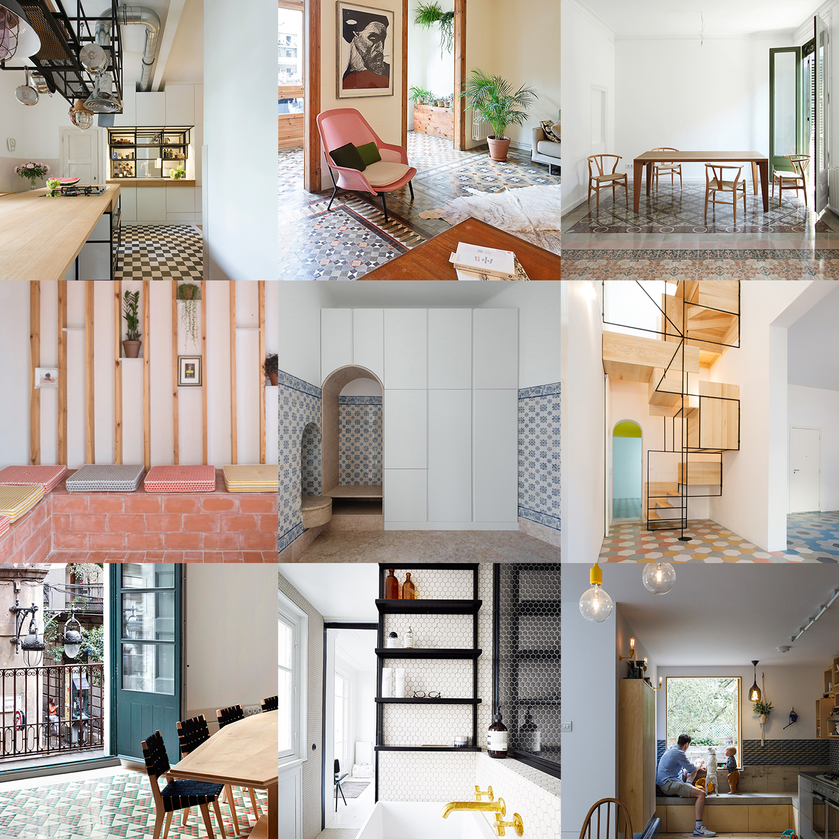
This week we’re counting down the most-pinned home interiors that feature tiled surfaces, from original mosaic floors in Barcelona apartments to a contemporary kitchen in a London house extension (+ slideshow). (more…)
This week we’re counting down the most-pinned home interiors that feature tiled surfaces, from original mosaic floors in Barcelona apartments to a contemporary kitchen in a London house extension (+ slideshow). (more…)

From the architect. Rios Clementi Hale Studios renovated and expanded an eclectic, 1980s manor house into a contemporary “farmhouse” retreat for a film and television producer. Since the original house was already well situated in its orientation to canyon views, the architects kept the building footprint in place and preserved the height and steep pitch of the roof to create a loft feeling inside. They extensively remodeled and expanded the interiors to open the rooms, simplify the circulation, better capture views, and blur the boundary between indoors and outdoors. The architects maximized the existing “bones” of the house and then focused on letting the landscape flow through.
Complementary slate roof tiles and tongue-and-groove siding of gray-painted cedar replace the original exterior materials. New expanses of glass are screened from direct sunlight by a rhythmic pattern of vertical, aluminum fins forming a continuous, two-story brise soleil (that also deters nosy onlookers). Large, cantilevered windows rimmed in steel project from gabled additions on the north and south sides of the house to engage the landscape. Original masonry chimneys were rebuilt to current seismic standards and internal gutters hidden from view to maintain the home’s taut profile. The resulting design reinterprets the traditional barn vernacular through modern simplicity and transparency.
The house is organized into a T-shape with rooms on each level accessed from the longer, horizontal bar, essentially a central, east-west circulation spine that extends the entire length of the house. Staircases and less-used spaces—including guest rooms, home gym, garages, and screening room—occupy the perpendicular wing at the front of the property. To highlight the owner’s extensive art collection, the architects designed the interiors as clean-lined, flowing spaces open to views through floor-to-ceiling windows. New skylights funnel daylight into living spaces and bedrooms. Banks of glass doors open the ground floor rooms to the outdoors. Steel-framed windows on the second floor project into the landscape to create the feeling of being suspended in midair. Connections to the outdoors are reinforced through floors of gray limestone extending from the entrance through the foyer, living area, and family porch to cover the rear patio.
A staircase featuring full-height, gunmetal-finished metal railings at the center of the house leads to the middle of the spine, where a mezzanine office/den overlooks the living room on the west end, and bedroom suites sit at the east. The original master suite was moved from the southwest corner of the house to the northeast side overlooking the pool view. The master bedroom was enlarged and new his-and-her bathrooms added to the suite.
The interior furnishings selections—by Waldo’s Designs, which is known for its high-profile Hollywood clientele—complement the architecture in their soft contemporary style. Natural textures, including dark-stained oak, rough-hewn stone, and high-grained woods, are balanced against the hard-edged, metal surfaces, glass walls, and stone floors throughout.
An important component of the design is the estate’s park-like landscape that was refreshed and refined by the architects. Old-growth trees, including redwoods, cedars, and palms, are preserved and surrounded by manicured lawns and hedges. The lawn appears as an extension of the golf course below the property to reinforce the vistas from the estate. Separating building from landscape is a strip of gravel encircling the base of the house to set off its modern architecture. A new reflecting pool and illuminated bridge create a dramatic entrance to the front door, particularly at night when the glass-faced house glows like a lantern.

Studio Pei-Zhu has unveiled plans for the Yang Liping Performing Arts Center in Dali, Yunnan, China. Located at a low latitude and high elevation, Dali features a dramatic terrain and a unique climate that create a boundless relationship between earth and sky. The project site is located in the heart of this landscape, on a fertile plateau between the Cangshan mountain range and Erhai lake.
In designing the Performing Arts Center, Studio Pei-Zhu has drawn inspiration from these natural variations in landscape and climate, employing a large canopy roof and a flowing form to invite users into the complex.
Graded topography and grassy hills draw theatergoers into an interior plaza, A “theater box” opens onto the plaza, transforming the space into an interior-exterior performance area. The blurred boundary between indoor / outdoor and landscape / stage also work to erase the psychological boundaries between performer and spectator.
The entire building itself is performative and accessible, as the building slopes down to create a stairway leading from the interior plaza to the building roof, opening up casual public space featuring views of the surrounding terrain.
The building’s materiality evokes the spirit of the surrounding mountains, while its unique woven facade allows light to penetrate into and through the building.
Construction on the Yang Liping Performing Arts Center is currently underway, with an expected completion date coming in 2017.
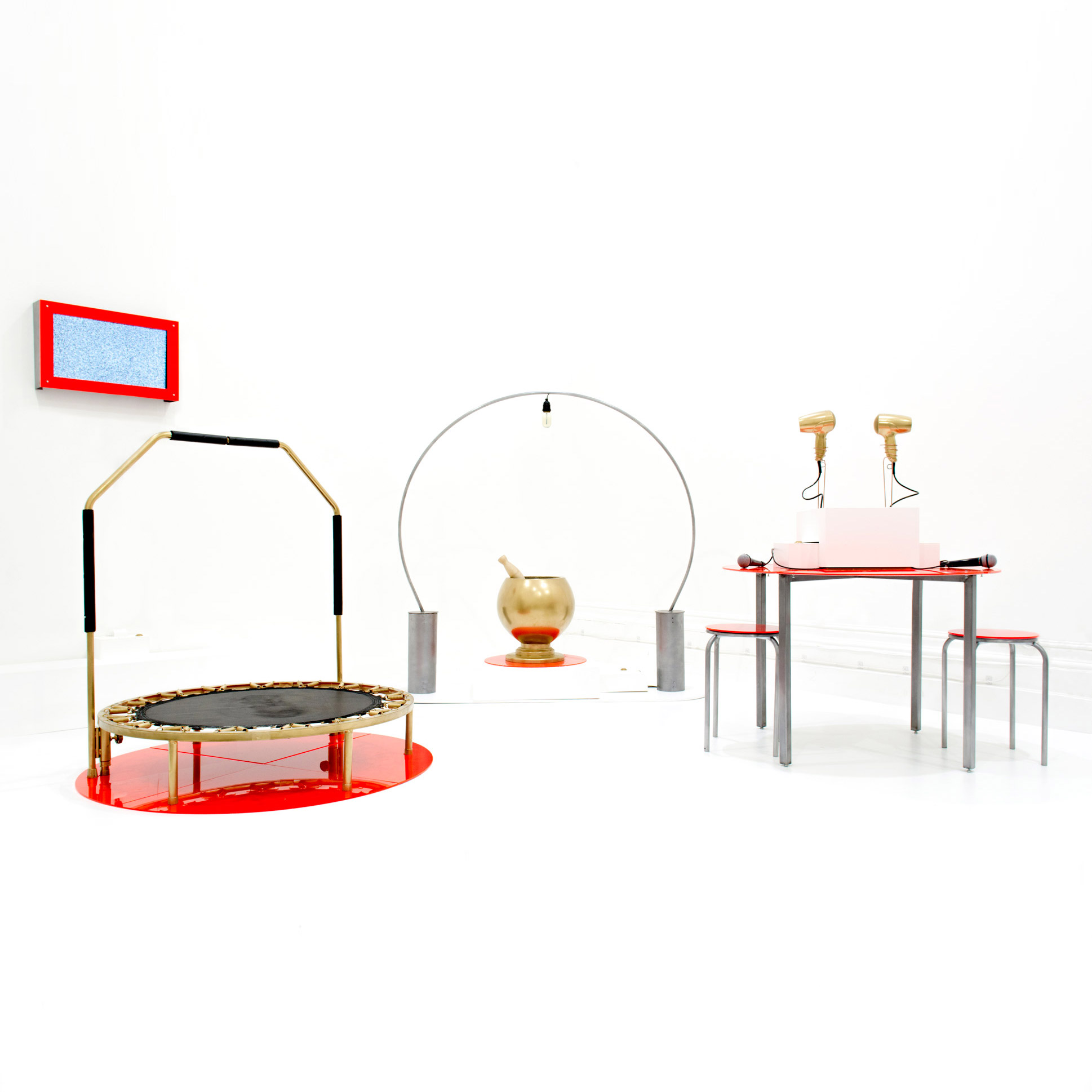
Graduate shows 2016: in this movie, Royal College of Art graduate Meret Vollenweider explains how her interactive installation of human-powered appliances aims to stop people taking electricity for granted. (more…)

From the architect. With the Centre d’Art Diane Dufresne, ACDF Architecture has created a new arts centre for the suburban municipality of Repentigny, providing a dynamic core where residents can take in stirring arts and culture without getting on the highway to nearby Montreal. The centre’s architecture, including its siting, massing, circulation and materiality, are instrumental in reinventing the desired community image. It plays with notions of rootedness while gesturing to a vibrant future, instilling a sense of belonging and optimism. Familiar yet distinct, it invites visitors in and encourages long, lingering stays.
With this project, the Municipality of Repentigny and ACDF conceived of the centre as a part of a larger master plan. It is the kick-off element to transform a once-sparse, underutilized park into a cultural corridor with thematic gardens, a civic plaza and a theatre. Part of the broader redevelopment scheme is to provide connections between previously disjointed, bungalow-lined streets. The design team positioned the building at the nexus of new walking paths, linking a main boulevard with surrounding residential lanes, helping to draw people to the site.
The building’s overall form further helps attract residents. The studio reinterpreted classical principles — a carefully proportioned colonnade in front of a calm reflecting pool, a monolithic materiality, and a solid, reassuring appearance — with its signature, contemporary sophistication. A number of the columns are off kilter to foster moments of encounter; the materiality is a glinting stainless steel; and the inner mass is sub-divided into three sinuous, Aalto-esque volumes, each of which conceals the centre’s multipurpose room, dance recital space and main gallery area. These spaces again balance functionality and flair. Each interior is understated to let the art shine, and was designed to optimize acoustics and lighting. Beyond contemporizing the façade, the building’s materiality deftly acts as a beacon — important, as the structure is set back from the nearby roads. The row of shimmering columns gleams in the sun, their reflectivity calling to passers-by as well as amplifying and dramatizing the surroundings, such as sunlight, vegetation, and seasonal colours. The qualities of the cladding also echo those of the bell towers of the Église de la Purification-de-la-Bienheureuse-Vierge-Marie, the oldest church in the Montreal region. To contrast the metal’s slickness, the three sinuous volumes in the interior are clad in locally sourced wood, which emanates warmth under an array of skylights.
The classic-meets-contemporary appearance helps establish a sense of familiarity and the porous circulation allows the public to weave through layers of the building, informally experiencing the art. Visitors can wander along through the newly landscaped forecourt, crossing a slatted wooden promenade that transverses the serenity of the reflecting pool (which doubles as a filter for storm water runoff). They can walk through the exterior colonnade, which also functions as an open-air exterior gallery, and absorb the creativity of the place without stepping inside the building. Or they can enter the interiors, and explore the galleries of linger in the interior colonnade.
Importantly, the centre contributes to the community regardless of the time of day. At night, it acts as a lantern, activating the surrounding park, and making serene reflections in the pond — reflections that express a sense of temporality, and which will instil a sense of calm for years to come.
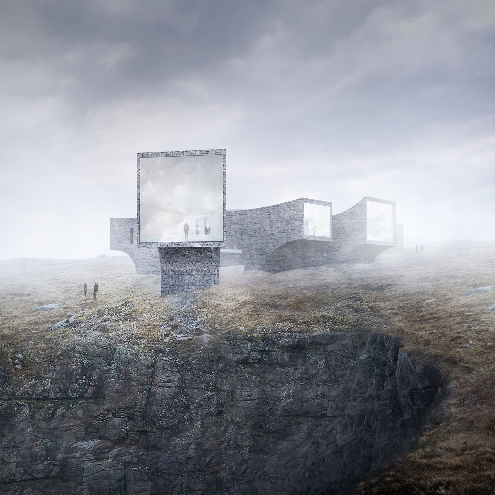
Norwegian firm Reiulf Ramstad Arkitekter has teamed up with Scottish studio Dualchas Architects to design a seafront visitor centre for an island in Scotland’s Outer Hebrides. (more…)

Walking next to a construction site is anything but enjoyable. Unavoidable noise (and sometimes air) pollution is partly responsible, but development hoardings also contribute to the unpleasant feeling. In most cases you walk alongside blank canvases, made from OSB or poorly built plywood boxes, and covered with a concrete grey or navy blue Dulux paint. If you’re lucky enough to pass by a development for luxury apartments, you’ll find some lavish advertising for the homes which, of course, you couldn’t afford anyway. With her blog “Development Aesthetics,” Crystal Bennes gives credit to the visual importance of hoardings, showcasing London’s latest construction sites and commentating on the inadequacy and often absurdity of the advertising on their hoardings. As apartment blocks mushroom around the British capital, the issue increasingly affects inhabitants’ use and understanding of public spaces.
Hoping to turn this trend around, the UK-based construction, architectural and engineering firm Primebuild has launched its “Canvas for London” Initiative, using construction site hoardings as platforms for artists to display their work.
According to Primebuild’s director Tom Tighe, “We believe in not just the end product, but the beauty of the process along the way. We see hoardings as temporary structures, which are the only connection with the public during works–a huge opportunity and one which we should give to the creatives of our cities who need the chance to promote their work on some of the biggest canvas sizes around.”
Hoardings could also meet educational goals, as exemplified by local artist Joshua Richardson with his “Project Plural.” The drawings–currently displayed on Primebuild’s construction sites–aim to “bring to life the ongoing importance of animal conservation, to educate children and adults through humorous illustrations and unearth all of the forgotten collective nouns.”
But the initiative’s primary goal is to raise awareness within the building industry. Architects and construction firms are not only responsible for the completion of their design, but also for the quality of “temporary” living environments during construction works. This approach needn’t even be an expensive added construction cost, as young artists looking for recognition could offer low-cost, compelling solutions to the design of suitable hoardings. In fact, only one question remains: why isn’t Primebuild’s approach more widespread?
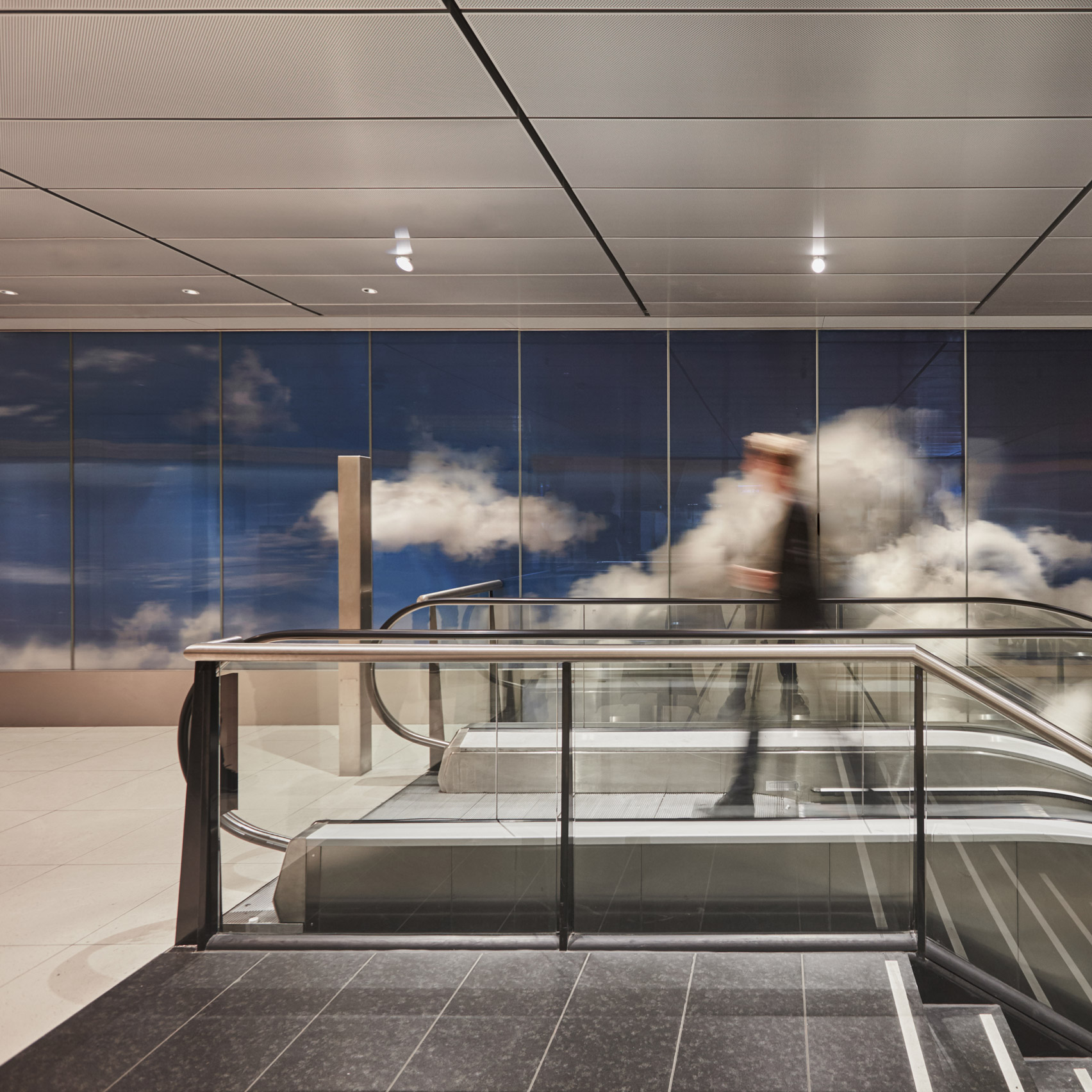
Dutch designer Daan Roosegaarde has covered a wall at Amsterdam’s Schiphol Airport in a realistic, cloud-studded sky (+ movie). (more…)

From the architect. It is a great challenge in an architectural sense, a great question whether contemporary architecture can be present in a village where the largest architectural intervention of the past 100 years has been some change of windows and doors; where the idea of the most modern materials is the red and blue metal rooftops and the idea of „form” remains the archetypical shape of the house. What tools does contemporary architecture have in such a conservative village sticking so much to traditions? Where could we start? Which values are we reflecting on, trying to save them from the current decay that will obviously disappeare soon and forever without intervention? How can something fit into this environment having a function that has never been seen there before, something that has no ancestors, no past, no natural location in the village? Being in connection with the environment is not a cliché here coming from the vibes of „genius loci” creating nice forms and transcendent content,it is rather a very practical need that could secure the long-lasting future of the pavilion: having connection is means of survival here. In a situation where the house is left alone for 11 months of the year (the 12th one being the time of the excavation) in the cornfield by the village the only chance for survivor is to have owner.
And there can be owner only if locals become owners. If locals can relate to the small constructions by their village, if they are able to accept them, and the community is able to look at them as its own and feel responsibility for them – in this case the pavilions can last the time they were constructed for. In any other case their inevitable future is decay and destruction. Considering these having connection is not only a purpose-it’s the only chance for the existance of the pavilions.

Clark Nexsen has won the international Activate Urban Housing Design Competition with its proposal for an urban dwelling on South Mint Street in downtown Charlotte, North Carolina. The design, entitled Mint, focuses on connectivity and neighborhood and includes residential, retail, and open green spaces.
Conceived as a catalyst for a culinary district, Mint aims to create a new urban living and working space, in which the connectivity of food-centered entrepreneurial enterprises fosters a sense of community.
Conceptually, we found a culinary incubator an interesting way to tie the residential with the retail and on a macro scale tie the development in with the bigger picture in Charlotte,” said Clark Nexsen architect, Albert McDonald. “We started to make connections between Johnson & Wales, a culinary school in Charlotte, tapping into new restaurants, bars, and breweries popping up in the local area. We started making connections to downtown Charlotte and the Carolina Panthers Stadium and started to think this could be a really good place for people to hang out before going downtown for games, as one example.
The site design additionally focuses on green space, incorporating a co-op garden for residents in partnership with test kitchens and on-site restaurants, as well as green pedestrian paths between residential and shared spaces.
Furthermore, a plaza will accommodate live entertainment and market or food trucks on Saturdays.
Learn more about the project here.
News via Clark Nexsen.

