Nagoya Courthouse / Takeshi Hosaka Architects


© Koji Fujii / Nacasa & Partners Inc.

© Koji Fujii / Nacasa & Partners Inc.


© Koji Fujii / Nacasa & Partners Inc.


© Koji Fujii / Nacasa & Partners Inc.


© Koji Fujii / Nacasa & Partners Inc.


© Koji Fujii / Nacasa & Partners Inc.

  • Structural Engineers: Kenji Nawa / Nawakenji-M
  • Client: Keisuke Noguchi
  • Site : 470.60 sqm
  • Building Area : 233.84 sqm
  • Floor Area Ratio: 187.67 sqm

© Koji Fujii / Nacasa & Partners Inc.

© Koji Fujii / Nacasa & Partners Inc.

From the architect. The site is located approximately 1 km west of Nagoya castle and in the neighborhood there are 2 story houses as well as high rise apartments over 10 stories high. Summer in Nagoya is very hot. When a downpour occurs water can rise over 50 cm above street level. Taking these matters into account we have designed a serene and comfortable house for a family of three (husband/wife and  child).


© Koji Fujii / Nacasa & Partners Inc.

© Koji Fujii / Nacasa & Partners Inc.

Plan

Plan

© Koji Fujii / Nacasa & Partners Inc.

© Koji Fujii / Nacasa & Partners Inc.

Taking advantage of the large site we have designed a single level court house surrounding a courtyard garden. However if we make it just a court house the outline of the sky is too distinct and from the surrounding high rise apartments you are able to see inside therefore we had the line of the glass facing the courtyard and the line of the roof cave in and protrude and the line of the glass, eaves and dirt floor intersect at the inside/outside boundary in a plane format. In this way it becomes an architectural style where the outside dirt floor with a roof, outside dirt floor without a roof, outside vegetable garden, all dirt floors inside and each area facing the inside glass come together side by side near the inside/outside boundary. This diverse area as well as having a role of controlling the line of sight and shutting out direct sunlight in summer it creates a living space where inside, half outside and outside produce a variety of living scenes.


© Koji Fujii / Nacasa & Partners Inc.

© Koji Fujii / Nacasa & Partners Inc.

The height of the floor is made 75cm higher than the front street for safety measure in case of a downpour. We have used diatom earth for the inside wall as much as possible so that you can feel the naturalness of the dirt. The outer wall was created with plane lines of roughness and planted a tree in the small outer garden so that you will be able to see the leaves outside form the small window. In addition, due to the window at the courtyard side and the small window at the small outer garden side the whole house has natural air flowing through thereby making it livable even in the hot summer of Nagoya.


© Koji Fujii / Nacasa & Partners Inc.

© Koji Fujii / Nacasa & Partners Inc.

The footpath made of earth mortar in the garden courtyard creates a shortcut access path and both inside and outside were planned to play a main role with daily life, vegetable garden life and garden life coming together. 


© Koji Fujii / Nacasa & Partners Inc.

© Koji Fujii / Nacasa & Partners Inc.
http://ift.tt/2bCJVys

Villa Mangwon / aoa architects


© Chin Hyosook

© Chin Hyosook


© Chin Hyosook


© Chin Hyosook


© Chin Hyosook


© Chin Hyosook

  • Architects: aoa architects
  • Location: 415-60 Mangwon-dong, Mapo-gu, Seoul, South Korea
  • Architect In Charge: Jaewon Suh, Euihaing Lee
  • Construction: COWORKERS
  • Area: 290.3 sqm
  • Project Year: 2016
  • Photographs: Chin Hyosook, Suh Jaewon, Hong Sangdon

© Chin Hyosook

© Chin Hyosook

From the architect. Villa mangwon is five stories building with gabled roof. The shape of the site is nearly rectangular and it has distant views on the upper floors. On the ground floor there are parking areas and a small retail shop with pilotis. The upper floors consist of small offices on the 2nd floor, four linear studio apartments on the 3rd and 4th. The studio apartment for rent is entirely open to the south and north, where it has a small balcony on the south and an open street view on the north. The top floor is the land owner’s family house with an attic and a small roof terrace. 


© Hong Sangdon

© Hong Sangdon

The family house has a linear living room on the west, two small rooms on the east and they are connected through a corridor of gable form. At the end of this corridor, natural light is coming through the skylight which connects two rooms, corridor and attic spatially, while giving enough light to those. The attic is finished with raw materials and normally for children’s playroom. Through a korean traditional wooden window in the attic children can talk to parents in the dining area. The roof terrace has a feeling of a room due to its wall with rounded opening on the south.


© Chin Hyosook

© Chin Hyosook

Section

Section

© Chin Hyosook

© Chin Hyosook

The structure of the building presents the A(served)-B(servant)-A(served) spatial system that invites an open view in the linear space. Contrary to the ‘white monolith’ with irregular window arrangement shown frequently in small housing projects in Korea recently, villa mangwon obviously expresses stacking each floor with regular and repetitive window arrangement.


© Chin Hyosook

© Chin Hyosook

This strategy reflects on our fundamental attitude which is to ask the architectonic meaning in the construction, to keep a distance from excessive sentimentality in design methodology and to seek harmony within disharmony. The front facade implies that the social weight rise upwards while it looks like the whole physical and social weight rest on the single thin column on the ground floor. Metaphorically, it resembles somewhat to the unstable structure of the Korean real estate market.


© Chin Hyosook

© Chin Hyosook

http://ift.tt/2bCCWp8

Rooftop bridge connects riverside house and roadside cafe in a South Korean valley


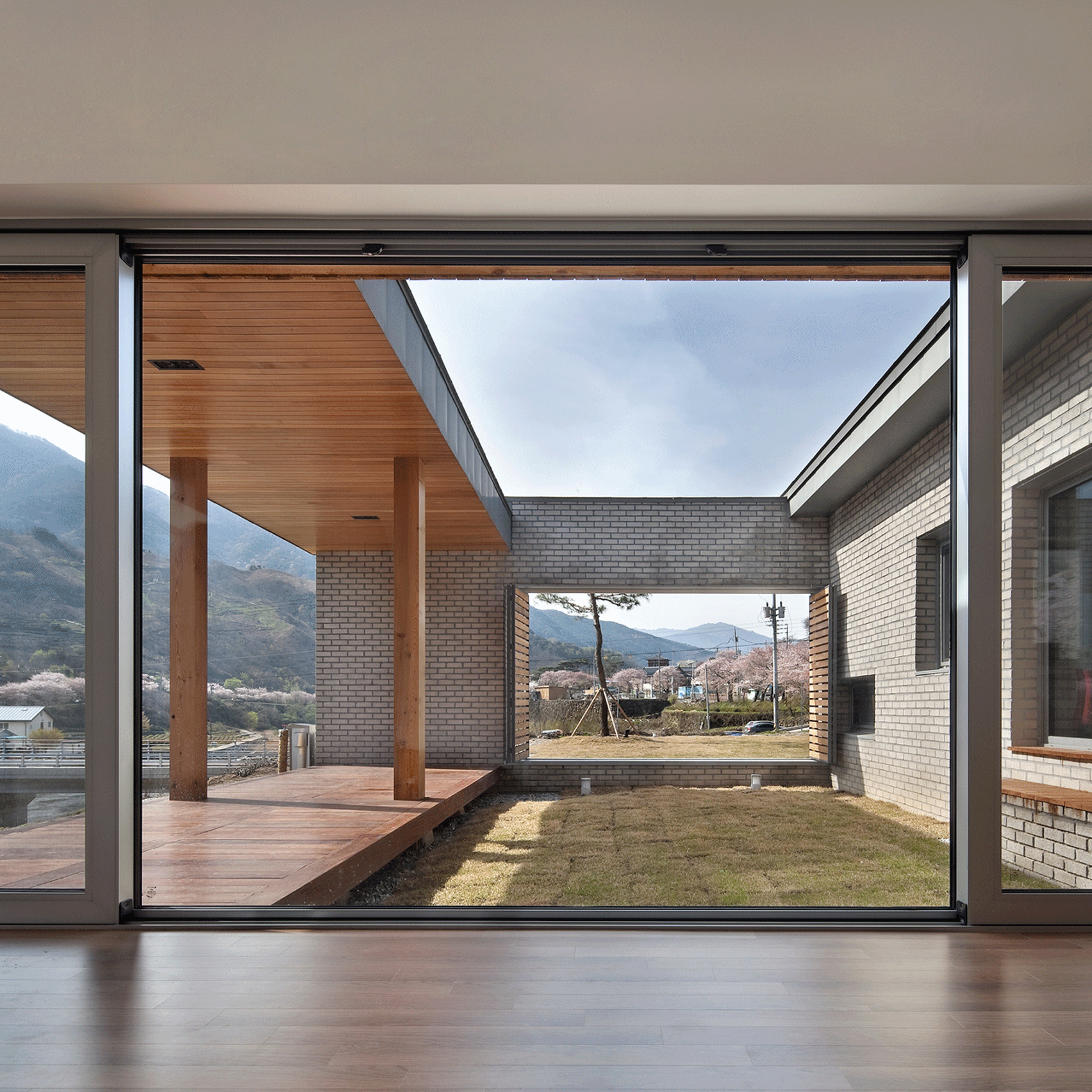
South Korean studio Lee Haan Architects has completed a house and cafe connected by a bridge and arranged around courtyards with views of a nearby river and cherry trees (+ slideshow). (more…)

http://ift.tt/2b28P9e

Tom Dixon designs “darkly theatrical” Himitsu cocktail lounge in Atlanta


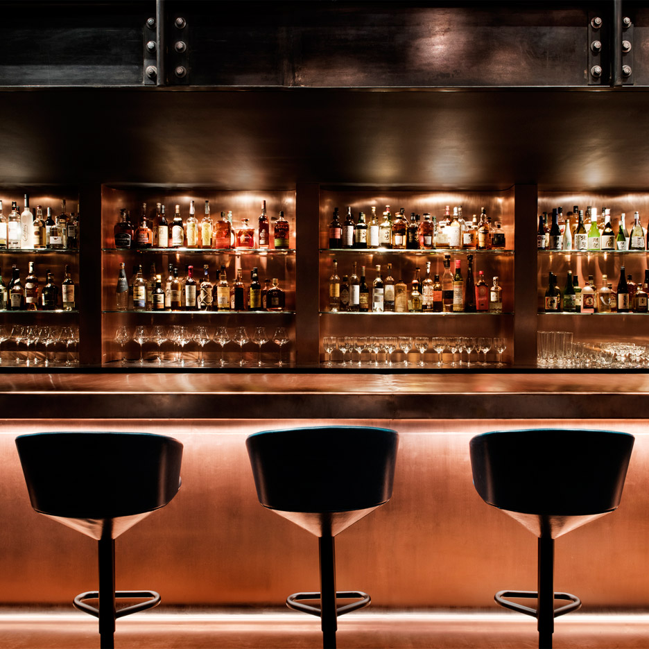
British designer Tom Dixon has completed his first hospitality project in America: a speakeasy in Atlanta, Georgia, featuring a copper bar and pendants that resemble molten metal (+ slideshow). (more…)

http://ift.tt/2bfdFQ5

Fukuchiyo Sake Brewery / yHa architects


© Y.Harigane

© Y.Harigane


© Y.Harigane


© Y.Harigane


© Y.Harigane


© Y.Harigane

  • Architects: yHa architects
  • Location: Kashima, Saga Prefecture, Japan
  • Area: 154.75 sqm
  • Project Year: 2014
  • Photographs: Y.Harigane
  • Construction: Nex-Corporation
  • Client : Fukuchiyo sake brewery
  • Site Area: 2,970 sqm

© Y.Harigane

© Y.Harigane

From the architect. Saga Prefecture Kashima is a city where east was facing the Ariake Sea. Southwest of Kashima City forms a border between the Nagasaki Prefecture, is a town with a population of about 30,000 people. Kashima City of “Hizen Hamashuku” is made at the mouth pouring into the Ariake Sea, it is a militia town that still has old streets. The town prospered as a port city, a post town, brewing has been carried out from the Edo era (1603-1858) in that there is abundant water and rice. Among them, Fukuchiyo sake brewery was founded in the late Taisho (around 1920), is the Japanese wine cellar of 1000 stone (100,000 bottles), and has received high evaluation, etc. to win the award in various awards ceremony recognizing excellence. Brand “Nabeshima” in 2011 is the fact that won the world’s highest award of the world in the IWC International Wine Challenge sake department, was collected at once many people’s attention. The Japanese wine cellar, tourists began to visit many from Japan across the country. Then, with a focus on the opening of a storehouse for the first time in the year and “Kashima brewery tourism” began. In 2015 it seems to give the attract of 70,000 people in two days.


© Y.Harigane

© Y.Harigane

In the wake of the award I have been involved in continuing to renovation plans, such as showrooms, office, lounge, rice warehouse, exterior design. This is the renovation project the old rice mills of registration tangible cultural property (the 1921 completion) to the gallery that can tasting and brewing exhibition for visitors. Because it is a registered tangible cultural property, it can not be basically the appearance and shape change, are landscaping the outer wall by burned cedar. The building of the old rice mill has long become a warehouse, it was a state that is tilted by leaning against the structural next to the equipment building. The plan, by the revitalization dragged along with the weight of the roof to correct the slope, we have structural reinforcement by newly inserting an iron plate below the beam. Wall of black leather iron plate of 12mm thickness, and at the same time increase the strength by installing a rib frame member of 4.5mm thickness around the square hole, has become a fixture to exhibit 1.8 litres bottle and 720 milliliters bottle. Iron plate wall structural member is directly finish, it is possible to respond to future flexible exhibition plans by using a fixture that uses a magnet.


Axonometric

Axonometric

As we consider plan, rather than a typical old house renovation column method of reinforcing the joints as seen in, it was decided to insert by offsetting the iron plates of the structural reinforcement inside. In doing so, the “soil walls 94 years ago of the inner wall,” as much as possible was considered leave as it is. It is for the “massive material that earthen walls” that the deposition of the time, because I felt a feeling of wrongness that the colliding a “superficial material for structural reinforcement” by the wood that was camouflage in antique painting. While aware of the time difference inherent in such material, I have dared using an iron plate, it is why you feel that there is “aging aesthetics” of aging and the same quality with the soil wall in black leather iron plate.


© Y.Harigane

© Y.Harigane

From Leon Battista Alberti up to Microsoft Windows, we know the world by what you see Some of the frame (“The Virtual Window” Anne Friedberg, The MIT Press, 2009). Square holes bored in the steel plate wall, so to speak “also said to unexpected mud 94 years obtain” are framing the the layers were also becomes an apparatus for observing (observation device). It is of course to watch the gallery inside of the exhibit, see this building through the square hole, it was also one of the important themes of this plan to obtain at the same time more than one viewpoint.


© Y.Harigane

© Y.Harigane

Throughout the plan, by putting a dare new elements while highlights the its form of architecture that remains from ancient times, given the space and the old ones, such as further look good “Architectural Interventions” is a concept.


Floor Plan / Section

Floor Plan / Section

We have inserted an iron plate of structural reinforcement (steel wall and ceiling+floor plate) to the existing building.  Since the bridge for crossing the building east of the waterway was decrepit, it was established the bridge by the tube-shaped 12mm of steel plate, which also serves as the entrance of the eaves.


© Y.Harigane

© Y.Harigane

The results of structural analysis, structural reinforcement by the 12mm steel plate, 4.5mm has made 1.65 times strength of rib-free by attaching the frame member (600 × 600mm · 900 × 900mm) by the ribs.


Section

Section

http://ift.tt/2bfcEHO

Video: Curators Discuss “Making Heimat, Arrival Country,” the German Contribution to the 2016 Venice Biennale

In this video, presented in collaboration with PLANE—SITE, the curators of the German Pavilion at the 2016 Venice Biennale discuss their theme of “Making Heimat, Arrival Country.” The exhibition explores the current influx of refugee communities occurring in Germany, and how architecture can be used to improve the “arrival cities” where immigrants tend to settle.

A word without a direct English translation, “heimat” refers to the sense of belonging and hominess of a place, rather than simply its pragmatic function in filling basic human needs.

“In a way it’s ‘modern home’, not only an architectural but also a mental situation,” explains curator Oliver Elser. “We have a housing emergency situation and a refugee emergency situation. So these two frontlines come together and it’s absolutely necessary to think about the situation in an architectural way, and not only as shelter for the people.”

The pavilion design subverts typical architectural exhibition strategies, opting not to include any architectural models while instead creating what designer Julian Schubert refers to as “spatial installation displaying the atmosphere of arrival cities.”

Commissioner Peter Cachola Schmal concludes, “The German pavilion will not be a normal architectural exhibition. There will be no architectural models; it will be quite something else. It will be political.”

See more of the interviews we conducted with PLANE—SITE and the rest of our Biennale coverage at http://archdai.ly/2016biennale.

Making Heimat: Inside Germany’s Pavilion for the 2016 Venice Biennale
//cdn.embedly.com/widgets/platform.js

http://ift.tt/2aWk8la

Oppenheim Architecture celebrates imperfections of La Muna chalet in Aspen during renovation


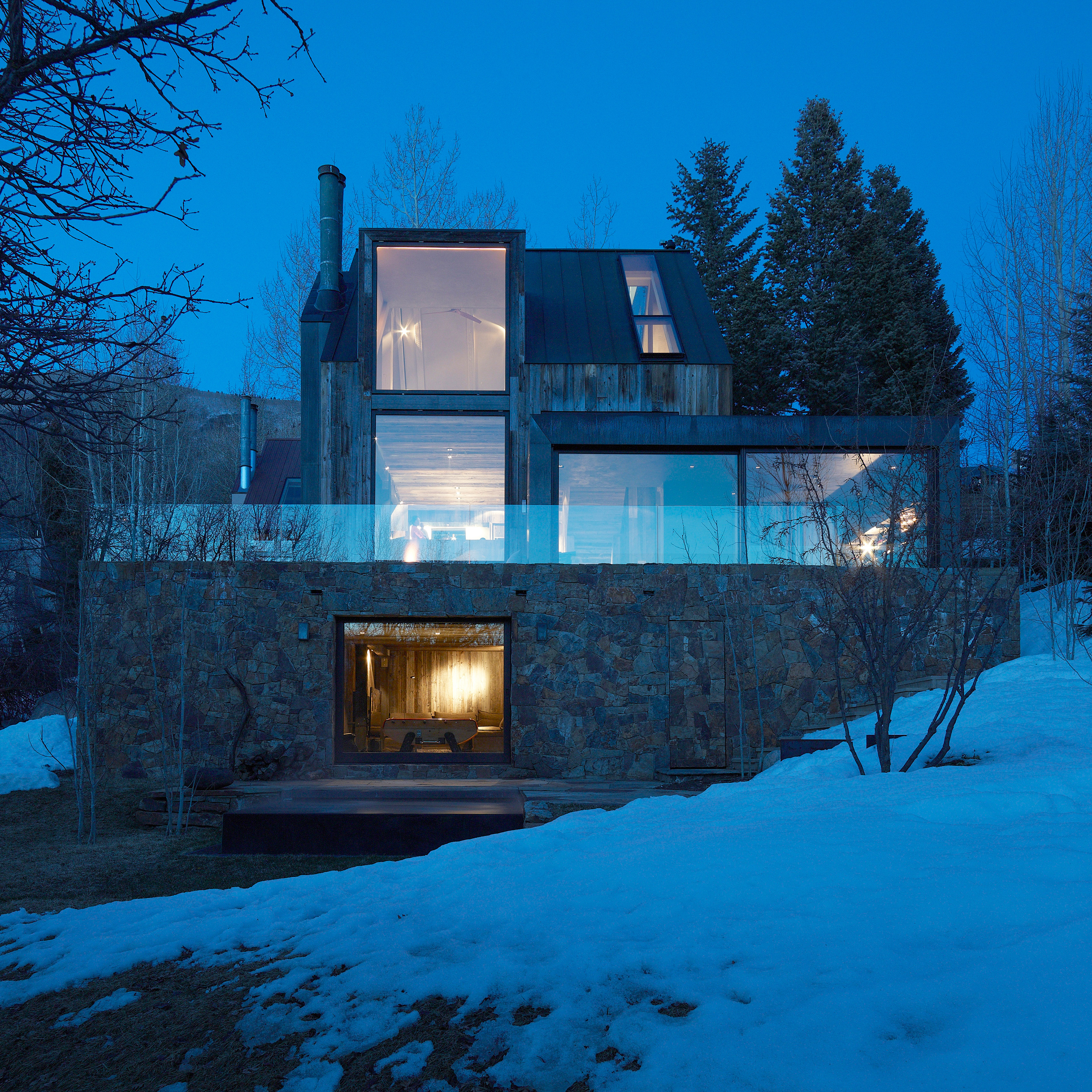
This rustic residence in Aspen has been renovated by Miami-based Oppenheim Architecture in line with the Japanese principle of wabi-sabi, which acknowledges imperfection as beauty (+ slideshow). (more…)

http://ift.tt/2bf3POo

Autonomous Tent creates a remote glamping spot on a California clifftop


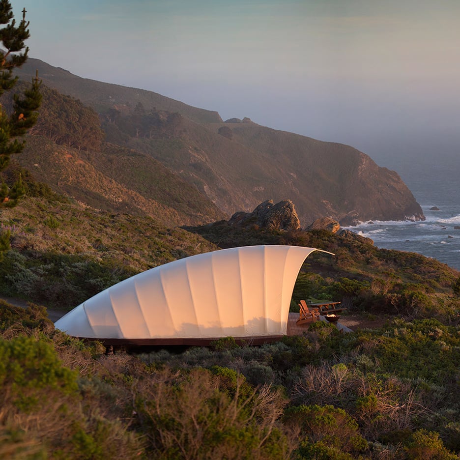
An American startup has installed a tent-like structure in California that aims to provide users with a luxury off-grid camping experience (+ slideshow). (more…)

http://ift.tt/2bBSR7e

Dental Clinic / Padilla Nicás Arquitectos


© José Hevia

© José Hevia


© José Hevia


© José Hevia


© José Hevia


© José Hevia

  • Architects: Padilla Nicás Arquitectos
  • Location: Las Palmas de Gran Canaria, Las Palmas, Spain
  • Architect In Charge: Padilla Nicás arquitectos
  • Area: 485.0 sqm
  • Project Year: 2013
  • Photographs: José Hevia

© José Hevia

© José Hevia

From the architect. The commission consists of a renovation  for a Dental Clinic located in a town located midway between Las Palmas de Gran Canaria and the tourist resorts to the south of the island.


© José Hevia

© José Hevia

The moderate size of the facade conceals the size of the Clinic which extends surprisingly towards the back of the building.


© José Hevia

© José Hevia

The opposite facade is used as a code required egress given the size of the premises.

This unique starting condition makes the general space of movement and anticipation the true protagonist of the proposal. Resolved with a broken, polygonal geometry, which distinguishes it from the orthogonal geometry used in technical work areas , there is an unexpected dynamism that may happily distract the patient from the purpose of his visit while touring the clinic.


Floor Plan

Floor Plan

Complementary to the specific resolution of the layout, the request should also lay the foundation for “corporate space” applicable to future sites used by this  growing company .


© José Hevia

© José Hevia

© José Hevia

© José Hevia

Clean surfaces , solid floors , and large panels are used to reduce the number of joints , simple colors according to the different areas of the premises and indirect lighting systems ; all with the intention of creating a friendly space with the necessity of hygiene and precision appropriate to a dental clinic.


© José Hevia

© José Hevia

http://ift.tt/2bBSYQg

Schmidt Hammer Lassen’s Dokk1 Wins Public Library of the Year Award 2016


© Adam Mørk

© Adam Mørk

The International Federation of Library Associations and Institutions (IFLA) has named Schmidt Hammer Lassen’s Dokk1 Library in Aarhus, Denmark as the winner of the Public Library of the Year Award 2016.

By beating out the SOM-designed Chinatown branch of the Chicago Public Libary; the Geelong Library & Heritage Centre in Geelong, Australia, designed by ARM architecture; and the Success Public Library by Bollig Design Group; Dokk1 became the first Danish library to win the award.


© Adam Mørk


© Adam Mørk


© Adam Mørk


© Adam Mørk


© Adam Mørk

© Adam Mørk

Completed in June 2015, Dokk1 is Scandinavia’s largest public library, containing space for a citizen service center, offices and automated parking for up to 1,000 vehicles. Its large staircases and outdoor areas connect the building to its site at the mouth of the Aarhus River, allowing the library to become a meeting point for the exchange of knowledge and opportunities. Dokk1 was an instant hit with the community – within 7 months of opening, the library had already welcomed more than 1 million visitors.


© Adam Mørk

© Adam Mørk

“Dokk1 is a covered urban square – an undulating landscape that facilitates learning, knowledge sharing, innovation and a sense of community,” says Senior Partner Kim Holst Jensen, Schmidt Hammer Lassen Architects. “Our goal has been to create a stimulating and dynamic environment at this unique location that fosters valuable and meaningful relationships between people; a cultural centre that everyone can see themselves in. Architecture, with all its supporting disciplines has served to fulfil this greater ambition and we have been overwhelmed by how the people of Aarhus have embraced Dokk1 since opening day”, says Senior Partner Kim Holst Jensen, Schmidt Hammer Lassen Architects.”


© Adam Mørk

© Adam Mørk

© Adam Mørk

© Adam Mørk

The jury praised the library for reinvigorating an underused part of the city by creating a building the reacts appropriately to its context on each elevation:

“With its unique and central location in the city, the library has become a key element in the forward-looking strategy for creating more life by the harbour, which used to be a practically deserted area,” the jury commented in a statement. “It is evident that accessibility has been given high priority, not only in the positioning of the library, but also in the many outdoor areas and staircases that provide access to the building from all sides. This is supported by the shape and facade cladding of the building, which has no back, but has been given a primary facade on every side. In both the interior and the exterior, a classical construction element, the staircase, has been used as both a functional necessity and a place for meeting and resting.”


Courtesy of Schmidt Hammer Lassen

Courtesy of Schmidt Hammer Lassen

Additionally, the jury found the building’s chosen material palette to be clean and durable while still feeling inviting:

“The jury also finds great architectural value in the simple and consistent choice of materials throughout the building, which adapts naturally to the harbour environment. Furthermore, the materials are of a high quality without being ostentatious, which makes the building stand out as a place of diversity with room for everybody.”


Courtesy of Schmidt Hammer Lassen

Courtesy of Schmidt Hammer Lassen

News via Schmidt Hammer Lassen.

Dokk1 / schmidt hammer lassen architects
//cdn.embedly.com/widgets/platform.js

http://ift.tt/2aW0lSO