architecture
Coca-Cola Pavilion / Atelier Marko Brajovic

© Fernando Martins
- Architects: Atelier Marko Brajovic
- Location: Av. Rodrigues Alves, 10 – Saúde, Rio de Janeiro – RJ, Brasil
- Area: 3500.0 m2
- Year Of Project: 2016
- Photographies: Fernando Martins
- Creative Director: Marko Brajovic
- Project Director: Bruno Bezerra
- Team: Fernanda Zanetti, Natalia Winnicka, Fernanda Matos
- Interns: Daniel Locatelli, Giane Pardini
- Agency And Production: Dream Factory
- Manufacture & Setup: GTM
- Graphic Designer: Renato Lins
Invited by Coca-Cola, Atelier Marko Brajovic designed a surprising and immersive installation where the public is introduced in an iconic and unique multi-sensorial experience. Parada Coca-Cola interior design is a strong and photogenic phenomenological gesture that represents the freshness sensation. An augmented physical real time hub that extends in a digital space through interactive technologies, sharing moments and music concerts.
© Fernando Martins
The project Parada Coca-Cola was installed in the portuary warehouse Armazem 3, revitalized area of Rio de Janeiro new boulevard known as Pear Mauá. From main boulevard the public is invited to start the journey by entering the immersive room, a sensorial experience designed in collaboration with SuperUber. After the introduction show the public enters the main installation, a free flow space where the public creates its own narrative experience.
© Fernando Martins
Floor Plan
© Fernando Martins
The public experience culminated In the center of the space made out of more than five hundred translucent acrylic spheres that simulated the physical behaviour of sparkling bubbles. A design process took advantage of generative parametric softwares that could simulate such a natural phenomenon. that A seven meter wide golden finished bar marks the center of the installation.
© Fernando Martins
The visual effect of movement is enhanced by lightning system programmed to react on different events as concerts, games and other brand activations. The main installation as well organize and introduce the public into the interactive installations as photo in 360 degrees, real-time dance game, a gallery, concert stage… and entrance to the store.
© Fernando Martins
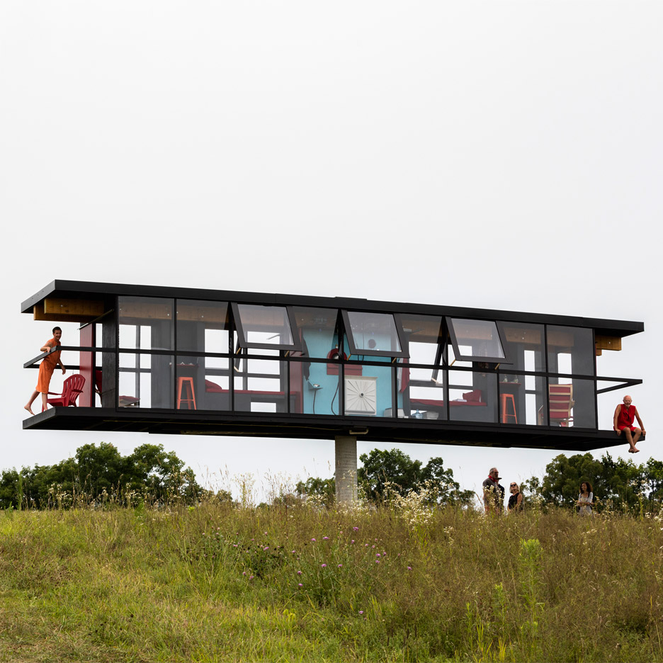
Rotating and tilting ReActor house accommodates two artists for five days
What Were Your #FirstSevenJobs?

#firstsevenjobs
photography sales
pot washer
bartender
urban planner
professor
author
architect— Vishaan Chakrabarti (@VishaanNYC) August 10, 2016
//platform.twitter.com/widgets.js
Last week, the latest craze to hit the Twittersphere was #FirstSevenJobs. An interesting mix of nostalgia and self-congratulatory posturing, the hashtag had seemingly everybody on the social media site sharing how they took their first seven steps to where they are now. For architects though, whose path to their ideal job is often long and torturous, the hashtag may have offered a little solace: with notable and successful architects, educators and critics sharing how they took their first tentative steps into the profession, those still working towards their goals can be reassured that, no matter where they are now, success could be on the horizon.
With that in mind, we wanted to extend the hashtag to our users: what were your first seven jobs, and what did you learn while doing them? What was your experience like in getting to where you are now? And do the jobs that many architects have in their early years reveal anything about the architecture profession?
janitor
fast food
Art T.A.
US AirForce (Contracts Officer)
Arch Gallery Assistant
Arch Design/Research
Now (#6 + teaching)#firstsevenjobs— Quilian Riano (@quilian) August 7, 2016
//platform.twitter.com/widgets.js
The best responses will be featured in a forthcoming article. Please share your experience in the comments below – even if you can’t claim to be as upwardly mobile as The Architectural Review‘s former Editor-in-Chief:
#firstsevenjobs urine sample collector; pork pie factory worker; train cleaner; semi-architect; architect; hack; grand dame.
— Catherine Slessor (@cath_slessor) August 7, 2016
//platform.twitter.com/widgets.js
England’s Premier League gets a minimal rebrand by DesignStudio

Atrium Townhome & Garden / RobitailleCurtis

© RobitailleCurtis
- Architects: RobitailleCurtis
- Location: Montreal, QC, Canada
- Design Architect: Andrew Curtis AIA, MRAIC, LEED BD+C
- Designer: Marie-Eve Lamarre Brodsky
- Project Year: 2016
- Photographs: RobitailleCurtis
- Landscape Architecture: RobitailleCurtis
- Design Landscape Architect: Sophie Robitaille, CSLA, AAPQ, ASLA Landscape Architect: Teressa Peill, CSLA, AAPQ
- Structural Engineering: Lateral
- Structural Engineers: Thibaut Lefort, Eng. & Alicia Gallagher, Eng. General Contractor – Avantage Plus
- Custom Millwork: Kastella
© RobitailleCurtis
From the architect. This townhome has a 32’ atrium with a skylight running the full width of the house. Our design embraces this feature and heightens the experience of its dynamic interior volume. A fireplace is integrated as a central focal point. Atop the mantle is a grand bookcase that provides storage and visual interest as it draws one’s eyes upward through the atrium.
Section
At the main living level, the kitchen has been relocated from the front of the home to the rear where it now enjoys more open space and daylight in its position adjacent a window wall with views to a newly designed garden. A carefully detailed millwork ‘cube’ is a primary organizing element of the ground floor plan. It is a nicely proportioned object that orients movement through the space as it separates the living room from the atrium and kitchen. The ‘cube’ contains two concealed glass pocket doors that enable the living room to be closed off. It also conceals a coat closet at the main entry of the home and hides a discreet powder room.
© RobitailleCurtis
At the ground floor level and up through the atrium and main stair, vertical grain Douglas fir slats provide screened views through the home and eliminate the necessity for guardrails. Douglas fir, concrete floors, and white lacquered millwork combine to create a crisp, clean, and warm material palette.
© RobitailleCurtis
At the third floor level, a net ‘floor’ has been installed at the top of the atrium allowing the void space to become a dramatic play surface adjacent to the kid’s bedrooms. The use of a net in this location precludes the need for guardrails and opens the floor plan to unimpeded views to and from the third floor. Riggers from Cirque du Soleil provided and installed the trapeze net.
Plan
Plan
Plan
In the garden a covered seating area adjacent to the kitchen serves to blur the boundary between the interior living spaces and the exterior. Carefully placed hornbeams create an aerial hedge offering privacy from adjacent buildings while focusing attention towards the rear of the garden. At the garden’s terminus, views are borrowed from a mature grove of hemlocks and spruce trees, enhancing the sense of lushness in this small city garden. Additionally, a small, shallow, fountain built into a concrete bench serves as a focal point.
© RobitailleCurtis
The Latest LEGO® Architecture Set: The U.S. Capitol Building

Courtesy of LEGO®
LEGO® has unveiled the newest kit in their Architecture series: The U.S. Capitol Building in Washington, D.C. Originally designed by architect William Thornton in 1793, the building has gone through several iterations, including the addition of its iconic white, cast-iron, neoclassical dome in 1866. The 1,032 piece LEGO® set portrays the building in its current form, with its “striking white, columned façade with its famous steps and lawns.” The kit also features a removable dome, which, when lifted off, reveals “a detailed interior depicting the famous National Statuary Hall, complete with columns, statues and tiled floor.”
Courtesy of LEGO®
The Capitol Building set measures just over 17 inches long and 6 inches high; and for those looking to build their own LEGO version of the Washington Mall, the set matches the scale of the LEGO® Architecture Lincoln Memorial kit. The new set will retail for $99.99 and will be available for purchase on September 1, 2016.
Courtesy of LEGO®
Courtesy of LEGO®
Courtesy of LEGO®
Courtesy of LEGO®
News via LEGO.
Roof of Rhode Island holiday home by Bernheimer Architecture features pyramid-like skylights
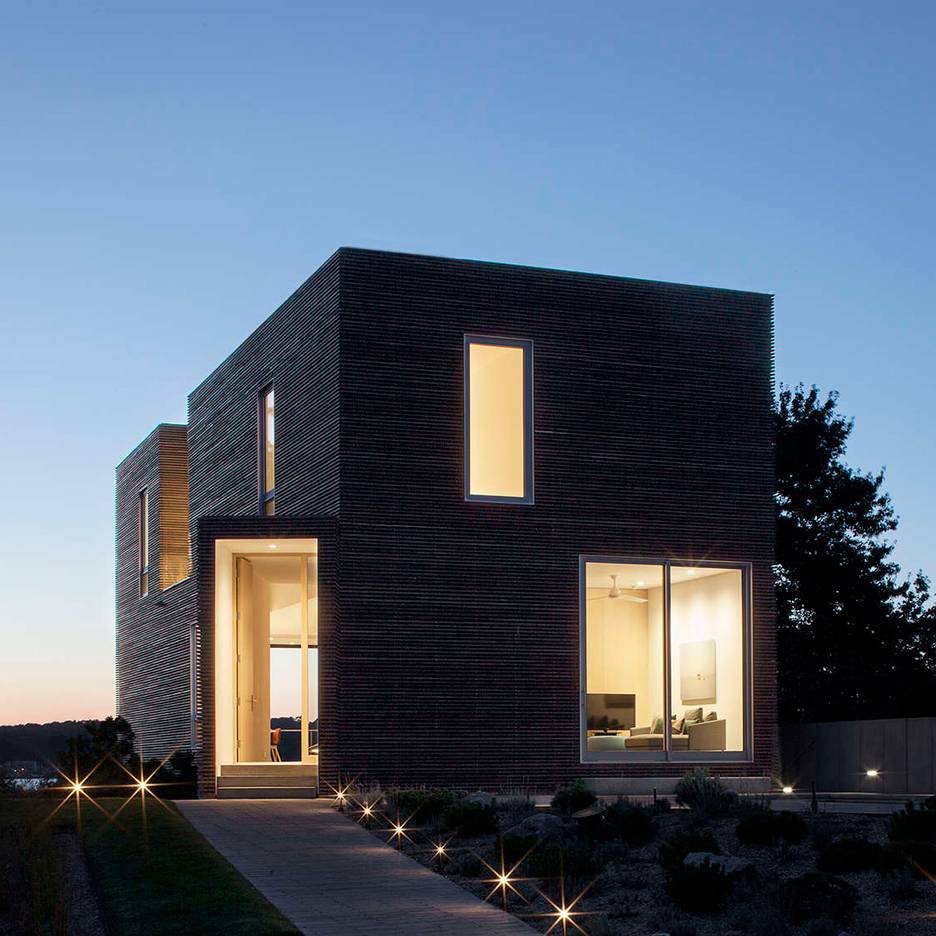
A+Awards: the next project in our series on winners from this year’s A+Awards organised by US site Architizer is a holiday home for a Brooklyn-based family on Rhode Island, with a charred-timber facade (+ slideshow). (more…)
How to Ensure that Your Online Architecture Portfolio is On Point

Why should I even have an online portfolio?
A portion of working in architecture includes having to market yourself and your skills. “One minute networking” is a skill that many architects learn in order to be successful in the creative field, but having the gift of gab requires you to put your money where your mouth is. If you have an online portfolio which is accessible with just an internet internet connection and a digital device capable of viewing it, your work is always conveniently available during your networking conversations. It’s also helpful for sharing your work in online conversations: while a pdf of your print portfolio can really only be sent by email, practically every messaging app or direct messaging service built into social networks will allow you to send a link, allowing you to take advantage of an opportunity even when you weren’t expecting one to arise. Finally, if you make it right your website can even do some of the advertising and networking for you.
The most important thing to remember is that like your resume or print portfolio, an online portfolio is a tool to help you advance your career, so it must be useful towards your goals. Therefore instead of asking yourself why you should have an online portfolio, you should ask yourself what those goals are, and how your online portfolio can be optimized to help you achieve them.
Now that we’ve gotten that question out of the way, here are 8 other questions to ask yourself:
2. Should I just upload a PDF of my print portfolio?
Yes and no. Uploading your PDF portfolio to a zine hosting site such as ISSUU is an easy-click way to get an accessible sample of your work online. It’s convenient for job applications when you can just include a URL rather than an attachment, or when you can include a QR code in your business card that links directly to ISSUU. But this method isn’t for everyone.
Besides simplicity, the main advantage of uploading a PDF is that it allows you to demonstrate your graphic presentation skills in traditional print media, which is great if that’s a skill you particularly want to highlight. But on the other hand, an online PDF is rarely the most convenient or effective way to see something online—just because your graphics looked great on a large format printout does not necessarily mean that it would convey the same quality as a jpeg on a 15 inch screen.. In addition, just as you may need different types of print portfolio for different purposes, having the same projects in both print and on your online portfolio could be redundant. Perhaps uploading a PDF of a two-page portfolio on your website is a happy medium. Do whichever you think your employers would prefer in your *dream* job.
<a href='http://ift.tt/2bu9Qsb;
3. I don’t have much time to learn how to code or to customize visuals—can I still have an online portfolio?
As mentioned previously, you could simply upload a PDF of your portfolio on ISSUU. An alternative to this is to create an account with Behance. The platform is hosted by Adobe and your free account displays a collection of all your work. There aren’t any customization features, which on the one hand makes the setup straightforward and easy, but on the other means that your work must stand on its own, without any added “wow factor.” However, the value of uploading individual images for online viewing rather than spreads and layouts should not be overlooked, and Behance therefore offers a more digitally-native way to display your work than ISSUU. The site also offers a fairly comprehensive social networking component—almost like a Linkedin for creatives. You never know, this could be the source of your next job opportunity.
<a href='http://ift.tt/2bbjImZ;
4. How should I create my website?
If you are quite adamant about having more control over the presentation of your work then this question is for you. There are ultimately more than a hundred ways to create a website but among the more popular these days are three platforms: WordPress, Squarespace, and Format.
Squarespace and Format: Both of these sites are quite similar in terms of pricing scheme and the friendliness of the user interface. There are easy-to-use templates that give you a polished looking website in mere minutes. As for comparisons, Squarespace targets their service beyond portfolios while Format focuses solely on portfolios. Squarespace also has a simple logo making service which might be useful. The choice really comes down to which templates you prefer, as they are exclusive to each site.
WordPress: It’s important to be aware of the difference between wordpress.com and wordpress.org. The former is a hosting service which gives limited customization options, but on the plus side is free and relatively easy to use. The latter platform is quite possibly the most reliable website creation service that is readily available to the public, however it does require you to host your own site, with all the technical understanding that requires. However, the system is incredibly popular, with even large companies using the platform including CNN and The New York Times. In general, as an open-source platform WordPress.org also gives you more freedom and control than Squarespace and Format thanks to its thousands of user-generated plugins you can install.
<a href='http://ift.tt/2bbjD2H;
5. How many projects should I feature on my website?
The answer to this question goes back to what you ultimately want to achieve with your portfolio. With print portfolios, they always say that you should only feature your best work—not only does it demonstrate critical abilities but it also keeps the page count to a reasonable number. For websites, you are allowed to have as much data as you want, so it depends solely on your desired outcome. If you want to be known for just one innovation or type of building, or you want people to only see the best you have to offer, only upload the corresponding projects. If you want a comprehensive archive, you should obviously upload all of your work—but you should probably also think carefully about the next question.
6. How do I organize the contents of my website?
If you choose to have a comprehensive archive of your work, it’s important to have logical organization system which makes it easy to quickly access whatever type of work your future employers are looking for. Many larger firms, such as Diller Scofidio + Renfro display their projects chronologically, but they have categorized their projects to different typologies. You may want to follow a similar technique. It’s best to look for inspiration towards the larger architecture firms like Foster + Partners or OMA because they have such a volume of projects that they need to have a good organizing system.
<a href='http://ift.tt/2bbjqws;
7. What is SEO and how will it help me?
SEO stands for Search Engine Optimization. It can be an incredibly complex consideration—after all, an entire industry has been built off of it—but in simple terms it boils down to a good mixture of links, content, and keywords on your website which increases the likelihood of search engines like Google to recommend your website on searches. There are many ways you can increase your website’s SEO ranking and here are a few ways to start, but perhaps the most important to remember is to include your name or the business name you with to go by in prominent places such as the url, the page titles and the headers in your page text. This may sound astonishingly obvious, but it’s actually surprisingly easy to forget, as we’ll discuss in the following question.
8. How can I make my portfolio standout?
The quick answer to this question is: Not with image based graphics! It’s very tempting to create beautiful image-based headers for online websites but the downside to this approach is that search engines cannot process image-based data which means that your website is not as SEO friendly as you would like. If you make the decision to have a beautiful, customized website, it’s worth your tie to make sure it is done properly, as trying to “hack” your way to a beautiful website often does more harm than good.
Spending extra time on formulating a unique color palette, and investing in a tasteful customized font is an efficient and cost-effective way to stand out from the pack. But the most important thing to remember is that your portfolio will be compared with many others in a crowded online space, so you need to make use of your creativity to highlight your best aspects; whether that means putting faith in your design abilities with a design which highlights the work itself or by creating something a bit more unconventional is up to you.
9. How often should I be updating?
There are few things more off-putting to a potential contact than an online portfolio that seems abandoned. The rule of thumb is that you should probably update your online portfolio at least once every 6 months, provided that you have a new project to add. Alternatively, you could opt to make regular updates on a monthly or weekly basis much like what Bob Borson has done with Life of an Architect. Creating articles that are useful to other architects/designers is a great way to market yourself and your practice and shows that you’re an engaged thinker, not to mention the fact that helpful articles with relevant titles are SEO friendly.
H3 House / Luciano Kruk

© Daniela Mac Adden
- Architects: Luciano Kruk
- Location: Mar Azul, Buenos Aires Province, Argentina
- Architect In Charge: Luciano Kruk
- Area: 75.0 sqm
- Project Year: 2015
- Photographs: Daniela Mac Adden
- Coordinator: Pablo Magdalena
- Collaborating Architects: Ekaterina Künzel, Josefina Perez Silva, Andrés Conde Blanco, Leandro Rossi
- Collaborators: Dan Saragusti, Giorgio Lorenzoli, Christian Studer, Isabelle Ducrest, Federico Eichenberg
- Text: Mariana Pique
- Site Area: 258 sqm
- Building Area: 75 sqm
© Daniela Mac Adden
From the architect. Mar Azul, a seashore town in Villa Gesell Department, neighboring Mar de las Pampas, had its sand dunes terrain divided into a grid pattern. Its dense aged pinewood grants Mar Azul’s atmosphere pleasant quietness and tranquility.
© Daniela Mac Adden
In a modest, 210 square meter plot of land on a corner, eight blocks away from the sea, rises H3, a minimum tread house designed to make the most of the parcel’s dimensions and the natural surroundings.
© Daniela Mac Adden
The commissioner: 3 sisters and each of their families.
Even though their budget was limited, they we valued ability to express what they wished H3 should be: their shared summer house, their own place to rest amid nature.
© Daniela Mac Adden
They requested that the house’s dimensions should be defined very rigorously. The brief should comprise a predominant social area and a more private one, constituted by two bedrooms: an ample master bedroom and a smaller cabin-like one, both sharing a common bathroom. They wanted the master bedroom to open up outwards into a semi-covered outside area. Also, they expressed their desire for a salamander to be placed at the heart of the house.
Plan 2
Plan 3
The house’s materiality was agreed on by the studio and the commissioners. H3 was completely built in exposed concrete, which served well to the maintenance moderation. Intending to keep the needs for equipment at a minimum, even furniture was conceived as a part of the concrete volume.
© Daniela Mac Adden
Pine planks were used to set the formwork so that the partitions as well as the slabs would preserve the texture of the wood veins in an attempt to establish a harmonious dialogue with the bark of the local trees.
© Daniela Mac Adden
The house was constituted as a compact block. The ground floor houses the kitchen, the dining room and the living room, all in an integrated space from which the staircase emerges towards the first floor. Given the house’s scale, the use of crossed views and vanishing points aimed at unifying and fluidifying the space in the room. Instead of confining the house’s different uses into separated rooms, they have been connected with each other, aiming at producing the general feeling of spatial expansion. As requested on the brief, the bedrooms and the bathroom were located upstairs, but the main bedroom’s outdoor semi-covered space was designed to be shared with the secondary bedroom. Additionally, it would partially work as the roof for the downstairs deck.
Section
Section
As the corridor and the serving facilities were set to the side next to the neighboring lot, the main windows were set on the house’s more private rear, allowing the dwelling to open towards the outside deck and calling for the conservation of the original trees.
© Daniela Mac Adden
On account of the abundant shadows provided by the profusion of the woods, there was no need to reach for architectonic devices to reduce the sun’s incidence inside. As a matter of fact, apart from connecting the house interior and gaining visuals, the windows of the house also absorb the light that dribbles through the dense canopy of the trees.
© Daniela Mac Adden
Overhangs and partitions preserve the house both from the effects of water and the sight from the streets.
Also, the volume housing the bathroom shelters the entrance to the house.
© Daniela Mac Adden
While the sidewalls are mainly blind, the front upstairs show the blind volume housing the bathroom and the high windows of the main bedroom, under which a storeroom lies inside. On the rear, floor-to-ceiling windows connect both windows with the outdoor deck they share.
© Daniela Mac Adden
Unlike what happens upstairs, floor-to-ceiling windows open the ground floor from its entrance towards the opposite side. When we designed this floor plan, we aimed at making it feel both like an indoor space, sheltered by the roof and the windows, but at the same time, somewhere in between in a continuum with the outside.
© Daniela Mac Adden
In this way, the layout of the house is the result of an architectural synthesis of the sisters’ intentions and desires. In its minimum scale, the house rises by its own will, but also integrates itself respectfully with its surroundings, both natural and human-built.

