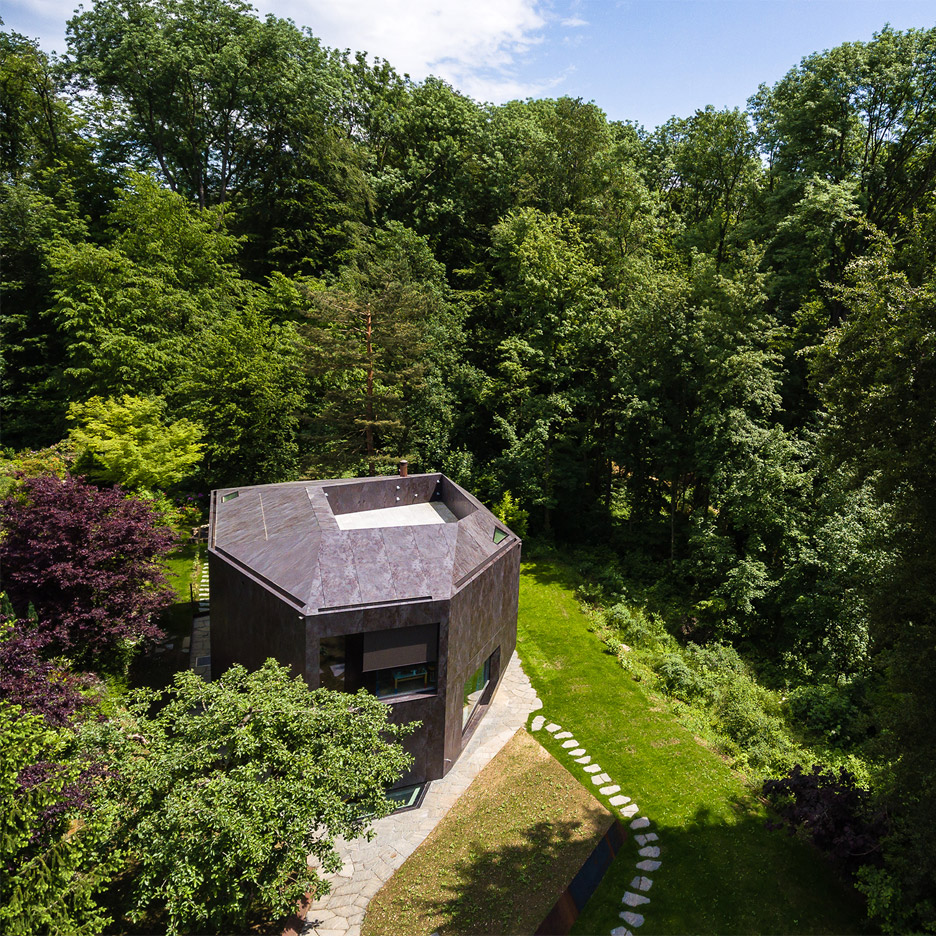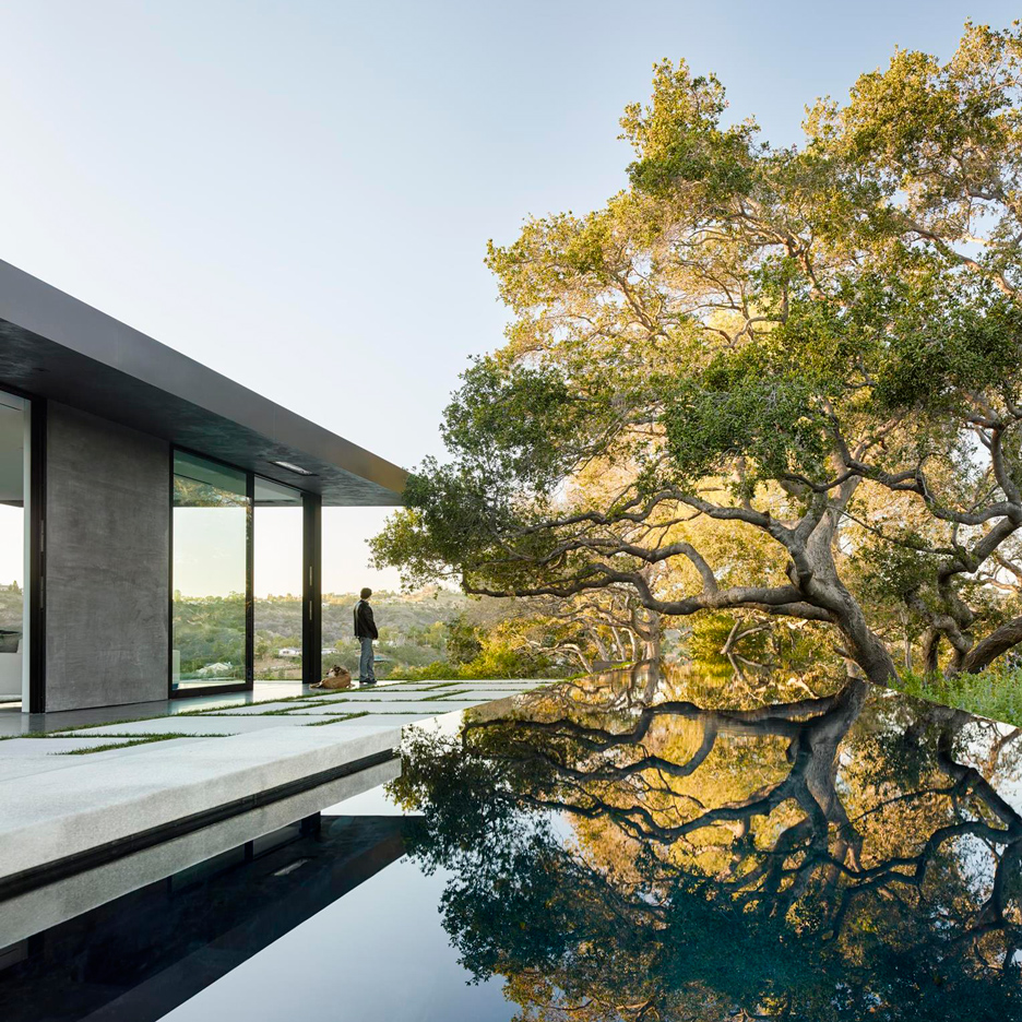
From desert hideaways to clifftop villas, the houses in this next roundup from our series spotlighting different US states are all in California (+ slideshow). (more…)
From desert hideaways to clifftop villas, the houses in this next roundup from our series spotlighting different US states are all in California (+ slideshow). (more…)

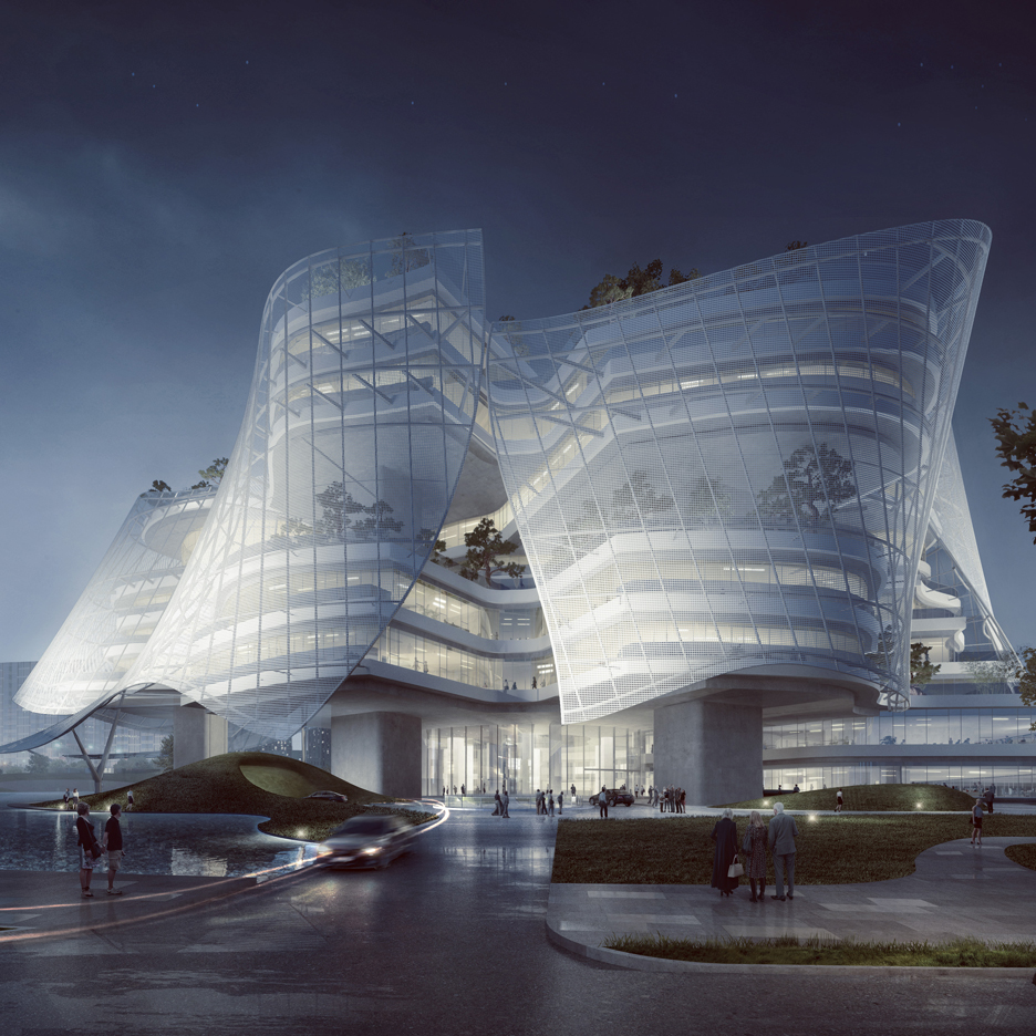
MAD Architects has conceived a new design center for international fashion group Xinhee in the coastal Chinese city of Xiamen. Designed as six petals growing from a central atrium, the 61,000 square meter building will sit on a 15,000 square meter site, and will serve as the home of Xinhee and its six subsidiary brands.
“We envision it as a building with skin-and-bones,” reveals MAD founding principal Ma Yansong, “the correspondence of clothing and architecture is they both explore the relationship between the interior and the exterior.”
The plan of the complex takes the shape of a six-pointed star, mixing office and garden spaces along each of the “organically-formed arms.” Vertical gardens run up the height of the arms, veiled by a PTFE envelope, which acts as a sun-shade to diffuse light and provide ventilation to the building during the hot season. The lightweight skin also gives the building an elegant, floating appearance, like “a piece of delicate, thin, soft skin covering the “bone” structure of the building body.”
Ma Yansong elaborates, “It’s interesting for a building with such an intrinsically logical structure to look floating and free.”
One wing of the building is designated to each of Xinhee’s brands to foster office efficiency, while the layout creates flexible spaces that allow the different departments to freely interact and communicate. The radial plan allows the building to be highly efficient, while still providing natural light, ventilation and immediate access to landscape. The atrium is open to both staff and visitors, and includes a footbridge which provides air circulation and doubles as a runway for fashion events.
The design center has been designed for maximum environmental awareness by adapting to the local climate. The first floor consists of public garden and water features to help provide ventilation to the structure, which has been lifted to reduce the first floor footprint by two-thirds. In the summer months, cool air is circulated through the atrium; in the winter, the glass room transforms into a solar greenhouse to keep the building warm. A translucent coating on the exterior glazing will decrease solar radiation, and an array of solar panels will line the rooftop to provide electricity for daily operations.
Xinhee design center is currently under construction and is expected to be completed by 2017.

From the architect. The assignment was to place 2 prefabricated warehouses of 1000 m2 on a plot of 10000 m2, and design an office building of 500 m2 that would give the corporative image to the Licanray company.
The first decision was to concentrate the design and budget efforts into the office building and its showroom.
The building is placed like a strip of 8m deep and 30m long on the east–west axis, parallel to the access road, and located at the narrow forefront. In this sense the building is placed like a visible face to the road, having 2 important open large façades, namely the north and south ones, and 2 blind façades, East and west façades.
The warehouses are arranged behind this building in the north-south direction, leaving a distance that would allow for the loading and unloading of the trucks.
For the structure of the main building, the use of laminated pine wood was proposed. Its construction was based on diagonal pillars in an ‘X’ form that configure the main façades, and by joining with the horizontal beams assemble the floors and roof.
The main program of the office is elevated a floor so that it could capture the views, liberating the ground floor for accesses of building and the showroom.
The expression of building is defined primarily by its structure. The enclosing elements, windows and walls, remain behind the structure, leaving it exposed.
The roof fulfills the fundamental role of protecting the wooden structure, and its overhang on the north façade also keeps direct sunlight out of the offices.

This article is part of our new “Material Focus” series, which asks architects to elaborate on the thought process behind their material choices and sheds light on the steps required to get buildings actually built.
The Mipibu House, designed by Brazilian firm Terra e Tuma Arquitetos Associados, measures 170 square meters, and uses exposed concrete blocks to complement an expansive layout. Located in an unusually sized site in Brazil, a key element of the architects’ design involved the consideration of the possible – or rather the inevitable – verticalization of nearby buildings. In response to this challenge, they designed a compact, complex design that answers the needs of their customer with creativity in the selection and use of materials. We talked with architect Danilo Terra to learn more about the choices of materials and the challenges of the project.
What were the main materials used in the project in question?
DT: Concrete blocks, cement, aluminum frames, and glass.
What were your main sources of inspiration and influence when choosing the materials used in the project?
DT: Benefits to the structural system as well as lighting and ventilation from the environment.
How did you research suppliers and builders suitable for the materials used in the project?
DT: Being materials that are not often considered relevant, since they typically provide a base or framework for other projects, we sought suppliers that were able to meet the demand, with quality materials and installation. The same went for the construction team, who would need to be used to working with these materials and have a reasonable construction speed. This last item, time, is still very underestimated by architects and should be considered as a part of the decision making in materials, not just their unit value.
Describe how decisions on materials influenced the design of the project.
DT: They allow or limit certain projective aspects such as size, the number of floors, openings and closures.
What were the advantages that these materials offered for the construction of the project?
DT: The possibility of facing a lean budget to invest in more relevant areas of the project, like larger sizes, larger openings. The space and its indoor / outdoor relationship were also very beneficial.
Did the choice of materials impose any kind of challenge to the project?
DT: Yes modulation and high structural performance.
Did you ever consider other possibilities of materials?
DT: No.

Villa Naarden is a private home located in Naarden, The Netherlands. Completed in 2013, it was designed by DENOLDERVLEUGELS Architects & Associates. Villa Naarden by DENOLDERVLEUGELS Architects & Associates: “The construction of this characteristic villa in the forests around Naarden has been finished in March 2013. DENOLDERVLEUGELS is responsible for the design of the villa as well as the interior design and garden design.” Photos by: Michael van Oosten
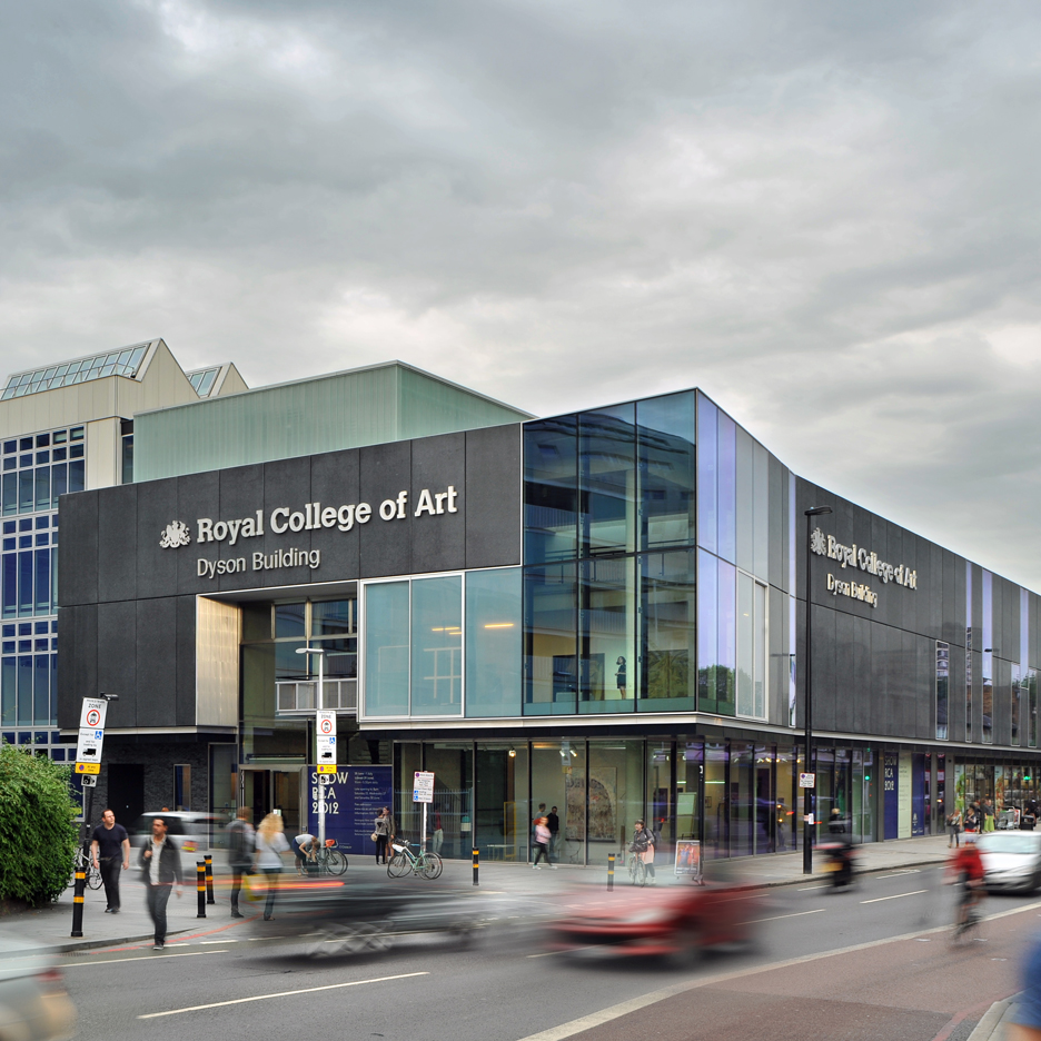
Herzog & de Meuron, Studio Gang and Diller Scofidio + Renfro are among the star-studded list of architects in the running to design a new campus for London’s Royal College of Art. (more…)

The largest football club in New Zealand, the Three Kings United Football Club, is set to receive a new headquarter and community center at Keith Hay Park in Auckland. Designed by Copeland Associates Architects (CAA), the single storey pavilion sits on a raised plinth to elevate it from the flood plain and gives spectators a greater vantage point over the surrounding sports fields. Comprised of predominantly lightweight, prefabricated elements, the building has a sense of lightness which increases in accordance with its greater transparency at the northern end.
The building takes advantage of the openness of the adjacent fields, incorporating 360-degree views of the park’s activities. The flat fields allow the new structure to be the prominent focal point for the north side of Keith Hay Park, directly overlooking the park’s Number One field without blocking key views. The clubhouse is designed to centrally connect a series of proposed pathways, forming the circulatory center of the park complex.
The building is conceived as a single storey pavilion sitting lightly on a finely finished concrete plinth set into the landscape. The pavilion is expressed as a floating sculptural roof resting on a series of eleven steel triangulated supports rising from the stepped plinth. The enclosed built spaces are set back under the roof and behind these supports, thus creating several generous verandas around all sides of the building, from under which the stepped viewing terraces emerge – said CAA in a press release.
The new headquarters follows a gradient of permeability, with the changing rooms forming a solid, concrete anchor point on the southern end which eventually opens up in both form and materiality to the northern end. The club room sits at the northernmost point, allowing visual connectivity across the grounds from inside the building. This end of the building features dominant glazing, but the airy, tent-like structure is still weighed down by a precast concrete hearth panel bearing the Three Kings United Football Club Emblem.
The architects said that “the shape of the roof was initially inspired by the notion of a leaf floating over the park and coming to rest. From that idea, the form evolved not only in response to economic and functional requirements, but also from the wish to capture the ethos of the club and its aspirations.” The building rises gently from the fields, and its softness fits appropriately within the quiet, residential suburb of Mt Roskill.
Check out the animation above from Copeland Associate Architects for an explanation of the club house’s internal arrangement and structural systems.
News via Copeland Associates Architects.

From the architect. This house has three elements very importants: 1. The developers: Joseba and María . 2. The situation, Gaucín and 3. The position, linked with the land and the amazing views.
2. The geographic situation is very important too. Gaucin is one of the most singular villages in the Ronda mountain area. The Town is like a balcony looking at the Strait of Gibraltar and Africa. Its privileged situation gives to Gaucin a amazing weather in addition to the views. The Villa is configurated by narrows streets and white Walls. Our idea is to play with white faces and shadows to be integrated with the surroundings
3. The plot position is in the highest area of the village and its link with the views and the landscape will be decisive in the concept of the form of the house: a white prism sculpted in the rock to hold a painting studio and a dwelling
The painting studio, sited in the ground floor, has double height to allow paint large format pictures. The control of the natural light, thanks to a patio drilled in the stone, is other requirement.
The bedroom is in the same space. This attic room is built with a light structure and open to the work area .
The living area is upstairs, developed as a open space and looking at the amazing views.
You can go to the roof trought a footbridge sited in the backyard garden . This area is like a white oasis, where the swiming pool , the Infinity views and the sky allow you to dream.
Finally is very important to highlight the work to integrate the project in the nearest surroundings. We have tried to not design anything new, we have just used the tradition, the light and the shadows