Uncle’s House / 3 Atelier


© Quang Dam

© Quang Dam


© Quang Dam


© Quang Dam


© Quang Dam


© Quang Dam

  • Architects: 3 Atelier
  • Location: Dalat, Lâm Đồng, Vietnam
  • Architect In Charge: Dau Phi Bach
  • Area: 120.0 sqm
  • Project Year: 2016
  • Photographs: Quang Dam
  • Constructors : Dau Trong Minh

© Quang Dam

© Quang Dam

The story began in 2015 while we were doing a construction in Di Linh Highland. Our Uncle helped us look for the materials for the construction, which was our big problem in this rural area (that house also has an interesting story, we’ll tell you later). For many times searching for materials together, we talked more and more about our own future plans and passions. Nothing happened until a few days later he came back and shared his concerns and his plans for a new house…


© Quang Dam

© Quang Dam

Living with his wife, his son and his daughter, he spent everyday from early morning to late night at a small booth in the local market, selling rubber shoes and clothes. The kids grow up in the environment only within the busy and bustling market. Their daily activities were nothing else but the games on technology devices. He realized that they might have no chance to experience an amazing childhood in the arms of Mother Nature as he had before. 


Ground Floor Plan

Ground Floor Plan

Mezzanine Floor Plan

Mezzanine Floor Plan

That was the reason why he planned to sell his old house, and then moved to a place which was a little bit far away from the central. He wanted to have a real home for his family. His desired home was the new home which was not only fulfilled with laughter and joy of his children, but peaceful enough for him to recall his sweet memories in his childhood. Two kids were born in the urban area already, now it’s time for them to completely grow up in the connection with nature.

Understanding his concerns, we designed and built this house.


© Quang Dam

© Quang Dam

The new land is located next to the highway that made our project more challenging. How to solve the problems with noise and dust from the highway became the most important thing for us to think about.


Section

Section

Uncle’s House reflects featured image of Di Linh Plateau, using a wide range of traditional as well as modern materials. All are processed just enough to maintain the nature of material itself. The tile walls proved their power when keeping the house warm at nights and cool during the sunny days. They especially recall the owners to their very old moments living peacefully in a Vietnamese village when they were young. Light also has its own story in this cozy house. Here the kids can spend their time to climb on the tree, draw on the rock, grow vegetables with their mom and take care of the fish right in their own yard, which they cannot found in the modern society nowadays. 


© Quang Dam

© Quang Dam

The house may be small. Yes, it is. But we don’t think it is.
http://ift.tt/2aHCGFX

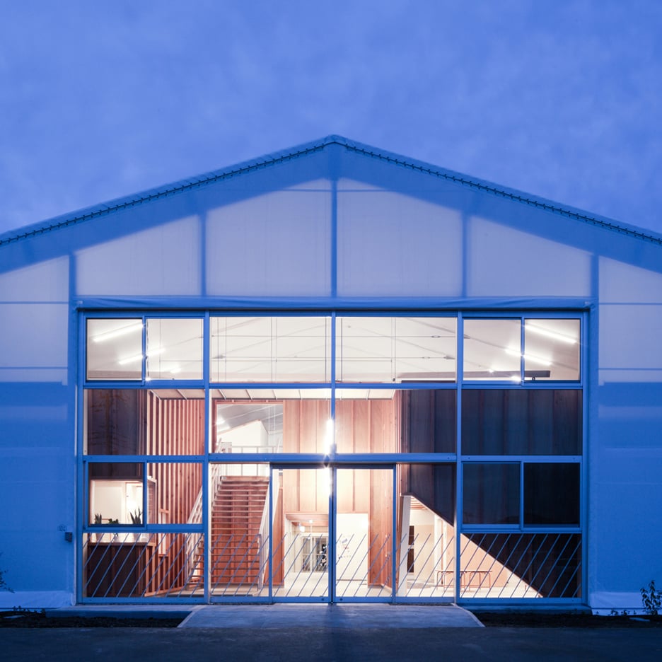
Yasutaka Yoshimura wraps warehouse in tent fabric to create Fukumasu Base kindergarten


Architect Yasutaka Yoshimura has transformed a disused warehouse in Japan into a kindergarten by enveloping the existing structure in a tent-like translucent membrane (+ slideshow). (more…)

http://ift.tt/2aa29r1

Umeda Hospital / Kengo Kuma & Associates


© Daici Ano

© Daici Ano


© Daici Ano


© Daici Ano


© Daici Ano


© Daici Ano

  • Structural Engineer: YSE Architects office
  • Mechanical Engineer: Morimura Architects Office
  • Sign Design: Japan Design Center, Principal designer Kenya Hara
  • Chairman Of The Board Of Directors: Kaoru Umeda.
  • Client: Medical Corporation shi-sei-kai,Umeda hospital.
  • Text Translation: Kiichiro Usami
  • Site Area: 2697.18 sqm
  • Building Area: 858.35 sqm

© Daici Ano

© Daici Ano

Umeda Hospital is as well-known obstetrician-gynecologist practice about ‘Declaration of breast’ that aims for child-birth and child-rearing, in a kind and friendly manifest to people and the natural environment.  The hospital led by Dr. Kaoru Umeda, is certified by UNICEF as one of ‘’The Hospitals Friendly to Babies‘’.


© Daici Ano

© Daici Ano

Plan

Plan

© Daici Ano

© Daici Ano

Dr. Umeda attaches importance to breastfeeding and cuddling. To best reflect his human philosophy in the architecture, we used wood in many places to express warmth and comfort. The signage by Kenya Hara is printed on pieces of cloth and covers boards and posts in the hospital, and can be taken off for washing just like clothes, which works well to soften the atmosphere of the hospital.


© Daici Ano

© Daici Ano

http://ift.tt/2ajYOCZ

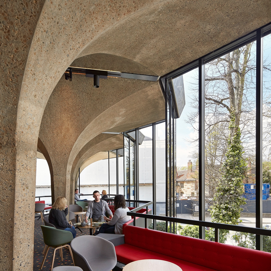
De Matos Ryan overhauls York Theatre Royal and its 1960s extension


London studio De Matos Ryan has refurbished a historic theatre in York, England, to create more space in both the 18th-century building and its 1960s extension by Modernist architect Patrick Gwynne (+ slideshow). (more…)

http://ift.tt/2amZkhh

Nabil Gholam Architects Propose Unusual “Art Oasis” in Saudi Arabia


Courtesy of Nabil Gholam Architects

Courtesy of Nabil Gholam Architects

An unconventional hybrid comprised of an art center, retail outlets, restaurants and private residences forms a new “Arts Oasis” in Riyadh, Saudi Arabia. Designed by Nabil Gholam Architects, the project was shortlisted as a finalist in Commercial Mixed-Use – Future Projects category at the World Building of the Year Awards.


Courtesy of Nabil Gholam Architects


Courtesy of Nabil Gholam Architects


Courtesy of Nabil Gholam Architects


Courtesy of Nabil Gholam Architects


Courtesy of Nabil Gholam Architects

Courtesy of Nabil Gholam Architects

The design promotes arts and culture within a predominantly residential district, whilst also interacting respectfully with the neighborhood scale of its context. Expressed as a contemporary take on the vernacular architecture found within Riyadh, the project offers a unique blend of programs whilst remaining visually respectful to its Saudi Arabian roots.


Courtesy of Nabil Gholam Architects

Courtesy of Nabil Gholam Architects

Nabil Gholam Architects described their design as a “peculiar experiment,” due to the prescribed functions of the complex intermix in a unique arrangement. Traditionally separated, the different public and private components engage with each other to form a cohesive whole, but individually retain their own function. The internal “oasis” helps bind these elements, which the architects say are “interlinked either visually or physically through the green heart of the project..”  

Two critical parameters weighed in to shape up the project: primarily, the way the project with an ambition to become a pioneer in promoting the arts (while remaining a profitable endeavor in its other components) positions itself within the city as well as at the neighborhood scale and effectively interacts with both. And on the micro level, striking the balance between maintaining the residents’ privacy within the project itself and insuring the success of the public functions.


Courtesy of Nabil Gholam Architects

Courtesy of Nabil Gholam Architects

Bordered by a busy commercial road on its main facade, the scheme cements its prominence by presenting itself as a large, articulated mass. This facade is expressed as a solid wall with perforations and occasional punctures through which the vegetation is visible, hinting at the large internal courtyard that lay within. The partially transparent ground floor becomes increasingly opaque as it approaches the residential zones. The masses, textures, and patterns reference the vernacular architecture found in the historical Al Diriyah district in Riyadh. 


Courtesy of Nabil Gholam Architects

Courtesy of Nabil Gholam Architects

The Art Center occupies the southern edge of the site and is the only ground floor tenancy not occupied by retail or restaurants. The center offers expansive gallery spaces, a café, a shop, auditoriums, workshop spaces, a multimedia library, a training center, and administrative spaces which are elevated on the mezzanine level.

The public functions of the building, as well as some of the residential, is organized a triple height lobby space which opens up onto the large, green courtyard. This internal “oasis” forms the green lung of the building. Terraced gardens step upwards on the first and second floors overlooking the void, protecting the occupants of the adjacent apartments from the activity below. 

The courtyard is able to be used year-round, thanks to a retractable shading system. When completely retracted the space is still semi-enclosed by a fixed, perforated roof, sending intriguing light patterns across the plants. The courtyard assists the building in achieving its sustainability strategy, as the heavily planted trees and cross ventilation across water features assists with temperature regulation. Cross-ventilated apartment units, planted roofs, low-e glazing, double skin, and textured cladding all bring the building closer to becoming more environmentally aware. 

News via Nabil Gholam Architects

http://ift.tt/2aqUq47

Albion Barn / Studio Seilern Architects


© Philip Vile

© Philip Vile


© Philip Vile


© Philip Vile


© Philip Vile


© Philip Vile

  • Structural Engineer: TALL Engineers
  • Services Engineer: Atelier TEN
  • Lighting Consultant: Sutton Vane Associates
  • Quantity Surveyor: BAQUS

© Philip Vile

© Philip Vile


Old Belchers Farm is a 17th Century farmhouse with a collection of barns and stables. The buildings have Historic Interest Building Status and the property falls within the Conservation Area of Little Milton.


© Philip Vile

© Philip Vile

The project brief was for a conversion that was to offer a new contemporary art and exhibition space that would help contribute to the upkeep of the estate, consisting of a dining room and of ces that wrap around a hidden library at the centre of the project.


© Philip Vile

© Philip Vile

This library, the heart of the concept, contains four secret doors that when opened connect to the surrounding spaces. When these doors are closed, the room is lined with bookshelves on all sides. It has a mirrored polished steel ceiling, which doubles the perceived height of the space by creating bookshelves that seem to extend to in nity. A set of thin L-shaped steel plates create a very light cantilevered balcony, allowing access to the higher bookshelves while maintaining their visual verticality.


Section

Section

This creates a reading room with an intimate ambiance contrasting with the surrounding bright lit rooms.


© Philip Vile

© Philip Vile

The main barn is located aside from the house courtyard setting, out of view from the High Street and just inside the private access road, as it enters into the courtyard. A lean-to block addition with asbestos roof was added to the main barn at some stage to the south elevation, obscuring the main barn and forming the boundary wall to the neighbouring property Betts Farm House.


© Philip Vile

© Philip Vile

Describing the design, Christina Seilern, said: “While the galleries are pared-down in design, the library is somewhat whimsical. It has a mirrored polished steel ceiling, which doubles the perceived ceiling height of the space by creating bookshelves that seem to extend to in nity. A set of thin L-shaped steel plates create a very light cantilevered balcony that allows access to the higher bookshelves, while maintaining their visual verticality.’

http://ift.tt/2ampBCE

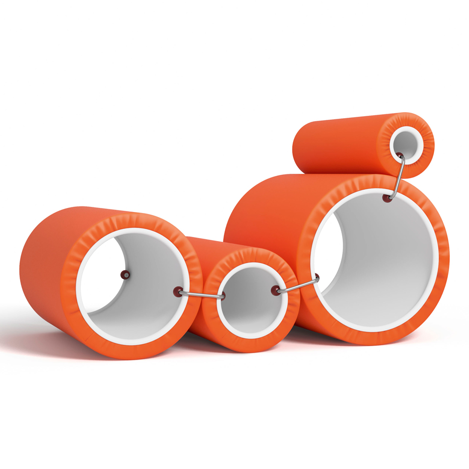
Cappellini reissues Joe Colombo’s classic 1960s Tube Chair


Renowned industrial designer Joe Colombo‘s Tube Chair has been rescued from “the pages of design books” by Italian furniture brand Cappellini, which is rereleasing the piece. (more…)

http://ift.tt/2aGKGHf

Steven Holl Receives Approval for Kennedy Center Pedestrian Bridge


Courtesy of Steven Holl Architects

Courtesy of Steven Holl Architects

Steven Holl Architects have received the go-ahead for a new pedestrian bridge linking their own Kennedy Center Expansion to the Potomac riverfront. Originally proposed by Kennedy Center architect Edward Durell Stone in 1959, the idea to extend the lively arts program from the center along the waterfront is set to increase the vitality of both existing programs. The bridge approval was one of the last remaining piece of the project, with the majority of the Kennedy Center Expansion already under construction.


Courtesy of Steven Holl Architects

Courtesy of Steven Holl Architects

The Kennedy Center, a national center for performing arts, was established in memoriam of President John F. Kennedy in 1959. The prestigious original building was marked for expansion, and a competition in 2013 saw Steven Holl Architects selected to undertake the design. The expansion encompasses the area south of the center to the waterfront, integrating the landscape and river into the center’s existing program. The bridge is an integral part of this plan, giving direct pedestrian access across this new zone.


Courtesy of Steven Holl Architects

Courtesy of Steven Holl Architects

In the landscape adjacent to the main expansion building towards the riverfront, various gardens and landscaped areas will play host to outdoor performances and on-site installations. A new cafe will further encourage the movement of activity from the waterfront upwards to the Kennedy Center. 


Courtesy of Steven Holl Architects

Courtesy of Steven Holl Architects

The bridge itself will also connect the center to Georgetown to the north and the Lincoln Memorial to the south to create new public access. With its approval, construction will take place within the next two years, completing Steven Holl Architects’ engagement with the center. 

For more information on Steven Holl’s active projects, check out our recent round-up.

News via Steven Holl Architects.

http://ift.tt/2aGAIG6

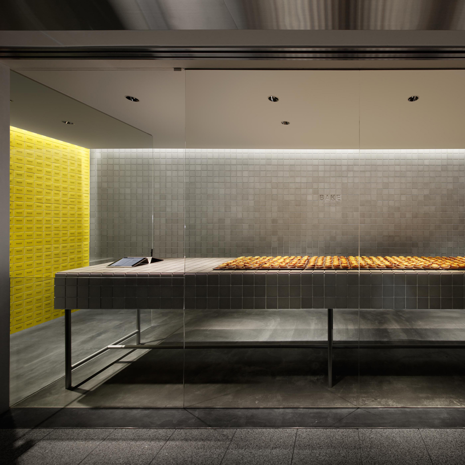
Yota Kakuda creates tiled interior for cheese tart store in Japan


Japanese designer Yota Kakuda used a bespoke aluminium tile to cover the walls and floors in this shop that sells baked cheese tarts (+ slideshow). (more…)

http://ift.tt/2aTTjuo

Lingenhel / destilat


© Monika Nguyen

© Monika Nguyen


© Monika Nguyen


© Monika Nguyen


© Monika Nguyen


© Monika Nguyen


© Monika Nguyen

© Monika Nguyen

From the architect. The “Lingenhel opening” marks the completion of destilat’s most important project in recent times.
This project is very unique and was therefore quite an extraordinary challenge for an interior design firm such as destilat. The visual and spatial identity for Johann Lingenhel’s culinary-gastronomic vision was developed from scratch for this project, since no corresponding definition of it existed initially.


© Monika Nguyen

© Monika Nguyen

The two cornerstones of this architectural concept by destilat (www.destilat.at) are the project’s listed building on Landstrasser Hauptstrasse in Vienna and Lingenhel’s corporate identity.


Plan

Plan

Its counters, bars, and presentation furniture evoke images of cubically stacked wooden beams, which were inspired by the beams of the historic roof truss. Surface structures and haptics play significant roles in this concept. Patination reflects their change, which develops over the course of time; as a result, the building’s long history as well as the production processes of certain foods find their place in this house.


© Monika Nguyen

© Monika Nguyen

The central idea of this concept is not to fight against natural ageing processes but use them to increase quality. This turns ageing processes into improvement processes, which are naturally associated with the tasteful ripening of cheese or raw ham.


© Monika Nguyen

© Monika Nguyen

The counter will become more and more beautiful by being used daily. It captures its very own history over the course of time in the process.


© Monika Nguyen

© Monika Nguyen

The architectural concept’s second cornerstone – Lingenhel’s corporate identity, which was developed by Germaine Cap de Ville – plays a central role in this interior design project with its “Lingenhel check” pattern.

The check pattern is transformed from its abstract graphic origins into the basis for wall-mounted product presentations. Translated into the third dimension, it ultimately turns into shelves, which are used to present wine.


© Monika Nguyen

© Monika Nguyen

One of the Lingenhel universe’s central areas surely is the public cheese dairy with its adjacent tasting and event room in the historic court stables.

In this area, the goal was to merge the cheese dairy’s hygienic requirements with an atmospheric and multifunctional event room.


© Monika Nguyen

© Monika Nguyen

The area of the cheese dairy is separated from the rest of the room by a glass wall and can only be accessed through a hygienic sluice. The room’s sophisticated light installation evokes the image of a theatre stage, which deliberately puts the cheese-making process in the central limelight.


© Monika Nguyen

© Monika Nguyen

The huge central table made of raw wooden beams and the two minimalistic wire-mesh chandeliers give the tasting room its archaic flair, which corresponds with the room’s character and, at the same time, provide attractive contrasts to the cheese dairy’s sober, industrial atmosphere.


© Monika Nguyen

© Monika Nguyen

http://ift.tt/2a9jtvZ