architecture
Bhutan Happiness Centre / 1+1>2

© Hoang Thuc Hao
- Architects: 1+1>2
- Location: Bumthang, Bhutan
- Architect In Charge: Hoang Thuc Hao
- Design Team: Pham Duc Trung, Nguyen Thi Minh Thuy, Le Danh Quan, Ngo Duc, Pham Gia Thang, Do Quang Minh, Vu Xuan Son
- Area: 1413.0 sqm
- Project Year: 2015
- Photographs: Hoang Thuc Hao
- Site Area: 9234 m2
© Hoang Thuc Hao
From the architect. In 2008, Bhutan has been the first country in the world applying the GNH rate (Gross National Happiness) instead of GDP. To celebrate this, The Bhutan Royal and Government have decided to build a center for happiness, where everyone can visit and share their experiences and philosophy about happiness living through meditation, and learn how to be happy and independent from materials.
© Hoang Thuc Hao
Two in the four main GNH rates are environment protection and preserving culture and identity. Therefore the Bhutan Government has required the GHN center to be environmental friendly and representing local contemporary and traditional cultural identity through design.
© Hoang Thuc Hao
The project includes a 100 seat convention house, a meditation hall for 250 people, administration, kitchen and dining room, and 5 accommodation houses. The cluster locates on the high mountain close to the river of Bumthang, northeast Bhutan.
Plan / Section
The design principles are the harmonies among different natural materials: soil – stone – wood; between indoor and outdoor spaces; between technology and traditional vernacular experiences. The half meter wall made of stone and soil ensure keeping the heat in cold winter. The concrete and wooden beam structure; solar energy and water through a natural filter system have helped save energy and increase the connection between human and nature. Existing pine trees were used to build the administration and accommodation centers. With the ecologically sensitive approach, the buildings are part of the natural system.
© Hoang Thuc Hao
The main meditation hall is inspired from the harmonies and Asian symbols of the earth and heaven with the first storey in round shape and the second in square shape. The idea is to create a balance life for human in which people do not dominate but live peacefully with nature and support each other to create a sustainable universe.
Details
The convention house with the eclipse shape is inspired from the Buddha tree together with the use of typical vernacular decoration details in a contemporary context.
© Hoang Thuc Hao
The entire site slightly locates within the beautiful pine forest, becoming an integral part of it.
The opening ceremony took place in October 2015 with the attendance of the Princess and Royal of Bhutan. The Bhutan Center of Happiness is now well operated and welcome by the people of Bhutan as well as international tourists.
© Hoang Thuc Hao
House in Goa / Ankit Prabhudessai

© Prashant Bhatt
- Architects: Ankit Prabhudessai
- Location: Margao, Goa 403601, India
- Area: 525.0 sqm
- Project Year: 2015
- Photographs: Prashant Bhatt
© Prashant Bhatt
From the architect. Elegantly placed on a bush hammered granite is a slightly tilted yellow white Frangipani tree which welcomes the visitors with its intoxicating fragrance and beautiful flowers . I tried to tell the stories about the relationship of the indoors to the outdoors , of the body with nature and that of our traditional connection with the roots of interlayered aesthetic history with transparent and rhythmical legibility through the contemporary interpretation of architecture. It is a transformation project of my house that was built 14 years ago perched at the foothills of the commercial capital of Goa, Margao.
© Prashant Bhatt
We like to entertain a lot of people in the house, so one major brief was to modify the layout of the house in such a way that it keeps in mind the tradition. There are many areas that are positioned throughout the house so as to cater to various sizes and type of social gathering.
© Prashant Bhatt
The main concept of the house was to blur the line between indoors and outdoors. The spaces in the house blend into each other creating a free flowing plan that connects the front lawn to the green backyard interlaid with elements from the Goan – Portuguese history.
© Prashant Bhatt
We cannot overlook the fact that Goa was ruled by Portuguese for nearly 400 years, but the architecture that sprung up from this era was developed by Goans keeping the tropical climate of Goa in mind inspirited by the Portuguese architecture context.
Ground Floor Plan
Inspired by the concept of Architect Le Corbusier, the planning of the house is choreographed around framing of views and scenes that alternate between controlled views of the nature and wide panoramas that create a variety of different atmosphere and experience throughout the house
© Prashant Bhatt
The house is never revealed at once. The circulation is planned in such a way that the spaces are slowly unfolded to the visitors in an experiential and spatial journey throughout the house.
© Prashant Bhatt
A lotus pond acting as a reflection pool welcomes the guest towards the balçao (traditional name for entrance porch).
© Prashant Bhatt
A teak wood door with a ‘janger dancer’ sculptural face placed on the lintel, an industrial cage light adorned with a tube shaped filament bulb and the red IPS (Indian Patented stone) finished bench with Azulezos or Goan painted tiles embedded in it define the entrance porch or balçao. Adding to the charm is the floor finished with the bush hammered black granite. Clean architectural elements combined with pure geometrical volumes create a well balanced, almost minimalistic composition at the entrance.
© Prashant Bhatt
The PARK・ING Ginza / Nobuo Araki/The Archetype

© Atsushi Fuseya
- Architects: Nobuo Araki/The Archetype
- Location: Ginza, Chuo, Tokyo 104-0061, Japan
- Architects In Charge: Nobuo Araki, Kenta Okamura
- Area: 725.63 sqm
- Project Year: 2016
- Photographs: Atsushi Fuseya
- Design Cooperation: Tanseisha
- Construction Management: Tanseisha
- Client: JUN Group
- Site Area: 707.27 sqm
- Construction Area: 628.268 sqm
© Atsushi Fuseya
From the architect. Following on from the POOL aoyama, THE PARK・ING GINZA is a conceptually constructed store created under the direction of Hiroshi Fujiwara.
© Atsushi Fuseya
When Fujiwara opened the POOL aoyama, he had plans to create a total of three pools: the pool in Aoyama, a pool bar at Isetan in Shinjuku, and a motor pool in an undetermined parking lot.
© Atsushi Fuseya
As the project proceeded, he was given the opportunity to realize the last pool at the Sony Building, which faces Sukiyabashi Crossing in Ginza.
Floor Plan
The new space is situated on the third and fourth basement floors of the Sony Building. One notable feature of the space is that it shares the third basement floor with Nishi-Ginza Parking Lot, enabling drivers to park and enter on foot, or even drive into the space itself.
© Atsushi Fuseya
This unique location allowed Fujiwara to realize his plans for a third pool.
Nishi-Ginza Parking Lot is a distinctive structure in its own right. The parking lot runs beneath Sotobori Street, from Sukiyabashi Crossing to Shimbashi Station. It has a capacity of 800 vehicles and has tenants including a rent-a-car station, restaurants and a rest area. As a result, it has an atmosphere that differs from ordinary parking lots in Tokyo.
With an appreciation for the distinct form and atmosphere of the parking lot, we designed the space to function as a store while remaining in harmony with its surroundings.
© Atsushi Fuseya
The store consists of a cafe, retail space and gallery, with no clear boundaries between them. Each section has been designed to be flexible and can host events independently, such as garage sales. The store encapsulates a sense of transience – one of the charms of a metropolis like Tokyo – and constantly provides visitors with surprises.
© Atsushi Fuseya
In order to accommodate the flexible nature of the space, temporary construction materials have been used throughout the interior. These materials resonate with the materials present in Nishi-Ginza Parking Lot. The result is that upon entering the store, visitors get a feel for the parking lot, with its atmosphere and materiality extend into the shop.
Floor Plan
While THE PARK・ING GINZA embodies the transient nature of the metropolis, it also presents itself as a distinctively unique space within the chaos of Tokyo.
© Atsushi Fuseya
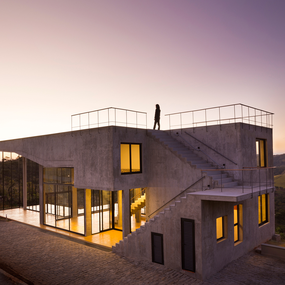
Cerrado House by Vazio features terraces overlooking Brazil’s Sierra da Moeda mountains
DUST uses “lava-crete” to create monolithic desert house in Arizona
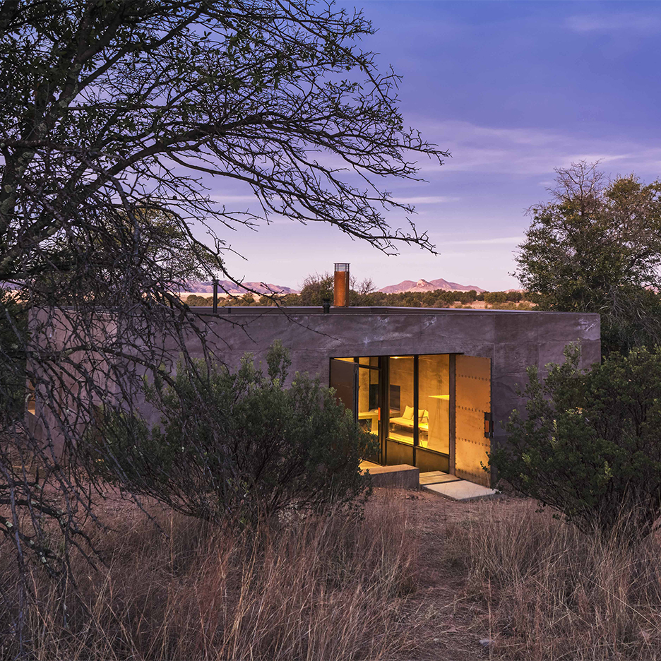
Arizona studio DUST has created a desert home south of Tucson using volcanic residue to form rammed-earth walls (+ slideshow). (more…)
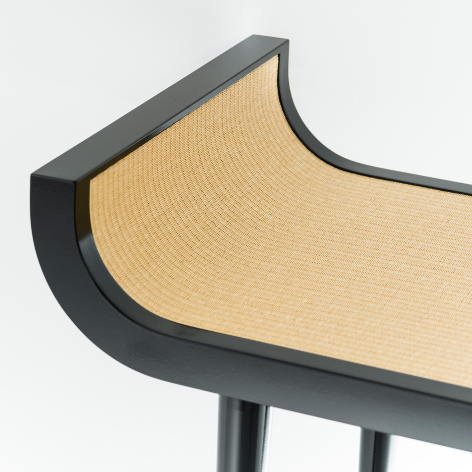
Japanese tatami mats made into furniture by José Lévy
The Wolf House / Wolf Architects

© Dave Keluza
- Architects: Wolf Architects
- Location: Chadstone VIC 3148, Australia
- Area: 441.6 sqm
- Project Year: 2012
- Photographs: Dave Keluza
- Collaborators: Toebelmann Constructions, Toscano Roman Render, Tectonic Flooring
© Dave Keluza
From the architect. A House That Meets the Heart …
When you arrive at the house you enter via a formal pedestrian entry. Beyond that is a contemporary Chinese garden which in itself is a playful expression of east meeting west. A bridge over a dry riverbed directs you the office at the rear. The office can accommodate several people and has its own bathroom and kitchenette. This allows for future use as an additional bedroom or granny flat. Resale is always an important consideration and most of the spaces were designed to be flexible in use. It was agreed that one of the most unsustainable things in houses is doing premature renovations. This house was designed with long term vision in mind.
© Dave Keluza
Life is Art. Live a Masterpiece.
At the front of the house is a large north facing yard which provides a great space for children to play privately and securely. It leads onto a generous double height front porch which then directs you into the house. The front porch has a dark polished concrete floor with a sealant that allows for the floor to also be a large blackboard for children to draw on. The main living space opens onto this northern yard with a set of quality commercial grade bi-fold doors which open completely. The floor level between the inside, front porch and lawn is very slight and this further blends the inside to the outside.
© Dave Keluza
Entry into the house is through a large walnut veneered door. Instead of a sculpture ahead or painting hanging on the wall, the wall is in itself a piece of art. This approach was taken throughout the house with many of the family’s collections. The objects for display are integrated into the architecture. The Star Wars action figures for example, are on individual stands on a wall and this forms a part of the walls texture making the whole display a feature in the interior architecture.
© Dave Keluza
The heart of the ground floor is triangulated by the living, dining and kitchen spaces. These areas were considered in the brief to be where the family spend most of their time together and therefore had to be interconnected. They are separated primarily by a double sided fireplace, an example of clearly defined spaces without walls. The kitchen is positioned at the western point of the triangle and acts as a control tower from which most of the house and landscaping beyond can be overseen.
© Dave Keluza
Ground Floor plan
© Dave Keluza
Enhancing Everyday Living…
Encouraging Connectivity throughout…
The residence is separated from the office by an operable glass wall located at the southern end of the dining room. Within the office is a space for one of the classic cars. The dining room is at the bottom of the vertical corridor and by looking upwards one understands why the house is so light filled. Light penetrates in most areas from multiple windows. No artificial light is required throughout the day and at night the house’s lighting is almost 100% LED. The dining room is strategically placed in the centre of the home and with a large void above it to enhance the feeling of sacredness, representing how the family regard meal times spent together daily.
© Dave Keluza
The site was not without its challenges. Certain elements of the previous 1940’s residence we retained for cost saving reasons and in consideration of embodied energy and sentimental value. These areas included:
– The existing master bedroom and ensuite which had been renovated several years prior
– A yellow brick tunnel which now has a mural painted by the owner
– The front fence
– The rear yard
– A large 4 car tin shed
The result was a house that consisted of 28 interconnected spaces unfolding over 10 subtle level changes. The key to the design is a multi-purpose vertical corridor which acts as a thermal chimney. It also allows for many internal views and vistas which are integral to the houses connectivity. Light can also penetrate through the space, allowing the Northern sunlight to penetrate to the deepest parts of the house.
© Dave Keluza
Triptyque proposes plant-covered Tropical Tower for São Paulo
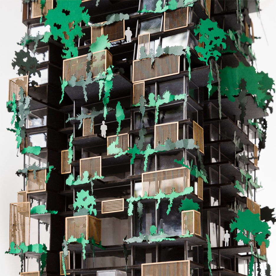
French-Brazilian firm Triptyque Architecture has designed a residential skyscraper covered in vegetation for São Paulo. (more…)
100 Broadview Lobby / Quadrangle Architects

© Brandon Barré
- Architects: Quadrangle Architects
- Location: Toronto, ON, Canada
- Project Year: 2016
- Photographs: Brandon Barré, Ben Rahn/A-Frame
© Ben Rahn/A-Frame
From the architect. A self-storage facility beneath a new condominium at the corner of two busy streets, 100 Broadview was an unremarkable and rather awkward brick and beam building in Toronto’s east end. For this building’s transformation, real estate investment and development group Hullmark engaged Quadrangle Architects with the goal of creating an accessible and attractive lobby, targeting new-economy tenants. To entice the intended demographic, Hullmark wanted to make a bold statement at grade—something that would demarcate 100 Broadview as a creative hub.
© Brandon Barré
Beyond 100 Broadview’s virtual invisibility, it was also inaccessible: the entryway denied direct, barrier-free access, forcing entrants to climb a few feet to the “ground floor” or descend a few steps to the lower level. Hallways lacked signage or wayfinding, creating further confusion and discouraging tenancy.
© Ben Rahn/A-Frame
Quadrangle’s mandate for this design was to upgrade 100 Broadview by embracing the building’s potential and history, infusing it with a contemporary spirit that would not only transform it into an attractive, well-designed space, but also a vibrant, neighbourhood hub while providing a wise investment in the property for the long-term.
© Brandon Barré
Quadrangle’s solution starts with a bright orange sign hanging above the lobby entrance, contrasting with the red brick and grey mortar façade, giving the building an identity and clearly marking the entrance. Their big move was to cut out the slab and transform the lion’s share of the ground level into a dramatic lobby. They designed a concrete ramp that zigzags downwards, drawing users to both the upper and basement levels with a sense of depth and movement. Intersecting the ramp are stairs downwards, marked with orange visibility strips, and a blackened steel staircase with wood treads leads upwards. These elements overlap, creating a textured and grand entrance to the building.
Floor Plan
The team’s demolition of the floor plate and the dynamic lobby created in its stead have given new life to this once ill-defined space. This balance of industrial elements, inviting warmth and dynamic colour define an entryway that welcomes creative and innovative thought, as well as congregation and rest. With the feature ramp creating a path for users of mobility devices and the bright colours producing high-contrast pathways for those with visual impairments, 100 Broadview demonstrates how universal design goes beyond mere accessibility.
© Ben Rahn/A-Frame

