Opinion: designers need to stop thinking about business as a dirty word and consider the legacy of their company, says Paul Priestman, chairman of transport design firm PriestmanGoode. Here, he explains why he has effectively sold his company to his employees. (more…)
From the architect. Today the Musée d’art de Joliette is recognized as Quebec’s most important regional art museum. While pursuing the objectives of conservation, dissemination and research established over half a century ago by its founders, the Musée continues to expand its permanent collection, which currently comprises some 8,500 works held in four collections: Canadian art, European art, contemporary art and archaeology.
The complete transformation and expansion of the original building was necessary to offer of a wide range of programs structured around the promotion of its permanent collection and the presentation of temporary exhibitions, as well as a host of educational and cultural activities for visitors of all ages. The addition of new flexible gallery space, animation rooms for youth, a multipurpose café, conference rooms and a rooftop terrace were necessary to open up the institution to the community and to allow it to play a larger role in the lives of the citizens of Joliette and its surrounding region.
Our objective to enhance the connection between the institution and the public is achieved by adding three new volumes to the building that accentuate the dynamism of the existing cruciform composition and allows passers-by a glimpse of the activity happening within. Furthermore, the fenestrated spaces frame views of the river L’Assomption and surrounding cityscape from within.
Since its inauguration, the museum has become an important setting for social activities and gatherings such a classes, creative studios, performances, exhibitions, guided tours, cocktails, and concerts.
Sections
Particular attention was paid to the original building by revealing and cleaning the existing concrete structure that had been covered up with brick and plaster over time. In order to facilitate visitor orientation and create a dramatic double-height space, part of the second floor concrete slab was demolished at the entrance of the building here the original museum atrium had once existed.
The museum greatly benefits from a succession of loosely programmed spaces with varied spatial arrangements that permit and encourage a multiplicity of functions. Furthermore, the reverberation time of each of these spaces was modulated with the use of absorptive acoustical surfaces, while motorized blinds control natural light levels, and a series of audio-visual infrastructures allow multimedia content to be broadcasted and featured in all of these spaces.
A work of art, conceived as part of the integration of art to architecture program, is perched at the top of the new, fully glazed emergency staircase and is seamlessly integrated in the exhibition circuit.
The project required a complete code compliance update of the existing spaces including the renovation of the museum archives in the basement, the replacement of all the mechanical and electrical systems, the complete waterproofing the building envelope, the construction of new office spaces and the creation of a entirely universally accessible museum. Also included in the architect’s mandate were the signage design and the selection of all interior and exterior furnishings.
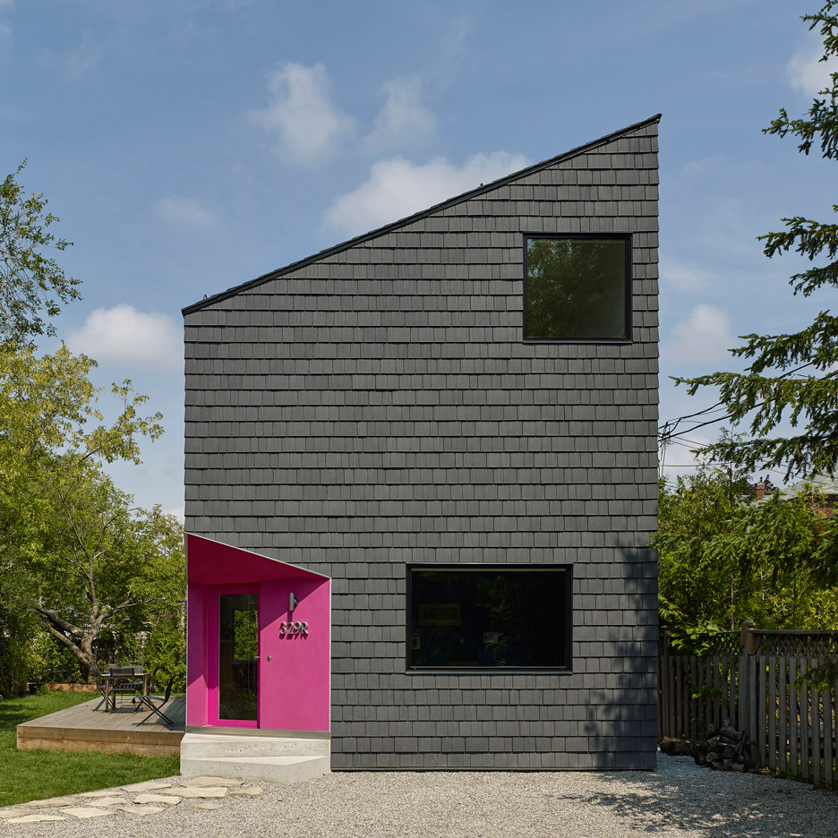
Toronto firm Reigo and Bauer has added a hot pink entrance to a three-bedroom home in a suburb of the city, which is otherwise clad in black shingles (+ slideshow). (more…)
Lightning rips through the sky over White Sands National Monument in New Mexico. Here, great wave-like dunes of gypsum sand have engulfed 275 square miles of desert, creating the world’s largest gypsum dunefield. Photo courtesy of Donald Palansky.
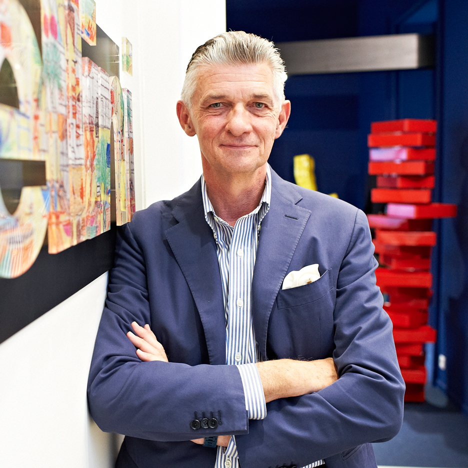
Italian brands create “too many products that look the same”, says Giulio Cappellini, whose furniture company is making a comeback under new owner Haworth (+ slideshow). (more…)
ArchDaily is continuing our partnership with The Architectural Review, bringing you short introductions to the themes of the magazine’s monthly editions. In this introduction to the July 2016 issue, Editor Christine Murray continues the crusade, begun in the previous issue, against “Notopia.” Here, Murray describes Notopia’s connection to our 21st century digital society, arguing that “the failed promise of the internet is how it has hurt the real world.”
It may be found even in an attractive metropolis, densely packed with fine buildings old and new, replete with coffee shops and bicycle lanes. Here, Notopia is a simulacrum of inhabitation, like a stage set for its players. Nothing is what it seems. The historic apartments that overlook the twisted pedestrianized lanes of Barcelona are in fact hotel rooms for weekend visitors. The towering sea-view condominiums of Vancouver are foreign investment properties bought in exchange for citizenship. Detroit’s streets of elegant gabled houses have no services, the municipal water systems long turned off.
Courtesy of The Architectural Review
A real city lives. It is a trading post, a natural meeting place where humans converge to exchange, not only goods, but ideas and culture. They set about marrying and employing each other. It is a hub for adventuring and joint venturing, with homes, schools and places of work within touching distance. It renews itself, a city with neighborhoods of all kinds of people, from grandchild to grandmother.
We can design for diversity of pursuits and culture – for different social classes, ages and incomes on the same street, and public space for them to meet. But the missing link is as much economic, as spatial. The nicer homes are uninhabited – purchased from abroad, the owners pay few taxes and visit rarely, and invest only in their business overseas. They have no need of a housekeeper or the local convenience store, and their presence produces no job opportunities in the country, let alone the community. Similarly, Airbnbs create a small economic boost for the few, but the tenants do not need schools or nannies, and do not vote in local elections. In these scenarios, money takes up space, drives up property prices, and pushes people out.
Notopia is a disease that prevents, either by design or in a complete failure of housing policy, the creation of a self-sustaining socioeconomic human ecosystem.
Courtesy of The Architectural Review
On the internet, in our digital communities, we gather on social media where deals are done, love is found, food ordered, frustrations shared, gifts purchased, questions answered, capital raised and petitions signed. We have grown more cosmopolitan, appearing in each other’s homes via Skype, investing in each other’s businesses, even a world away. While the scourge of Notopia brings social segregation, delivered and delineated in neighborhoods gentrified or sunk, online there are no borders other than barriers we erect selectively, friending or blocking.
The failed promise of the internet is how it has hurt the real world – the home, the local shop, the municipality, and ourselves. The digital world is one of sensory deprivation: there is nothing to touch, taste or smell, a realm bereft of delight and intimacy of the most human kind.
In the city, we can be surprised by the unexpected pleasure of a conversation with someone we would never have “swiped right.” It’s where an umbrella is held over your head by a stranger, the bike courier cuts you up and you curse loudly, and the market seller offers you the sharp taste of exotic fruit.
Courtesy of The Architectural Review
There is the half-remembered dream of a late evening in a public square in a vibrant quarter of a large city. Teenagers loiter in clusters, residents lean out of windows in conversation with the restaurateur, who serves coffee to the last customer, as the street cleaner begins the night shift. This natural, social symbiosis is nearing extinction – in some places, because nationalism and intolerance deny the migrant traffic that would fill population gaps. Cities need people to thrive.
We must stop the spread of Notopia and its generic anywhere-architecture, and build social ecosystems instead. Our buildings must not only respond to local conditions and climate, but also enable a shape-shifting range of incomes and inhabitants. We must seek balance, not too many Airbnbs, few vacant homes, enough young people, enough jobs, and productive, not just disruptive, economies. We need start-ups and large commercial spaces, subsidized and market rents, family and student housing, the more collocated, the better. We need policies such as rent control, freedom of movement and intelligent city planning to enshrine a self-renewing vitality.
The promise of this virtual world that we have built online – its freedoms of expression and connection – has failed us. What might the post-digital city look like, and how can we design its neighborhood economics to work for us?
Detached house, for a marriage, two children and services. Public areas on the first floor and private spaces in the second. In this higher volume, parents and children are parted; the first to de east and the children to the west. On the second floor, the ends of each volume has the most private places to finish in the center with the most common areas (father desk and TV/multimedia room for children); creating a large central volume of double height; which contain the relations and nexus (both foot how sight) between this double duality (private / public and children / parents)
A dialogue between the weight and mass of Concrete with the lightness and warmth of the wood. The base structure on the first and second floors is concrete, delivering a “sturdy table” to line the outside with a steel and wood. Both on the second floor as the double volume center height, native wood used dried and processed internally. Canelo was used in walls and ceilings, and Tineo or Coihue in floors.
This element was used to create the east wall of the kitchen, like a kaleidoscope filtering out the morning light in the kitchen; and distorter the lighting that receive bathrooms, and in the function how a screen to separate access and dining. It is a playful element that gives movement and illuminates at the same time that separate them.
The second floor hallway is transformed into a large corridor that ends in two terraces; the small west terrace flying over the main entrance, and the large east terrace. This corridor, which runs the maximum internal length of the house (24 meters + terraces) in addition to the semi-interiors latticework of the terraces, is accompanied by a large horizontal south window, communicating the neighboring fields inside the house.
The main staircase, located as a finish of the central volume of double height that is projected to the north courtyard, rests on a large vertical wall that is peeled away from the house and allows the entry of solar illumination throughout the day (being this wall a support of the rays and shadows the sun); becoming a true sundial that indicates both the advance of the day, as the change of the seasons.
Researchers from Arizona State University in Tempe have determined there is a gene that allows us to see the color red. That gene sits in the X chromosome and since the women have to X chromosomes, they are better at differentiating between the red-orange color spectrum.
And speaking of orange did you know that if you drink your chocolate in an orange cup it will taste better? But do not forget, colors don’t exist, they are all in your head! Actually, they are just results when our brains try to make sense of signals it receives from the outside world.
Take just now this quick and fun quiz to find out if you can actually see ale the colors!
Arquitectonica has released the plans for Pierce Boston—its first building in Boston—a luxury residential condominium in Boston’s Fenway neighborhood. With the recent large-scale real estate boom, the Fenway area is undergoing a massive transformation, with Pierce Boston to become the first building of its caliber in the neighborhood.
In an effort to balance new luxury with the existing iconic fabric of the area, the building is designed in simplicity with contemporary materials, so as to modernize the building against its context. Glass and metal will panel the façade, with the metal paneling patterned down to the scale and texture of a more traditional masonry brownstone. “As the building comes to grade and its opacity increases, it more closely reflects the history of the neighborhoods within which it rises” explained the architect in a press release.
Overall, the mixed-use tower will feature 109 condominium units, 240 rental units, and over 20,000 square feet of street-level retail space. With a curtain wall and floor-to-ceiling windows, the building is designed to maximize 360-degree views of Boston, Cambridge, the Charles River, and the Emerald Necklace.