Rustico is a residential project designed by Carnet Casa. It is located in Crema, Italy. Photos courtesy of Carnet Casa
De Gouverneur / Architectuur MAKEN

© Ossip van Duivenbode
- Architects: Architectuur MAKEN
- Location: Gouvernestraat 93, 3014 Rotterdam, The Netherlands
- Architect In Charge: Ferry in ‘t Veld, Nina Aalbers
- Area: 146.0 sqm
- Project Year: 2016
- Photographs: Ossip van Duivenbode , Courtesy of architectuur MAKEN
- Other Participants: Koelman Bouw B.V., Chris Bosvelt, Pieters Bouwtechniek Delft, Stonecycling
© Ossip van Duivenbode
From the architect. Though Rotterdam – with its high-rise and modern developments – feels like a pretty dense city, there are still empty plots in the city center. These are the result of the ambitious post-war plans in between old houses. The gaps in between old and new are often left open, which are potential locations for small buildings. The local-government stimulates initiatives for such small scale projects. We started to bike around the city to find a plot in our favorite neighborhood and we took a close look to possible locations and the regulations that comply. About 2 years ago [sept 2014] we laid eyes on this very location, and we contacted the local-government with an email questioning: can we build here? Followed by a reply: Yes, please! The contractor started building in March 2016 and finished in July 2016.
Courtesy of architectuur MAKEN
The house is a fill-in project with extra attention to respect the views and daylight of the neighbors and the existing passage to the backyards. The building with 4 levels, just like the adjacent buildings, is therefore built on a small plot. The house is 4,65meters in width and 8,8meters deep. Every floor contains 1 big room. Ground floor: kitchen/dining room, connected to a little garden. First floor: office. Second: living room. Top floor: sleeping room and rooftop terrace. The usable floor area is 120 square meters. The stairs are positioned in such a way that they provide a lot of flexibility and splitting floors in multiple rooms is possible. The concrete walls which are necessary for the stability the house are left visible. Rough concrete shows the structure and features the interior of the house. The polished concrete floors are only 180mm thick, including the finish and floor heating. The concrete beam normally situated under the ground floor is put on top of it, to create a conversation pit containing the kitchen.
Courtesy of architectuur MAKEN
Section
Courtesy of architectuur MAKEN
The buildings in the street are built in different moments in time, from 1850 on, showing a variety of architecture. They all have one thing in common: the buildings are materialized with brickwork. This new house in an old street, complies with the old by the introduction of something new. The chosen bricks seem ordinary and go well together with both adjacent buildings. Though these are waste based, Stonecycling bricks, which hasn’t been applied yet. A mix of brick bonds is used, in which the sliced stones form long vertical lines across the facade. These sliced stones show the ingredients of the brickwork: building waste such as glass, ceramic waste such as toilet bowls and roof tiles. Thereby the waste is the ornament in the facade and looks at the same time identifiable, showing the beauty of a circular building material.
© Ossip van Duivenbode
Ortelli Architetti Design a Contemporary Residence in Lugano, Switzerland

Collina d’Oro is a private home designed by the Italian firm Ortelli Architetti. The home was completed in 2012 and is located in Lugano, Switzerland. Photos by: Claudio Tajoli
This week, Toyo Ito’s Taichung Opera House opened to the public
This week on Dezeen: Toyo Ito’s cavernous opera house opened in the Taiwanese city of Taichung, while cultural buildings by Zaha Hadid Architects and Amanda Levete neared completion. (more…)
Kodasema Designs a Movable Pre-Fab Mini House Prototype First Presented at the Tallinn Architecture Biennale

KODA is a residential project completed by Kodasema. It was first presented at the Tallinn Architecture Biennale held in Tallinn, Estonia in 2015. KODA by Kodasema: “KODA by Kodasema – a movable pre-fab mini house prototype from Estonia has been shortlisted for the Small Project Prize at the World Architecture Festival 2016. KODA is one out of nine projects listed in that category. The mini house was first presented in..
Pars Hospital / New Wave Architecture

© Parham Taghioff
- Architects: New Wave Architecture
- Location: Rasht, Gilan Province, Iran
- Lead Architects: Lida Almassian, Shahin Heidari
- Area: 30000.0 sqm
- Project Year: 2016
- Photographs: Parham Taghioff
- Client: Teb Zist Bonyan
- Contractor: Latoum co
© Parham Taghioff
Since the second half of twentieth century up today, the architectural design of hospital buildings has faced great changes. These changes are coming from vital role that these types of buildings will play in city context and society as urban features.
© Parham Taghioff
Wide Surveys on typology of current health centers in IRAN leads to such disappointed results, for years these buildings have been built on base of repetition of some pre-designed blocks, which are covered with a shell around as building and finalized as building of hospital. So complicated network of path are generated which mostly are very narrow and dark corridors that arouse sense of fear and stress in users more and more, hence this is the time to redefine and re-evaluate the values that are affecting hospitals and healthcare centers quality of services that leads users to calmness during their experiences in these types of centers.
© Parham Taghioff
Designing hospitals is not becoming too much problematic issues just because of its mostly huge scale in design but the critical points comes out as it should be considering interconnection of such very complicated functions that covers areas from medical science to engineering, psychology…etc. Those mentioned areas are always faced with vital changes by time, even day by day. Best solutions are desired as inevitably these types of places affecting peoples feelings so directly There are values that should be considered which persuade comfort feelings and reduce stress and pain in patients, like perfect distribution of areas, shape of volume, alignment to site’s context, view to outside, green spaces, furnishing, materials, color and light.
© Parham Taghioff
Plan
© Parham Taghioff
Pars hospital of Rasht is belonging to private section as owner, of course these private units seeking their profits in creative and pioneer designs that are becoming very effective motivation points for having best costumer service and attracting more users. So for these units, users are considered both precious guests for the hospital as well as demander of healthiness whom pay for it; The better buildings quality, attract more customers, give better services and earn more profit, this is the goal.
Section
The pars Hospital of Rasht is built in overall 30000 sqm with almost 160 beds, it is located adjacent to one of most crowded roads of Rasht city with high possibility of rising in noise pollution in future. For having less affection from sound pollution, the expansion of the building in the site is in a way to have most distance from road. In accordance with Context of the city Rasht, designer tries to consider sloppy volumes so in this way apparently continuity of sightseeing preserved.
© Parham Taghioff
The concept of design in ground floor coming from having wide space with combination of diagnostic spaces, emergency parts and Outpatient clinic which are connected to other sections vertically an horizontally through main transparent Atrium, play vital role of merging buildings sections into one single entity and acting as organizer of interior pedestrian path, provide coherency, forming hierarchy between public and private areas and creating light space with efficient usage of daylight and less using electrical energy.
Diagram
Preservation of Continuity of users movement beyond remedial sections in all parts of building is afforded in a way that wouldn’t makes any interruption between protected and unprotected areas.
© Parham Taghioff
This building and its specific generated spaces unlike the other common types of health centers are very bright spaces, which in composition to specific colors increase efficiency of daylight usage in interiors.
© Parham Taghioff
The other point which affects our design was about designing in a different way, as it seems that remedial spaces are suspended through the so bright volume of the building so apparently with this clever division between spaces the topic of Infection control debate is controlled in perfect way.
Backing and supporting sections which almost so crowded and faced with fire hazard have been located with some distance in the form of three sloped volumes in two levels that defined their abundance with a green line around and have very adequate natural ventilation in between that is desired for medical instruments, of course this ventilation is avoided in remedial sections in building cause through these part we wont to expand infections in any case.
© Parham Taghioff
This atrium present very good potential for designing the building of the hospital, a place that needs more compatibility with the soul of technology and its growing speed specifically in this area of science, an intelligent inspiration behind of design is desired to create spaces with great possibility of adoption and transformation in the time of necessity. Future possible extension of the hospital is considered in west-north side of the building.
© Parham Taghioff
Entrees to hospital are divided in three types of main entrance in south side and emergency door in east side of building and finally there is helipad in roof that prepares the vertical access of the building. All the accesses are connected in atrium and then generated through the building’s sections.
© Parham Taghioff
The whole volume and form of the facades have vital influence in invitation the users and support their feeling of trust to these places as its specific design criteria tries to prepare a place of calm for patience and their attendances. Days and nights in this building will give them sense of liveliness, as in the days bright spaces with controlled penetration amount of natural light inside with nice colors in walls and floors makes their stresses less and in night, the bright atrium in the hearth of the building shine like star that shows path of health and improve sense of hope to life for users and viewers outside.
Raw Color turns office supplies into chromatic experiments for Aram Gallery exhibition
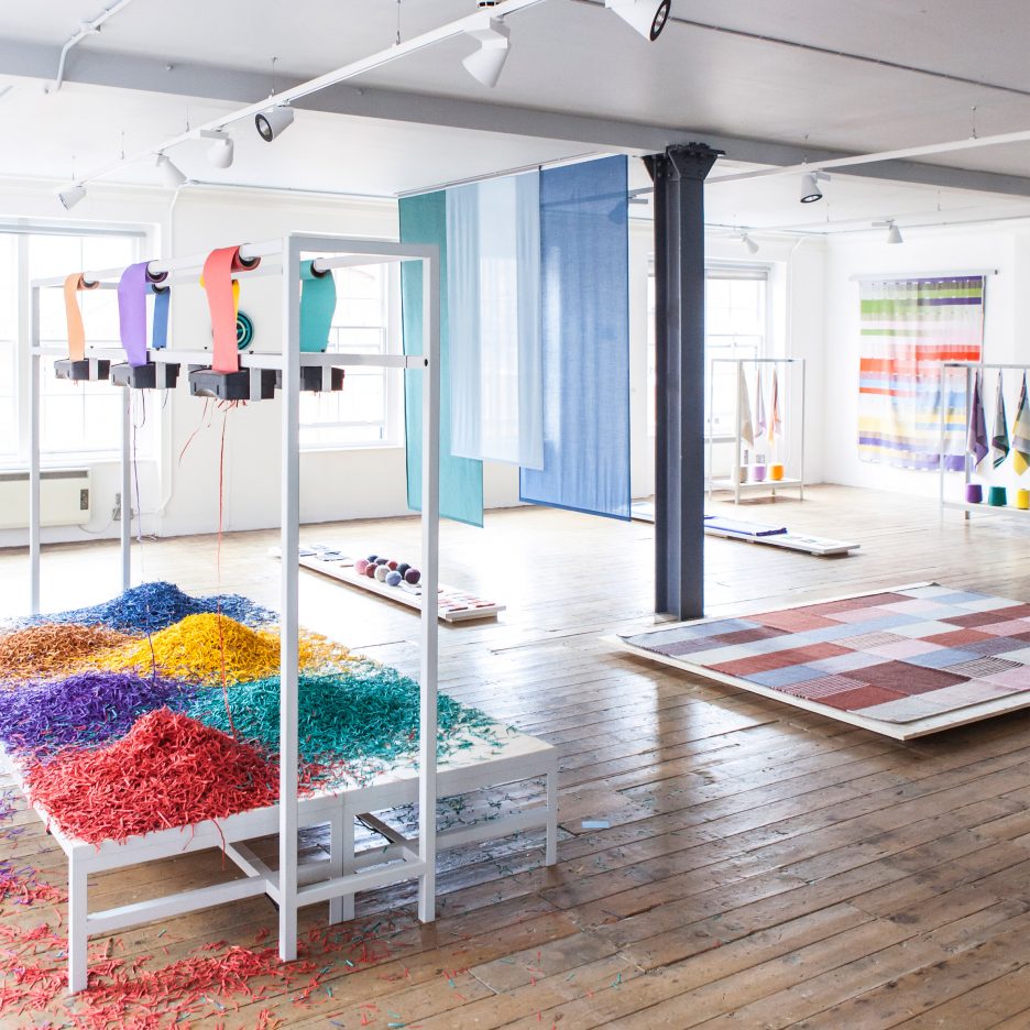
London Design Festival 2016: responsive paper shredders and fans that create moving colour effects feature in the Blend exhibition created by Dutch studio Raw Color at London’s Aram Gallery (+ slideshow). (more…)
Brew Box Pad / Itay Friedman Architects

© Boaz Arad
- Architects: Itay Friedman Architects
- Location: Kreuzberg, Berlin, Germany
- Area: 85.0 sqm
- Project Year: 2016
- Photographs: Boaz Arad
© Boaz Arad
Reinventing a space, demolishing the old and to approach the clients needs and wishes nowadays always requires a innovative idea.
© Boaz Arad
A box can contain what you place in it, but most importantly can become what you brew of it. From this basic rethinking of the interior shell the Brew Box pad design scheme emerged.
Diagram
Our client needed a place to live and develop his future business, so we found it only appropriate to create a space that can accommodate his demanding life yet retain the seclusion and peace of home.
© Boaz Arad
The client had a clear idea and love for the industrial design and a dream of a loft space, giving us the task to reinvent the mundane typical old building block apartment into a style to which it was never constructed for.
© Boaz Arad
The introduction and combination of materials such as metal, old bricks, patterned glass and old style factory tiles where key elements in the mood board we created for this project, alongside our clients work, love for entertaining, cooking and having an optional guests room.
© Boaz Arad
To incorporate all this, we first had to rethink the old circulation layout in order to try and reopen the space for all these different uses.
Creating an oval shape movement diagram versus the old linear movement pattern, we essentially introduced the possibility to access every part of the space uninterrupted even if one part of it was blocked by use of its inhabitants.
© Boaz Arad
The entrance became the main gathering space of the apartment, acted as a access point to the living room / guest bathroom, toilet, service room and private bedroom.
© Boaz Arad
The living room could be both private and public due to the fact that we introduced a glass door we designed and manufactured specially for our clients. With it, we both extended the space combining living room and kitchen in to one as well as segregated it when needed as a guest quarter by a pre installed curtain system blocking the transparency of the door.
© Boaz Arad
The service room acts as an extension to the kitchen, with extra work space / pantry, that can be opened or closed with a secret shelving door unit, or act as a corridor space to access the kitchen and entrance without engaging the living room space and at times when needed as a private extension to the bedroom.
© Boaz Arad
The bedroom is the most secluded part of the apartment, and to maintain it we reinstalled old style double wing door to the living room and a secret mirror door to the service room by which creating a gradual movement through public and semi public spaces before reaching the private space.The Brew Box pad concept created an abundance of containing spaces or as one would say “a box in a box” , creating self sustainable spaces for both living working and entertaining.
Tic Tric Trac / baumschlager eberle

Courtesy of baumschlager eberle
- Architects: baumschlager eberle
- Location: Räffelstrasse 22, 8045 Zürich, Switzerland
- Client: Swiss Life AG
- General Contractor: Implenia Generalunternehmung
- Area: 46915.0 sqm
- Project Year: 2014
- Photographs: Courtesy of baumschlager eberle
- Planning: Baumschlager Eberle Vaduz
- Project Architect : Marc Fisler
- Assistance: Marius Cerha, Ina Brink, Tomasz Walecki
- Landscape Architect: Müller Illien Landschaftsarchitekten
- Structural Engineer : Frick & Gattinger
- Building Physics: Braune Roth AG
- Building Technology: Ospelt Haustechnik
- Fire Safety: EWP AG
- Site Area: 12766 sqm
- Net Floor Area: 39534 sqm
Courtesy of baumschlager eberle
The rental area of 27,800 square metres radiates an open and vibrant atmosphere that would delight Donald Duck’s nephews, Huey, Dewie and Louie, known in German as Tic, Tric and Trac, who have given the complex its name. baumschlager eberle have devised a spatial concept that meets current needs for highly flexible and cost-effective commercial space. The ensemble’s showpiece is a 700 square metre creative mall linking all three buildings at the first floor level. This multifunctional open area provides an informal meeting point for the tenants and ample space for events. The ground floor will accommodate shops, cafés and restaurants catering for the daily needs of the tenants and local residents.
Plan
The outstanding external feature of the complex is the two-part, concrete curtain-wall facade which corresponds with the structure of the interior space. The thermal envelope with its extensive window glazing is supplemented by circumferential concrete elements, the projecting nature of which ensures extensive shading and dispenses with the need for any additional protection against the sun. “The continuous static system with load-bearing cores and a column grid of 8.10 metres make the shell very economical inside”, says Marc Fisler, baumschlager eberle’s project manager in Vaduz.
Courtesy of baumschlager eberle
Plan
Courtesy of baumschlager eberle
No costly interior work has been carried out. The structural concrete has deliberately been left visible and the building services offer considerable flexibility. Marc Fisler: “The heating has been installed alongside the facade and the many electrical cable ducts buried in the concrete ensure an optimal basic structure. Other technical equipment such as ventilation, cooling and additional sanitary units have been prepared at the core and can be installed by the tenant as required.”The 2.7-metre modular grid relates to the construction and so facilitates the individual finishings and the refinement of the rental space.
Section
In urban development terms Tic Tric Trac fits effortlessly into its commercial surroundings. The buildings along Räffelstraße take their cue from the volume of the structures in the neighbourhood. The tallest building has ten storeys, rises up 40 metres and thus makes maximum use of the permitted height for the neighbourhood.
Courtesy of baumschlager eberle