How to Ensure that Your Online Architecture Portfolio is On Point


Why should I even have an online portfolio?

A portion of working in architecture includes having to market yourself and your skills. “One minute networking” is a skill that many architects learn in order to be successful in the creative field, but having the gift of gab requires you to put your money where your mouth is. If you have an online portfolio which is accessible with just an internet internet connection and a digital device capable of viewing it, your work is always conveniently available during your networking conversations. It’s also helpful for sharing your work in online conversations: while a pdf of your print portfolio can really only be sent by email, practically every messaging app or direct messaging service built into social networks will allow you to send a link, allowing you to take advantage of an opportunity even when you weren’t expecting one to arise. Finally, if you make it right your website can even do some of the advertising and networking for you.

The most important thing to remember is that like your resume or print portfolio, an online portfolio is a tool to help you advance your career, so it must be useful towards your goals. Therefore instead of asking yourself why you should have an online portfolio, you should ask yourself what those goals are, and how your online portfolio can be optimized to help you achieve them.

Now that we’ve gotten that question out of the way, here are 8 other questions to ask yourself:

2. Should I just upload a PDF of my print portfolio?

Yes and no. Uploading your PDF portfolio to a zine hosting site such as ISSUU is an easy-click way to get an accessible sample of your work online. It’s convenient for job applications when you can just include a URL rather than an attachment, or when you can include a QR code in your business card that links directly to ISSUU. But this method isn’t for everyone.

Besides simplicity, the main advantage of uploading a PDF is that it allows you to demonstrate your graphic presentation skills in traditional print media, which is great if that’s a skill you particularly want to highlight. But on the other hand, an online PDF is rarely the most convenient or effective way to see something online—just because your graphics looked great on a large format printout does not necessarily mean that it would convey the same quality as a jpeg on a 15 inch screen.. In addition, just as you may need different types of print portfolio for different purposes, having the same projects in both print and on your online portfolio could be redundant. Perhaps uploading a PDF of a two-page portfolio on your website is a happy medium. Do whichever you think your employers would prefer in your *dream* job.


<a href='http://ift.tt/2bu9Qsb;

<a href='http://ift.tt/2bu9Qsb;

3. I don’t have much time to learn how to code or to customize visuals—can I still have an online portfolio?

As mentioned previously, you could simply upload a PDF of your portfolio on ISSUU. An alternative to this is to create an account with Behance. The platform is hosted by Adobe and your free account displays a collection of all your work. There aren’t any customization features, which on the one hand makes the setup straightforward and easy, but on the other means that your work must stand on its own, without any added “wow factor.” However, the value of uploading individual images for online viewing rather than spreads and layouts should not be overlooked, and Behance therefore offers a more digitally-native way to display your work than ISSUU. The site also offers a fairly comprehensive social networking component—almost like a Linkedin for creatives. You never know, this could be the source of your next job opportunity.


<a href='http://ift.tt/2bbjImZ;

<a href='http://ift.tt/2bbjImZ;

4. How should I create my website?

If you are quite adamant about having more control over the presentation of your work then this question is for you. There are ultimately more than a hundred ways to create a website but among the more popular these days are three platforms: WordPress, Squarespace, and Format.

Squarespace and Format: Both of these sites are quite similar in terms of pricing scheme and the friendliness of the user interface. There are easy-to-use templates that give you a polished looking website in mere minutes. As for comparisons, Squarespace targets their service beyond portfolios while Format focuses solely on portfolios. Squarespace also has a simple logo making service which might be useful. The choice really comes down to which templates you prefer, as they are exclusive to each site.

WordPress: It’s important to be aware of the difference between wordpress.com and wordpress.org. The former is a hosting service which gives limited customization options, but on the plus side is free and relatively easy to use. The latter platform is quite possibly the most reliable website creation service that is readily available to the public, however it does require you to host your own site, with all the technical understanding that requires. However, the system is incredibly popular, with even large companies using the platform including CNN and The New York Times. In general, as an open-source platform WordPress.org also gives you more freedom and control than Squarespace and Format thanks to its thousands of user-generated plugins you can install.


<a href='http://ift.tt/2bbjD2H;

<a href='http://ift.tt/2bbjD2H;

5. How many projects should I feature on my website?

The answer to this question goes back to what you ultimately want to achieve with your portfolio. With print portfolios, they always say that you should only feature your best work—not only does it demonstrate critical abilities but it also keeps the page count to a reasonable number. For websites, you are allowed to have as much data as you want, so it depends solely on your desired outcome. If you want to be known for just one innovation or type of building, or you want people to only see the best you have to offer, only upload the corresponding projects. If you want a comprehensive archive, you should obviously upload all of your work—but you should probably also think carefully about the next question.

6. How do I organize the contents of my website?

If you choose to have a comprehensive archive of your work, it’s important to have logical organization system which makes it easy to quickly access whatever type of work your future employers are looking for. Many larger firms, such as Diller Scofidio + Renfro display their projects chronologically, but they have categorized their projects to different typologies. You may want to follow a similar technique. It’s best to look for inspiration towards the larger architecture firms like Foster + Partners or OMA because they have such a volume of projects that they need to have a good organizing system.


<a href='http://ift.tt/2bbjqws;

<a href='http://ift.tt/2bbjqws;

7. What is SEO and how will it help me?

SEO stands for Search Engine Optimization. It can be an incredibly complex consideration—after all, an entire industry has been built off of it—but in simple terms it boils down to a good mixture of links, content, and keywords on your website which increases the likelihood of search engines like Google to recommend your website on searches. There are many ways you can increase your website’s SEO ranking and here are a few ways to start, but perhaps the most important to remember is to include your name or the business name you with to go by in prominent places such as the url, the page titles and the headers in your page text. This may sound astonishingly obvious, but it’s actually surprisingly easy to forget, as we’ll discuss in the following question.

8. How can I make my portfolio standout?

The quick answer to this question is: Not with image based graphics! It’s very tempting to create beautiful image-based headers for online websites but the downside to this approach is that search engines cannot process image-based data which means that your website is not as SEO friendly as you would like. If you make the decision to have a beautiful, customized website, it’s worth your tie to make sure it is done properly, as trying to “hack” your way to a beautiful website often does more harm than good.

Spending extra time on formulating a unique color palette, and investing in a tasteful customized font is an efficient and cost-effective way to stand out from the pack. But the most important thing to remember is that your portfolio will be compared with many others in a crowded online space, so you need to make use of your creativity to highlight your best aspects; whether that means putting faith in your design abilities with a design which highlights the work itself or by creating something a bit more unconventional is up to you.

9. How often should I be updating?

There are few things more off-putting to a potential contact than an online portfolio that seems abandoned. The rule of thumb is that you should probably update your online portfolio at least once every 6 months, provided that you have a new project to add. Alternatively, you could opt to make regular updates on a monthly or weekly basis much like what Bob Borson has done with Life of an Architect. Creating articles that are useful to other architects/designers is a great way to market yourself and your practice and shows that you’re an engaged thinker, not to mention the fact that helpful articles with relevant titles are SEO friendly.

http://ift.tt/2aXL9BP

H3 House / Luciano Kruk


© Daniela Mac Adden

© Daniela Mac Adden


© Daniela Mac Adden


© Daniela Mac Adden


© Daniela Mac Adden


© Daniela Mac Adden

  • Architects: Luciano Kruk
  • Location: Mar Azul, Buenos Aires Province, Argentina
  • Architect In Charge: Luciano Kruk
  • Area: 75.0 sqm
  • Project Year: 2015
  • Photographs: Daniela Mac Adden
  • Coordinator: Pablo Magdalena
  • Collaborating Architects: Ekaterina Künzel, Josefina Perez Silva, Andrés Conde Blanco, Leandro Rossi
  • Collaborators: Dan Saragusti, Giorgio Lorenzoli, Christian Studer, Isabelle Ducrest, Federico Eichenberg
  • Text: Mariana Pique
  • Site Area: 258 sqm
  • Building Area: 75 sqm

© Daniela Mac Adden

© Daniela Mac Adden

From the architect. Mar Azul, a seashore town in Villa Gesell Department, neighboring Mar de las Pampas, had its sand dunes terrain divided into a grid pattern. Its dense aged pinewood grants Mar Azul’s atmosphere pleasant quietness and tranquility.


© Daniela Mac Adden

© Daniela Mac Adden

In a modest, 210 square meter plot of land on a corner, eight blocks away from the sea, rises H3, a minimum tread house designed to make the most of the parcel’s dimensions and the natural surroundings.


© Daniela Mac Adden

© Daniela Mac Adden

The commissioner: 3 sisters and each of their families.

Even though their budget was limited, they we valued ability to express what they wished H3 should be: their shared summer house, their own place to rest amid nature.


© Daniela Mac Adden

© Daniela Mac Adden

They requested that the house’s dimensions should be defined very rigorously. The brief should comprise a predominant social area and a more private one, constituted by two bedrooms: an ample master bedroom and a smaller cabin-like one, both sharing a common bathroom. They wanted the master bedroom to open up outwards into a semi-covered outside area. Also, they expressed their desire for a salamander to be placed at the heart of the house.


Plan 2

Plan 2

Plan 3

Plan 3

The house’s materiality was agreed on by the studio and the commissioners. H3 was completely built in exposed concrete, which served well to the maintenance moderation. Intending to keep the needs for equipment at a minimum, even furniture was conceived as a part of the concrete volume.


© Daniela Mac Adden

© Daniela Mac Adden

Pine planks were used to set the formwork so that the partitions as well as the slabs would preserve the texture of the wood veins in an attempt to establish a harmonious dialogue with the bark of the local trees.


© Daniela Mac Adden

© Daniela Mac Adden

The house was constituted as a compact block. The ground floor houses the kitchen, the dining room and the living room, all in an integrated space from which the staircase emerges towards the first floor. Given the house’s scale, the use of crossed views and vanishing points aimed at unifying and fluidifying the space in the room. Instead of confining the house’s different uses into separated rooms, they have been connected with each other, aiming at producing the general feeling of spatial expansion. As requested on the brief, the bedrooms and the bathroom were located upstairs, but the main bedroom’s outdoor semi-covered space was designed to be shared with the secondary bedroom. Additionally, it would partially work as the roof for the downstairs deck.


Section

Section

Section

Section

As the corridor and the serving facilities were set to the side next to the neighboring lot, the main windows were set on the house’s more private rear, allowing the dwelling to open towards the outside deck and calling for the conservation of the original trees.


© Daniela Mac Adden

© Daniela Mac Adden

On account of the abundant shadows provided by the profusion of the woods, there was no need to reach for architectonic devices to reduce the sun’s incidence inside. As a matter of fact, apart from connecting the house interior and gaining visuals, the windows of the house also absorb the light that dribbles through the dense canopy of the trees.


© Daniela Mac Adden

© Daniela Mac Adden

Overhangs and partitions preserve the house both from the effects of water and the sight from the streets.

Also, the volume housing the bathroom shelters the entrance to the house.


© Daniela Mac Adden

© Daniela Mac Adden

While the sidewalls are mainly blind, the front upstairs show the blind volume housing the bathroom and the high windows of the main bedroom, under which a storeroom lies inside. On the rear, floor-to-ceiling windows connect both windows with the outdoor deck they share.


© Daniela Mac Adden

© Daniela Mac Adden

Unlike what happens upstairs, floor-to-ceiling windows open the ground floor from its entrance towards the opposite side. When we designed this floor plan, we aimed at making it feel both like an indoor space, sheltered by the roof and the windows, but at the same time, somewhere in between in a continuum with the outside.


© Daniela Mac Adden

© Daniela Mac Adden

In this way, the layout of the house is the result of an architectural synthesis of the sisters’ intentions and desires. In its minimum scale, the house rises by its own will, but also integrates itself respectfully with its surroundings, both natural and human-built. 

http://ift.tt/2bbbqLB

Win a FREE Full Pass to Greenbuild 2016 From reThink Wood

This October, reThink Wood is heading to Los Angeles for Greenbuild – the world’s largest conference and expo dedicated to green building. If you haven’t registered already, this is your chance to win a free pass to the conference and hear from dozens of inspiring speakers about the latest advancements in the green building movement. 

To celebrate, reThink Wood is offering a full pre-paid conference pass ($1,050+ value) to one lucky ArchDaily reader. The winner will be invited to learn more about why building with wood is sustainable and to meet with experts onsite who are passionate about sustainable design with wood in a variety of structure types.

Enter to win by answering the following question in the comments section before August 26 at 12:00PM ET.:

With Greenbuild coming to Los Angeles this year, tell us your favorite building designed with wood in the Los Angeles area.

This year’s event also marks one year since the winners of the U.S. Tall Wood Building Prize Competition were announced. Swing by the reThink Wood booth (#2035) to check out the winning project models and speak with experts about the innovative new technologies and building systems that are expanding the possibilities for wood use in construction.

With more architects and developers opting for renewable solutions to attaining safe, cost-effective, high-performing tall buildings in urban-dense settings, Greenbuild is the perfect opportunity to recognize how mass timber is gaining traction in the U.S. 


Courtesy of reThink Wood

Courtesy of reThink Wood

Not attending Greenbuild this year? You can still participate in reThink Wood’s Twitter chat! See below for more details:

Twitter Q&A
Hosted by @reThinkWood
Wednesday, October 5, 10:30 – 11:00 a.m. ET
reThink Wood Booth (#2035)

To kick off the week at Greenbuild, Twitter users are invited to join a virtual chat at the conference to discuss wood’s resilience, emphasizing its ability to withstand the test of time while giving a nod to future iconic buildings including the U.S. Tall Building Competition winners. The chat will feature a diverse panel of experts including architects, developers and engineers that will share their background and experience designing with wood. Attendees at the conference are welcome to gather for the chat in-person with experts at the reThink Wood booth.

To learn more about reThink Wood, visit www.rethinkwood.com and connect on Facebook, Twitter, LinkedIn and Slideshare!

Remember, to enter to win your free pass to Greenbuild, answer the question above in the comments section before August 26 at 12:00PM ET.

http://ift.tt/2b5UTvn

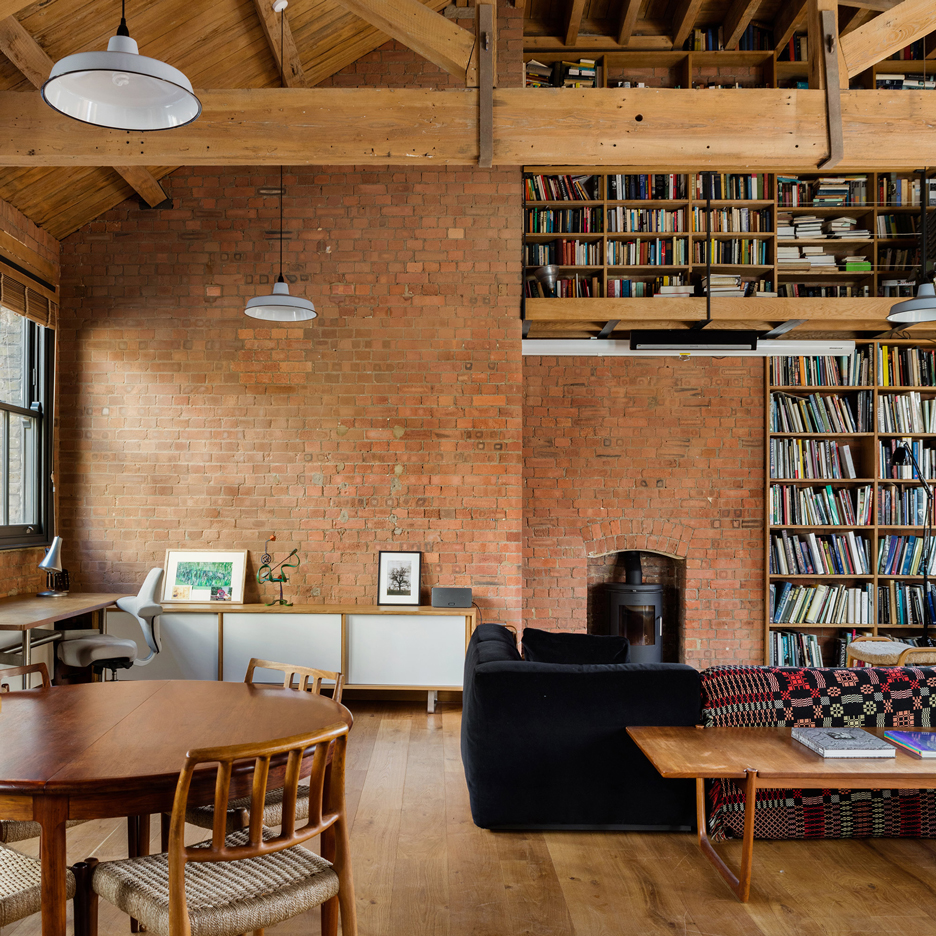
Emil Eve Architects retains historic “quirks” in Shoreditch warehouse conversion


Emil Eve Architects has paired original details with contemporary finishes in this loft apartment, which it created inside a Victorian warehouse building in Shoreditch, east London (+ slideshow). (more…)

http://ift.tt/2bxDbDk

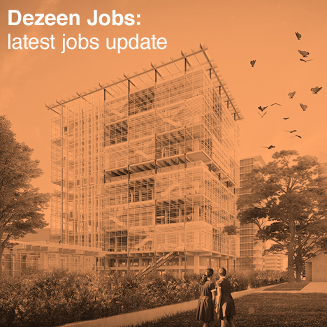
Dezeen Jobs: latest jobs update

Dezeen Jobs architecture and design recruitment jobs update Grimshaw

See the latest from our recruitment site Dezeen Jobs, including positions with Hollwich Kushner, UNStudio and Grimshaw‘s Australian office, which has designed a high-rise school complex in New South Wales (pictured). This is also the last chance to apply for roles with Heatherwick Studio, The V&A, John McAslan + Partners and more… (more…)

http://ift.tt/2aXywGY

Pitsou Kedem Architects Play with Shadows in this Private Residence in Tel Aviv, Israel

In Praise of Shadows by Pitsou Kedem Architects (30)

In Praise of Shadows is a private home located in Tel Aviv, Israel. Completed in 2014, it was designed by Pitsou Kedem Architects. In Praise of Shadows by Pitsou Kedem Architects: “The mashrabiya is made of Corten steel boards, which has given the Corten home its name. Made in the style of mashrabiya designed to trick, hide and confuse – it is used as a means to obscure the protagonist..

More…

Call for graduates to enter IE School of Architecture and Design competitions


Dezeen promotion: the IE School of Architecture and Design in Madrid is inviting architecture and design graduates to enter a pair of competitions, with prizes that include university scholarships and paid internships at international studios. (more…)

http://ift.tt/2aVRvml

AA School of Architecture Designs Adaptable Structural Plastic 3D Printing Method


Courtesy of The AA School of Architecture

Courtesy of The AA School of Architecture

The AA School of Architecture’s DRL Masters Program has developed a thesis project, entitled Growing Systems, which explores adaptable building systems using methods of robotic fabrication and generative special printing within the context of housing.

Centered on a new method of structural 3D vertical extrusion, the project combines the precision of prefabricated elements with the adaptability of on-site fabrication, in response to the flux and dynamism of cities. The method becomes a system of elasticity that can accommodate site parameters, as well as future adjustments.


Courtesy of The AA School of Architecture


Courtesy of The AA School of Architecture


Courtesy of The AA School of Architecture


Courtesy of The AA School of Architecture

Generally speaking, the new design method combines techniques of 3D vertical extrusion with the natural behavior of the material—a biodegradable plastic—to create novel geometries that are additionally sustainable, efficient, and aesthetic.


Courtesy of The AA School of Architecture

Courtesy of The AA School of Architecture

Through its adaptability, Growing Systems facilitates programmatic housing changes, for example, a house in need of expansion as a family grows. Such changes are possible due to the project’s phase-changing construction material, which, when heated, becomes sticky and can be connected to new constructions. Similarly, the plastic can be melted to remove an unnecessary portion of the building.


Courtesy of The AA School of Architecture

Courtesy of The AA School of Architecture

Courtesy of The AA School of Architecture

Courtesy of The AA School of Architecture

Furthermore, the plastic material has the advantage of being strong and flexible, while also lightweight.

The system can also negotiate at a larger scale maintaining its entropy – When two houses starting from different initial conditions change over time, one needing to grow while the other shrinks – an exchange of material can occur, balancing the system.


Courtesy of The AA School of Architecture

Courtesy of The AA School of Architecture

In the construction process, a robotic arm is utilized on-site, so as to quickly build with minimal disruption, including an elimination of the need for scaffolding, as well as an elimination of waste.


Courtesy of The AA School of Architecture

Courtesy of The AA School of Architecture

Courtesy of The AA School of Architecture

Courtesy of The AA School of Architecture

Courtesy of The AA School of Architecture

Courtesy of The AA School of Architecture

The robotic arm will be embedded with intelligence, being able to scan the environment and the printed geometry and provide feedback. It will also be equipped with a generative algorithm that will adjust the design real-time fully erasing the line between design and fabrication.

Project Team: Shajay Bhooshan Studio: Marta Bermejo, Ruxandra Matei, Vladislav Bek-Bulatov, Li Chen

News via The AA School of Architecture. 

http://ift.tt/2aVOUZt

Renovation Of The Aalto University Undergraduate Centre / Arkkitehdit NRT Oy


© Tuomas Uusheimo

© Tuomas Uusheimo


© Tuomas Uusheimo


© Tuomas Uusheimo


© Tuomas Uusheimo


© Tuomas Uusheimo

  • Architects: Arkkitehdit NRT Oy
  • Location: Otakaari 1, 02150 Espoo, Finland
  • Architect In Charge: Arkkitehdit NRT Oy
  • Design Team: Matti Nurmela, Tuomo Remes, Teemu Tuomi Architectural design team: Teemu Tuomi, Matti Nurmela, Tuomo Remes, Timo Kilpiö, Kristiina Suoniemi, Jani Koivula, Heikki Ruoho, Tuula Olli, Susanna Anttila, Tommi Suvanto, Kimmo Roponen, Heikki Saarinen, Tuula Hikipää, Sini Papakonstantinou, Mila Viksilä
  • Area: 47985.0 sqm
  • Project Year: 2015
  • Photographs: Tuomas Uusheimo
  • Contractor: Aalto University Properties Ltd.
  • Partner In Charge: Teemu Tuomi, (2008-2012 architect Matti Nurmela)
  • Project Architect: Tuomo Remes
  • Building Consultant: Olli Jaakkola, Juha Pesonen
  • Structural Designer: Keijo Saloviin
  • Hvac Designer: Paavo Tikkanen
  • Electrical Designer: Kirsti Pakkanen
  • Acoustic And Av Designer: Ari Lepoluoto, Juha Storm

© Tuomas Uusheimo

© Tuomas Uusheimo

From the architect. The former main building of the Helsinki University of  Technology took on a new role when three universities  
were merged as Aalto University in 2010. The Otaniemi  Campus designed by Alvar Aalto was chosen as the shared home of the Aalto Schools of Engineering, Business and  
Arts & Design.


© Tuomas Uusheimo

© Tuomas Uusheimo

The main building was originally completed in two stages in 1964 and 1974. The entire building was in need of renovation to bring it up to a modern-day university’s needs, including improved accessibility and flexible educational spaces. Some facilities were repurposed as they no longer served their original function. The HVAC systems, safety exits and fixtures were  also in need of modernization.


© Tuomas Uusheimo

© Tuomas Uusheimo

Renovating such a prestigious landmark – exemplifying as it does a ‘total work of art’ – was a challenge. With the advent of flexible working and learning practices, old buildings – even masterpieces – must adapt to changing user needs to maintain their value. Retrofitting flexible educational spaces in an old building without altering the original architectural concept is difficult, however. The building required new HVAC systems and safety exits for which no space was allocated in the original plan. Architects NRT showed exemplary skill in overcoming these challenges in their tailored planning and execution.


© Tuomas Uusheimo

© Tuomas Uusheimo

Each wing – variably 2-4 storeys high – is designed to function as a separate building linked to the campus complex. The main volume is rhythmically articulated by small courtyards. Aalto envisioned a leafy, American-style enclosed campus with  paths traversing the yards between the main building, library  and shop. The striking, auditorium-like roof of the low-rise  main building is an iconic campus landmark 


Floor Plan

Floor Plan

Floor Plan

Floor Plan

The main façades, spatial logic and detailing were fully  preserved, with the entrance hall, auditorium and main cor- ridors superbly restored to their former glory. The workroom wings underwent heavier modifications, with spaces opened  up for greater flexibility. Most of the new ventilation engine rooms are now located in the basement, maintaining the hori-zontal profile of the teaching wings. The architects preserved the most valuable features of the architecture in a logical  hierarchy. The laboratories, studios and lecture rooms were  converted into open spaces that can be furnished adaptably  to serve group learning activities. The open-plan work hubs  are spatially ingenious, though the furniture could be more inspiring and better balanced with the architecture.


© Tuomas Uusheimo

© Tuomas Uusheimo

Today the architect is no longer a ‘creative genius’ so much  as a ‘master negotiator’ who strikes a balance between  the project’s architectural aspirations, the wishes of various  user groups and other practical requirements. In this project,  Architects NRT successfully reconciled goals that were to  some extent contradictory. The building was still in use by  the university when the renovations began, and its user base  expanded after the school became part of Aalto University.  NRT did excellent work in catering to the needs of all of  
the school’s faculties in this ambitious renovation project. HR


© Tuomas Uusheimo

© Tuomas Uusheimo

http://ift.tt/2aVg7hV

AD Classics: Proposal for a Hospital in Venice / Le Corbusier


Model. Image © Fondation Le Corbusier (FLC/ADAGP)

Model. Image © Fondation Le Corbusier (FLC/ADAGP)

Le Corbusier made an indelible mark on Modernist architecture when he declared “une maison est une machine-à-habiter” (“a house is a machine for living”). His belief that architecture should be as efficient as machinery resulted in such proposals such as the Plan Voisin, a proposal to transform the Second Empire boulevards of Paris into a series of cruciform skyscrapers rising from a grid of freeways and open parks.[1] Not all of Le Corbusier’s concepts, however, were geared toward such radical urban transformation. His 1965 proposal for a hospital in Venice, Italy, was notable in its attempt at seeking aesthetic harmony with its unique surroundings: an attempt not to eradicate history, but to translate it.


Model. Image © Fondation Le Corbusier (FLC/ADAGP)


Plan


Plan


Situation Plan


Sectional Model. Image © Fondation Le Corbusier (FLC/ADAGP)

Sectional Model. Image © Fondation Le Corbusier (FLC/ADAGP)

There was no shortage of demand for Le Corbusier’s work in Italy after the end of the Second World War. The country experienced incredible economic growth in the decades following the war; what had previously been primarily an agricultural economy rapidly transformed into a major industrial nation.[2] The architect had already been commissioned to design a new headquarters for the Olivetti Company outside of Milan when the city of Venice approached him with their own commission for a new hospital. The new building, which would stand in the neighborhood of San Giobbe, was to serve as a facility for care of the seriously and terminally ill.[3]

Le Corbusier’s proposal did not stand out from the rest of the city as a brazen Modernist landmark. Rather, it utilized the existing urban vocabulary to appear as a seamless continuation of the old city. The hospital was conceived as a network of interconnected modules clustered around a number of square courtyards, a clear analogue for Venice’s traditional urban fabric. As with the rest of the city’s buildings, the new hospital was supported by a number of piles driven into the Venetian silt. However, these were not typical wooden piles; in reference to his own design canon, Le Corbusier chose instead to perch the hospital atop a grid of his trademark concrete pillars, or pilotis. The overall intent was that the new hospital would extend the urban fabric rather than interrupt it.[4]


Plan

Plan

Long Section

Long Section

While Le Corbusier chose to emulate the typical Venetian structural typology, he did not sacrifice functionalism to do so. The modules that comprised the hospital were to be almost identical, featuring 28 patient rooms facing onto three corridors; four of these squares, dubbed “care units,” were arranged around a small central square, the corners of which branched off into corridors connecting to other squares. The system was designed to allow the hospital to expand as needed in the future, ensuring it would have space both for added patient load and newly-invented medical equipment. The hospital was also vertically stratified programmatically: administrative and entry services were located at the ground level, patient bedrooms were on the top floor, and all other hospital program needs on the level between the two.[5]

One curious aspect of the design was the lack of conventional windows in the care units. The only daylight to enter the space did so through clerestory windows along the inner corridor walls of each hospital room; an American journal considered this an “unkindness,” as it denied patients the opportunity to gaze out at the Venetian lagoon during their stay.[6]


Plan

Plan

Another design move which elicited concern was the automobile gangway leading from the Santa Lucia Railway Station directly to the hospital’s ground level entry. Though an automobile causeway had already been built alongside the rail bridge leading from the mainland to the station, Le Corbusier’s proposal would have brought cars even further into a city that remained largely devoid of their presence – firmly out of choice. The same journal which questioned the lack of conventional windows considered the provision for automobiles “inexcusable,” even declaring that it was the one feature that would prevent the hospital from achieving the same architectural vitality as the surrounding historical structures.[7]

Given Le Corbusier’s typical contempt for pre-existing urban fabrics, his deference to the traditional Venetian aesthetic seems anomalous. In the brief of his Plan Voisin, he decried the Haussmann-era buildings and boulevards of Paris as a grotesque mix of mismatched buildings and narrow trenches – a relic which, he insisted, was nothing short of disgusting.[8] While he reviled Paris, however, he developed a peculiar fondness for Venice. As early as the 1930’s, he referenced the Italian city as an ideal urban model, lauding its canal network and the acceptance of multiple architectural forms and styles without the need for false, superficial continuity. While Paris would represent his Modernist desire to wipe the slate clean and build anew, it was in Venice that he would contradictorily espouse the benefits of historic preservation.[9]


Model. Image © Fondation Le Corbusier (FLC/ADAGP)

Model. Image © Fondation Le Corbusier (FLC/ADAGP)

The Venice Hospital project came very late in Le Corbusier’s life; he proposed the final design only a few months before his passing in 1965. Debates over the value of the hospital as a form of urban renewal ultimately became moot as, due to a lack of funding, the city ultimately chose a different design for a site on the mainland.[10] Nonetheless, Le Corbusier’s proposal represents the synthesis of his seemingly contradictory viewpoints – a sort of functional, Modernist historicism. It was fitting, perhaps, that Le Corbusier’s final design project was for a city that he came to admire so deeply.

ArchDaily would like to acknowledge Socks Studio as a key source of material for this article.

References
[1] Le Corbusier. “Plan Voisin, Paris, France, 1925.” Fondation Le Corbusier. Accessed May 18, 2016.
[2] Signoretta, Paola E. “Italy – The Economic Miracle.” Encyclopedia Britannica. May 12, 2016. [access]
[3] Flint, Anthony. Modern Man: The Life of Le Corbusier, Architect of Tomorrow. Boston: Houghton Mifflin Harcourt, 2014. p184.
[4] Verderber, Stephen, and David J. Fine. Healthcare Architecture in an Era of Radical Transformation. New Haven, CT: Yale University Press, 2000. p24.
[5] Fabrizi, Mariabruni. “The Building Is the City: Le Corbusier’s Unbuilt Hospital In…” Socks Studio. May 18, 2014. [access]
[6] Verderber, Stephen, and Fine, p24.
[7] Fabrizi.
[8] Le Corbusier, “Plan Voisin.”
[9] Corbusier, Le, Stanislaus Von. Moos, and Arthur Rüegg. Le Corbusier before Le Corbusier: Applied Arts, Architecture, Painting, Photography, 1907-1922. New Haven: Yale University Press, 2002. p153.
[10] Verderber, Stephen, and Fine, p24-25.

http://ift.tt/2aTANBh