From the architect. Bureau Fraai has completely renovated a 50’s farmhouse and extended the existing old barn next to the house with a contemporary extension. With the design of this extension the architects realized a harmonic relation between the existing and the new.
The young family living in this farmhouse in the east of Holland had the wish to completely renovate the out-dated interior while also opening up the house to it’s beautiful surroundings. Bureau Fraai realized this by opening up the whole ground floor plan of the existing house and by adding a spacious extension creating a strong visual connection to the big garden.
For the extension the architects decided to extent the current old barn next to the farmhouse. While the existing barn was built from bricks and ceramic roof tiles, the façade and roof of the extension are made of black pre-weathered titanium zinc with hidden aluminum window frames giving it a bold and modern feel.
The contrasting light interior with the wooden scissor frames, on the other hand refers to historical Dutch farm structures. By using this same wooden scissor frame as the window frame for the front windows all borders between the interior and exterior seem to disappear.
Ballet, in Asia, is often dismissed as an aristocratic passé, or mistaken for a weak and feminine art form. As the premier platform for the development of Ballet in China,how does one reframe this story to a new Chinese audience? Can the spatial qualities echo the nature of the art form? This was the brief we gave ourselves when we were commissioned to work on the design of the Morning Star Ballet Foundation.
We explored instead, a dual-faceted notion of Ballet, focusing on the one hand, a visual performance of light and grace, and on the other, an intense expression of strength and discipline, often internalized amongst dancers. Thus, the “entry”, akin to Ballet’s external expression, is made as both sculptural spectacle and as passage, rendered in gradients of light. The studio proper, in contrast, is carried through with more solemn palette of greys in varying textures from unfinished concrete to thin set epoxy resin.
To create a seamless sculptural passage, the stair geometry is defined by two rails, one that traces the hand from the edge of the info desk onto the stair rail, another from the outer rail onto the wall, and ceiling. The surface between the rails adopts a slight curvature, generating concave and convex surfaces that gently gradate the northern daylight, thereby giving lightness to the form. Burnt Sienna white was specified in matt and gloss for the walls and inner rail respectively, to complete the space with just a touch of warmth against the cooler concrete.
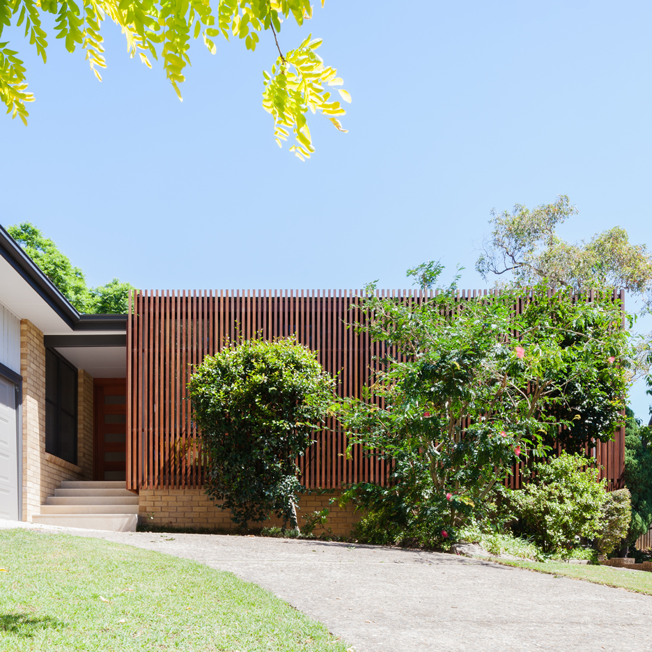
A slatted wooden screen wraps around the extended living space of this 1960s bungalow in Sydney, forming a protective surface that shields the interior from direct sunlight and views from the street (+ slideshow). (more…)
From the architect. This project offers a new housing in the city in order to fulfill the needs of urban people who are tired of living in apartments and wish to choose a new life style through a new space and place. Many have chosen sub-urban house to escape from the tiresome apartment. However, the client for this project is a young couple who can’t leave the city and this generation can’t give up the urban infrastructures.
The purpose of this project is to build a detached house in a small community and also giving them opportunity to earn some rental profit. This is a new challenge to escape the typical commercial houses which many have been imitated. I tried to arrange rental areas and detached housing area horizontally rather than vertical structure with floors that a household lives in each of them. And stairs connect those spaces.
This structure creates independence of detached house and connectedness of rental house. Most commercial houses in the city have been built with economic logic that commercial areas took the better spaces but residential areas were forced out toward upper floors and couldn’t enjoy the benefit of yard and land. However, if the residential and rental spaces are separated horizontally and the residential space is arranged vertically, the residents may enjoy the benefits of both sky and land. I expect that this is a method that both residential and commercial may coexist in the city.
The land shape is remained as triangle as a new road was created due to urban planning. In approaching the space, a triangular cube is arranged and there’s a gap in between to separate the two main functions. And one of the separated spaces is a rental area and the other is a detached house. The cube of rental space is separated by floors and twisted that shows formative stimulation and individuality. Moreover, these cubes may have optional skylight and illumination as some sides are emptied to complete the whole form.
Section
Section
The cube is white from the beginning. This white cube is separated into two and draw people into the gap. The gap is outside but the territory is limited and implies that it is a sensible entrance. If walking up the space in between, we could reach the entrances of each cube, and those spaces maximize the white ambience. Those white lumps are floated and cracked and the gap in between become a space that create something. Some energy that connect landlord and tenure, detached house and studio, horizon and vertical, and big and small are created, and this energy naturally leads to communication and reaches to a new community.
From the architect. The site is located at the North East corner of Hengqin Island in Zhuhai, within close proximity of the Shizimen Commercial District. The site’s North East is in close with the sea and enjoys excellent sea view and view resources. The site is only separated Macau by a river and enjoys the view of landmark of Macau such as the Macau Tower, MGM and the Grand Lisboa. Taipa is 200m to the north of the site and it is situated on an excellent location.
Courtesy of Raynon Chui Design
We came to scheme originally the overall program from the principle of green, ecology and future. Starting at the period of architecture plan, the designer arranged reasonably the site, layout and energy conservation of the building as to meet the demand of low power consumption, high efficiency and low level of pollution. Simultaneously to exploit renewable resources at most and decline the use of non-renewable resources to the least, dedicated to the impact of the procedure of constructing on surroundings in context. To utilize new construction technology and technique in the project to excavate the value of the architecture itself at maximum, end up with the consequence of harmonious relation between human and nature.
Courtesy of Raynon Chui Design
Inspired philosophy of the outline from fish, the building was constructed in earth-covering form to occupy the roof extending to the ground. Hypostatic union with the surroundings makes it hard to distinguish the demarcation line. The central area of the building was made translucent to develop grey space connecting interior and external in resulting to form integration visually.
Courtesy of Raynon Chui Design
Most of the surrounding landscape design including the installation of sculptures and artworks to work as transition to enhance artistic sense. Ideally result in developing a public recreation site with coast, art, humanity and nature.
Courtesy of Raynon Chui Design
Important before all the designer took the architectural appearance and form into consideration. After that, extend materials and design conception inheriting from the entire architecture to the interior .To invite nature lighting and views into the interior and connect respective floors intensively. Maintain the interchange between human and environment acts as rhythm of interior space.
First Floor Plan
Second Floor Plan
Rainwater Collection: collected rainwater on the roof and ground together to arrive at surface collection center goes through filtering system to meet the other purposes such as landscape and irrigation.
Courtesy of Raynon Chui Design
Energy Conservation: The exposed walls are occupied with low-E glass capable of reflecting heat and lead to import natural lighting at most and reduce the use of artificial lighting. Earth-covering design with real grass brings out topical microclimate ending up with the reduction of heat island effect and perseverance of warmth.
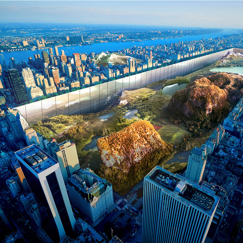
US designers Yitan Sun and Jianshi Wu have proposed transforming Manhattan‘s Central Park into a sunken landscape encircled by a below-grade megastructure with office, housing, retail and cultural space. (more…)
From the architect. Located in an historic building in the heart of the city of Porto, this project consisted in the transformation of a room into the author’s architecture office. Although small (55 m2), this premium space, in regards of solar exposition and relationship with its urban surroundings, was able to accommodate all the demands and areas inherent to its new role as a contemporary office.
Therefore, the office develops throughout six distinct areas: (1) a working area, (2) a printing area, (3) a meeting area, (4) a storage area, (5) a kitchen and (6) a bathroom, in a set of spaces organized in two groups – work and services – distributed along a corridor that unifies the entirety of the place. This distribution results from the functionality and time of usage of each area, whereby the office was organized in a way that the most ephemeral spaces were located by the door, as opposed to the more permanent working areas which require the most privacy and light.
Axonometri
Due to the specificity of all the different spaces, they were distinctly organized in a way that the support areas were enclosed in a volume attached to the circulation corridor and parallel to the working areas laid out in an open plan. This unity is also strengthened through the usage of a profile of light and bookcase that link the three working areas and promote their interconnectivity and fluidity of circulation.
In order to create a coherent unit between these new elements and the pre-existing ones, the entirety of the space was painted white with the exception of the more concrete looking grey floor that allows for a contrasting element that avoids an excessive homogenization of the space.
Sections
This proposal mainly intended to create a space that, although located in an historical building, would answer the modern demands of an office and promote a respectful dialog with its pre-existence.
American consumers who learned about design through Ikea are starting to appreciate other brands and are “very ready and ripe” for online retailers like Ahalife, according to Shauna Mei, founder of the e-commerce site that has just hired former Net-A-Porter director Christopher Colfer to drive the brand’s global expansion (+ exclusive interview). (more…)
UNStudio has won a competition to transform the former Deutsche Bank site in Frankfurt‘s financial district into a lively mixed-use site comprised of offices, apartments, hotels, retail, gastro and open public spaces. With four high-rise towers reaching up to 228-meters-tall, the proposal plans to feature the city’s highest residential and office buildings.
“Bringing a mixed-use project into this financial district will not only enliven the area during daytime, but it will also introduce evening programs and create an essential form of social sustainability to this part of the city,” says Ben van Berkel of UNStudio. “The introduction of the residential and the leisure components are key to this strategy. This sculptural family of towers will also create the suggestion of a cohesive neighborhood within the skyline and emphasize the importance of this part of the city within the whole.”
From the architects: A key aim of UNStudio’s proposal was to open up the site towards the city centre and integrate the listed building façades in the Junghofstraße. New connecting routes, passages and squares within the site will enliven the area and connect it to the pedestrian zones in the city centre. Publicly accessible spaces, such as a planned roof garden, a city square, multiple restaurants and retail outlets aim to improve the quality of time spent in the financial district. Accordingly, the proposals are in line with the city’s objectives of making the area more accessible and generating more public use, whilst simultaneously creating space for apartments and hotels on the location.
The four high-rise towers and public spaces on the Deutsche Bank site will form a new urban quarter. Two of the towers are earmarked for residential use, while areas for restaurants and retail will also be developed. With its special location within the skyline and its adjacency to the shopping and pedestrian zones of the city centre, the project has the potential to create an area of cosmopolitan urbanism that is unique in Germany.
The development operates as an urban hinge to connect the financial district with the city centre. With a diversity of publicly accessible functions not only connects former separated areas of the city, but creates a unique and lively destination for inhabitants, professionals from the Bankenviertel, neighbors and visitors. Through a sequence of two public squares and numerous pedestrian accesses the new quarter promises to become a lively new neighborhood in Frankfurt.
The project will include a new high-rise building with 59 floors – another building within Frankfurt’s Skyline that has the potential to enrich the high-rise landscape. This tower is already included in the current zoning plan. The two additional high-rise residential buildings that together will provisionally provide space for more than 600 apartments are new features. In addition, there will be a daycare centre for children, two hotels and a wide-ranging selection of restaurants and retail outlets.
The four towers are grouped in such a way that the central square is completely framed. The differentiation of the orientation and heights of the four high-rise buildings articulates variations within the skyline and optimizes daylight penetration. The volumes of the towers, with their subtle kinks and shifts, create unique spatial and visual relationships.
The next step will involve further qualification processes for the building, which will commence shortly. The start of construction of the new district is expected in the course of the coming year, while the first building is expected to be in use in 2020.
From the architect. This traditional, early twentieth century home has been transformed into a luxurious apartment featuring a wellness spa and roof-deck. Classic details and intricate woodwork are offset by the crisp contours of contemporary elements. Voids in the load-bearing interior walls create circulation in the floor plan and connect the living spaces. Residents can enjoy a spectacular view of Rotterdam’s skyline from the sauna, steam room, bathtub and roof-top whirlpool bath.
Section 1
The primary living space is on the second-story. Here, the floor plan has been augmented to include new functions such as an ensuite separation between the living and dining spaces and a second (guest) bathroom. These new functions are bundled into one discrete volume that is separate from the walls and ceilings of the traditional house. The gesture creates a clear distinction between the house’s classic and contemporary elements. Small wooden flooring strips, two by twenty centimeters, unite old and new.
Upstairs in the fourth-floor bedroom, all of the load-bearing walls have been eliminated. In the center of the space is a large, freestanding L-shaped element clad in American oak. The horizontal stroke of the L houses the bed and a large bathtub. The vertical stroke of the L contains a steam room and a sauna with a panorama window that provides a view of the city skyline.
Detail
The roof-deck is accessible from the fourth-story bedroom by means of a roof access skylight. Along two sides, a semitransparent chestnut fence affords privacy. The remaining two sides of the deck are open, to provide a spectacular 180-degree view of Rotterdam’s skyline. A low, built-in container doubles as a railing and roof garden. The moss and stonecrop frame the deck with a thick swath of green. The roof-deck is floored in reclaimed hardwood and a subtle hatch in the floorboards betrays the whirlpool bath. From the bath, the skyline of Rotterdam can be seen in all its glory.