Home / AD+studio


© Quang Dam

© Quang Dam


© Quang Dam


© Quang Dam


© Quang Dam


© Quang Dam

  • Architects: AD+studio
  • Location: Ho Chi Minh City, Ho Chi Minh 70000, Vietnam
  • Design Team: Nguyen Dang Anh Dung, Nguyen Van Trung, Vo Dinh Huynh
  • Area: 84.0 sqm
  • Project Year: 2016
  • Photographs: Quang Dam

© Quang Dam

© Quang Dam

Located in the South West corner of the building, it is a 2-bedroom apartment of which the area is 84 m2. After two years for office lending, this apartment has been partly damaged. The current arrangement plan also creates several problems when the using purpose is changed. Refurbishment method is to move the culinary area close to the living room which is arranged symmetrically through the center axis; the old kitchen is renovated into a multi-function space with a storage beneath; adding a private WC to the master bedroom; changing direction for the door of the other bedroom in order to surmount the room crossing disadvantage by giving way directly towards to the laundry balcony which is a new ventilating ways for the apartment. Afterwards, through the narrow hall, the common space has more views to the balcony and towards outside, making the space become bigger and airy.


© Quang Dam

© Quang Dam

Diagram

Diagram

© Quang Dam

© Quang Dam

I personally do not like apartment block in HCMc. It gives me a feeling of living in many stacking boxes which are constructed in a disorganized manner around the city; living with no garden, no breathing space and having no awareness of who behind the wall, all of which are the methods of building a life style to be relatively strange for the one who grew up in the countryside with nature and neighbors all around.


© Quang Dam

© Quang Dam

This apartment is a gift for my little sister, giving her a familiar living space, a childhood memory of when we were kids together enjoying our COLORFUL life in our little home with FRONT AND BACK GARDEN, where we shared our memories UNDER THE ROOF. Living spaces under the roof has been formed and remained in our mind as a place where we get back for a peaceful, leisurely feeling – the feeling that a common apartment cannot bring.


© Quang Dam

© Quang Dam

http://ift.tt/2cZ7kfA

The Ziffer / JLArchitects


© Namsun Lee

© Namsun Lee


© Namsun Lee


© Namsun Lee


© Namsun Lee


© Namsun Lee

  • Architects: JLArchitects
  • Location: Yeongtong-gu, Suwon-si, Gyeonggi-do, South Korea
  • Architect In Charge: Solto Jibin
  • Design Team: Jae Heon Lim, Namho Jo, Eunpil Jeon, Jihi Min
  • Area: 457.0 sqm
  • Project Year: 2016
  • Photographs: Namsun Lee

© Namsun Lee

© Namsun Lee

From the architect. Near Seoul, a few new cities and towns have been developed in last decades. Gwang-gyo is one of those new developed cities, originally and currently being developed as the center of government administrative and R&D clusters hub. The project is located in the mixed-use zone, which has the floor area ration 1.8. As the other zones of new town, strict design codes are regulating the formal and programmatic rules of the area; then, the district shows the aspect of both sides of regulations, the pleasant unity and boredom of the rule as well.


© Namsun Lee

© Namsun Lee

© Namsun Lee

© Namsun Lee

Since those codes are not functioning in negative way in terms of architecture and the ecological construction and so on, the project has been pushed forward to communicate in better way with contexts around. Those 4 stories mixed-use buildings in neighborhood usually stay individually without conversations except the store in the ground floor. The projects has been put into vertical void in the corner of the building, and making it garden to be able to communicate with the street level breaking the boredom of common new town setting.


© Namsun Lee

© Namsun Lee

Section

Section

© Namsun Lee

© Namsun Lee

Project title, the Ziffer means the abbreviation of ‘the Z-shaped buffer’ melting the closed barrier between public and private. In each floor, folding doors have been installed in the set-back layer of the structural masonry wall to protect from the quite cold winter of Korea. Thus, the Ziffer borrowed the systemic way how the zipper is functioning to open and close insides and outsides in convenient ways.


© Namsun Lee

© Namsun Lee

http://ift.tt/2czz2vt

Norwegian climbing centre by Reiulf Ramstad Arkitekter resembles a snow-capped mountain


The jagged form of this climbing centre by Reiulf Ramstad Arkitekter is covered in grey, brown and white shingles that reference a snow-covered mountain behind the building (+ slideshow). (more…)

http://ift.tt/2d3P4QO

Istakagrha / RAW Architecture


© Bambang Purwanto

© Bambang Purwanto


© Ifran Nurdin


© Bambang Purwanto


© Bambang Purwanto


© Ifran Nurdin

  • Architects: RAW Architecture
  • Location: Taman Meruya Ilir, Meruya Utara, Kembangan, Kota Jakarta Barat, Daerah Khusus Ibukota Jakarta 11620, Indonesia
  • Client : Mr. Ferdi Septiono and Ms. Joice Verawati and Family
  • Principal : Realrich Sjarief
  • Project Team: Bambang Priyono, Tatyana Kusumo, Miftahuddin Nurdayat, Rio Triwardhana, Anton Suryanto, Christiandy Pradangga, Maria Vania.
  • Area: 180.0 sqm
  • Project Year: 2015
  • Photographs: Bambang Purwanto, Ifran Nurdin
  • Supervisors: Sudjatmiko, Singgih Suryanto
  • Construction Manager : Eddy Bachtiar, Jasno Afif Angga
  • Structure Engineer: John Djuhaedi
  • Master Carpenter : Syarifuddin pudin
  • Mechanical And Electrical Engineer : Bambang Priyono, Andi, Karim, Hamim
  • Landscape : Mr. Ferdi Septiono, Ms. Joice Verawati and Family
  • Plan And Illustrations : Miftahuddin Nurdayat, Tatyana Kusumo, Rimba Harendana

© Ifran Nurdin

© Ifran Nurdin

Located in Taman Meruya Ilir, West Jakarta region, Istakagrha meaning brick house,Situated in the increasingly crowded West Jakarta area, the 180 sqm house occupies a 150 sqm plot of land, 10m x 15m. Istakagrha is reflected by its name, brick House, it is a small and compact house with a orange painted color on the light weight brick, black colour , and rough concrete texture finishes.The expression creates humble and distinctive look 


© Bambang Purwanto

© Bambang Purwanto

“We have a dream to have a house which like a villa in Bali. A house more than a functional but a place to live and grow with feel of nature, we really love staying in tranquil house” explains homeowner Mr. Ferdian Septiono and Ms. Joice Verawati Realrich Sjarief. The clients are graphic designer who are willing to have a compact sustainable house. 


Section

Section

Section

Section

The architecture of istakagrha separated inside and outside with the landscape of a barrier wall made by light weight brick. The combination is stacked with pattern of solid void, which provide sense of privacy and security, meanwhile allowing sunlight and air circulation to flow inside the living room. The house faces east side allowing morning sunlight come to the space at 9 am. The stair is placed at the west side, the west side is walled with brick to provide thermal insulation. The air ventilator is placed at the west side of the house above the stair from ground to 1st floor providing fresh air circulation throught air stacking effect. The house has one open air receiving area as anteroom then no more separation wall between living, dining, and cooking which In the living room, the kitchen also takes some importance its final layout is the result of few adjustments based on the owner’s domestic habits. The only enclosed space in the ground floor is guest room, which doubles as a working space and guest bed room. A simple foyer and a light well integrated with stair, and art work is placed after the receiving area at the west side of the building. The first story houses private spaces. At the end of the corridor is 1 bedroom with shared bathroom and a walk-in closet. An simple and functional feel showering area is attached to the bathroom. The material used in this building is choosed based on the best craftmenship available in Jakarta, concrete structure is used because of the cost efficiency, engineered wood is used because of the look and lightness, metal frame for facade and sunshading are used because of durability. 


© Ifran Nurdin

© Ifran Nurdin

3 types of brick was used based on each character. First, is light weight brick, 200 x 600 x 100 mm, for the facade. Light weight brick was chosed because of the lightness, precision and can be easily molded and constructed as facade/ Second, orange brick which is most common material used in Jakarta, The third one is the ceramic brick 50 mm x 150 mm x 10 mm which is used for covering the stair wall as insulation and interior surface. An additional bedroom, bathroom and a stair way to the attic on the 1st floor is linked by a corridor leading to an open space beside the void leading to the stairwell and stair case through compact space. Istakagrha showed an example of small house in Jakarta with small plot of land with sustainable design approach and keeping privacy from out side to inside through simple form which is stacking brick.  


Diagram

Diagram

http://ift.tt/2cbvpJT

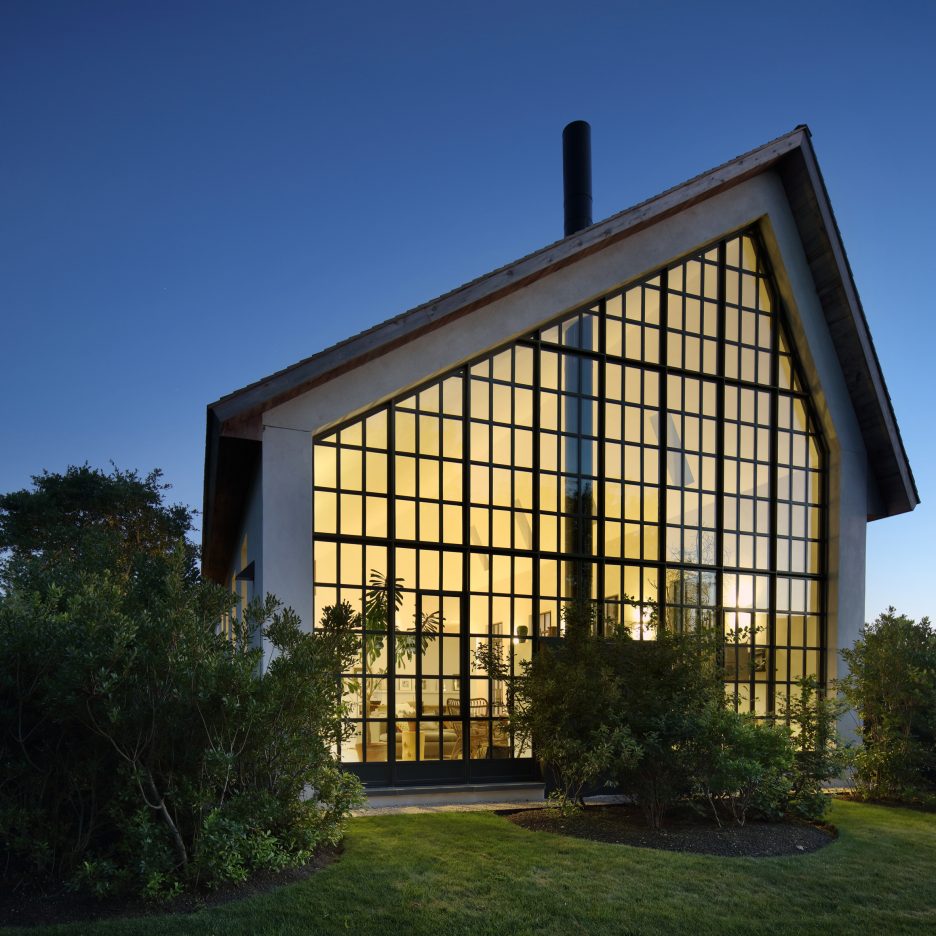
Giant window fills gable end of Hamptons guest house by TA Dumbleton


Brooklyn studio TA Dumbleton Architect took cues from two divergent typologies – an old farmhouse and a city loft – while designing this weekend retreat on Long Island in New York (+ slideshow). (more…)

http://ift.tt/2chGWux

JINS Ageo Shop Renovation / Schemata Architects


© Kenta Hasegawa

© Kenta Hasegawa


© Kenta Hasegawa


© Kenta Hasegawa


© Kenta Hasegawa


© Kenta Hasegawa

  • Architects: Schemata Architects
  • Location: Tokyo, Japan
  • Architect In Charge: Jo Nagasaka / Schemata Architects
  • Project Team: Ryosuke Yamamoto, Ou Ueno, Takuya Sakamoto
  • Area: 239.6 sqm
  • Project Year: 2016
  • Photographs: Kenta Hasegawa
  • Construction: FUYUKI KOGYO / Ideura Kensetu (demolition + landscape + façade) / SPACE(interior) / O.F.C(furniture)
  • Collaboration: KIGI (sign and graphic design)

© Kenta Hasegawa

© Kenta Hasegawa

JINS, one of the biggest eyewear brands in Japan, commissioned Schemata Architects to design the renewal of their Ageo shop on the occasion of its 12th anniversary. The existing shop consists of two L-shaped blocks, respectively an eyewear shop and a cafe, positioned around a square courtyard surrounded by an open corridor serving as a cozy outdoor cafe space. However, the existing building was clad in wooden panels and the courtyard and the cafe were hidden from the street. 


© Kenta Hasegawa

© Kenta Hasegawa

We removed the exterior walls and installed Low-E paired glass to initiate the view towards the beautiful courtyard  from the street, while creating an impressive display of their extensive eyewear products highly visible from the street at the same time. 


© Kenta Hasegawa

© Kenta Hasegawa

Plan

Plan

© Kenta Hasegawa

© Kenta Hasegawa

The interior design was intended to emphasize the effect of exposing the skeleton of the building. New interior walls are offset from the original wall lines, finished with brick tiles usually used for exterior finishes; shelves and display furniture are designed as independent elements detached from the building. Eyewear products vary in shapes and colors, and we collaborated with the graphic design office KIGI to introduce visual elements in the shop so that the products and the space can relate to each other in a free and independent way. 


© Kenta Hasegawa

© Kenta Hasegawa

http://ift.tt/2cArD0y

MoMA Launches Online Database of 3,500 Past Exhibitions


Installation view of the exhibition Bauhaus: 1919-1928, on view December 7, 1938 through January 30, 1939 at The Museum of Modern Art, New York. The Museum of Modern Art Archives, New York. Image © Soichi Sunami

Installation view of the exhibition Bauhaus: 1919-1928, on view December 7, 1938 through January 30, 1939 at The Museum of Modern Art, New York. The Museum of Modern Art Archives, New York. Image © Soichi Sunami

The Museum of Modern Art in New York (MoMA) has released an online archive of over 3,500 of the museum’s past exhibitions from its founding in 1929 to today. Free and available to the public, the database contains photographs, press releases, checklists, catalogues and lists of featured artists.

The archive contains 660 entries tagged under “architecture” and includes some of architectural history’s greatest exhibitions: the Modern Architecture International Exhibition by Philip Johnson and Henry-Russell Hitchcock in 1932; Herbert Bayer’s exhibition Bauhaus 1919-1928 in 1938; Thresholds/O.M.A. at MoMA: Rem Koolhaas and the Place of Public Architecture in 1994; and, most recently, A Japanese Constellation: Toyo Ito, SANAA, and Beyond, which wrapped up its run this past July.


via moma.org/history

via moma.org/history

The release is the product of a massive undertaking by museum staff to digitize past archives. Many of the pages contain links to related publications or preserved websites dedicated to individual exhibitions. A easy-to-use menu bar allows users to search directly for keywords or refine their search based on exhibition type and year.


Mies van der Rohe and Phillip Johnson at the exhibition Mies van der Rohe, on view September 16, 1947 through January 25, 1948 at The Museum of Modern Art, New York. The Museum of Modern Art Archives, New York. Image © William Leftwich

Mies van der Rohe and Phillip Johnson at the exhibition Mies van der Rohe, on view September 16, 1947 through January 25, 1948 at The Museum of Modern Art, New York. The Museum of Modern Art Archives, New York. Image © William Leftwich

The database will be continuously updated as new exhibitions are held, meaning architecture lovers will have the opportunity to check out next year’s Frank Lloyd Wright retrospective, even if they are unable to make a trip to MoMA in person.

Check out the online archive for yourself, here.


Installation view of the exhibition Machine Art, on view March 5, 1934 through April 29, 1934 at The Museum of Modern Art, New York. Image Courtesy of Museum of Modern Art

Installation view of the exhibition Machine Art, on view March 5, 1934 through April 29, 1934 at The Museum of Modern Art, New York. Image Courtesy of Museum of Modern Art

http://ift.tt/2cz9qid

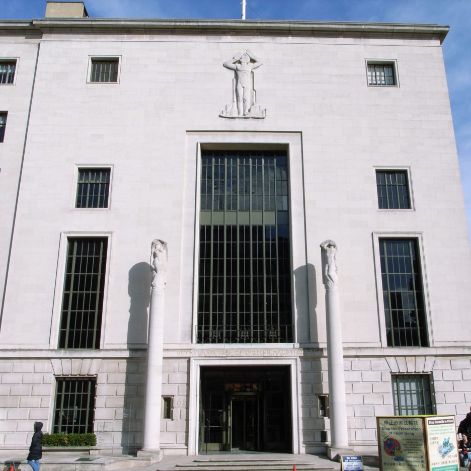
Brexit could trigger skills crisis in architecture and construction says RIBA


Brexit: the Royal Institute of British Architects has written to the UK’s Brexit minister David Davis to warn that construction is facing a skills deficit. (more…)

http://ift.tt/2cBFFMl

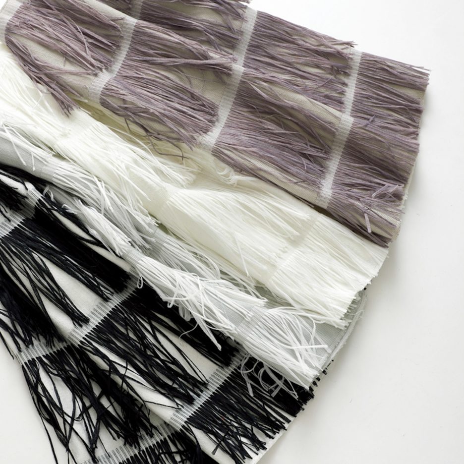
Issey Miyake and Muji among participants at first New York Textile Month


Dezeen promotion: an Issey Miyake fabric-pleating demonstration, a talk at Muji‘s flagship store and an installation made of recycled materials will take place during the inaugural New York Textile Month (+ slideshow) (more…)

http://ift.tt/2cYpPkj

Into the Wild / Openfabric


© Daryl Mulvihill

© Daryl Mulvihill
  • Client: The Hague Municipality, Richard Krajicek Foundation
  • Consultant: Arcadis

© Jacopo Gennari Feslikenian

© Jacopo Gennari Feslikenian

Play is about finding ones place in the world and making sense of that world. We have created a plan that seeks to juxtapose two different worlds. The man made and the natural. The plan has an urban exterior and a wild natural interior, each space contains a different type of play.


© Francesco Garofalo

© Francesco Garofalo

© Daryl Mulvihill

© Daryl Mulvihill

Section

Section

© Daryl Mulvihill

© Daryl Mulvihill

The formal exterior is a place for sports and structured ordered games, while inside the wild interior children are encouraged and free to construct and destruct their own play spaces using natural materials. A boundary “ribbon” between the two worlds wraps and protects the interior, while adapting towards the exterior to allow games and integrate traditional playground elements.

Grevelingenveld known locally as Deltaplantsoen is a neighbourhood square in Rivierenbuurt, The Hague. The design of the 8.100m2 space links carefully with the development of a new neighbourhood school which faces onto the square. 


Plan

Plan

© Jacopo Gennari Feslikenian

© Jacopo Gennari Feslikenian

The playground concept brings three different types of play together into one ensemble; the interior is a wild natural playscape, the exterior an urban sports court, and the threshold between the two known as “the ribbon” is a playful architectural element containing all the traditional playground equipment. This diversity of playing types arranged as an open ended playscape, creates a rich and dynamic world that offers children endless possibilities for play and to reinterpret and reimagine the space. In contrast to the many mono-functional playgrounds with standard equipment that exist everywhere today. 


© Daryl Mulvihill

© Daryl Mulvihill

Diagram

Diagram

© Francesco Garofalo

© Francesco Garofalo

The central natural playground is a space where children are free to construct and destruct their own play spaces from natural materials and fast growing plants such as willow and reeds. Bringing a natural playscape like this into the heart of the neighbourhood will increase children’s daily contact with nature, an important factor for a healthy childhood and an experience that is missing from many urban neighbourhoods. The planting selection is chosen to provide maximum visual variety throughout the year while the biodiversity of flora and fauna will provide a rich context for environmental education offered by the school, and the continual growth of the plants and trees over the years provides an ever changing landscape. 


© Jacopo Gennari Feslikenian

© Jacopo Gennari Feslikenian

The threshold between the urban and the natural is known as The Ribbon, it’s an undulating playscape where children can navigate between the two worlds in an engaging and inviting way. The Ribbon can be climbed over via the climbing wall, crawled through via the tunnels, slide via the slides, the edge has a steel coping for skating and scooting. It serves as a sitting element at the edge of the sandpit or a spectator stand for those watching the sports courts and much more.


© Daryl Mulvihill

© Daryl Mulvihill

In contrast, the external space is a formal hard surfaced square for sports and structured games. Here patterns of lines define sports courts such as football and basketball and also create an abstract patterns, a playful matrix that can set boundaries for new games.


© Jacopo Gennari Feslikenian

© Jacopo Gennari Feslikenian

http://ift.tt/2cMx23n